Background
When they’re built right, brands tell stories.
After building a lot of things throughout his lifetime, master craftsman Joe Plaskowitz was ready to build a business. Over a period of decades, Joe has distinguished himself as a “Joe of all trades” with impeccable service. He came to us looking for a business name, visual identity, and website that accurately reflected his vast experience and remarkable skillset.
Challenge
Establish a descriptive yet pithy name, a simple yet elegant identity, and a website that told Joe’s story in a compelling way.
Solution
Words with double meaning come together to succinctly describe Joe’s essence, and drive the identity and website design.
Results
A solid brand presence, an influx of business, and award-winning recognition for Joe.
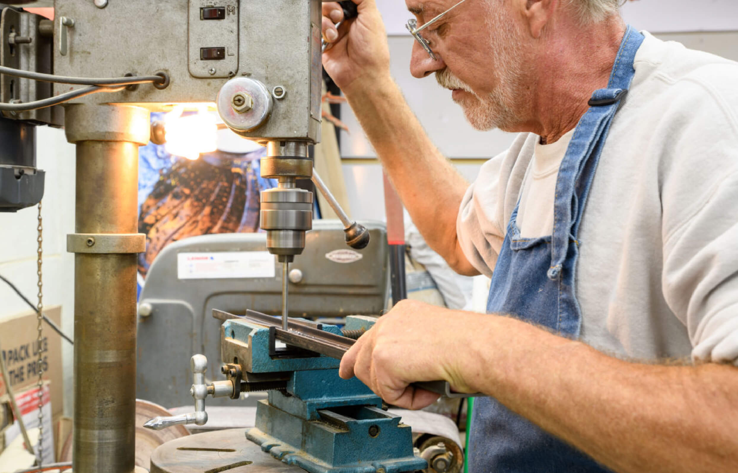
Distilling a name and identity from diverse experiences
Joe wanted a name that encapsulated both his broad skillset and his specialty trade, while also referencing his quality work and attention to detail.
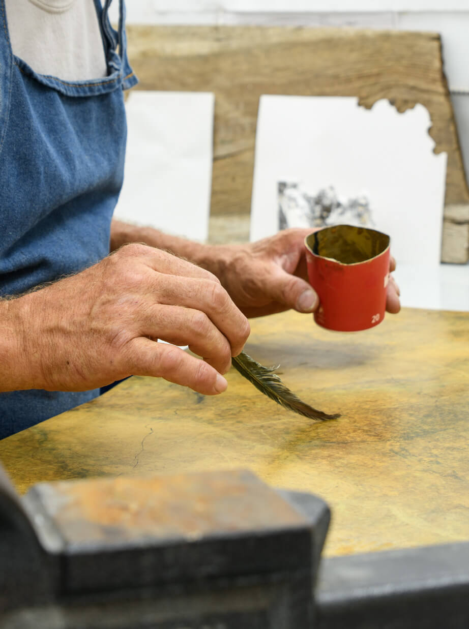

The power of hidden meaning
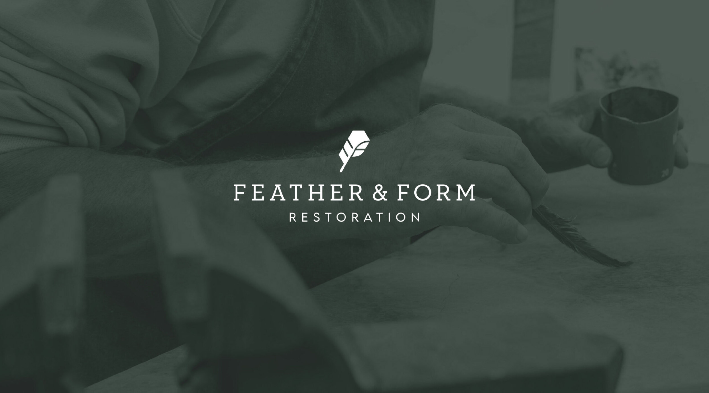
Joe’s business name is a nod to his specialty feathering paint technique, his light-handed work, and his ability to form exquisite results that fulfill unique visions. The visual mark for his logo tells the story of his brand, blending an F into the feather, while also suggesting the form of a home. His website was designed to showcase his history and versatility, so that he could connect with a multigenerational audience with an appreciation for refinement.
Distilling a name and identity from diverse experiences
Joe wanted a name that encapsulated both his broad skillset and his specialty trade, while also referencing his quality work and attention to detail.

The power of hidden meaning
Joe’s business name is a nod to his specialty feathering paint technique, his light-handed work, and his ability to form exquisite results that fulfill unique visions. The visual mark for his logo tells the story of his brand, blending an F into the feather, while also suggesting the form of a home. His website was designed to showcase his history and versatility, so that he could connect with a multigenerational audience with an appreciation for refinement.

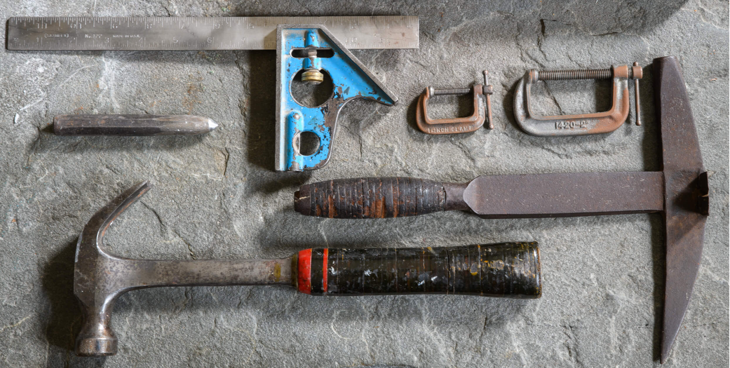
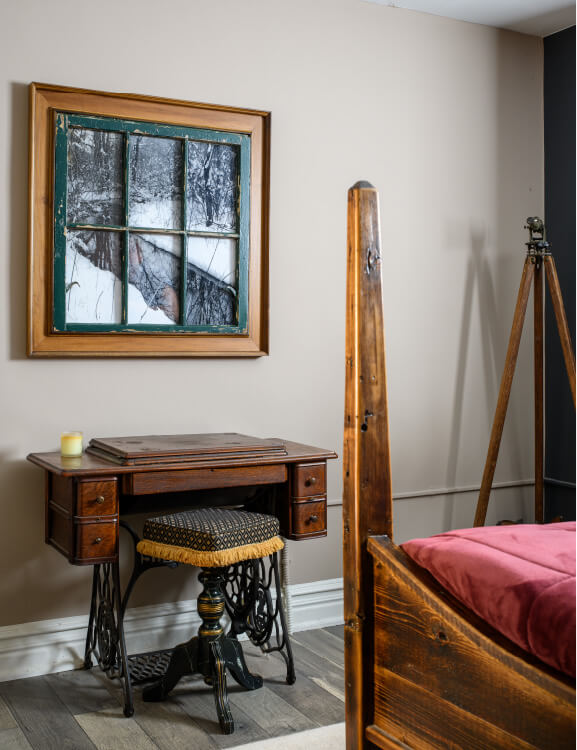
Through messaging and custom photography, the website showcases how Feather & Form Restoration turns vintage visions into reality.
Color palette & Typography
Charcoal
Sage
Mint
Parchment
IvyPresto Display Thin
IvyPresto Display Italic
Proxima Nova Medium

Challenges
It was important to capture the big picture without losing sight of the details.
Joe’s experience is both broad and deep, resulting in a varied history that needed to be strategically assessed in order to pinpoint a name, and carefully curated to determine storytelling highlights for the web.
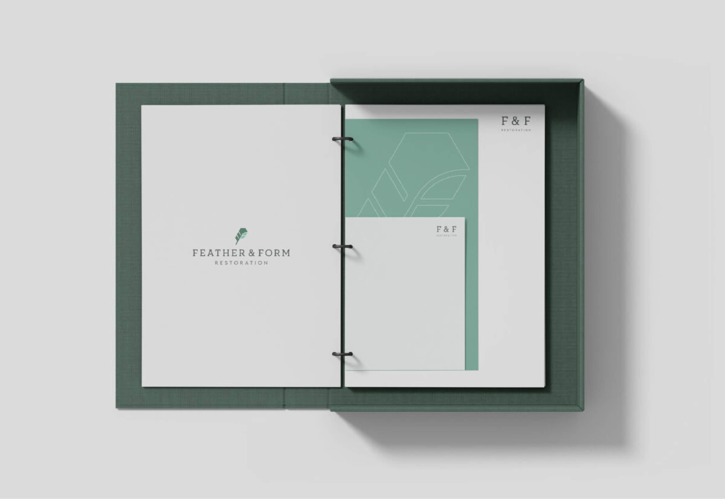
The Outcomes
In addition to strategizing a memorable and descriptive name, we developed a comprehensive brand identity with marketing collateral that fed a successful marketing campaign. Feather & Form Restoration is reaping the benefits with a deluge of new business and “Best of Philly” recognition.
