Background
A non-profit website needs to tell a story about an organization and where it’s going, clearly showcasing its impact. A website focused on the past loses engagement and doesn’t attract needed sponsors/partnerships.
Women’s Campaign International (WCI) is a not-for-profit organization that empowers women and girls worldwide through leadership-focused programming in entrepreneurship, public health, political advocacy, and international relief. Women continue to be underrepresented in leadership positions throughout the world, and WCI’s Founder and President, Marjorie Margolies, seeks to change that. WCI prepares girls to be confident and effective leaders by providing support that’s tailored to community needs and developed in collaboration with local partners for long-term sustainability. Despite a powerful forward-looking mission, WCI’s website was too focused on the past, overshadowing its global impact and risking missed opportunities with partners and sponsors. A redesign was necessary to reframe the WCI story, attract the intended audiences, and improve overall user experience and engagement.
Challenge
Redesign the website to highlight WCI’s impact, and attract partners and sponsors to help achieve their mission.
Solution
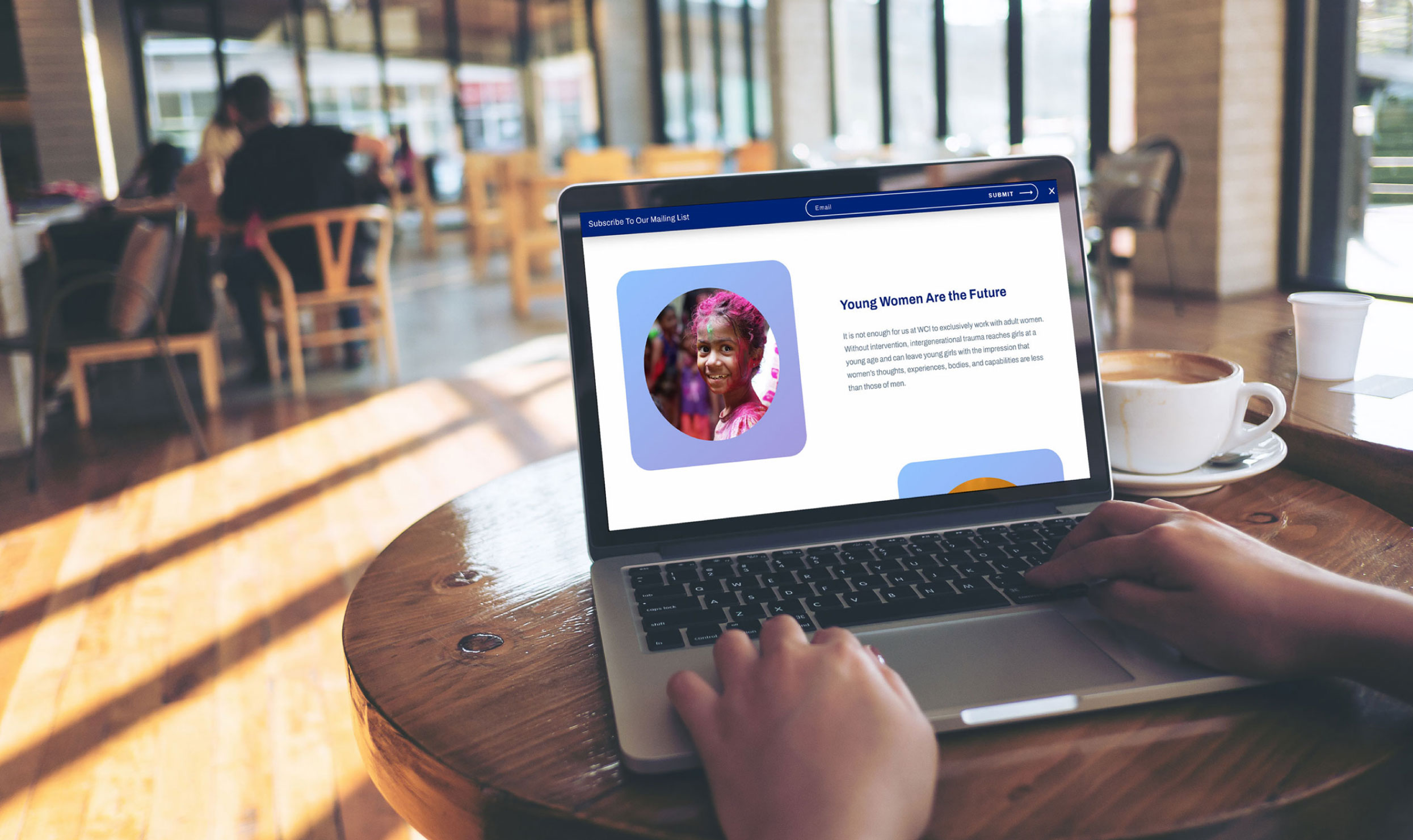
An accessible design with inclusive imagery/graphics, subtle animation, and intuitive navigation. Strategic calls to action interwoven with purposeful design elements.
Results
A website with engaging and inclusive design choices, aligned with the organization’s visual and purpose-driven identity.
The Objective
Redesign the website to focus on organizational impact
The goals of the redesign were to: 1) strengthen website presence, 2) shift the focus from WCI’s past to its present, highlighting its global impact, and 3) improve engagement with potential partners and sponsors in support of the organizational mission.
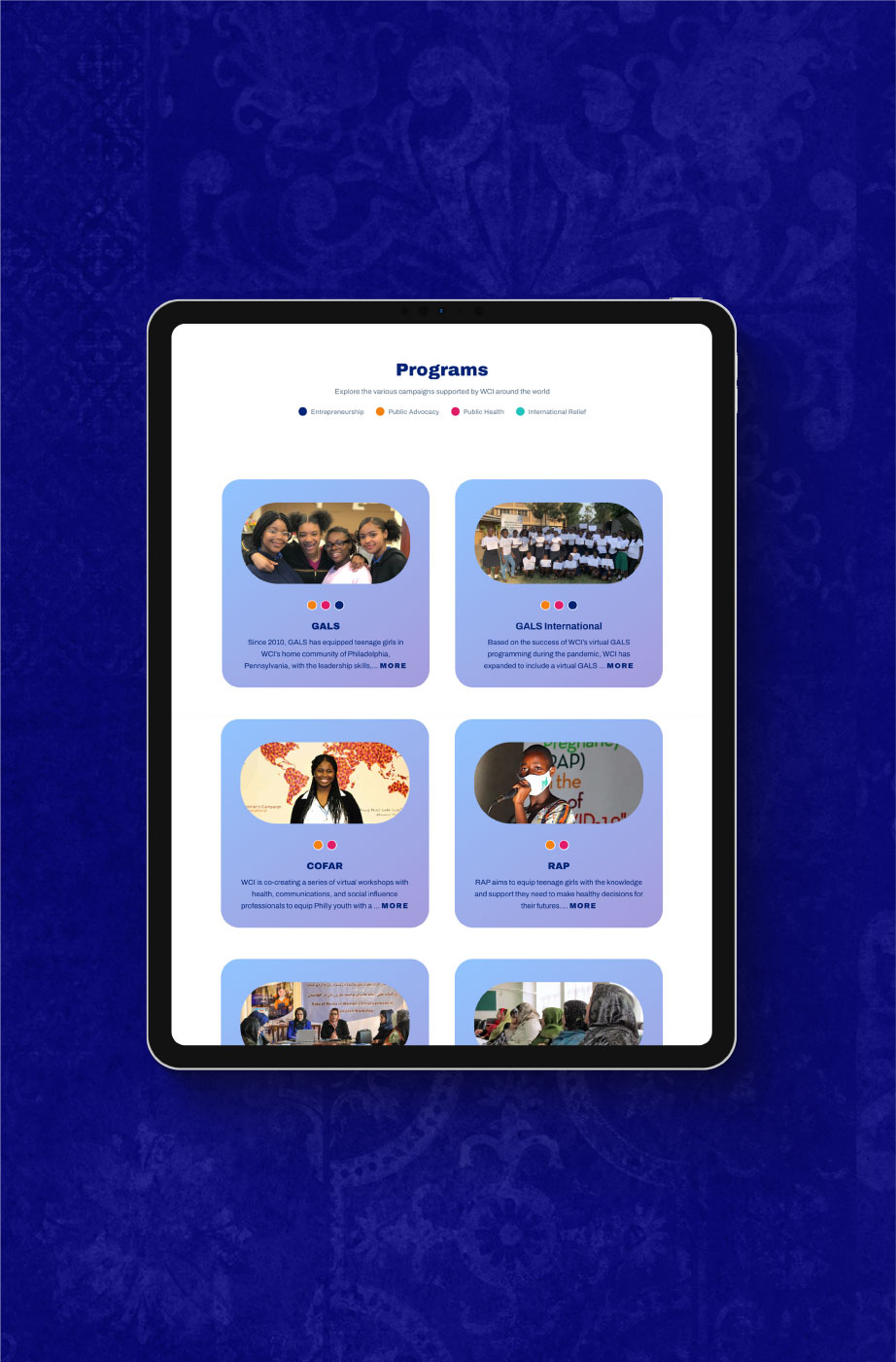
Design solution
Focus on enhanced user experience, inclusivity, and cohesive brand elements
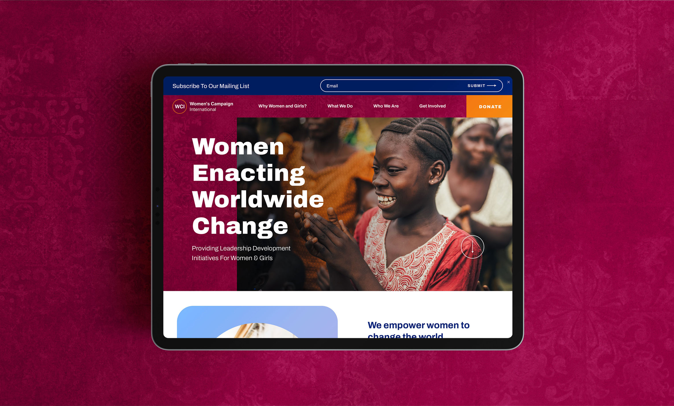
The website was designed in adherence with accessibility guidelines, enabling the widest possible audience to interact with the content. An intuitive navigational structure makes information about WCI’s different programs, resources, and opportunities easy to find. Call-to-action buttons have been strategically placed through content flow for improved user engagement, guiding visitors to sign up for programs, donate, or get involved.
The typography, color scheme, and design elements align with WCI’s branding for a cohesive and recognizable brand experience. There is a tapestry pattern layered throughout the site that not only has a dynamic effect, but also is a nod to the cultural and historical significance of a woven tapestry. This design element was intentionally chosen for its multigenerational and inclusive symbolism.
WCI exists to make a global impact, so that must be showcased in an impactful way– by weaving together inclusive design elements with accessible content in a visually compelling manner.
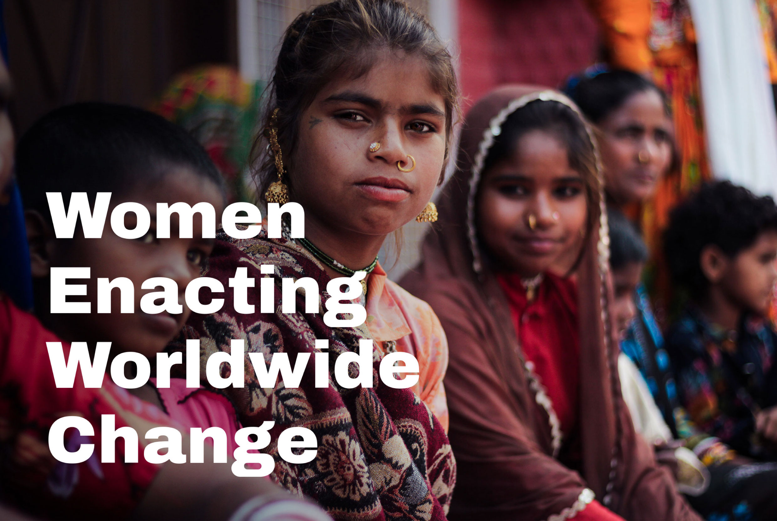
Color palette & Typography
Navy
Maroon
Pink
Orange
Lilac
Archivo Black
Archivo Bold
Archivo Regular




challenges
Imagery and animation can powerfully enhance a site, if done right with thoughtful presentation.
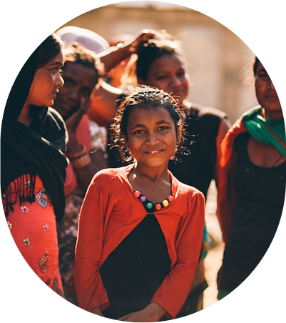
Disparate imagery and/or too much interactivity can appear distracting. We were working with lots of different image types and sizes, so we wanted to develop a stylized way of standardizing them. We created a framing photo treatment that helped to elevate and unify the photos throughout the site. We also infused subtle animation into the site for a fresh and modern feel without overwhelming users.
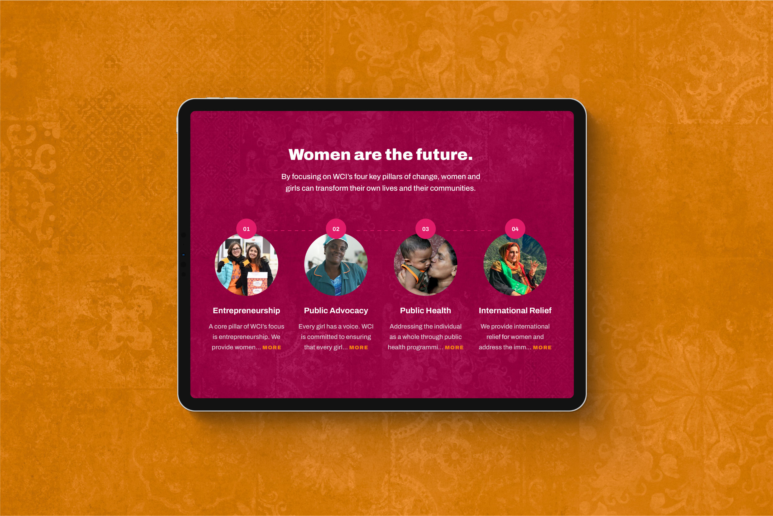
Outcomes
The refreshed website is an embodiment of WCI’s mission, supporting community transformation through equality and inclusion. With diverse imagery, accessible design, cohesive styling, and improved navigation, the new WCI site is both user-friendly and impactful. It strikes an appropriate balance of “just right” interactivity and calls to action to promote user engagement, providing more appeal for corporate sponsors and other partnerships.
