Background
A longtime favorite reintroduced with a cleaner, more elevated look.
For decades, Neptune Market has been a fixture in Harvey Cedars: part grocery, part deli, part café, and a gathering place for locals and visitors alike. However, the look no longer matched the spirit of the market. The new owners wanted to overhaul the brand to reflect the quality and care that define the experience while keeping the easygoing quality that makes Neptune a community staple.
Challenge
A dated identity that was too heavy for the spirit of the market. Refresh the look so it felt light, current, and true to Neptune’s long-standing charm.
Solution
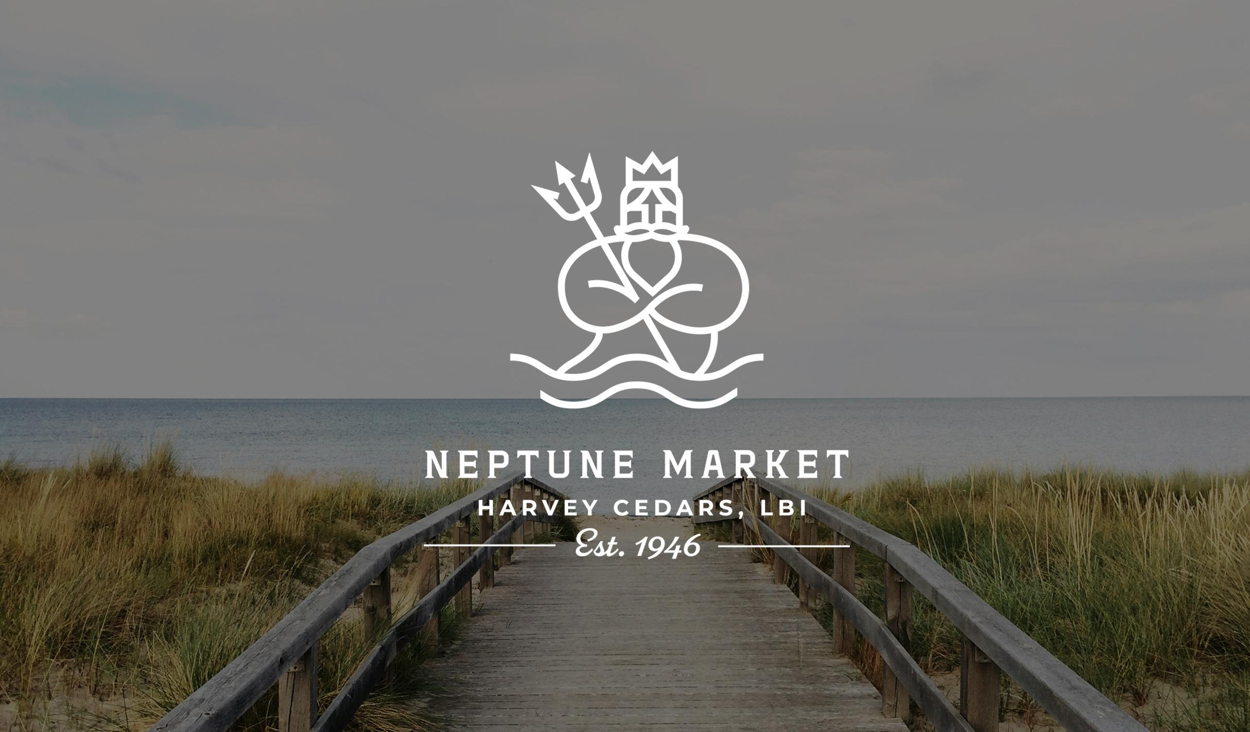
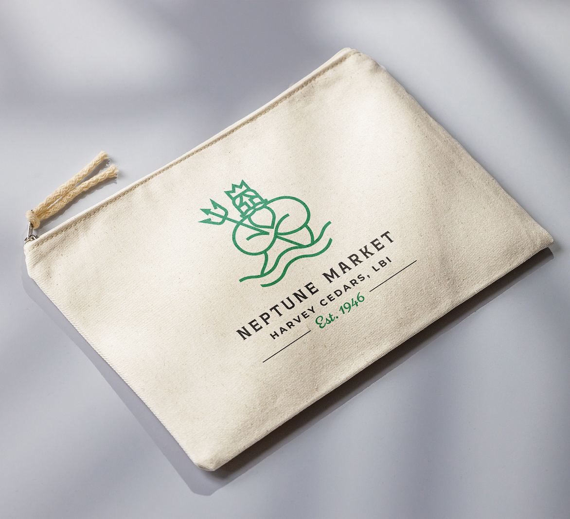
We reimagined the Neptune icon and paired it with clean typography and a balanced color palette, creating an identity that feels fresh, bright, and grounded in the market’s roots.
Results
The new look reflects the market’s everyday appeal through thoughtful simplicity, giving it a visual system that feels both current and comfortably familiar.
The Objective
Reimagine a cleaner identity with a nod to historical roots
As a beloved community gathering place for summer visitors and year-round locals alike, Neptune Market needed a more modern identity without making waves or washing away the nostalgia that locals hold dear. The goal was to rebuild Neptune Market’s visual language from the ground up while preserving what made it feel authentic.
Refreshed Foundation
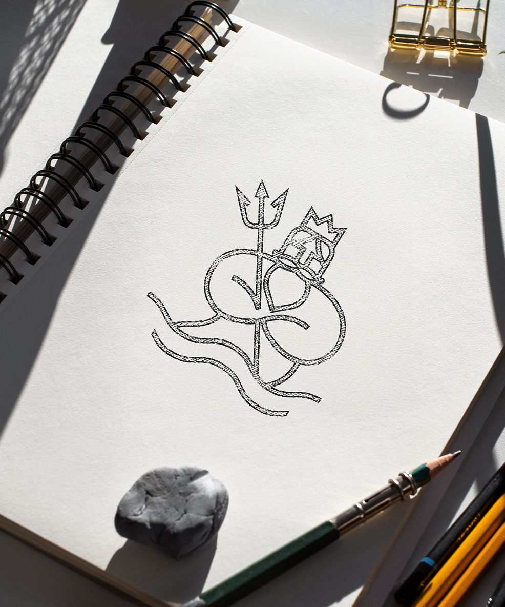
A nod to Neptune
By leaning into the literal definition of a stringer—a structural component that supports a staircase—we crafted a visual identity that beautifully conveyed the ideas of stability, peace of mind, and growth through Stringer’s three-step risk management process. This visual narrative served as the foundation for an elevated site design and cohesive marketing materials that aligned with the overall vision and business goals.
Color palette & Typography
Sea Blue
Sky Blue
Green
Navy
White
League Spartan Bold
League Spartan Regular
Challenges & Accommodations
Appealing to two distinct demographics without alienating either
Neptune’s target market was comprised of both in-season renters and offseason locals, so striking a balance between elevated and grounded was key. In order to preserve the sense of inclusive community and “counter vibe” that the market was known for, it was important to find the right bridge between old-school comfort and charm and a fresh, clean feel.
Outcomes
A refreshed brand that feels right at home.
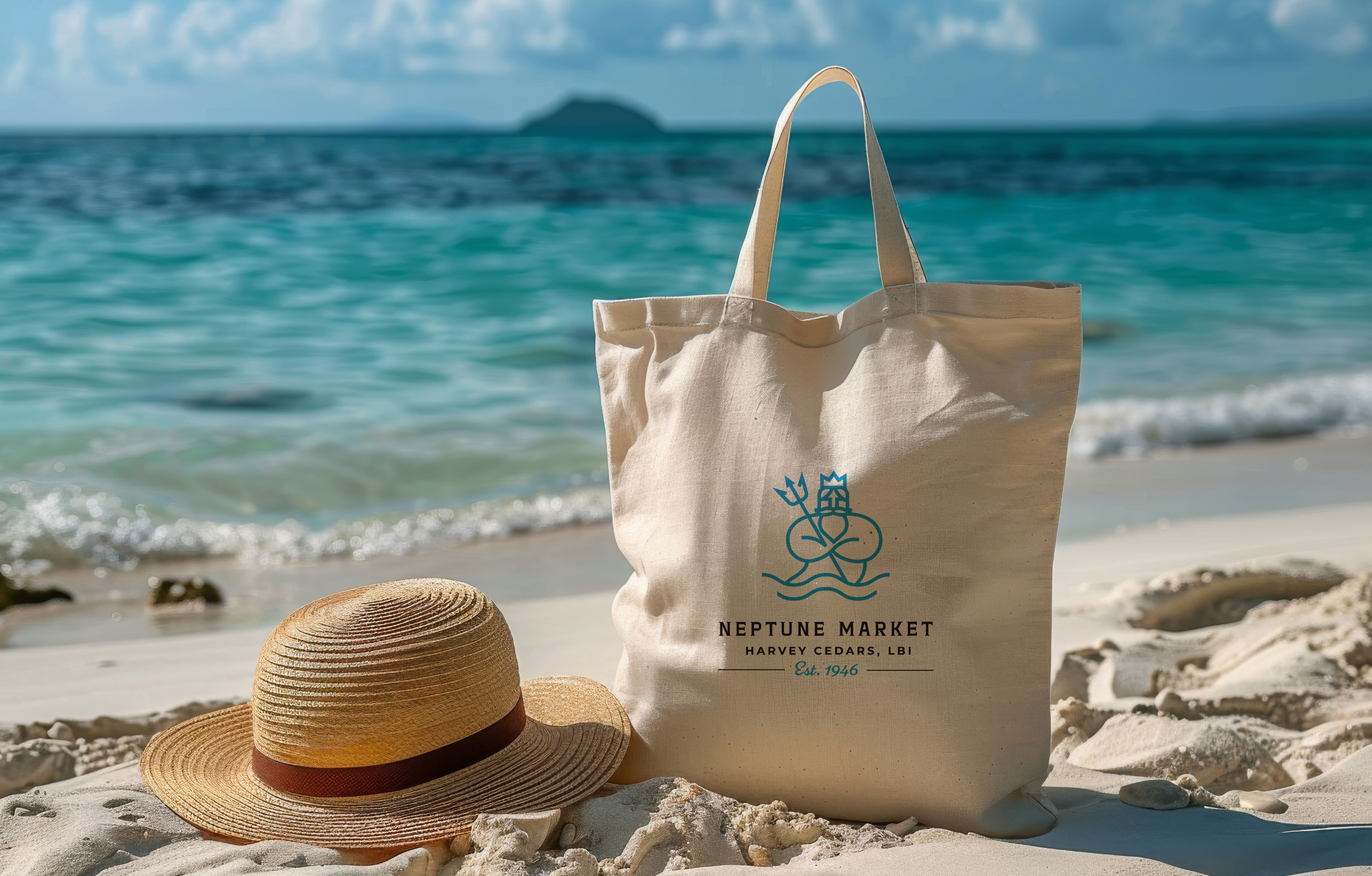
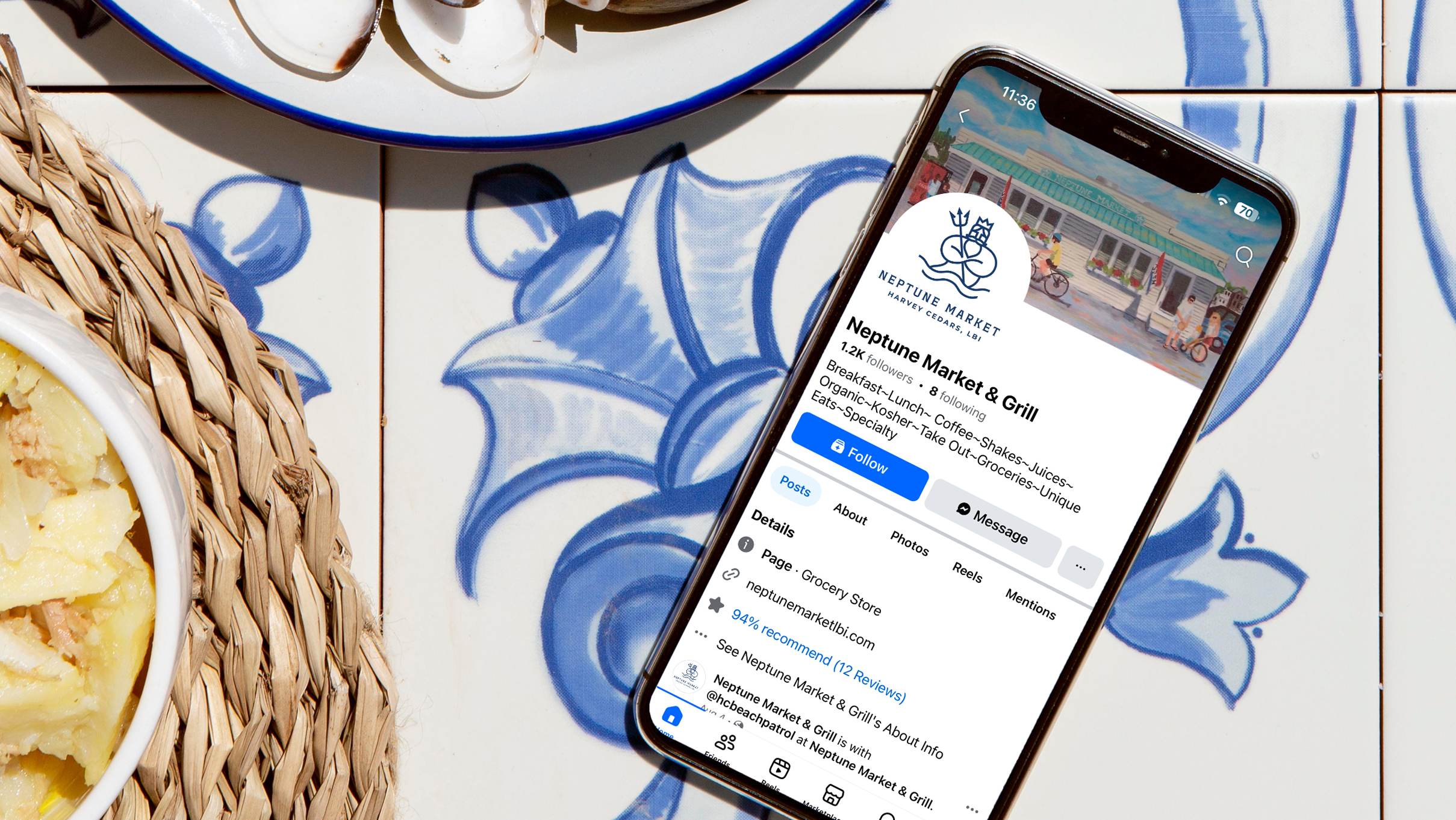
The updated identity gives Neptune Market a clear and balanced visual foundation, with a renewed sense of polish and the comfort and familiarity people have always loved.Creating a brand that feels fresh, natural, and true to its story has reinforced Neptune Market’s place as a community hub in Harvey Cedars, and opened up opportunities for more exciting merch.


