Background
A veteran-founded company redefining workplace learning needs a strong, credible brand.
Work-Merk was founded by experienced business leaders and veterans who set out to transform how organizations approach employee training and professional development through AI-driven technology solutions. When they reached out, the business was growing quickly but lacked a clear and cohesive visual identity. They needed a design system that communicated sophistication, reliability, and growth potential.
Challenge
Create a brand identity that reflected the company’s credibility and innovation while standing out in the competitive learning and workforce development space.
Solution
A clear visual framework that unified the brand across signage, website design, and marketing materials, including a co-branded promotion with Starbucks that extended Work-Merk’s visibility.
Results
A cohesive, elevated identity that positioned Work-Merk as a trusted, forward-thinking learning company and set the stage for its early market growth.
The Objective
Position Work-Merk as an innovative learning company equipped to serve both corporate and institutional clients.
The brand needed to feel modern, flexible, and built for scale while maintaining a sense of credibility and clarity.
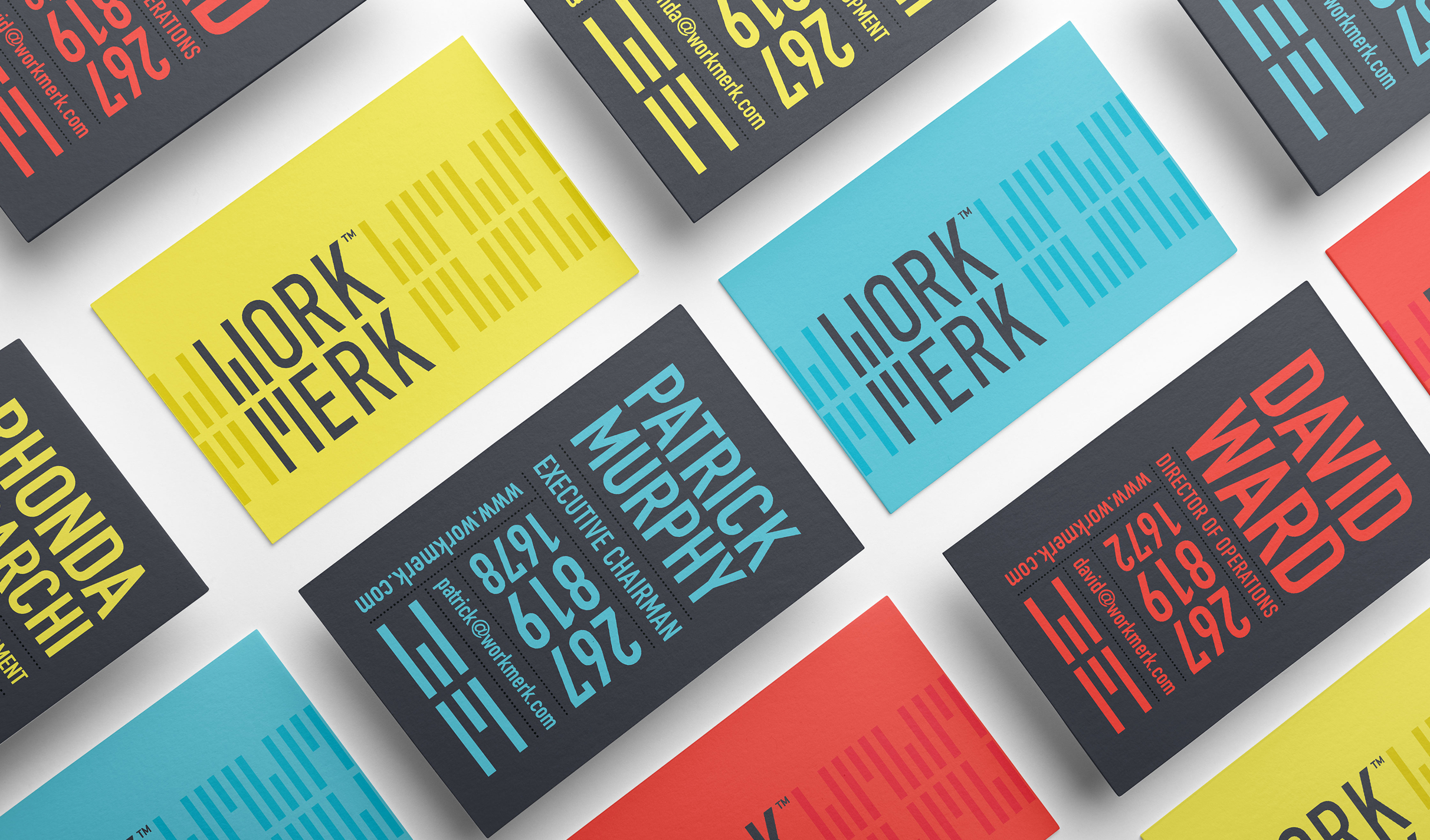
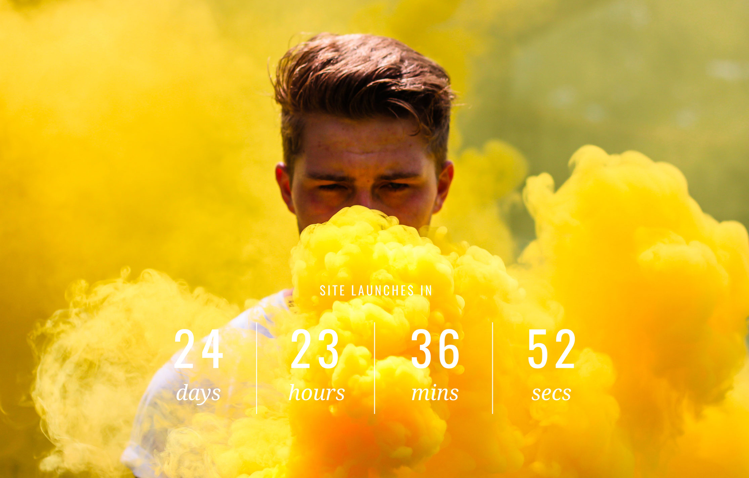
Our engagement included positioning strategy, visual hierarchy, logo design, typography, color palette, tone of voice guidelines, and website splash page. The goal was to create a comprehensive visual system that aligned how the brand was expressed and experienced across digital and physical touchpoints.
Reflective Symbol
A symbol of change and growth
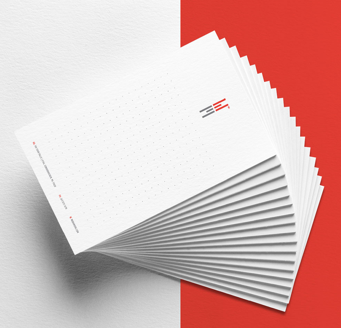
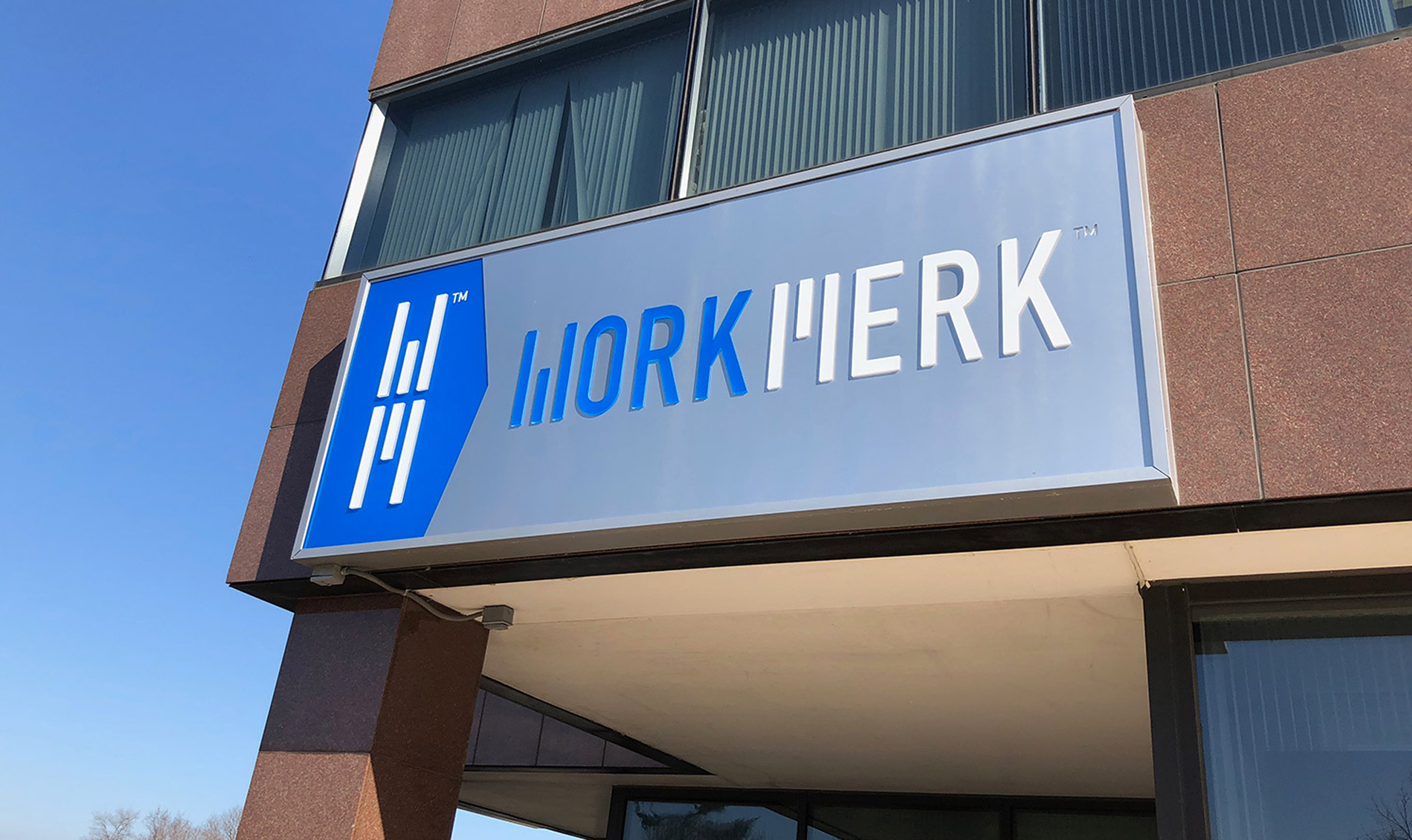
The icon of six lines is the letter W and the letter M in perfect mirrored reflection of one another, designed to symbolize the moment when an individual or organization reflects on where they have been and where they want to go. It also takes on the shape of an abstract figure with outstretched arms and legs, symbolizing openness, momentum, and human connection. Together, these elements reflect the company’s focus on progress through learning and transformation.
Defining the moment when learning becomes a choice to move forward, not just a box to check.
Color palette & Typography
Gray
Red
Teal
Yellow
Blue
Oswald Bold
Raleway Bold
Raleway Regular
Challenges & Accommodations
A change in business direction means revisiting brand expression.
During our engagement, Work-Merk was defining its position within the learning and workforce development space. As the company grew, its focus later shifted, and elements of the brand evolved accordingly.
Our work represents the original brand vision. It was built around clarity, intelligence, and professionalism. While the company’s direction has changed, the system we created remains a strong example of scalable design and strategic foundation.
Outcomes
The brand, visual framework, and launch materials we created established Work-Merk’s early credibility and market presence. The cohesive system gave the team a strong visual identity and structure that could evolve with the business.
Even as their mission changed, the identity we created continues to represent the power of thoughtful design. It was built for clarity, structured for scale, and positioned for its next chapter of growth.
