Background
When a brand grows, each new piece should feel unique—but still part of the same story.
Nick and Lindsey, the husband and wife team behind Chestnut Hill Brewing Company, started with a simple idea: a neighborhood brewery and pizza spot that brought people together over great beer and food. As their business grew, they opened the Taproom, an elevated dining space that offered a more refined experience. The two concepts shared the same heart but needed clearer definition. Our goal was to build a brand system that connected them visually and strategically while letting each stand on its own.
Challenge
The brand expansion had to balance distinction and connection; between the brewery and the taproom, each needed its own personality while feeling part of the same family.
Solution
A cohesive brand system tied everything together—logo refinement, signage, menus, packaging, merchandise, and marketing materials—while giving each location its own distinct look.
Results
The project created a unified foundation for both spaces. Each now reflects its own tone and atmosphere while remaining visually connected through intentional design and messaging.
The Objective
Build a brand family that felt cohesive but not cookie-cutter.
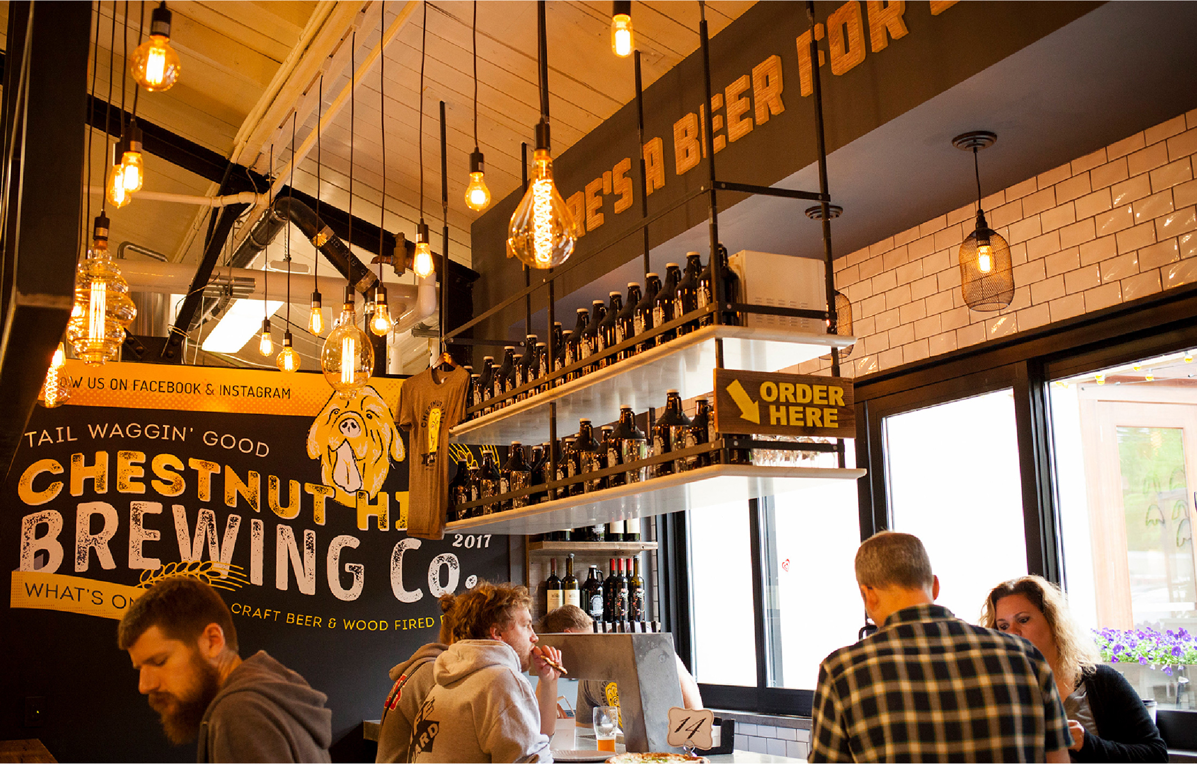
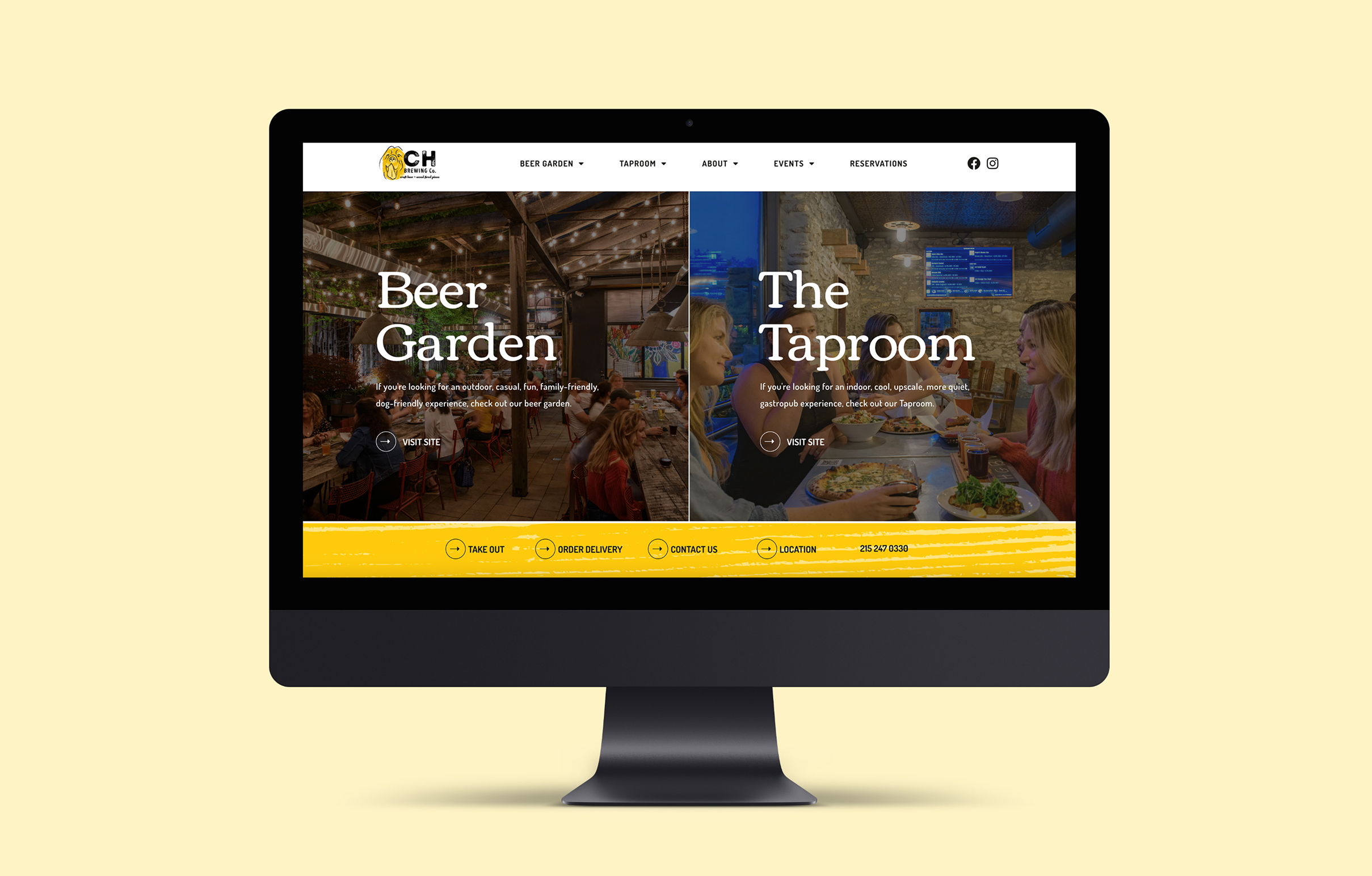
The brewery needed to keep its relaxed, neighborhood feel, while the introduction of the taproom called for a more modern, elevated tone. Once an overarching visual identity was established, our goal was to develop environmental design, packaging, and a website that brought both concepts together in one clear, intuitive experience.
Canine Inspiration
Two dogs, one story
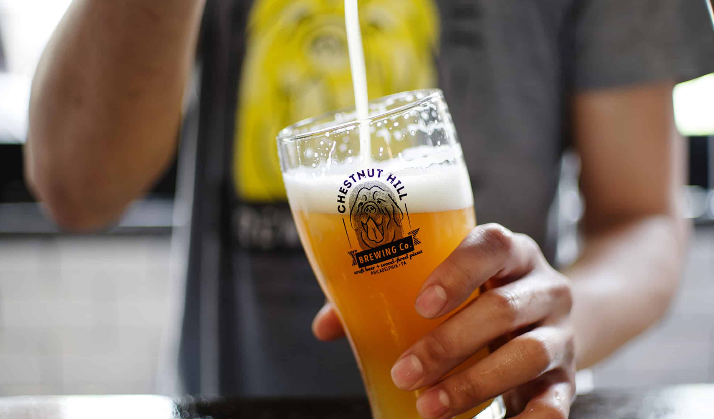
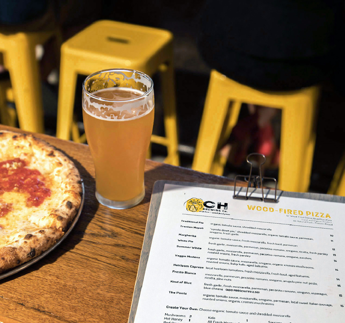
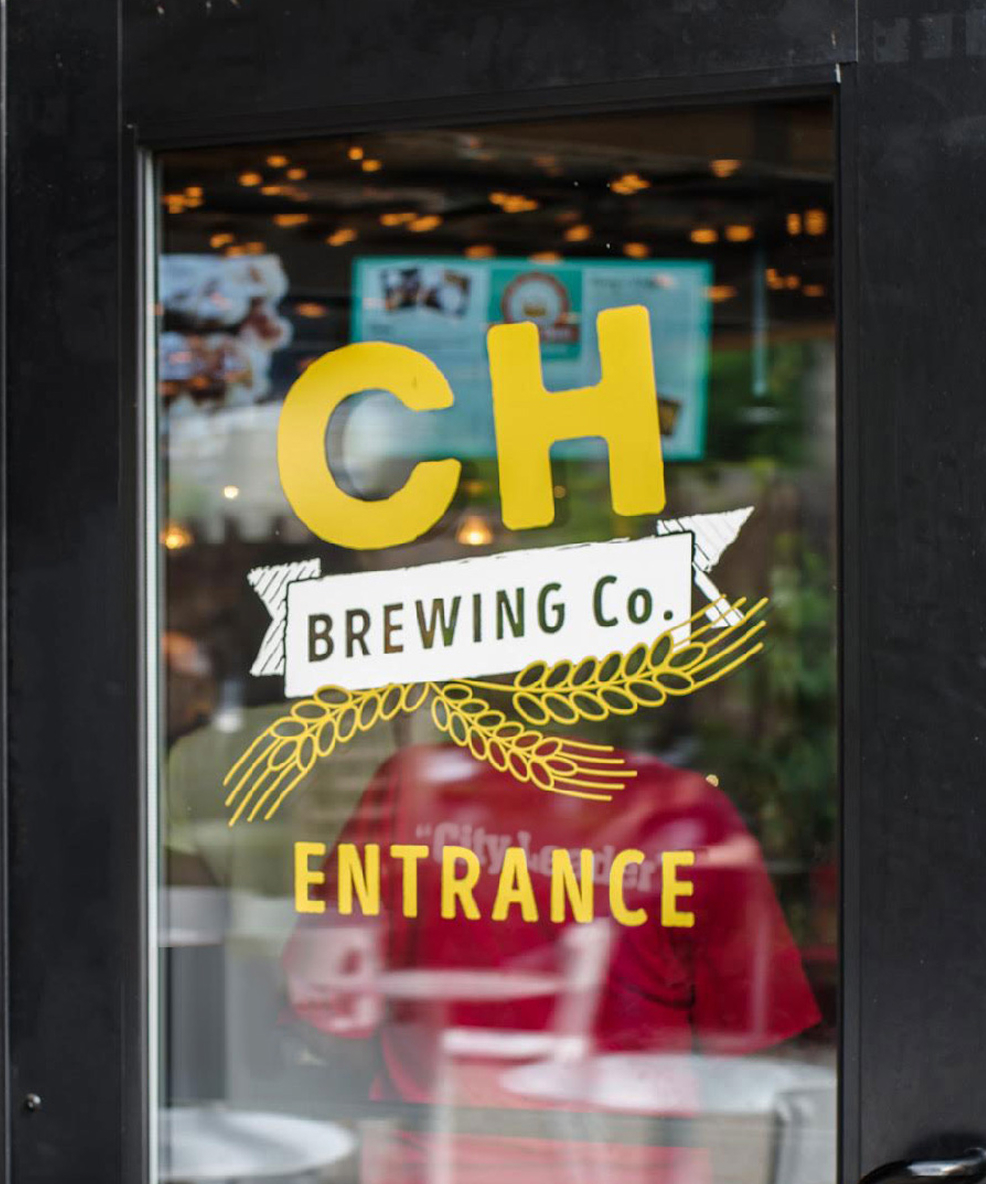
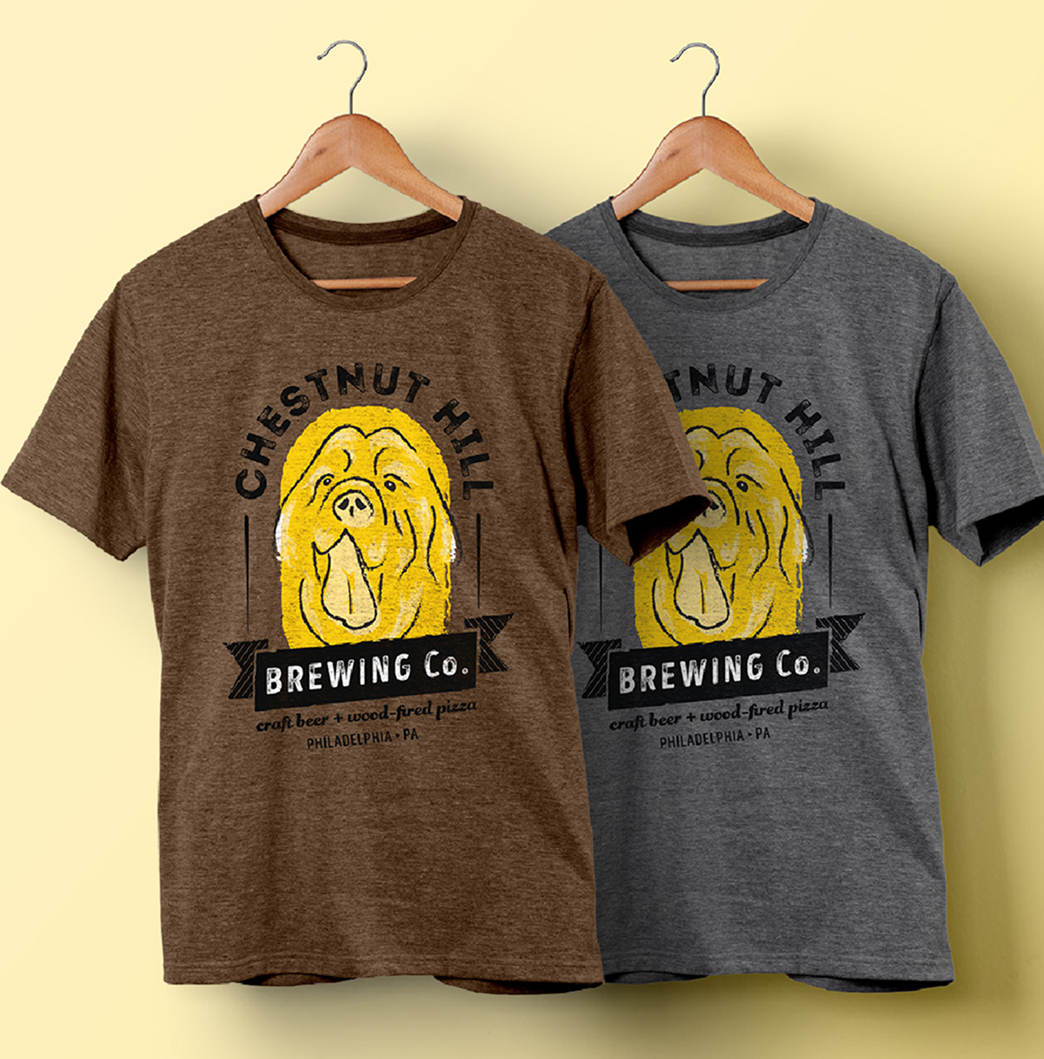
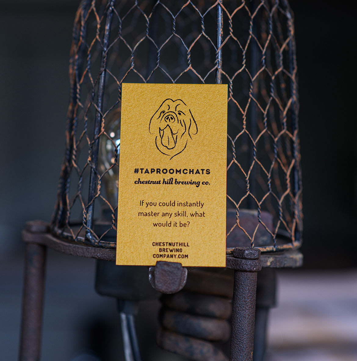
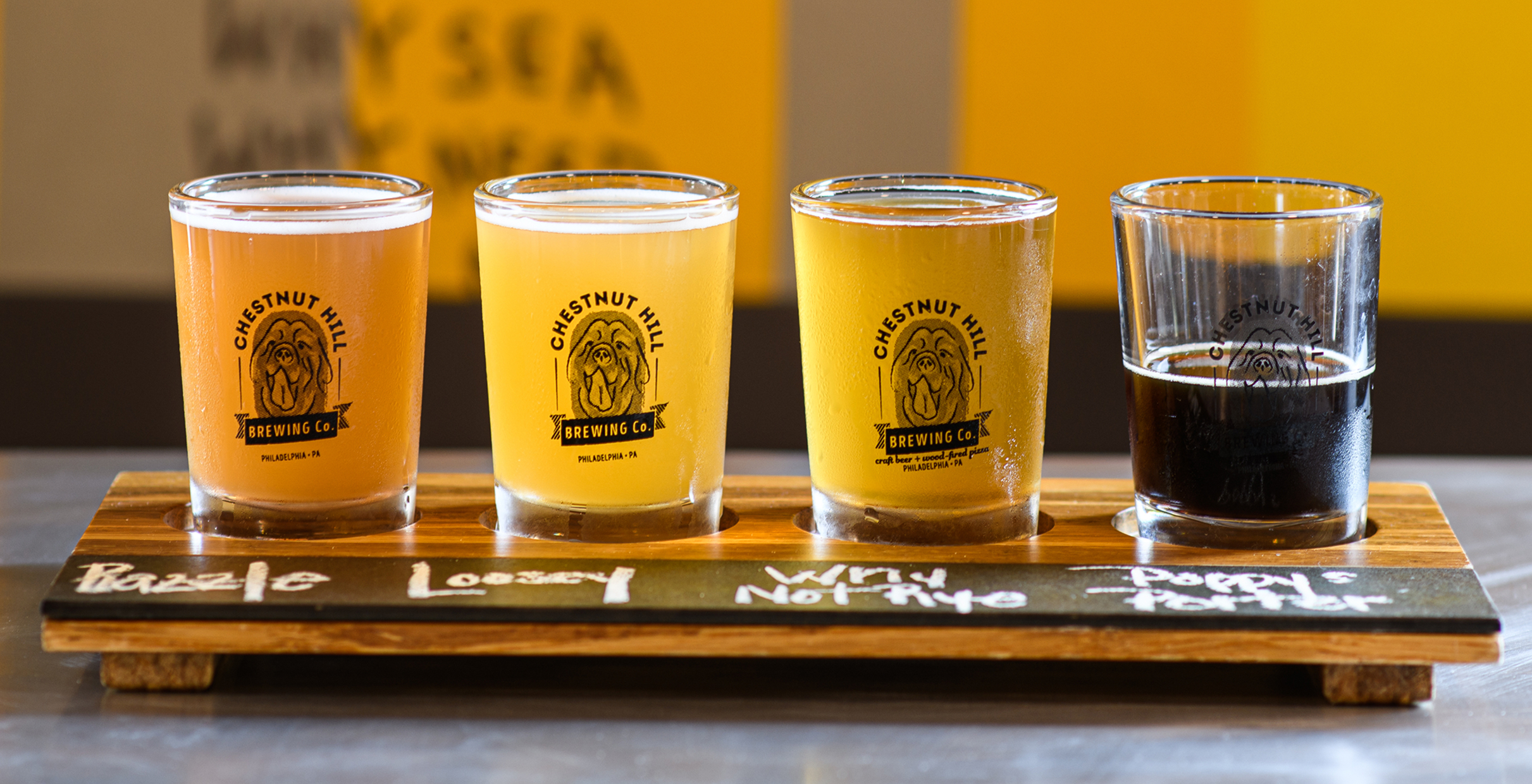
We first created a strong visual identity for the brewery, then expanded it to support the launch of the taproom as a more sophisticated dining experience. The founders’ Newfoundland dogs became the inspiration for the brand, appearing across cans, signage, and merchandise as friendly ambassadors of the brewery’s personality. Paired with a clean wordmark and refined typographic system, the design feels approachable and fun while conveying the credibility and craft of a well-respected brewery and taproom.
A growing local favorite became two complementary destinations, each with its own feel but a shared sense of craft and community.
Challenges & Accommodations
As the business expanded, the relationship between the brewery and taproom needed to be clearly defined.
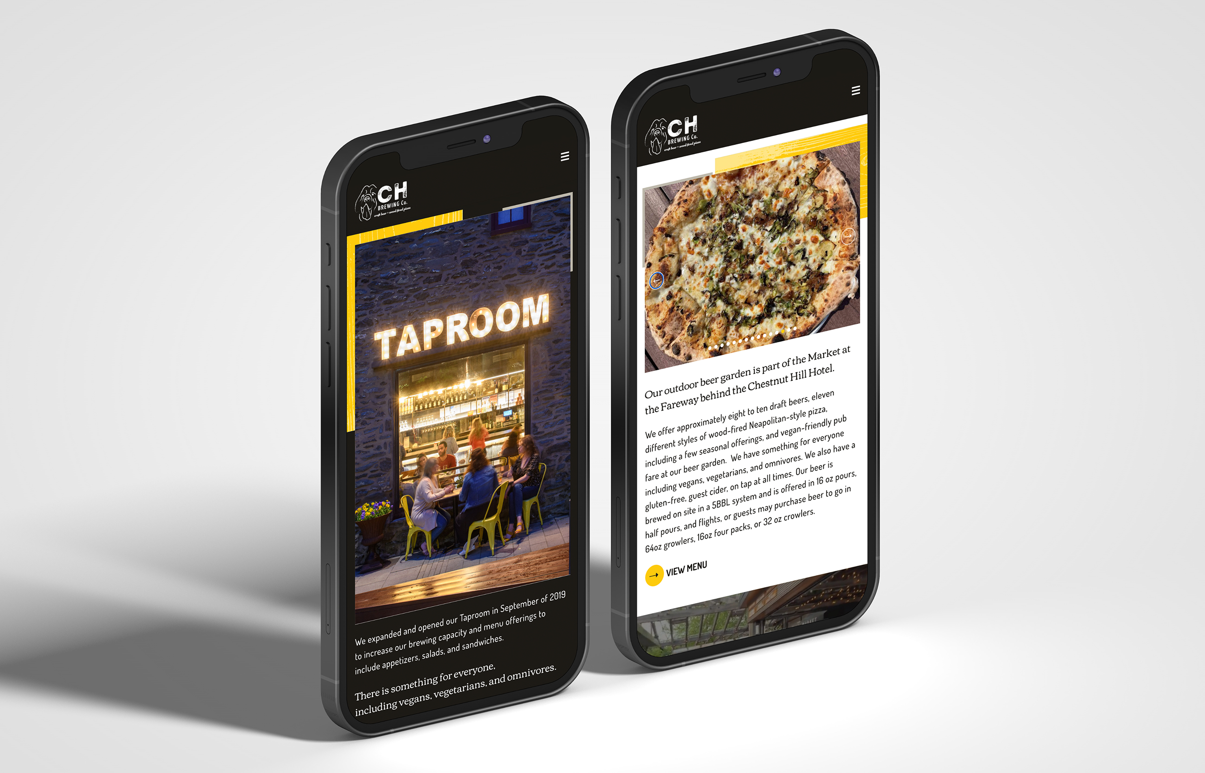
As the two spaces took shape, visitors needed a simple way to understand how they connected. We designed a website that clarified the relationship, giving each space its own home while linking them through one intuitive experience.
Outcomes
The updated system integrated two experiences into one clear brand story.
Through consistent visuals and messaging, the brewery and taproom now feel distinct but connected in their brand expression, giving guests a clear sense of what each offers and how they fit together.
