Background
Appealing to two distinct audiences can be challenging when they have different points of view; a strategic redesign can bridge the gap.
Tomahawk Strategic Solutions provides customized safety and security services to law enforcement, corporate sector, and private sector clients. The company was founded by a group of military veterans who saw an opportunity to stand apart from the competition by embracing a solution-oriented, educational, and caring brand image for broad appeal to senior decision-makers across industries. Although they had built an elite reputation based on their expertise, professionalism, and humble approach, their website did not relate well to the different segments of their broad audience or reflect their unique value proposition. They needed a refreshed, clean website to clearly communicate their differentiators and position the business for next-level growth.
Challenge
Reimagine the website with intentional design elements to appeal to two distinct audiences with one shared goal: to create safer communities.
Solution
A design that favored sophisticated professionalism with thoughtful image selection, a calming color scheme, and flexibility for future expansion.
Results
A clean, elevated site that bridges the gap between dissimilar audiences and attracts high-profile clients, including Fortune 100 corporations.
The Objective
Professionalize the website to better align with organizational goals
The goals of the redesign were to: 1) elevate the brand image of Tomahawk Strategic Solutions, aligning its visual aesthetic with its professional reputation, and 2) create a site that would resonate with both law enforcement and corporate-sector senior leadership.
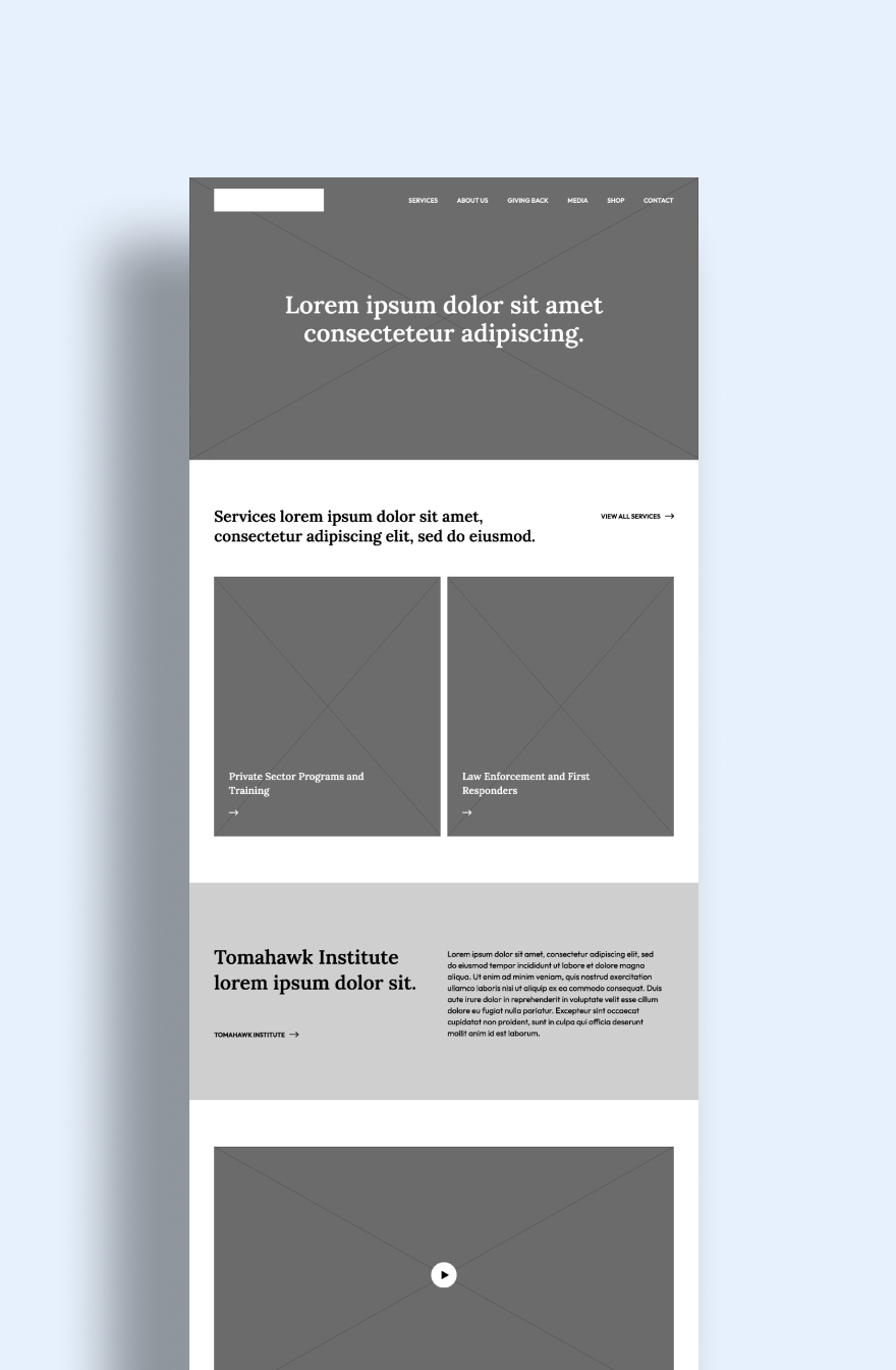
Design Solution
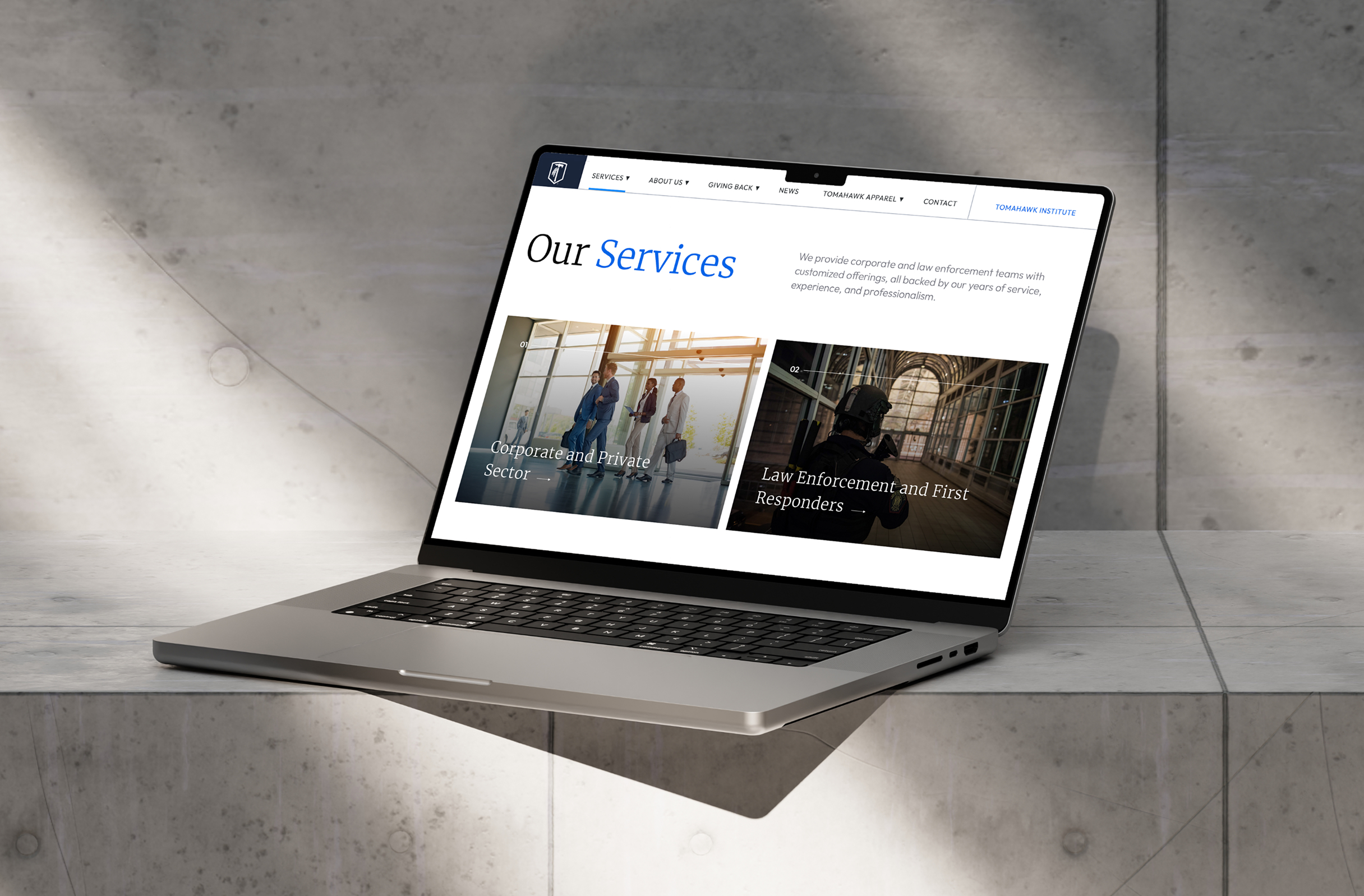
Focus on calm colors and non-aggressive imagery
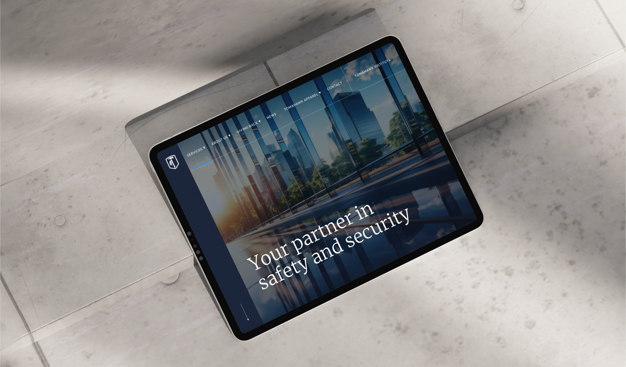
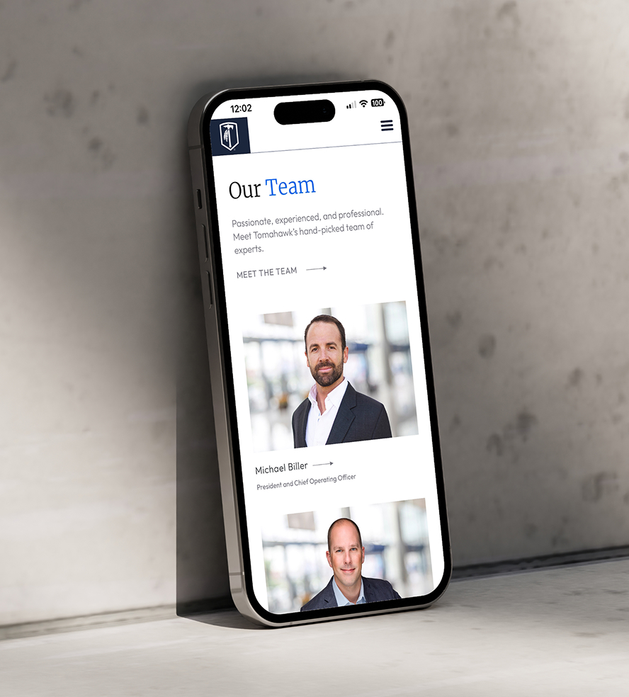
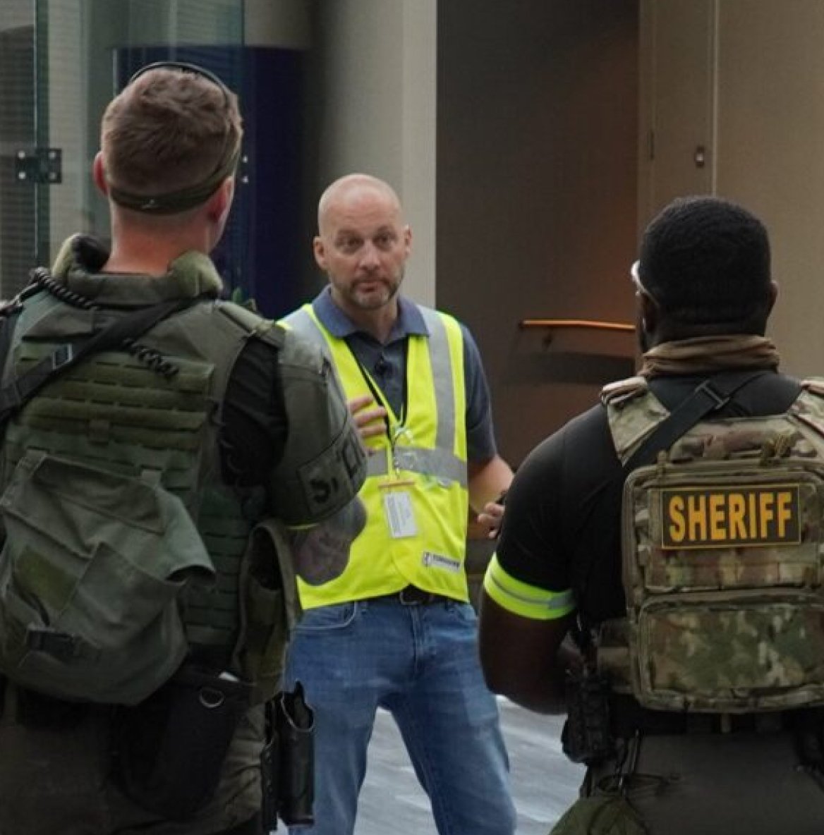
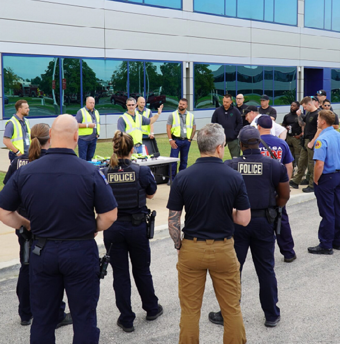
The website design emphasizes a calm, confident visual presence that reflects the company’s professionalism without relying on the aggressive cues common in the industry. A refined palette of blues together with ample white space creates a sense of clarity and composure, while the imagery was chosen with great care, favoring corporate and learning environments over tactical scenes. Where references to weaponry were necessary, they were treated subtly through muted overlays to maintain a balanced, approachable aesthetic.
A refined, approachable design elevates the brand’s professionalism and underscores its commitment to safer communities—without relying on the macho cues common in the industry.
Color palette & Typography
Dark Navy
Navy
Bright Blue
Red
Light Gray
Merriweather Light
Outfit Regular
Outfit Light
Challenges & Accommodations
Short-term design must take into account long-term business objectives.
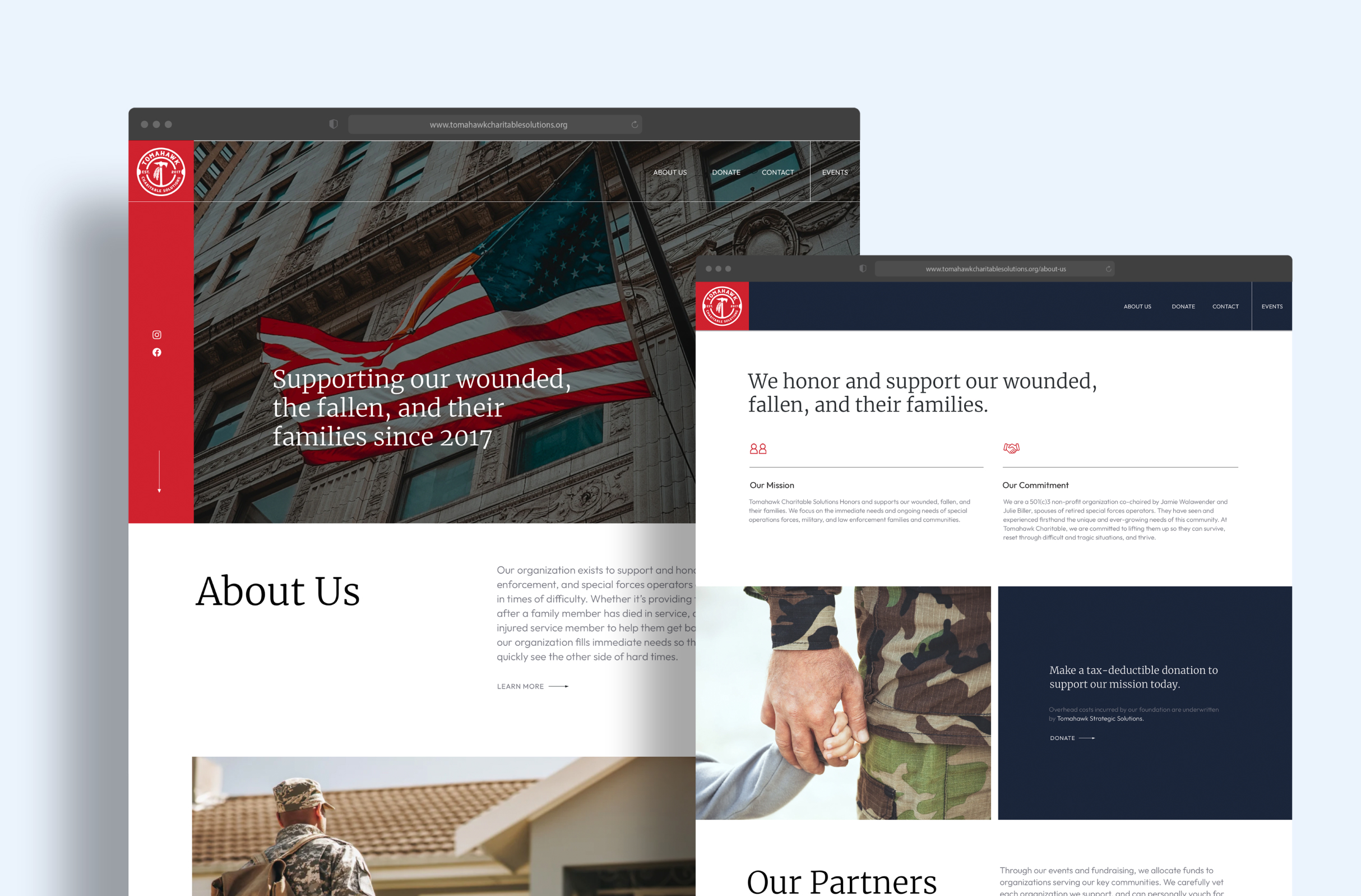
Designing the website required balancing the company’s immediate needs with its long-term business goals. The site needed to represent the company’s current capabilities while laying the groundwork for future e-commerce and e-learning integrations. In addition, the organization’s charitable sister site needed a complementary design despite certain technical limitations.
To ensure visual consistency and scalability, we developed web brand guidelines to guide future buildouts and established shared design elements—such as typography, button, and arrow styling—across both sites, achieving a cohesive yet distinct brand presence.
Outcomes
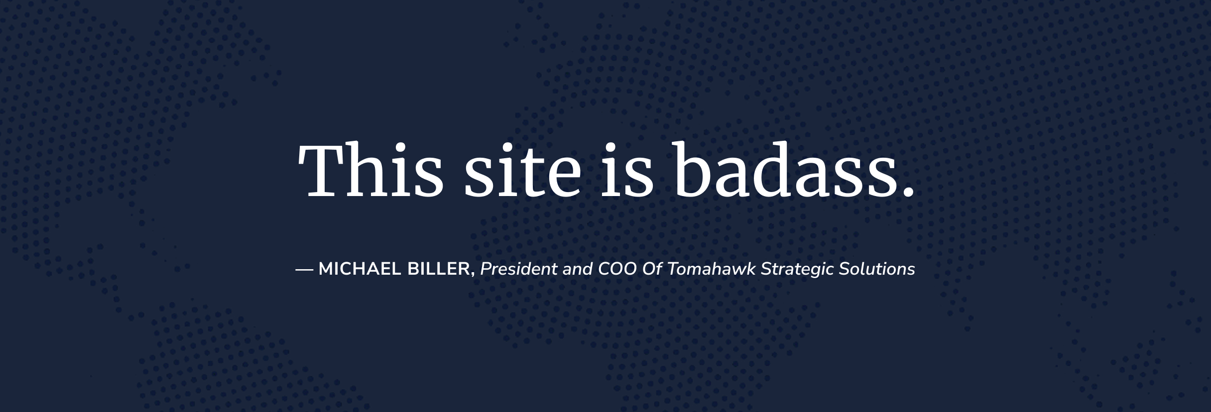
The redesigned website successfully unites two distinct audiences under a shared mission of creating safer communities.
Through a sophisticated visual approach—marked by a calming color palette, intentional imagery, and a flexible framework for future growth—the site conveys professionalism and trust. The result is a clean, elevated digital presence that bridges the gap between sectors and has drawn top-tier corporate and government clients.
