Background
A website and visual identity evolve from a simple presence to a strategic tool for growth
Founded in 2013, Stringer’s early website and brand identity were functional but fragmented. Initially, little consideration was given to design or user experience, with Stringer primarily focusing on low-hanging fruit—pursuing existing relationships and referrals. Over time, the site became dated, reflecting a patchwork of updates without a cohesive design or message. As the firm grew beyond its founding team, the brand failed to reflect Stringer’s sophistication, innovation, or three-layered risk management process. The firm needed a refreshed identity and digital destination that matched their expertise and positioned them for the next stage of growth.
Challenge
Revamp their website (previously a basic repository of information), and refresh their logo to better reflect Stringer’s story in a simple, modern, and memorable way.
Solution
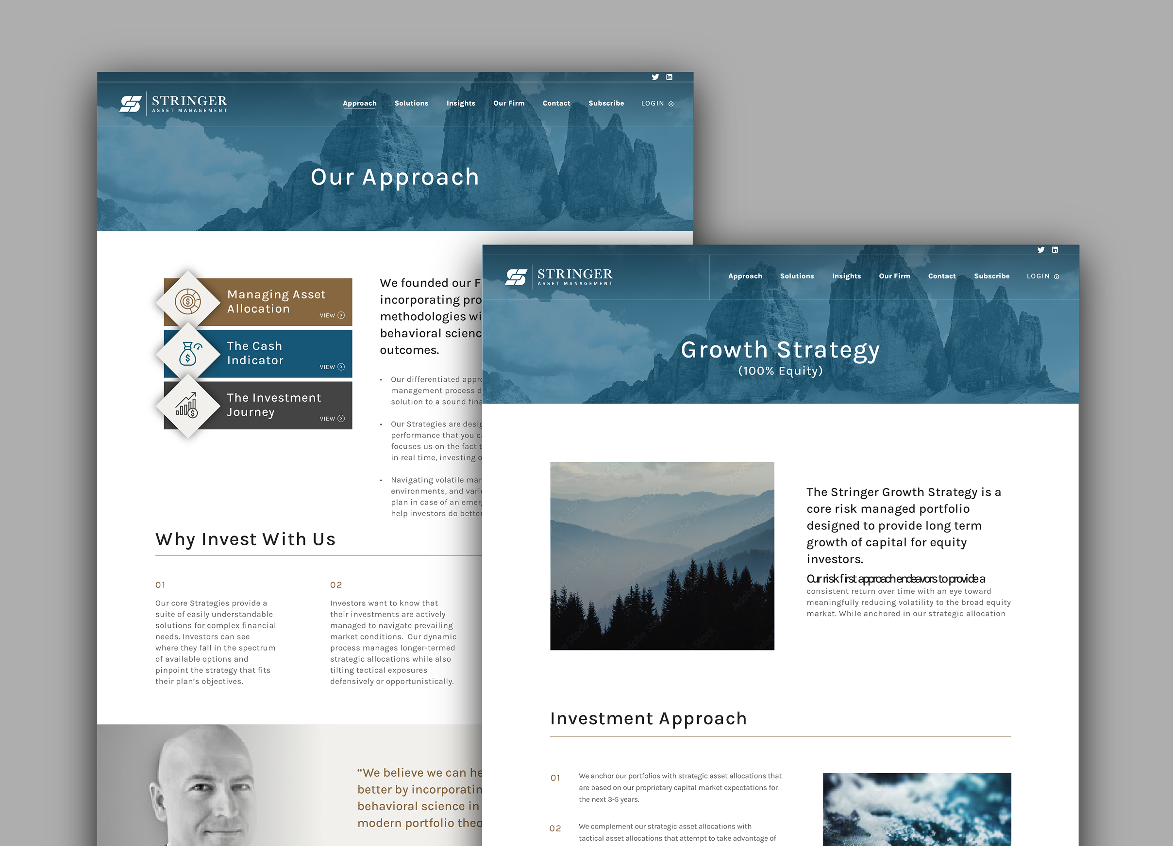
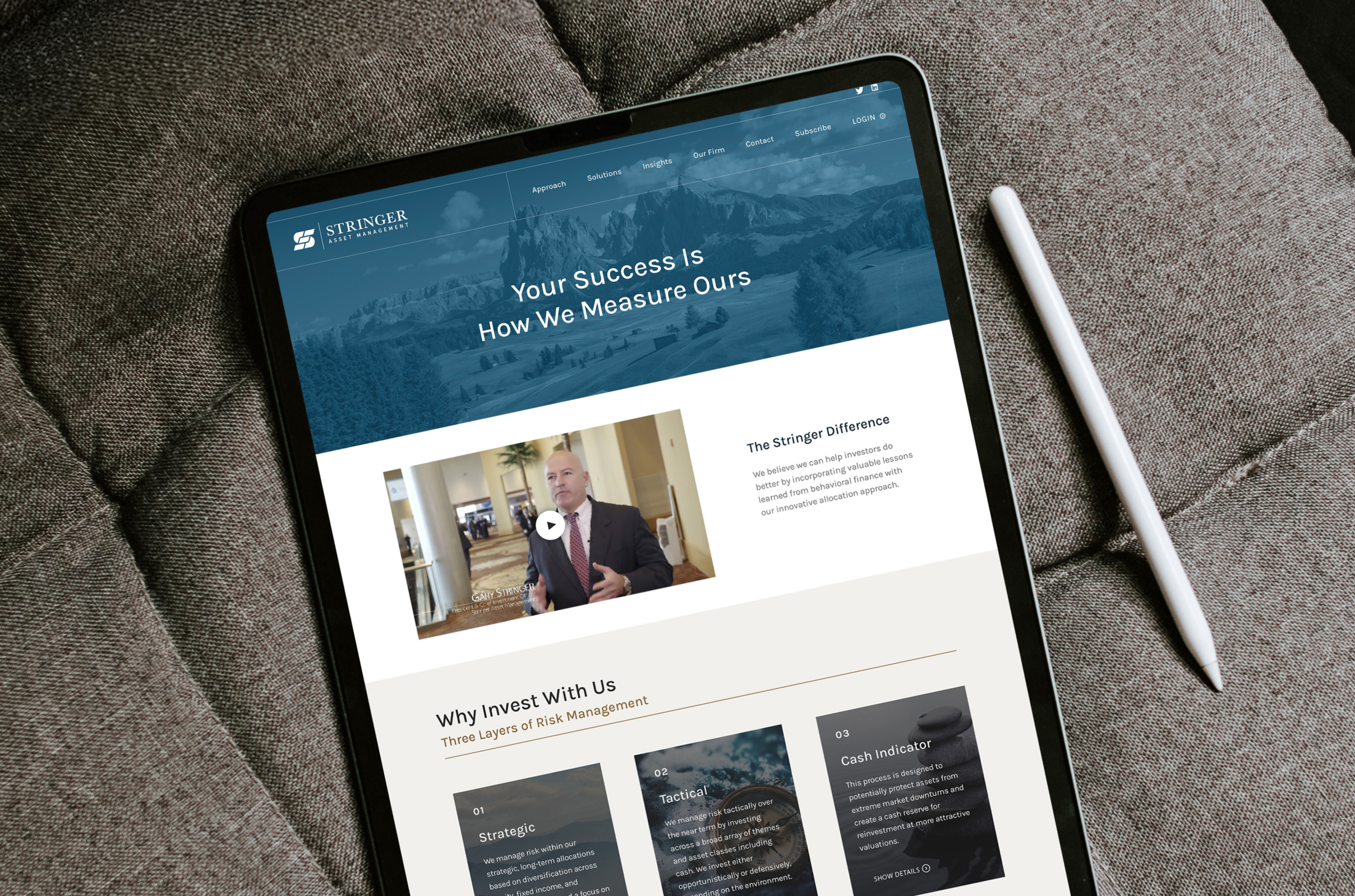
A logo that conveys the brand’s narrative involving three layers of risk management; a holistic redesign of the website with a focus on engagement, user experience, and calls to action.
Results
A confident and differentiated brand that communicates expertise and a proven process. Stringer is poised to be more purposeful with marketing, capture new clients, and take their business to the next level.
The Objective
Reimagine the logo and website to showcase the brand story and position the firm for growth
The goals of the redesign were to: 1) refresh the logo to better reflect their story in a simple, modern, and memorable way, and 2) revamp the website to be more engaging, user-friendly, and drive action.
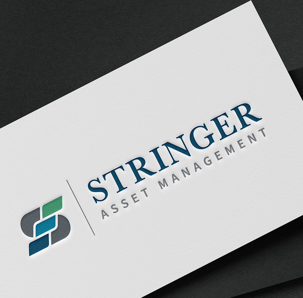

Meaningful Structure
Symbolism that supports an impactful story
By leaning into the literal definition of a stringer—a structural component that supports a staircase—we crafted a visual identity that beautifully conveyed the ideas of stability, peace of mind, and growth through Stringer’s three-step risk management process. This visual narrative served as the foundation for an elevated site design and cohesive marketing materials that aligned with the overall vision and business goals.
Combining modern design elements with thoughtful metaphors supports a brand narrative in the way it was meant to be told.
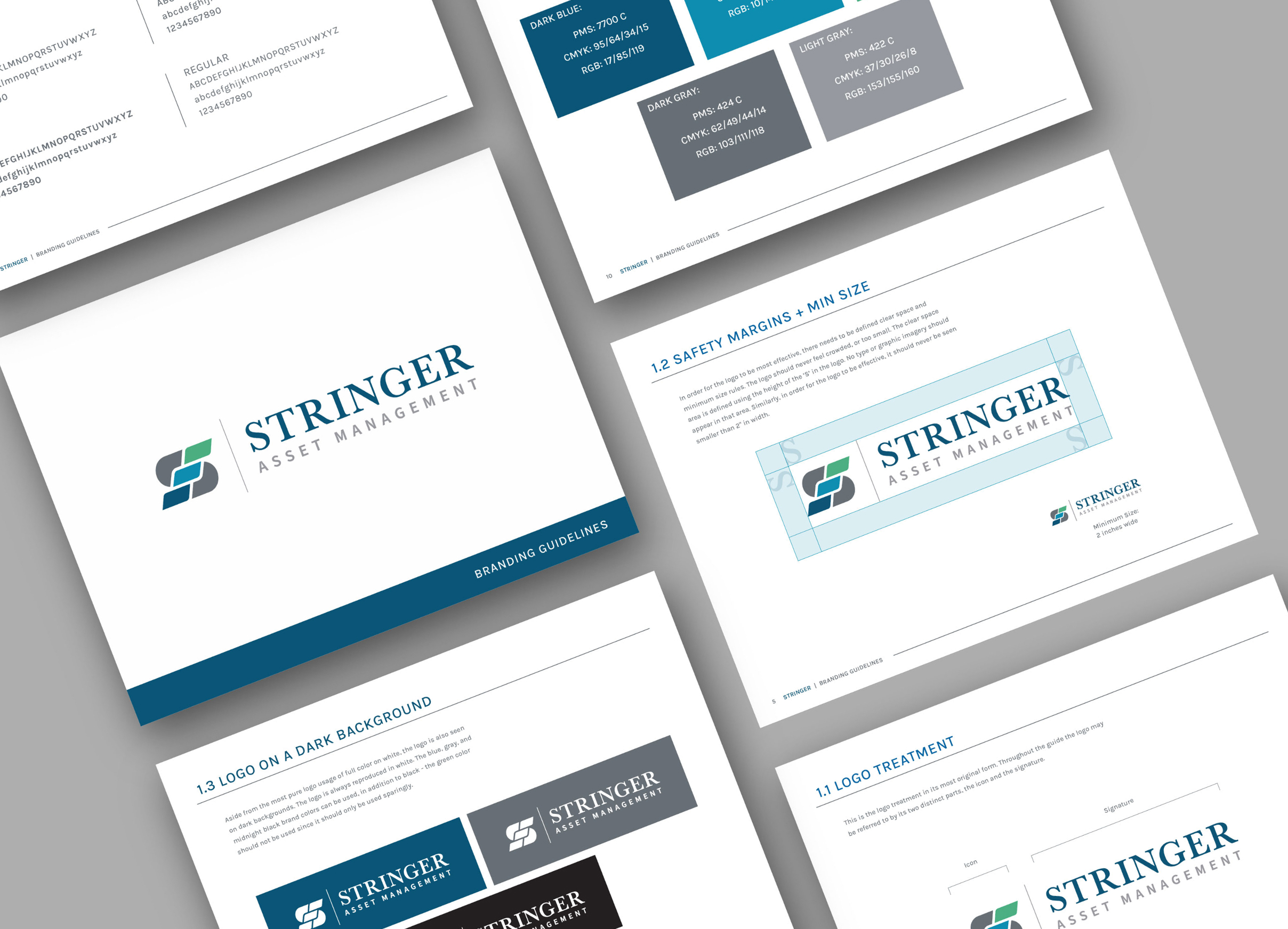
Color palette & Typography
Dark Blue
Light Blue
Green
Bronze
Cream
Karla Bold
Karla Medium
Karla Regular
Challenges & Accommodations
Initially, only the website redesign was in scope– but sometimes a step backward helps to move forward.
Stringer recognized that their piecemeal website was holding them back. It wasn’t until we approached the brand and website together that the true opportunity became clear—the whole would be stronger than its parts. Through a focused discovery process, we identified a clear design direction rooted in Stringer’s competitive differentiation. By drawing on their three-tiered approach to risk management and culture of innovation, we developed a custom brand identity that tells a compelling story and supports a user-friendly website and engaging marketing materials. A cohesive visual system and brand guide now ensure consistency across every touchpoint, prioritizing snackable content and visual storytelling over text-heavy explanations.
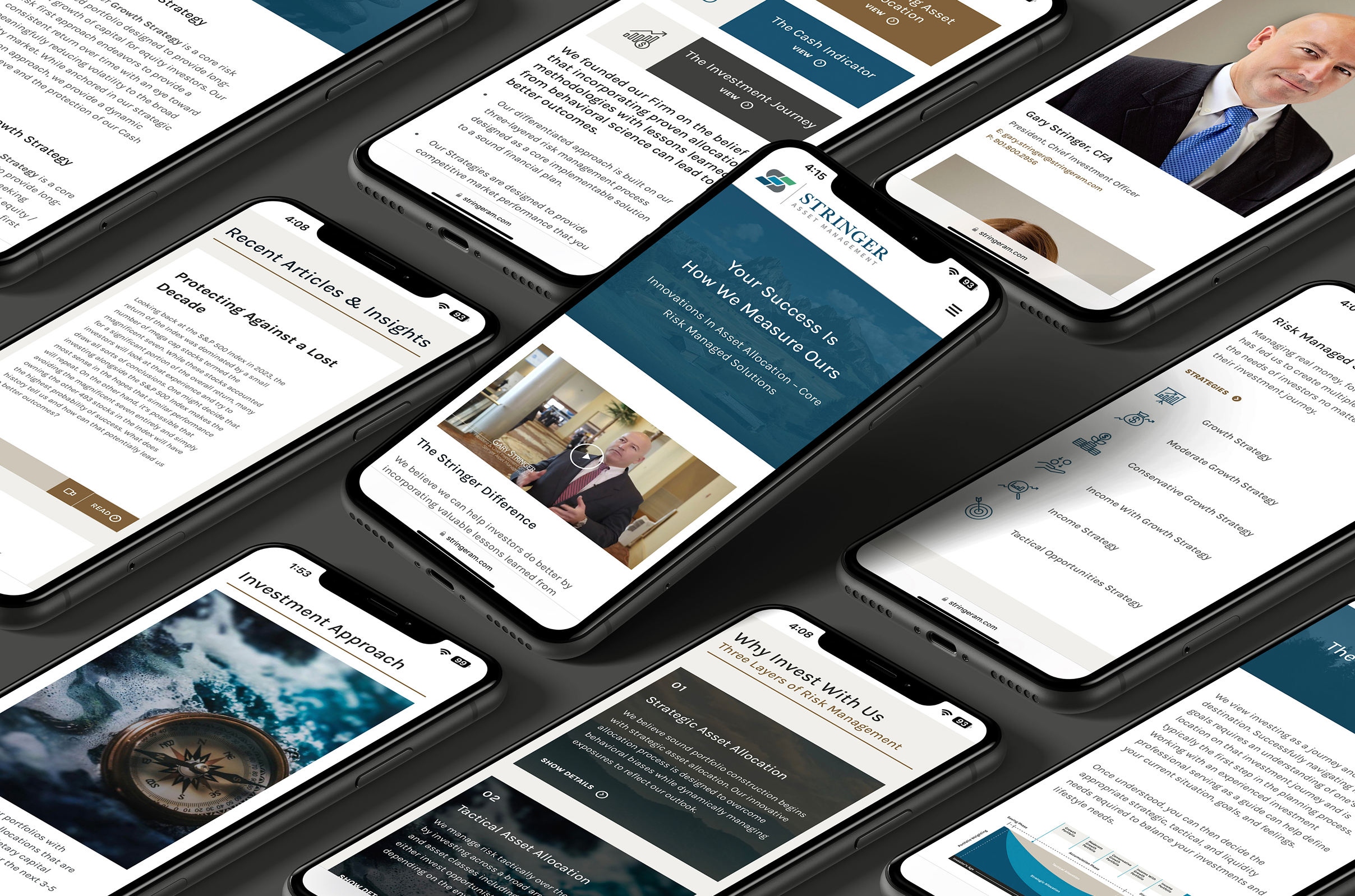
Outcomes
A brand built for clarity, confidence, and growth
With a professional yet approachable identity that communicates confidence, accessibility, and a differentiated process, Stringer is moving forward with purpose—capturing new clients, elevating their reputation, and unifying their story.
The new website and visual system balance stability with innovation, positioning Stringer as a trusted partner to advisors nationwide. From logo to layout, every element reinforces their core focus: risk managed, relationships strengthened, futures secured.
