Background
A longtime landmark enters its newest chapter, refreshed with refined character and charm.
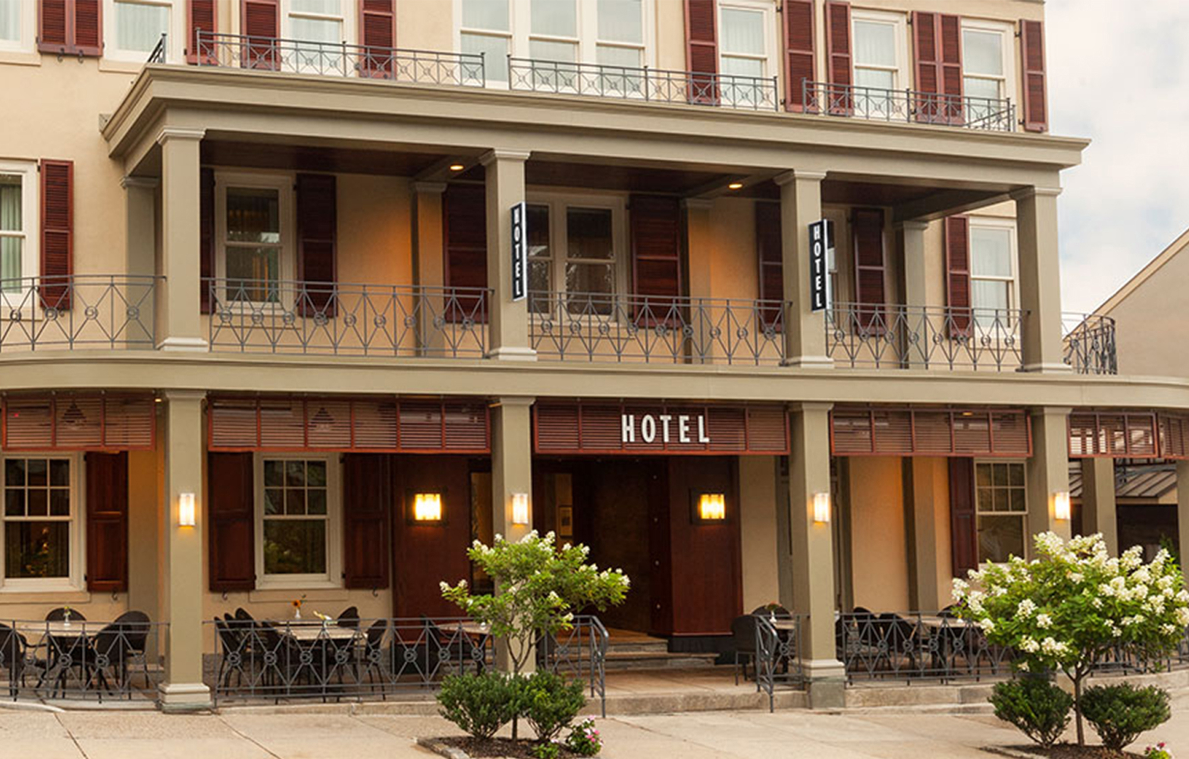
In the heart of Chestnut Hill, this historic boutique hotel has been a local favorite for generations. When new ownership took over, they set out to refurbish the property with care, honoring its heritage and warmth while elevating the experience for today’s guests. However, the existing visual identity felt dated and inconsistent with the property’s revitalized aesthetic.
Challenge
Refresh the brand so it reflected both the history of the building and the elevated guest experience envisioned by its new owners.
Solution
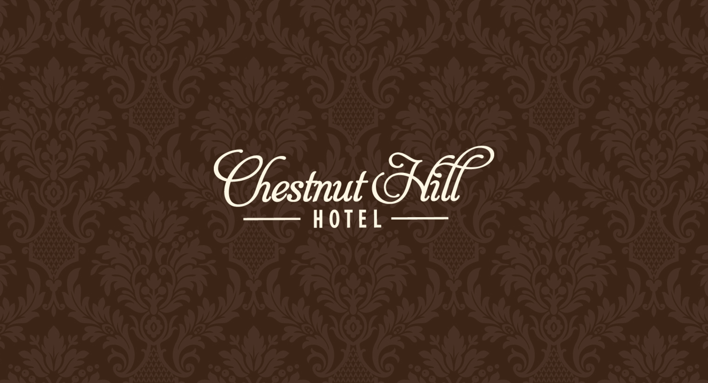
We developed a classic yet modern identity that bridges tradition and renewal. The new logo features elegant ligatures that form smooth, intentional connections between letterforms, conveying craftsmanship and a quiet sense of luxury.
Results
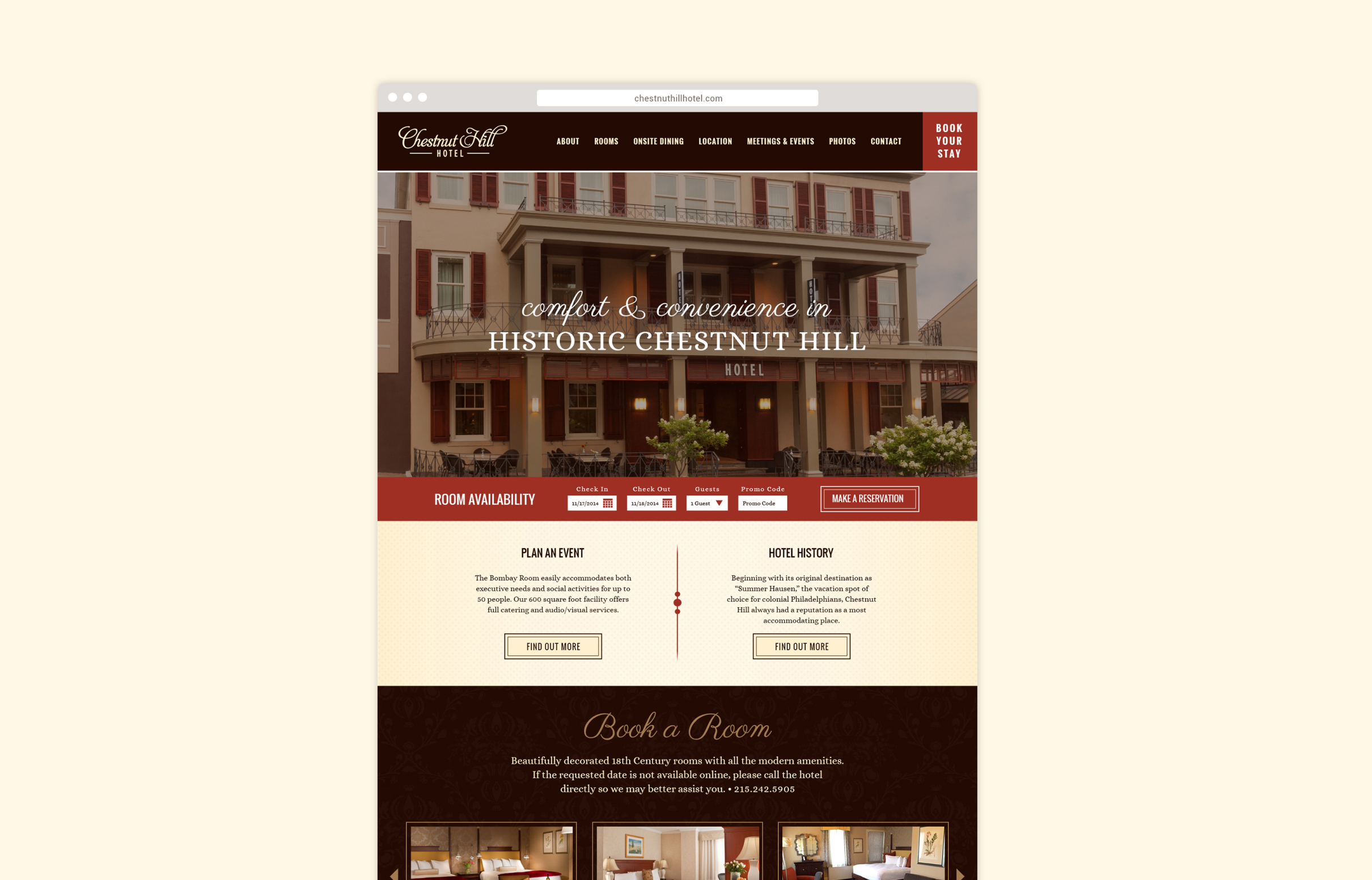
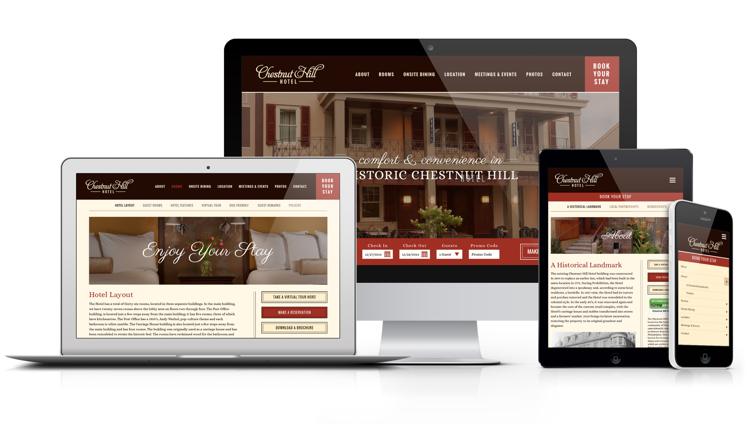
The refreshed brand introduced unity and sophistication across all applications, from stationery to signage. The visual system now conveys warmth, elegance, and local character that complements the hotel’s renovated atmosphere.
The Objective
Create a refined and cohesive brand identity that honors the hotel’s history while reflecting its modern revival.
The goal was to establish a design system that could flex across print, digital, and environmental applications while maintaining a sense of classic hospitality and timeless beauty.
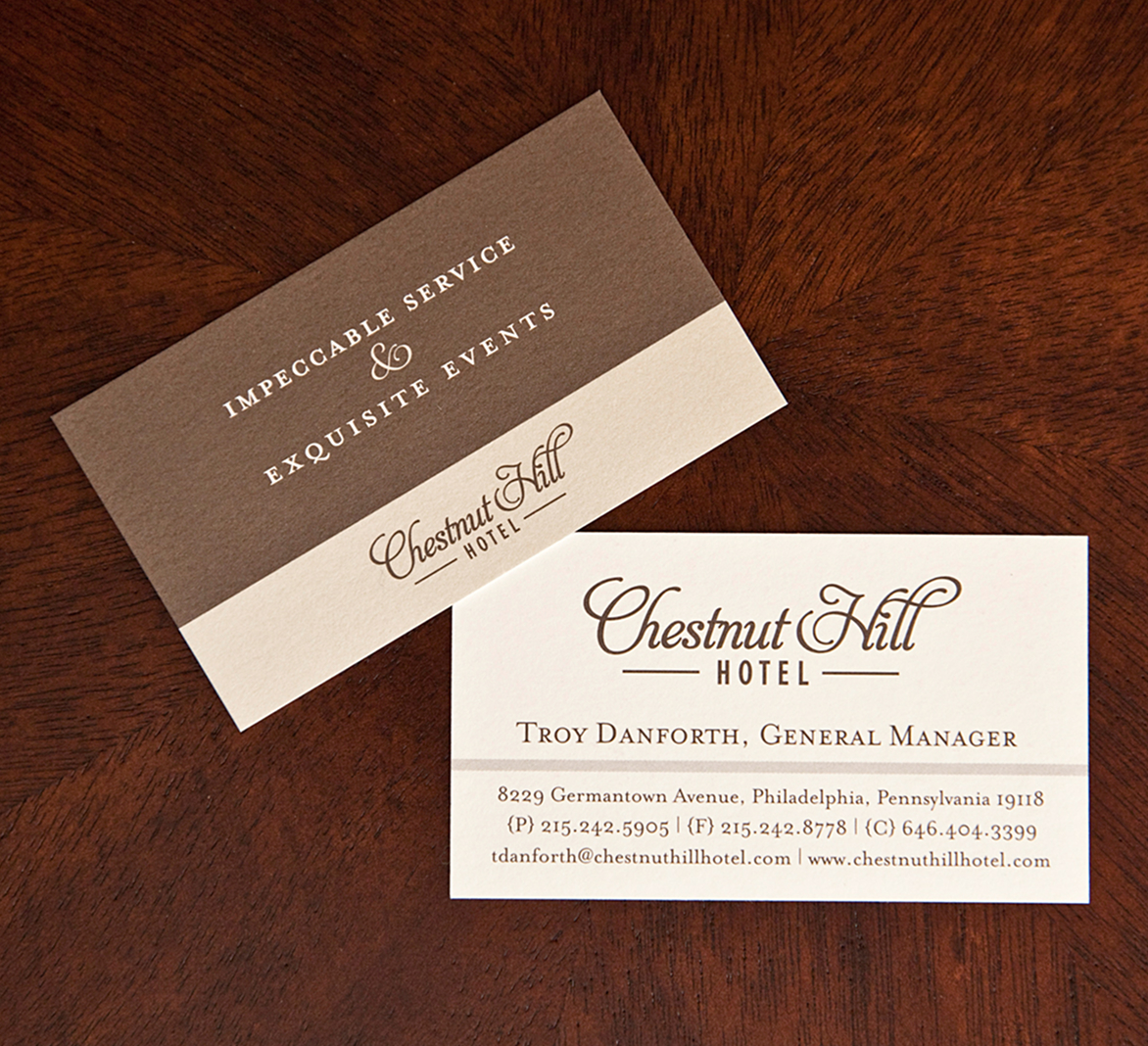
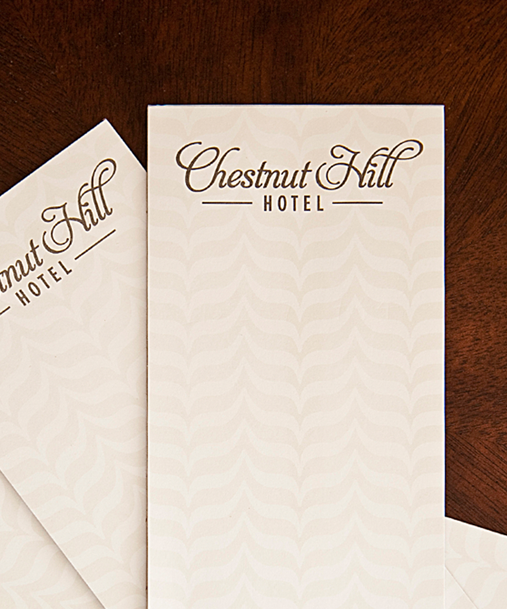
Crafted Detail
A mark of distinction
The logo’s defining feature is the elegant connection within the “ill” letterforms, a detail that gives the wordmark its distinctive flow and character. The lockup creates a sense of movement and grace, reflecting the hotel’s blend of artistry and warmth. This subtle design choice adds personality without excess, giving the brand a handcrafted sophistication that feels effortlessly timeless.
Color palette & Typography
Red
Brown
Cream
Mustard
Coffee
Oswald Regular
Alice Regular
Challenges & Accommodations
Balancing heritage with modern appeal was essential to match the revamped tone.
The existing branding no longer aligned with the hotel’s updated look and feel. The challenge was to create an identity that felt current yet rooted in tradition, blending elegance with approachability for both new and returning guests.


Outcomes
A timeless identity that embodies the neighborhood’s spirit.
The cohesive brand system unites all visual elements under a polished, consistent aesthetic that reflects the hotel’s elegance and captures the charm and sophistication of Chestnut Hill. From signage and stationery to the website and marketing materials, each piece now communicates a hospitality experience that feels elegant, personal, and connected to the neighborhood that surrounds it.
