Background
For established financial firms, internal organizational shifts can impact how the firm presents itself externally.
With nearly three decades of history, Radnor Financial Advisors had built a reputation rooted in trust, experience, and enduring client relationships. As the firm underwent organizational restructuring, leadership recognized an opportunity to evolve the brand, modernizing its presence while preserving the credibility and confidence clients had come to expect. The engagement marked the beginning of a long-term partnership, with branding work that would support Radnor through lengthy phases of growth and change.
Challenge
Elevate a legacy brand through organizational change and milestones, while maintaining client trust.
Solution
A sophisticated brand system befitting a wealth management firm, designed to adapt and endure over time.
Results
A cohesive brand with consistent application that supported ongoing growth and eventual acquisition.

The Objective
Create a refined visual identity that reflects maturity, sophistication, and trust
The initial objective was to develop a comprehensive rebrand that could be applied consistently across all client and internal touchpoints. The refreshed identity needed to feel elevated and polished, appealing to Radnor’s high-net-worth clientele. Establishing a clear brand foundation was essential to ensuring cohesion during anticipated growth.
Solution
A cohesive brand system built for longevity, flexibility, and consistency.
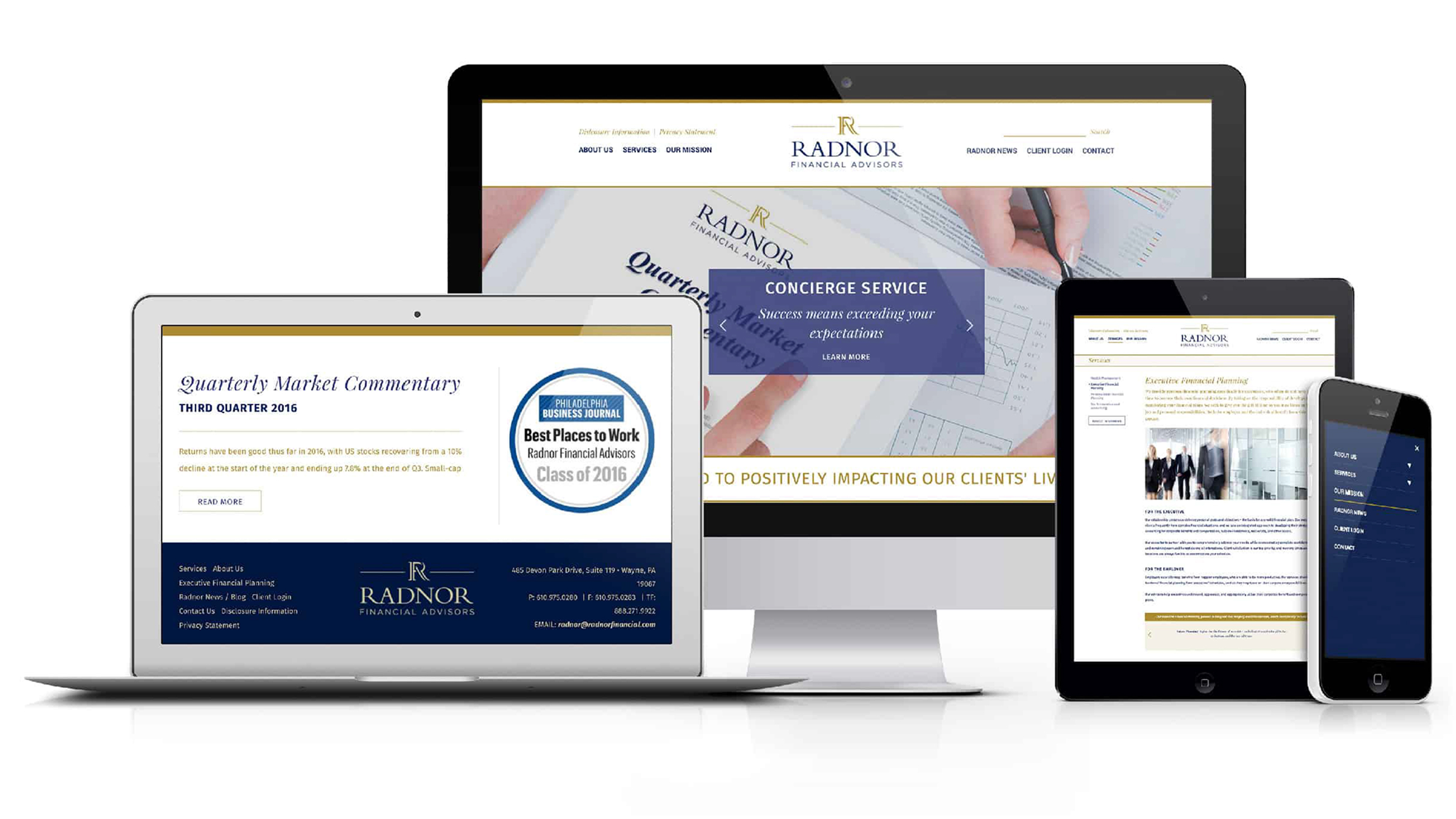
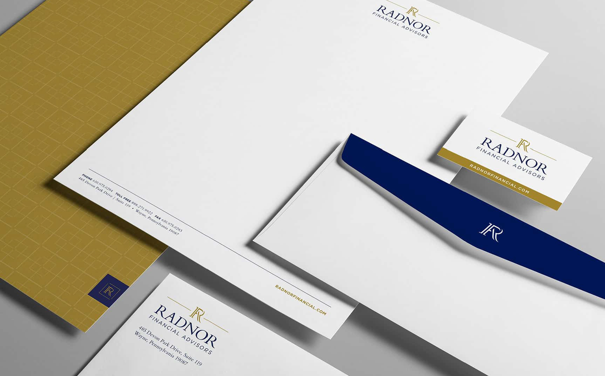
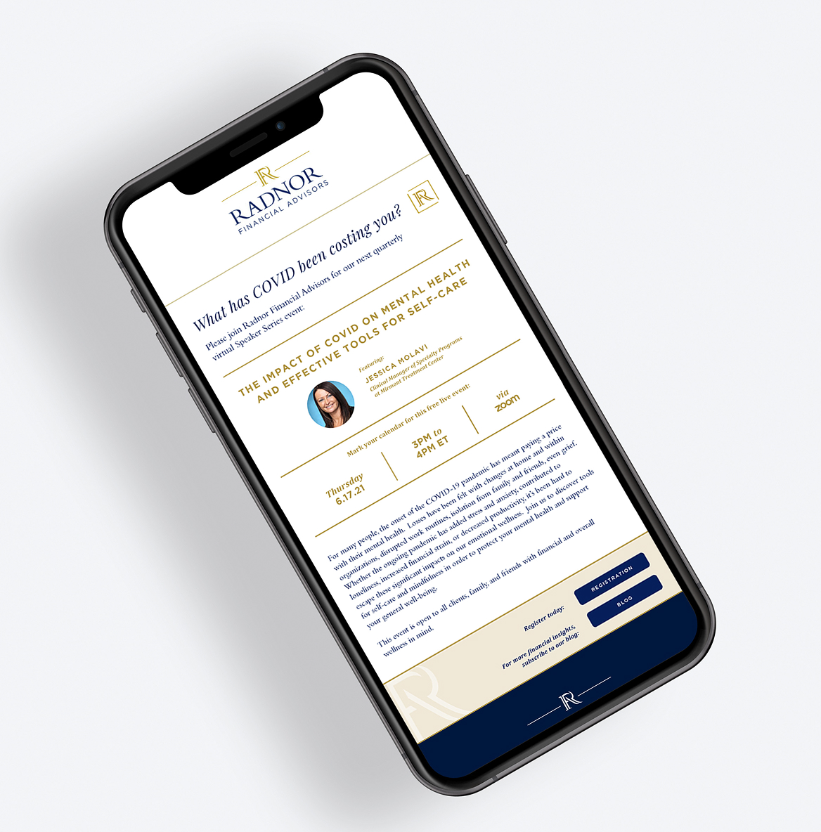
We developed a comprehensive rebranding strategy that balanced modern refinement with timeless professionalism. An elegant logo and visual identity established a more sophisticated presence, supported by a robust brand style guide to ensure consistent application across all touchpoints. The system extended seamlessly across marketing materials, office communications, client-facing reports, social media graphics, and a redesigned website—creating a unified experience that reinforced Radnor’s credibility at every interaction.
Color Palette
Navy
Light Blue
Gold
Cream
Challenges & Accommodations
Celebrating a milestone without disrupting an established brand.
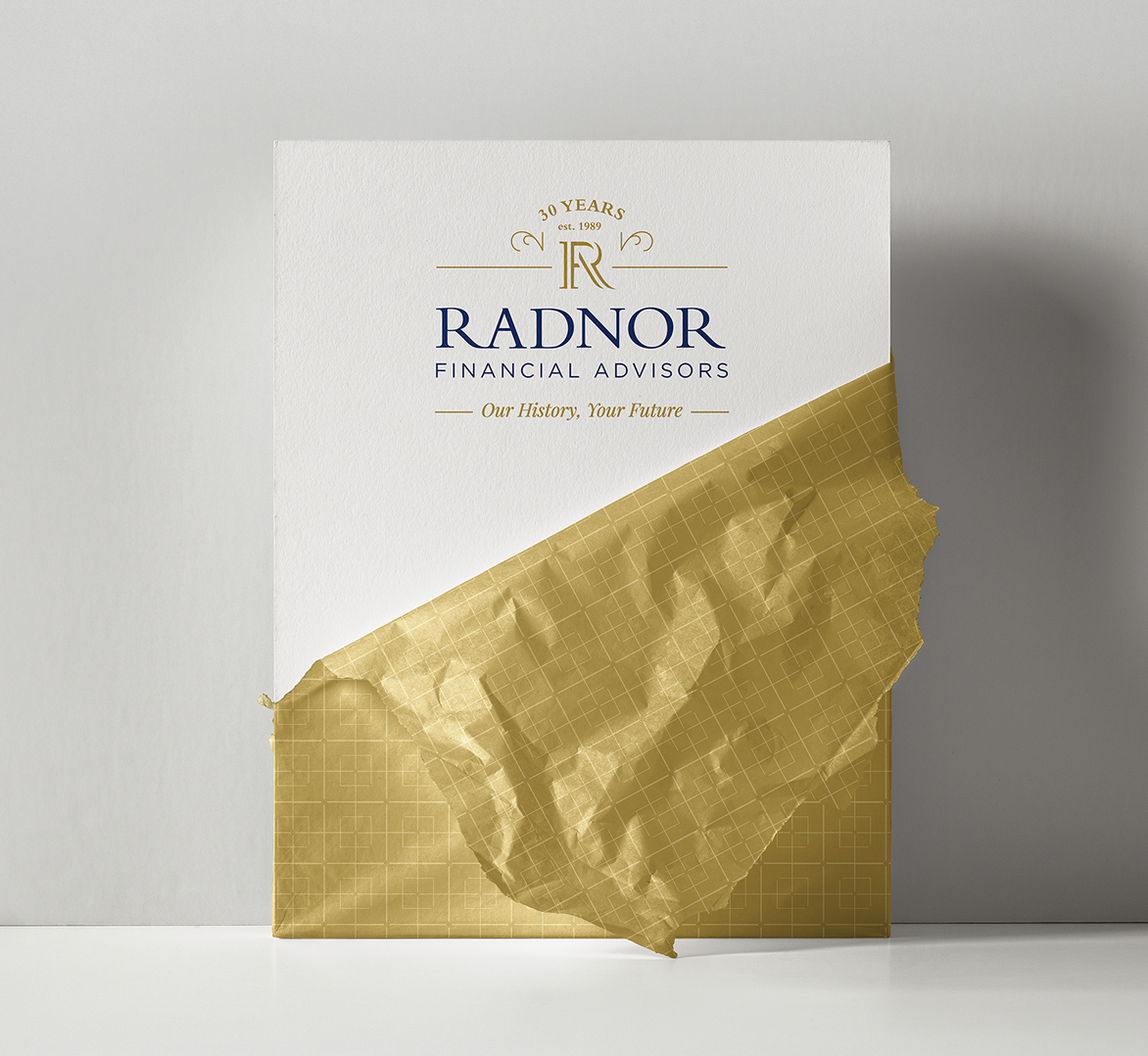
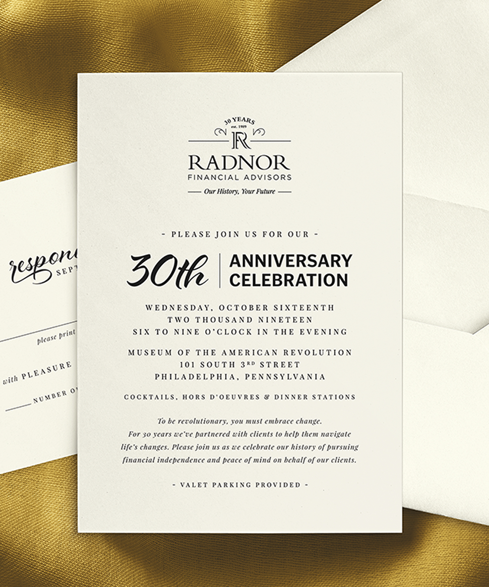
Following the initial rebrand, Radnor approached its 30th anniversary with a desire to mark the milestone in a way that felt meaningful yet restrained. The challenge was to create a special-edition anniversary logo that could stand in for the primary identity for one to two years without causing confusion or diluting brand recognition. The anniversary mark was designed to integrate seamlessly within the existing visual framework, complementing the core logo, reinforcing Radnor’s longevity and depth of experience, and adding a sense of distinction and prestige across the website and marketing materials.

Outcomes
The updated Radnor brand provided a stable, polished foundation through years of growth and change.
Its clarity and consistency proved especially valuable in 2021, when CI Financial acquired Radnor for ~$2.6 billion. We managed all acquisition-related communications on behalf of Radnor, including press releases and internal and external messaging, ensuring a smooth, confident transition for clients and stakeholders. Shortly thereafter, CI Financial rebranded as Corient, continuing to enable Radnor’s growth and client-first approach. The brand evolution respected Radnor’s history while positioning the firm for long-term success within a larger organization.
