Background
A neighborhood market evolves into a contemporary community destination.
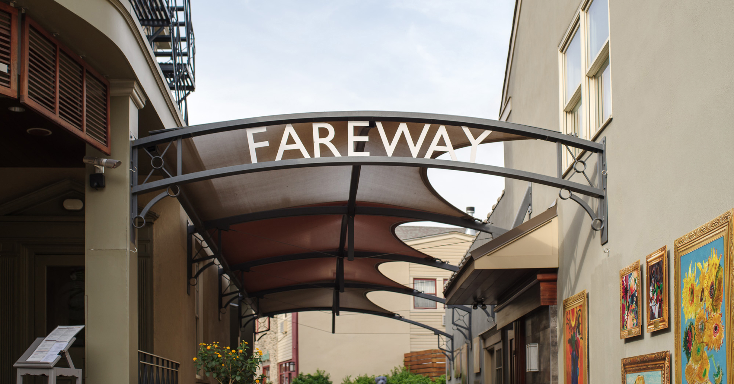
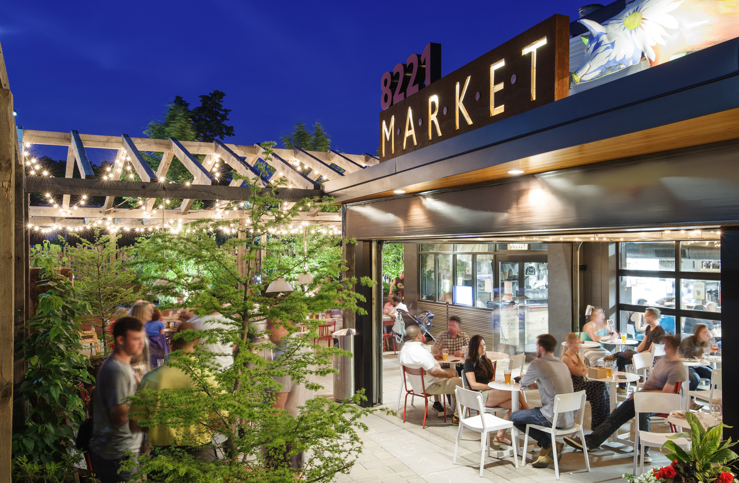
Market at the Fareway is a food and gathering space that serves both longtime Chestnut Hill residents and daily visitors. As the market expanded and the space was refreshed, leadership recognized the need for a new visual identity and website design that accurately reflected how people experience the market. It was no longer just a collection of stalls; it had become a central hub for everyday activity, connection, and neighborhood life.
Challenge
Create a brand and website that signal Market at the Fareway’s modern direction while respecting the community’s attachment to its farmers’ market past.
Solution
We designed a new logo and website that balance warmth with a clean, contemporary feel. The identity emphasizes clarity and community, giving the market a cohesive presence without overshadowing individual vendors, who are highlighted on the site in an intuitive layout.
Results
Market at the Fareway is now positioned as a modern destination for daily shopping, quick meals, and community connection. The brand reflects its variety at a glance, the website simplifies planning a visit, and the experience feels more unified and intentional across touchpoints.
The Objective
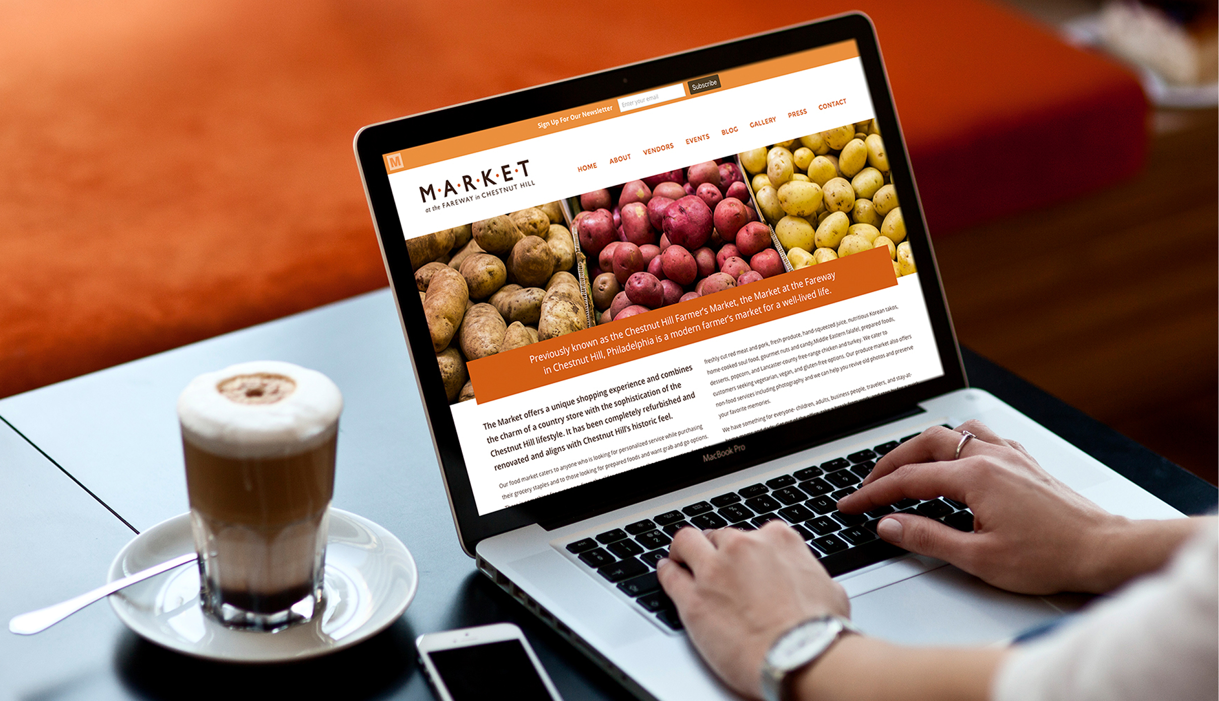
Create a cohesive visual system and digital presence that support the market’s broader role in daily neighborhood life.
The goal was to present Market at the Fareway as a recognizable destination that could support a range of vendors, from the ones people go out of their way to visit to the reliable neighborhood favorites, while still feeling familiar to local patrons. The identity needed to overcome the community’s attachment to the former farmers market, establish the new name, and introduce the updated vibe without losing the trust of regular visitors. Together with the brand, the website needed to appeal to both longtime residents and new customers, provide clear information, and offer a structure that could grow with the market over time.
Design Solution
A flexible identity built to unite the market while giving vendors room to shine.
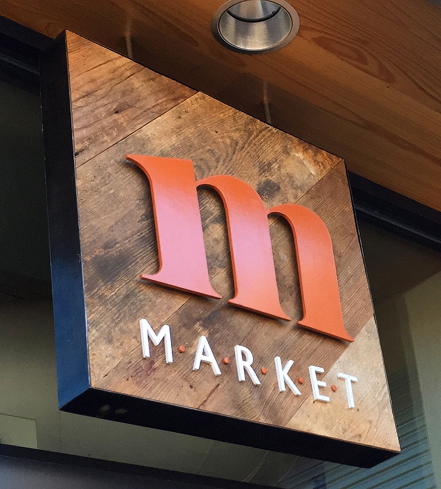
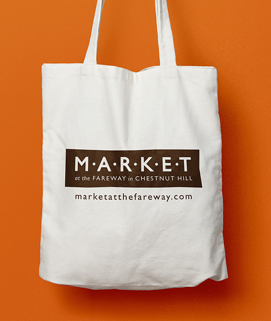
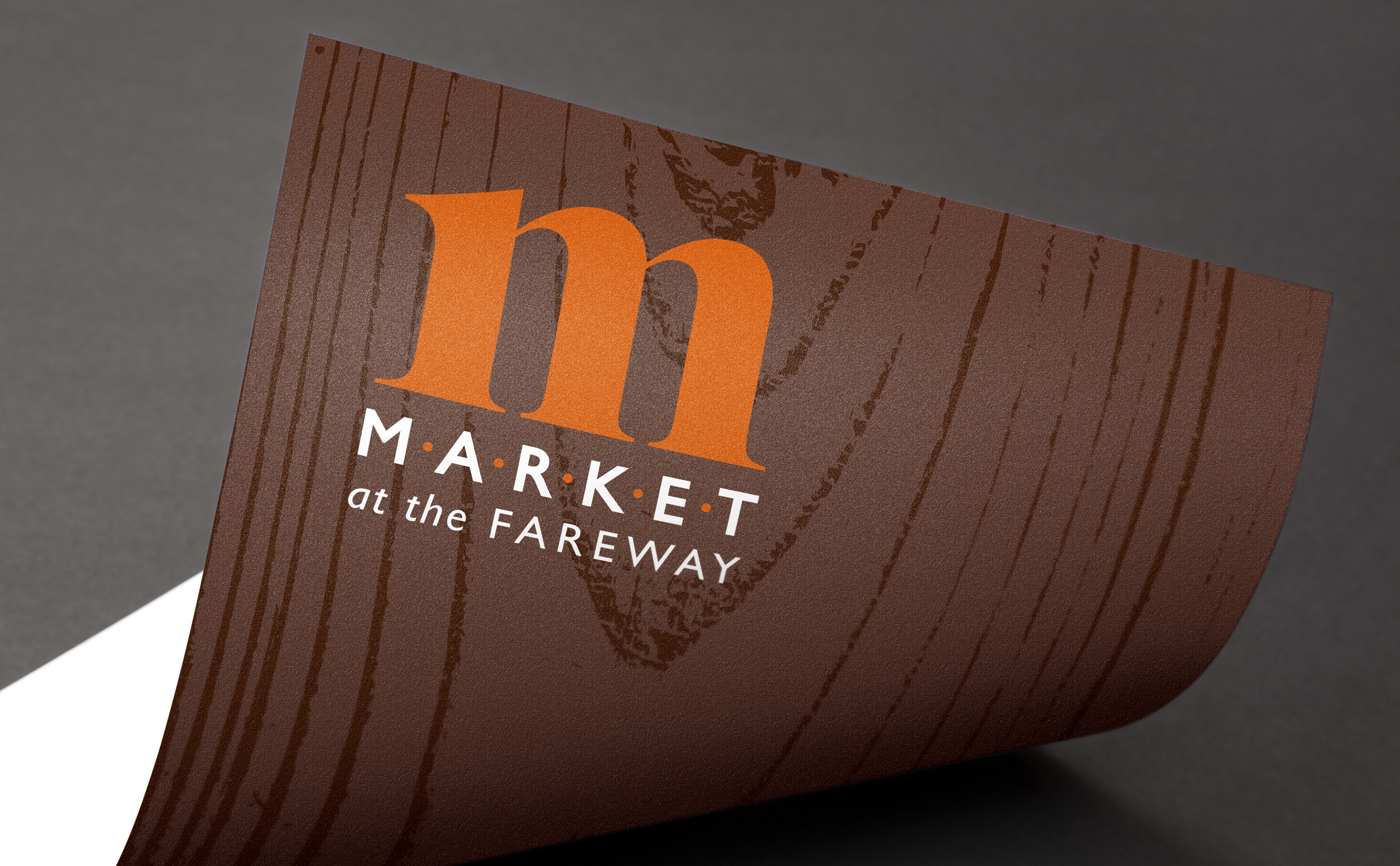
We created a visual system that pairs clean typography with warm, approachable details that reflect the tone of the market. The logo was designed for clarity across signage, print materials, and digital formats. The website uses a simple, visitor-focused structure that allows people to easily browse vendors. Photography and layout choices highlight the welcoming everyday experience of the market and reinforce its updated identity.
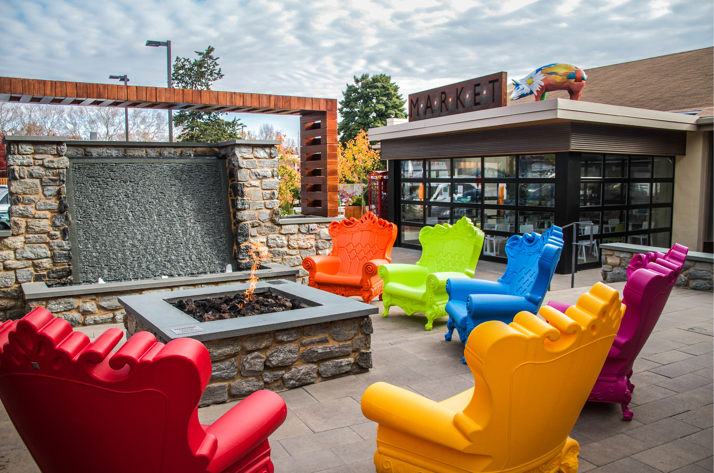
Market at the Fareway is a modern market experience designed for everyday Chestnut Hill living.
Color Palette
Brown
Tan
Red
Orange
Yellow
Challenges & Accommodations
The transition to a refreshed market came with community hesitation.
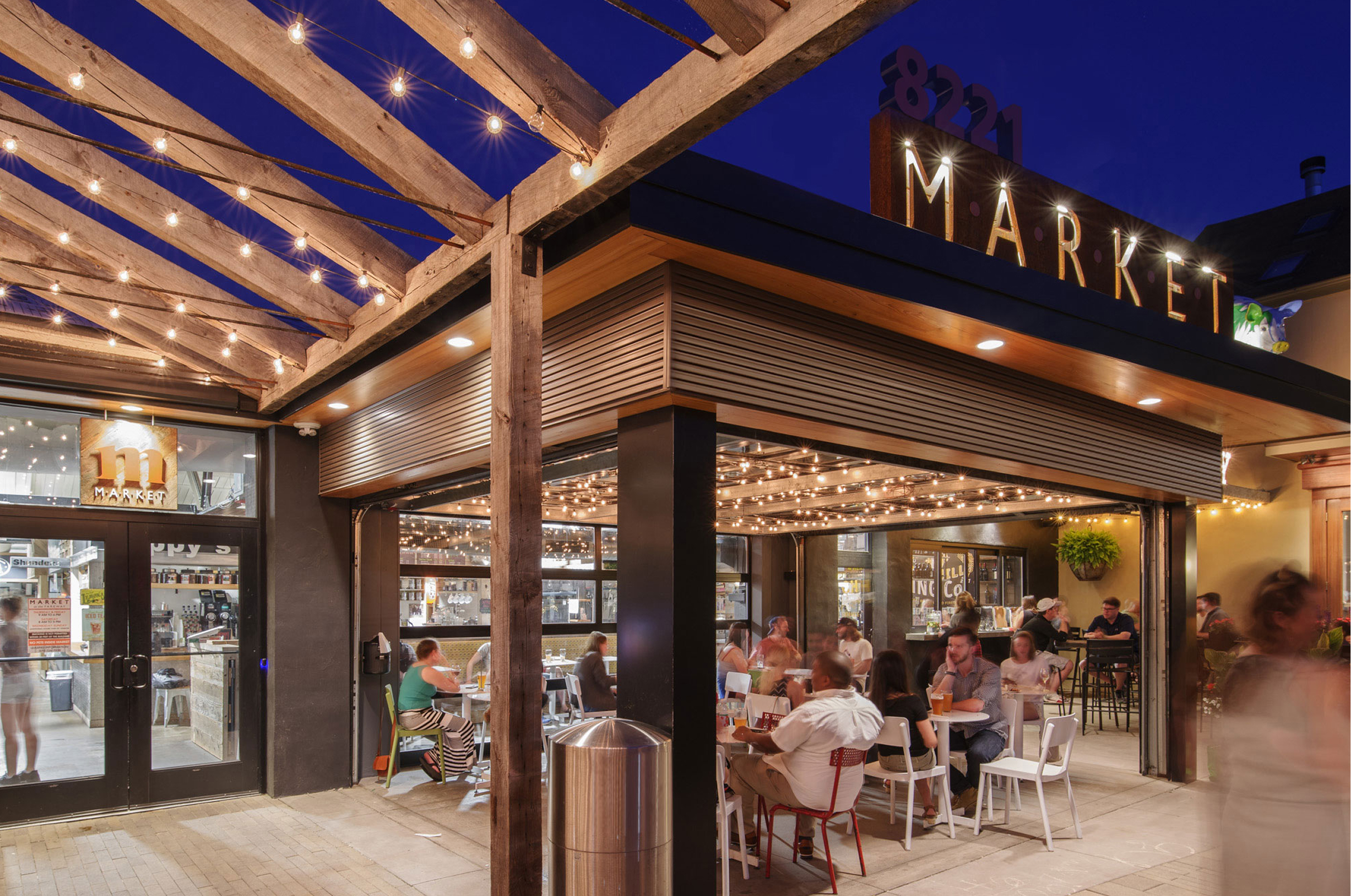
Many neighbors were attached to the old farmers’ market and were unsure about the new name and updated vibe. People continued to use the former name, and shifting longstanding habits took time. The evolved branding was introduced in a thoughtful way that felt natural and reassuring, showing that the change reflected the market’s growth, rather than a complete departure from what people had valued before.
Outcomes
By introducing a clearer and more consistent identity, the brand helped bridge the gap between what the market had been and what it was becoming. The new name gained traction, visitors understood the expanded offerings more easily, and the experience felt aligned with the market’s refreshed direction. The outcome is a modern presence that still feels rooted in the neighborhood.
