Background
When expanding access to education depends on the quality of your digital presence, user experience is critical.
Founded in 1964, Lower Merion Township Scholarship Fund (LMTSF) is a 501(c)(3) nonprofit dedicated to helping eligible high school graduates pursue post-secondary education through need-based grants. For decades, the organization has relied on the generosity of donors to maximize its impact within the community. As the scope and scale of its programs grew, LMTSF recognized that its existing website no longer reflected the importance of its mission or the breadth of its work. The organization needed a refreshed digital presence that could clearly communicate impact, attract donors more effectively, and support applicants and administrators alike. As part of this broader refresh, the dated acorn/oak leaf logo was also slated for a revamp.
Challenge
Modernize the logo and streamline the website to create a more user-friendly experience that is easy to maintain on the back end.
Solution
A reimagined visual presence grounded by the logo’s symbolism of growth, potential, and pathways, with a focus on usability and audience connection.
Results
A refreshed identity and intuitive website for all audiences, strengthening brand awareness, expanding donor base, and increasing educational impact.

The Objective
Create a clear, engaging website that strengthens donor confidence and usability
The redesigned LMTSF website needed to feel cohesive and credible, clearly articulating LMTSF’s purpose while providing a seamless experience for multiple audiences, making it easy to give, apply for grants, and access key information. Just as important, the platform had to be flexible and easy to maintain internally, allowing administrators to manage content dynamically without technical complexity.
Solution
A mission-forward, user-centered website built for clarity and donor engagement.
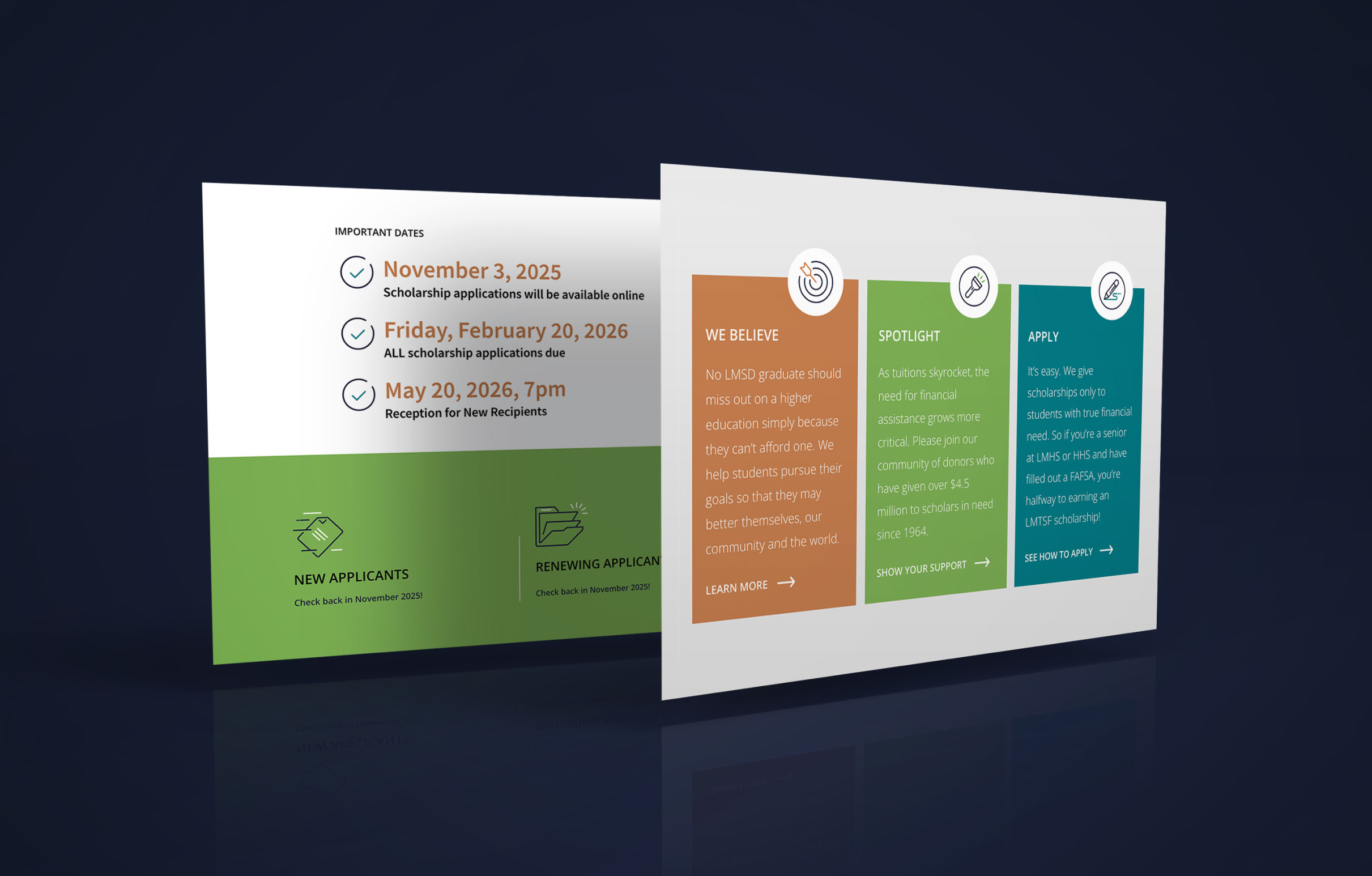
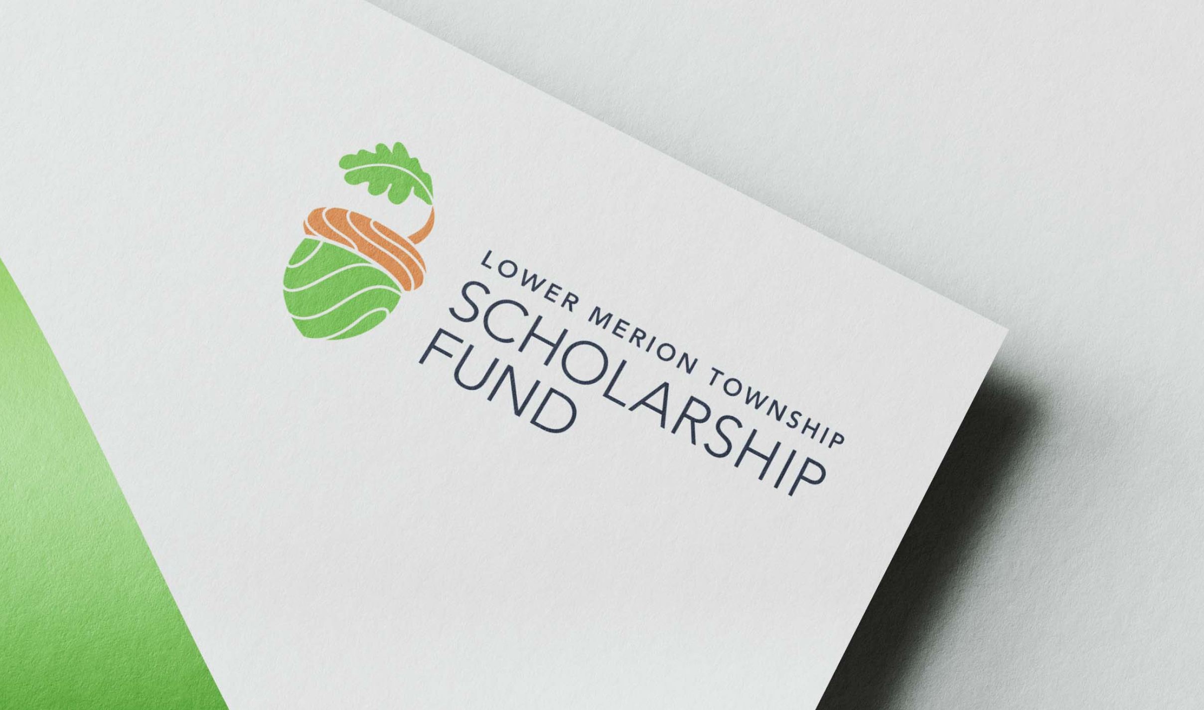
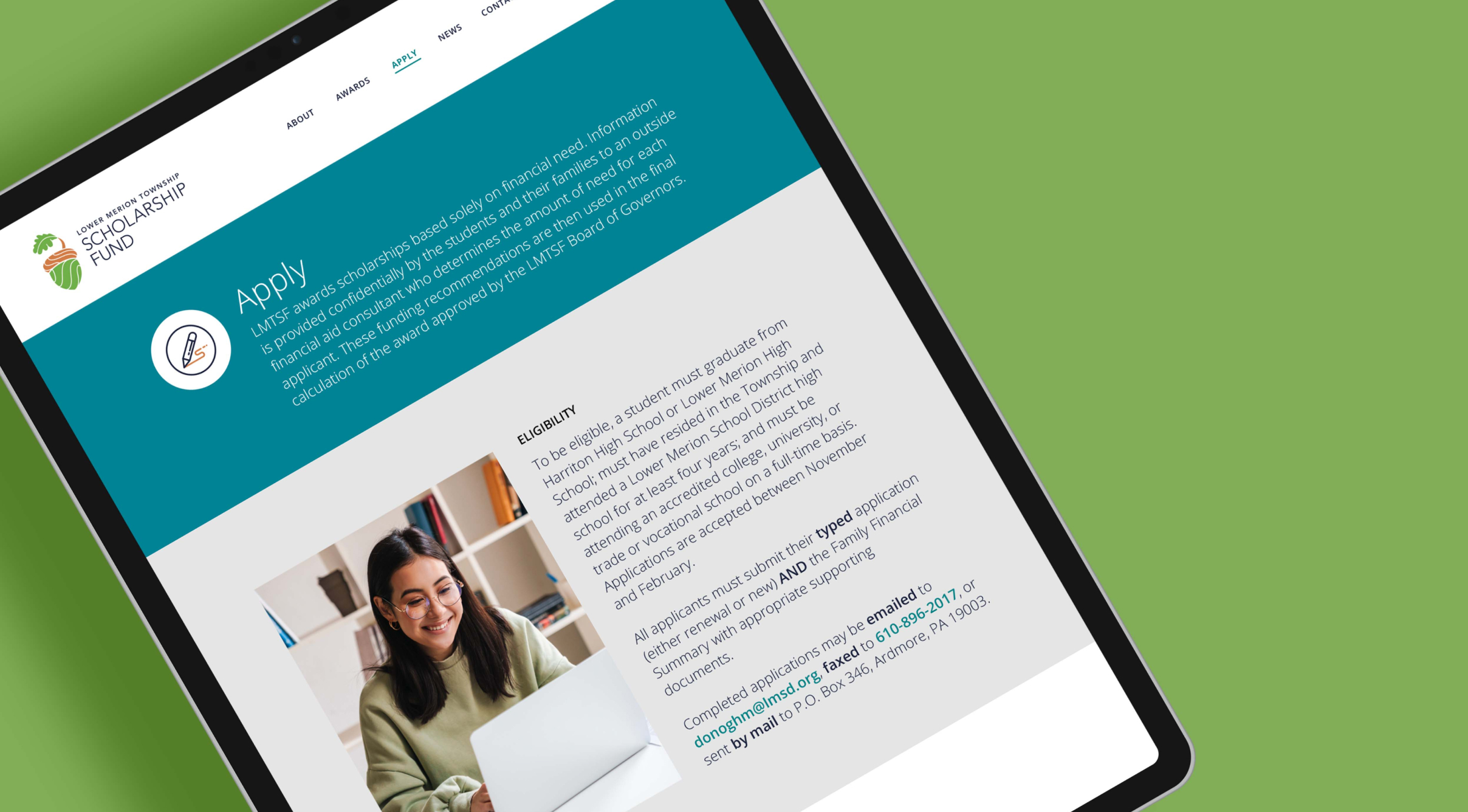
Rooted in the ideas of growth and potential, the organization’s dated acorn and oak leaf logo was modernized to appeal to a cross-generational audience and set the overall tone for the brand elements. The redesigned website reflects a cohesive brand identity that keeps LMTSF’s mission front and center. Clean layouts, clear navigation, and purposeful content hierarchy guide users quickly to the information they need—whether they are donating, applying, or learning about the organization’s impact.
The new website highlights the mission while making it easier for donors and applicants to take action.
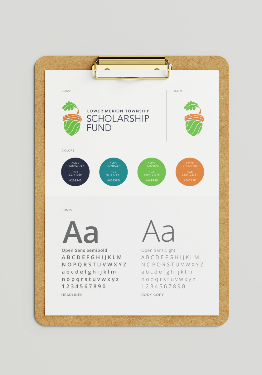
Color palette & Typography
Navy
Teal
Green
Orange
Gray
Montserrat Bold
Open Sans Semi Bold
Open Sans Regular
Challenges & Accommodations
Balancing diverse user needs within a simple, intuitive structure.
LMTSF serves distinct audiences, each with different goals and expectations: donors needed a streamlined, intuitive giving experience that reduced friction and increased confidence; applicants required clear guidance, robust support, and easy access to information. At the same time, the organization manages a large volume of information—awards, grants, news, and updates—which required thoughtful site architecture to ensure clarity without overwhelming users.

Outcomes
The new LMTSF website provides a welcoming digital front door for the organization.
Donors can better understand the importance of their contributions and easily make gifts, while applicants benefit from clearer pathways and improved access to information. The refreshed site enhances LMTSF’s visibility, reinforces credibility, and supports long-term sustainability by improving engagement across all audiences. With this foundation in place, the organization is better equipped to grow its reach and continue expanding access to post-secondary education for students in need.
