Background
The Center for Applied Health Informatics (CAHI) is part of Penn Medicine and functions as a “center of centers.”
Rather than operating as a single department, CAHI brings together multiple groups that already exist across the health system and aligns their work around shared goals. Its role is to aggregate health system data, information, and expertise, then translate that collective intelligence into action that improves care, operations, and decision-making.
Much of CAHI’s work happens behind the scenes. It is essential infrastructure, necessary but often invisible. Because of this, the Center needed a clear identity and website to explain who it is, what it does, and why it matters to people across Penn Medicine.
Challenge
Making an invisible but critical function visible and understandable to a wide range of audiences.
Solution
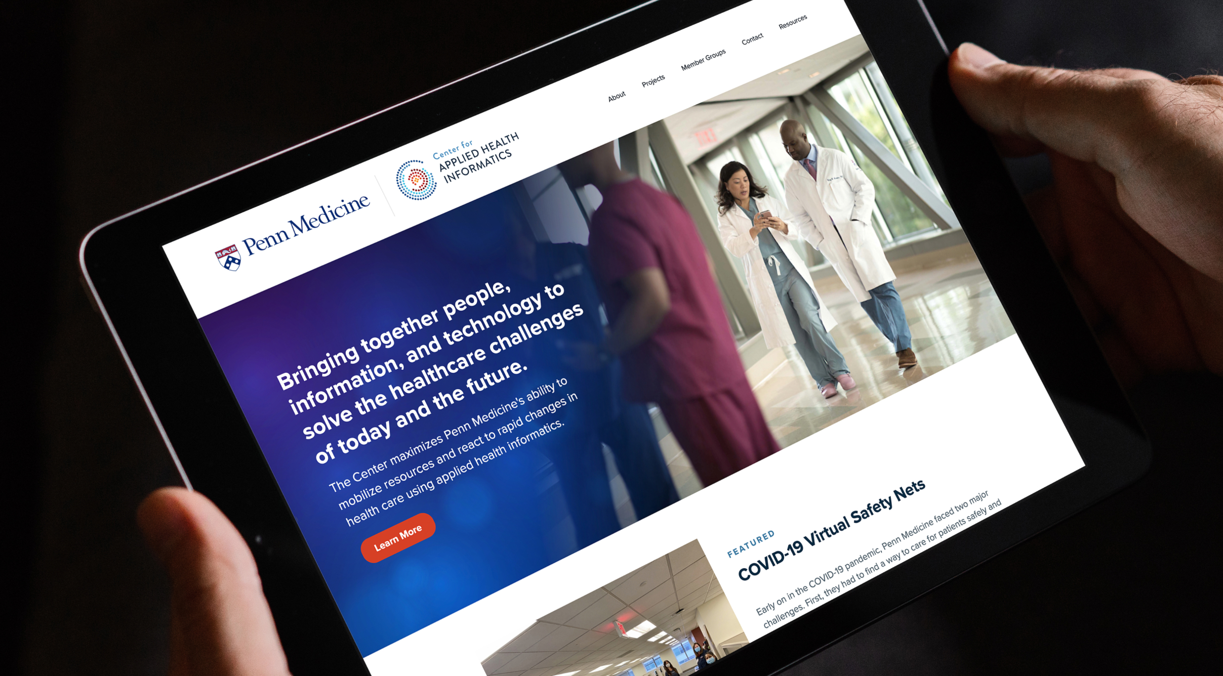
A clear brand identity and website grounded in CAHI’s role as a connector, coordinator, and driver of progress.
Results
A cohesive visual and digital presence that helps people quickly grasp CAHI’s purpose and value.
The Objective
Give form to a complex, collaborative mission
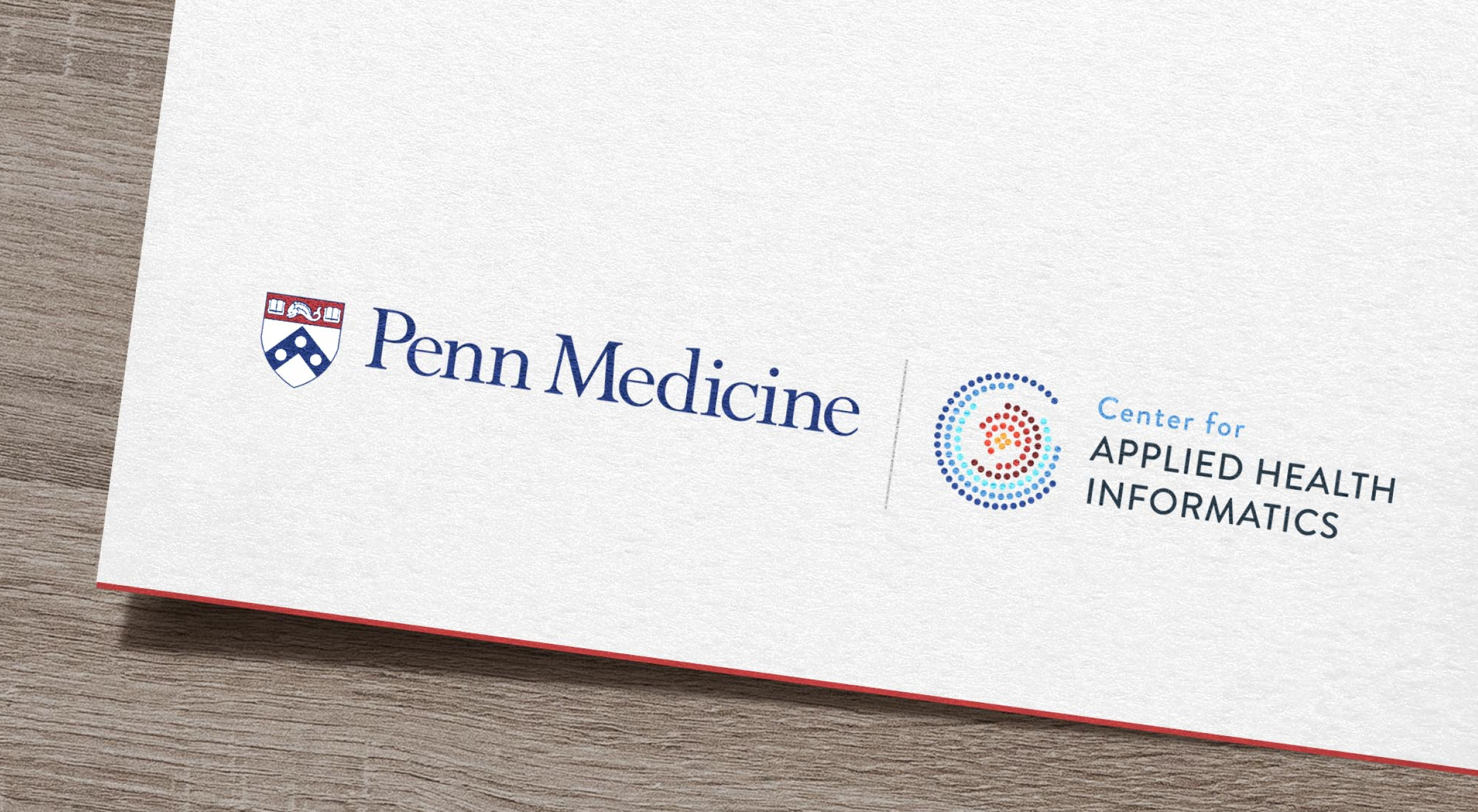
The goal was to create an identity and website that could express CAHI’s role as connective tissue across the health system. The work needed to support recognition, feel credible within an academic medical environment, and help people understand that CAHI is not a data warehouse, but a coordinated engine that turns information into insight and action.
Design Solution
A logo rooted in connection and coordinated motion
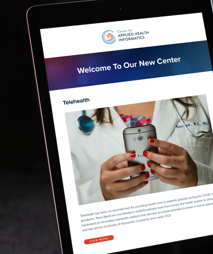
We worked closely with the CAHI team to translate their strategic thinking into a visual system. Conceptually, CAHI described itself using metaphors such as a nerve center, air traffic control, a funnel, and an engine for progress. These ideas informed a logo built around networked connection and coordinated movement, with individual elements that remain distinct but come together as part of a larger whole. The mark reflects many inputs converging into purposeful output, mirroring how CAHI operates across Penn Medicine.
Color palette
Yellow
Red
Orange
Mid Blue
Dark Blue
Challenges & Accommodations
Representing coordination without oversimplifying
CAHI supports physicians, scientists, health system leaders, and other professionals who rely on timely, reliable information to make decisions. The challenge was creating a single identity and website that could speak to all of these audiences, convey seriousness and agility, and reflect collaboration without flattening the complexity of the work.

Outcomes
A foundation for alignment and recognition
The final identity and website give CAHI a clear public presence that matches how the Center operates internally. Together, they help people understand that CAHI is reserved for high-priority goals and built to connect the right people and information at the right time. By making an invisible function visible, the system supports alignment, confidence, and ongoing collaboration across Penn Medicine.


