Background
Fitrition United, a boutique fitness and nutrition studio, was built around a holistic approach to health that combined functional group fitness, personalized training, and nutrition consulting.
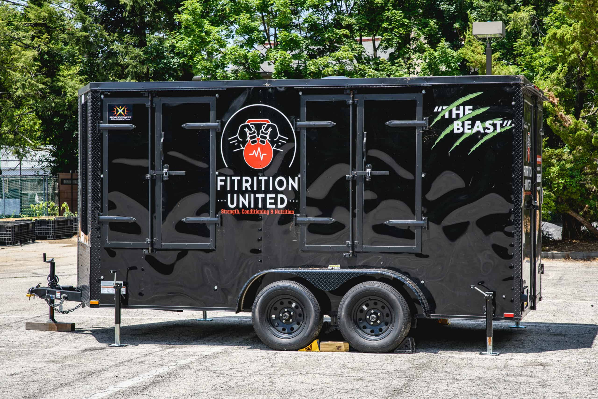
Internally, the studio was fondly referred to as Fit U, a name that reflected both physical fitness and the idea that programs were designed to fit each individual. The studio offered a range of programs, including large group classes, small-group coaching, youth performance training, and a mobile fitness unit that brought workouts directly to teams and workplaces.
From the beginning, the goal was to create something more thoughtful than a traditional gym. The brand needed to communicate strength and energy while also emphasizing personalization, support, and long-term wellness.
Challenge
Translate a broad, multi-layered offering into a brand that felt focused, motivating, and easy to understand.
Solution
A clear name, positioning, and visual system that unified fitness, nutrition, and community under one cohesive identity.
Results
A recognizable brand foundation that supported launch, promotion, and day-to-day communication across channels.
The Objective
Establish a clear and differentiated brand foundation
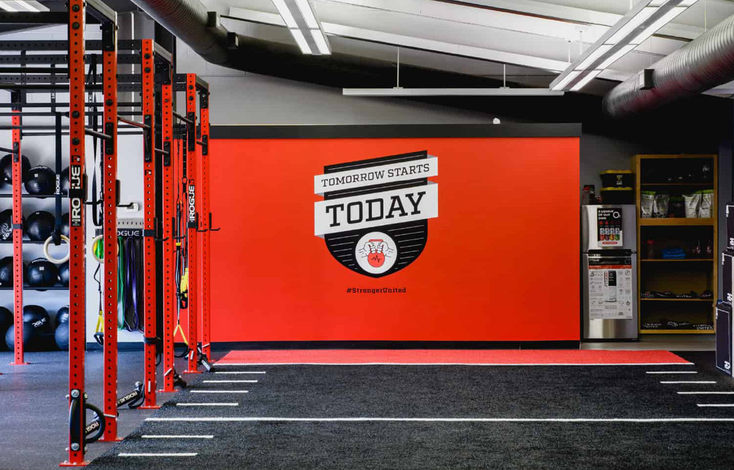
The objective was to develop a name, positioning, and identity that captured the studio’s whole-body philosophy and community-driven approach. The brand needed to feel confident and energetic without being intimidating, and flexible enough to support multiple programs, audiences, and formats.
Design Solution
A brand system rooted in strength and shared effort
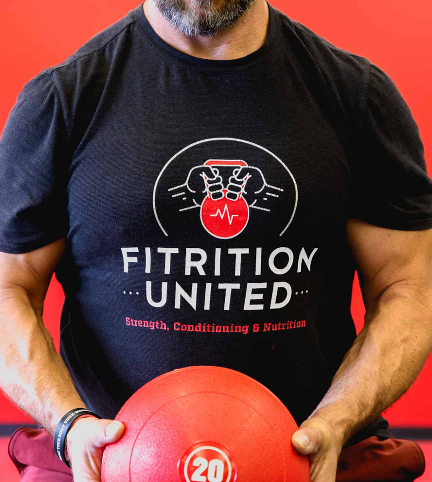
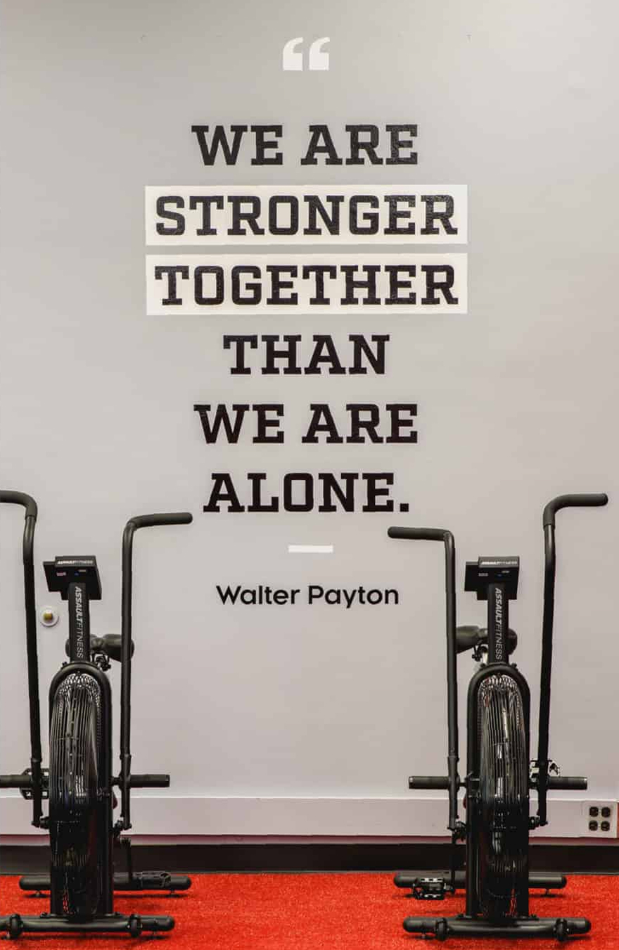
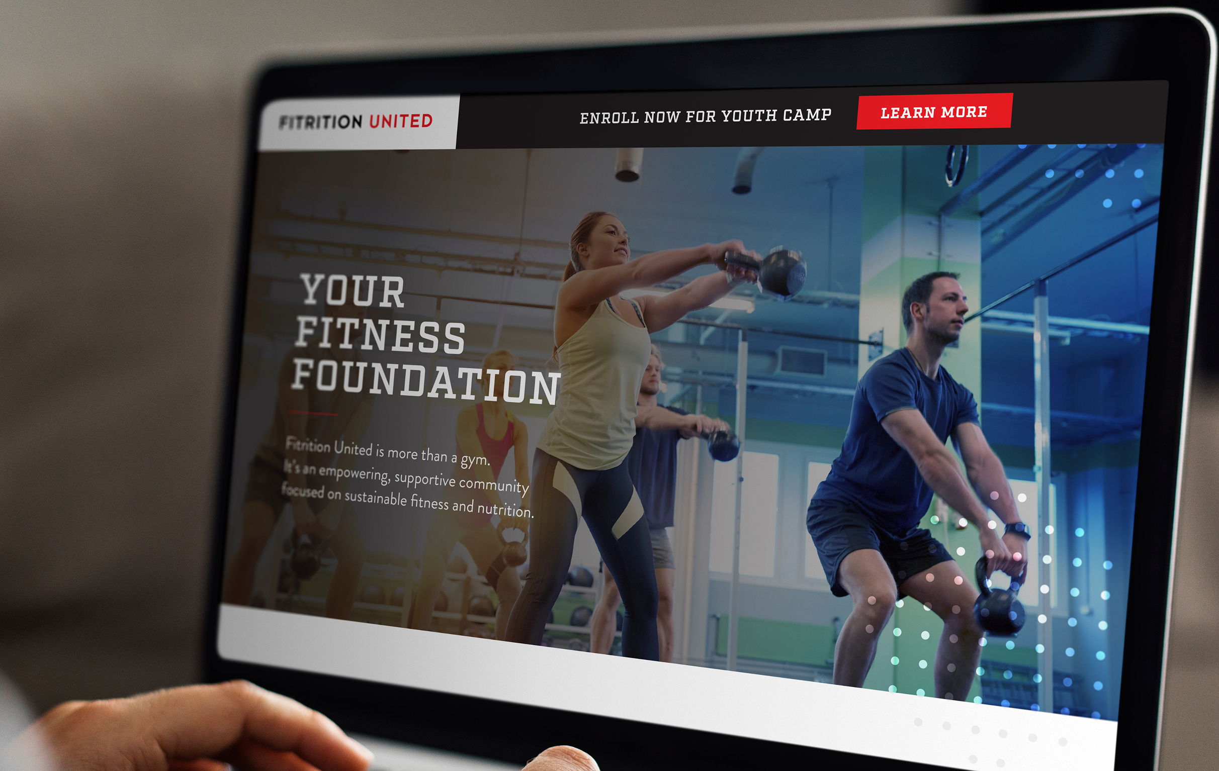
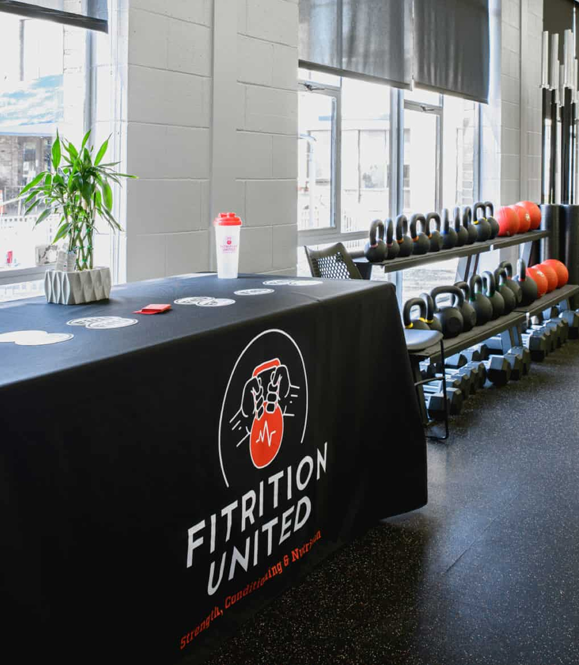
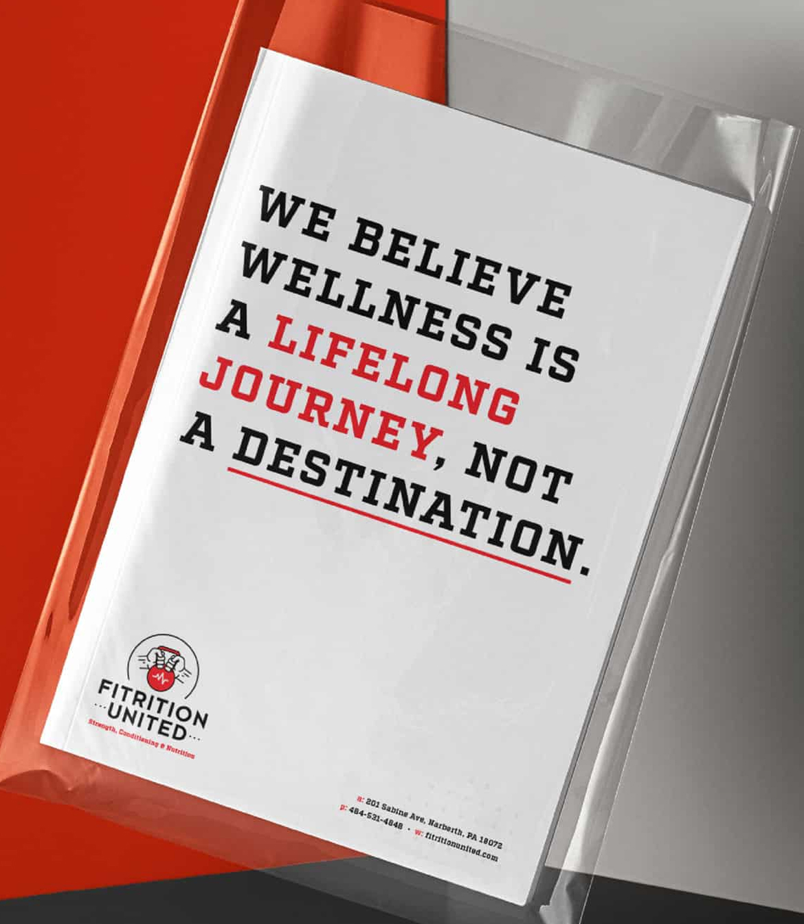
We partnered with the Fitrition team to define the name, positioning, and overall brand direction before developing the visual identity. The logo and system were built around the idea that progress is stronger when achieved together, emphasizing alliance, support, and collective momentum over individual performance. Bold typography, strong contrast, and a focused color palette conveyed energy and clarity, while marketing materials, signage, and a website worked together to clearly explain offerings and reinforce a consistent, community-centered brand experience.
Color Palette
Black
Charcoal
Red
Light Gray
Challenges & Accommodations
Communicating variety without confusion
Fitrition combined training, nutrition, youth programming, and mobile services under one brand. The challenge was creating messaging and materials that explained these options clearly while maintaining a strong, consistent identity and reinforcing the studio’s emphasis on personalization and community.
Outcomes
A cohesive platform for growth and engagement
The final naming, positioning, and brand system gave Fitrition a clear and confident presence across physical and digital spaces. The work helped prospective members understand the studio’s philosophy and offerings while reinforcing a sense of belonging and shared commitment. Together, the brand assets supported consistent communication and a strong foundation for outreach and engagement.
