Background
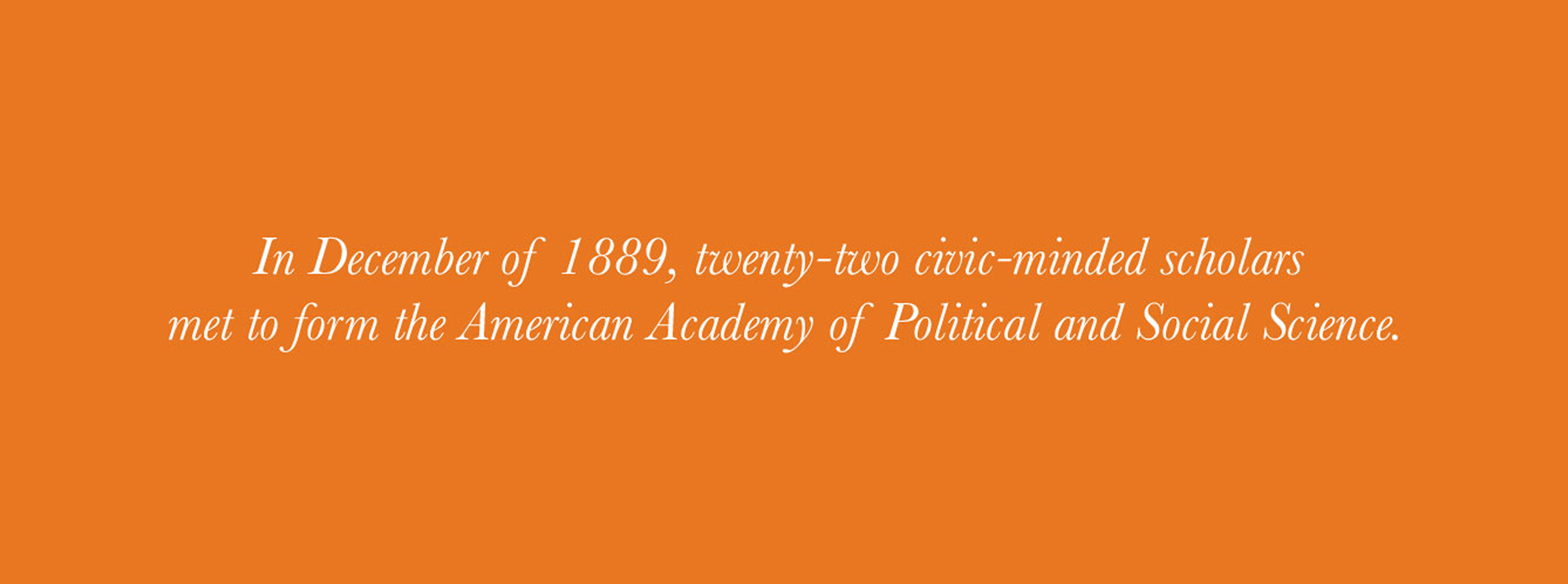
Founded in 1889, the American Academy of Political and Social Science (AAPSS) has a long history of advancing social science and public policy. Over time, its visual identity had become dated, creating tension between the organization’s relevance today and the depth of its history.
Challenge
Modernize the look and feel of a 130-year-old institution without diminishing its credibility or historical weight.
Solution
Refine the existing identity with restraint, creating a flexible system that balances relevance with continuity.
Results
A durable, adaptable visual foundation that strengthens recognition and supports AAPSS’s ongoing programs and communications.
The Objective
Evolve the identity without disconnecting it from its history
The goal was to modernize the AAPSS identity so the mission would feel relevant and engaged, yet maintain a solid bridge to the past. The work needed to respect the organization’s origins while supporting its role in today’s civic and policy conversations.
Design Solution
A deliberate refinement grounded in continuity
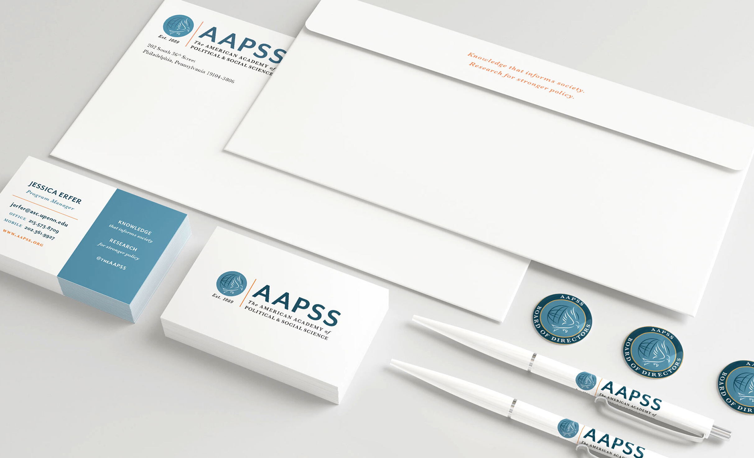
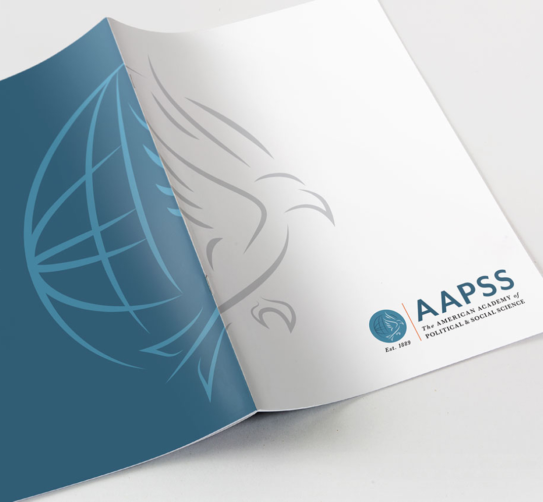
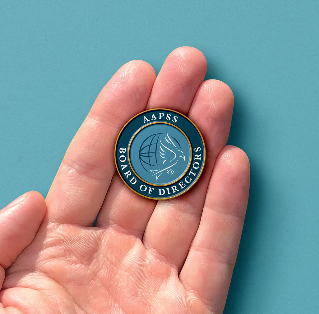
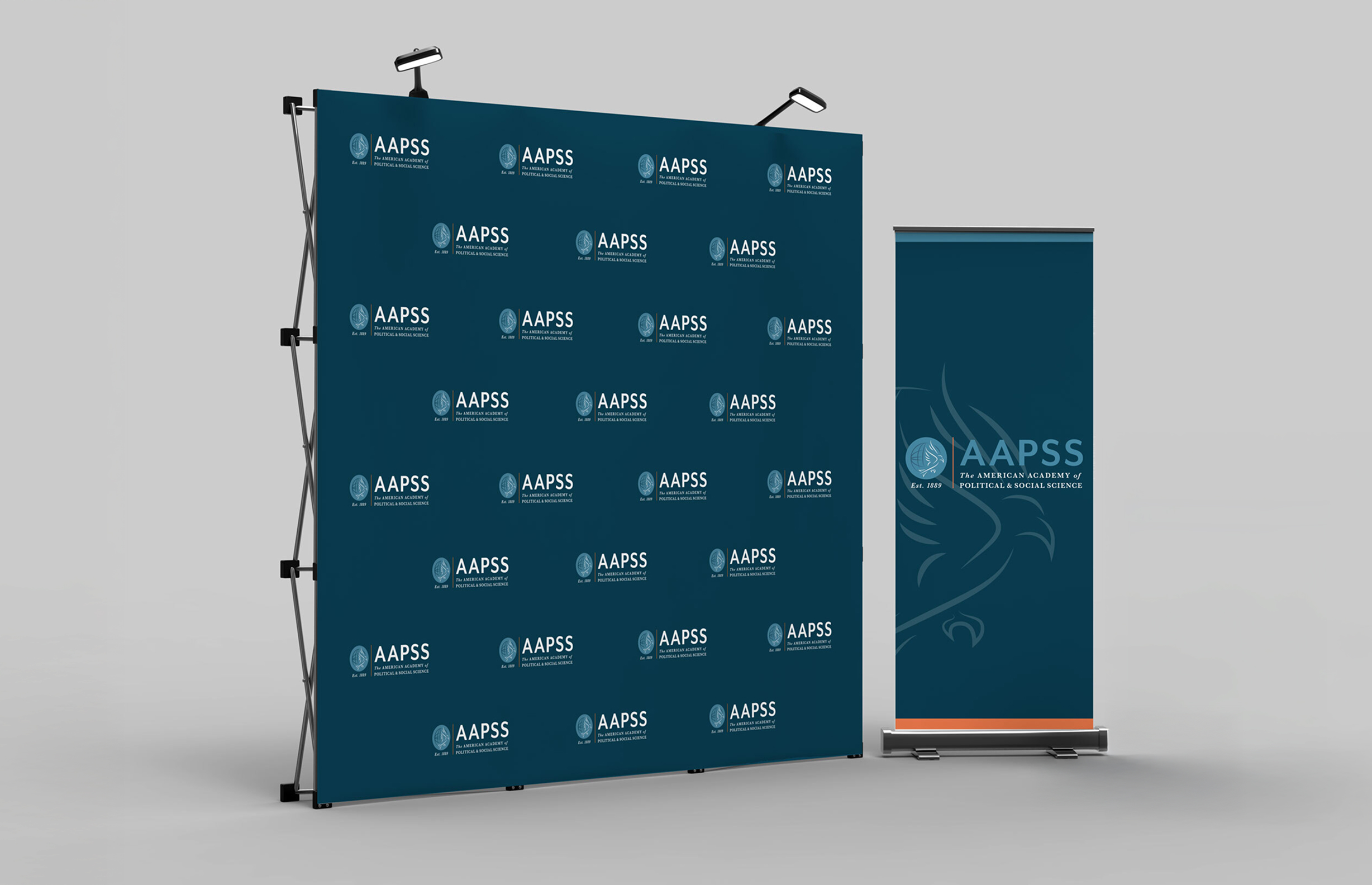
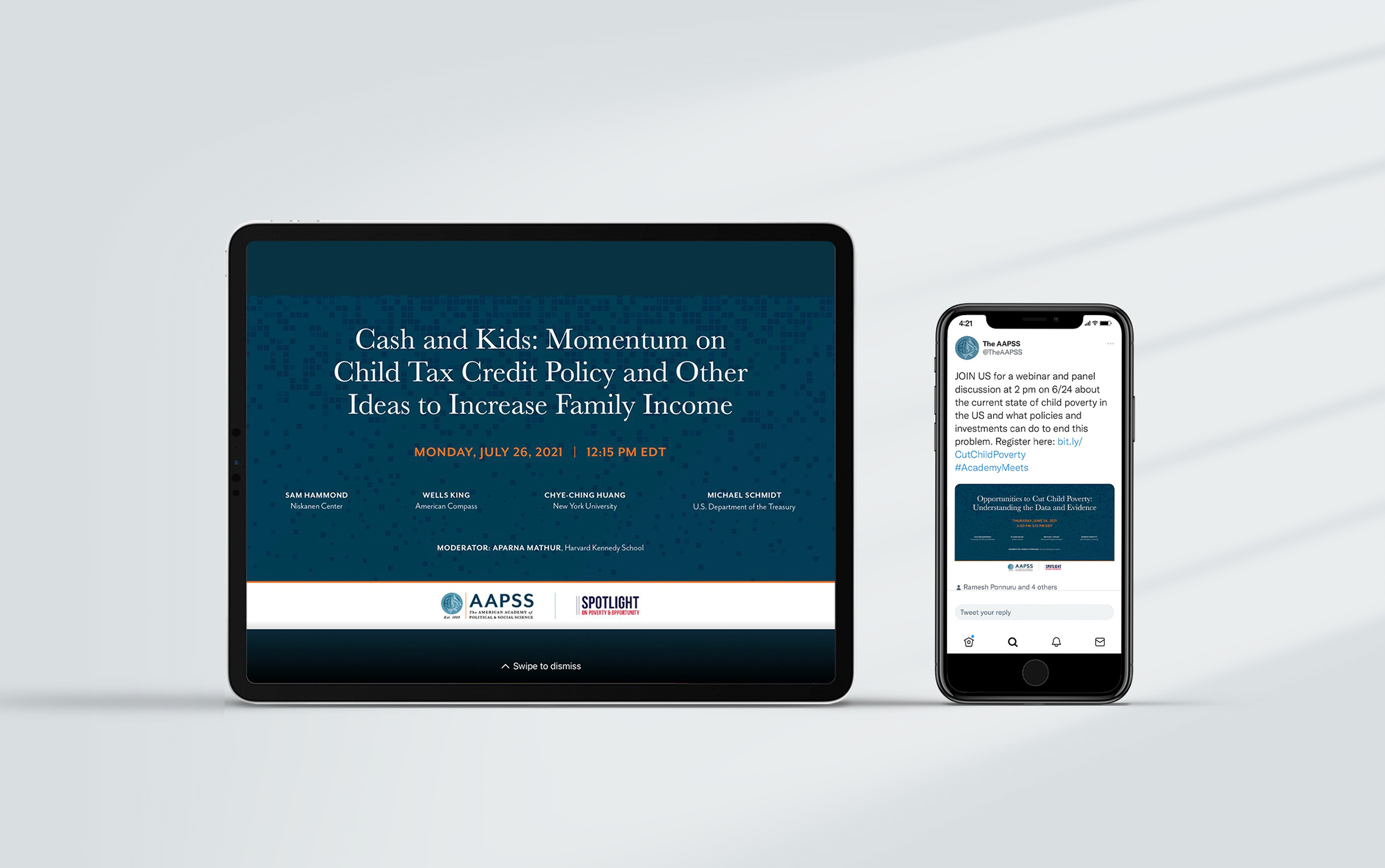
We redesigned the AAPSS identity by preserving what mattered most. The eagle was retained as the central symbol, and the full organizational name remained intact, while the acronym, AAPSS, was elevated as the primary visual identifier. This approach allowed the identity to feel more current without breaking continuity. The system became the foundation for print, event, and program materials, supported by a style guide to ensure consistent use over time.
A visual system designed to evolve thoughtfully, not overwrite institutional history.
Color palette & Typography
Navy
Light Blue
Orange
Black
Baskerville Regular
Baskerville Italic
Challenges & Accommodations
Modernizing without overcorrecting
Updating a brand with roots in the 1800s presented both opportunity and responsibility. The work required careful judgment. The challenge was restraint. The identity needed to move forward without feeling disconnected from its past or overly redesigned. Every decision had to prioritize longevity and repeat use.
Outcomes
A stable foundation that supports ongoing work
The updated identity gave AAPSS a strong, reliable foundation that continues to support the organization years later. With limited internal resources and a wide public reach, consistency became a practical advantage. Each new piece of work builds from the same system, making design decisions easier and reinforcing a cohesive presence across programs, events, and communications.


