Background
For a farm built on integrity and nurtured with intention, a strong logo becomes a signal of trust, story, and stewardship long before a customer ever visits the land.
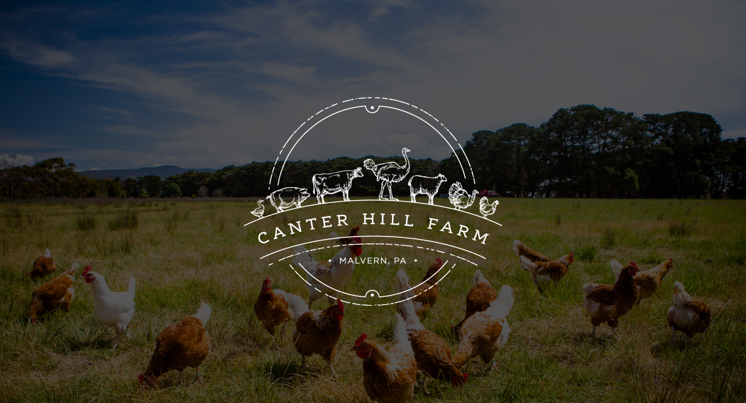
Canter Hill Farm is a family-run farm known for its humane practices and dedication to sustainable agriculture. The owners wanted a logo that represented the diversity of animals raised on the property while expressing craftsmanship, integrity, and connection to the land.
Challenge
Produce an identity that captured the full range of the farm’s animals in a simple, cohesive way. It needed to feel handcrafted yet polished, conveying warmth and tradition while scaling cleanly across formats.
Solution
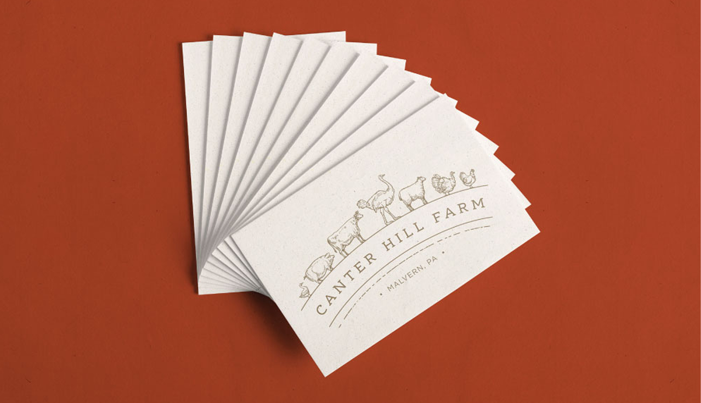
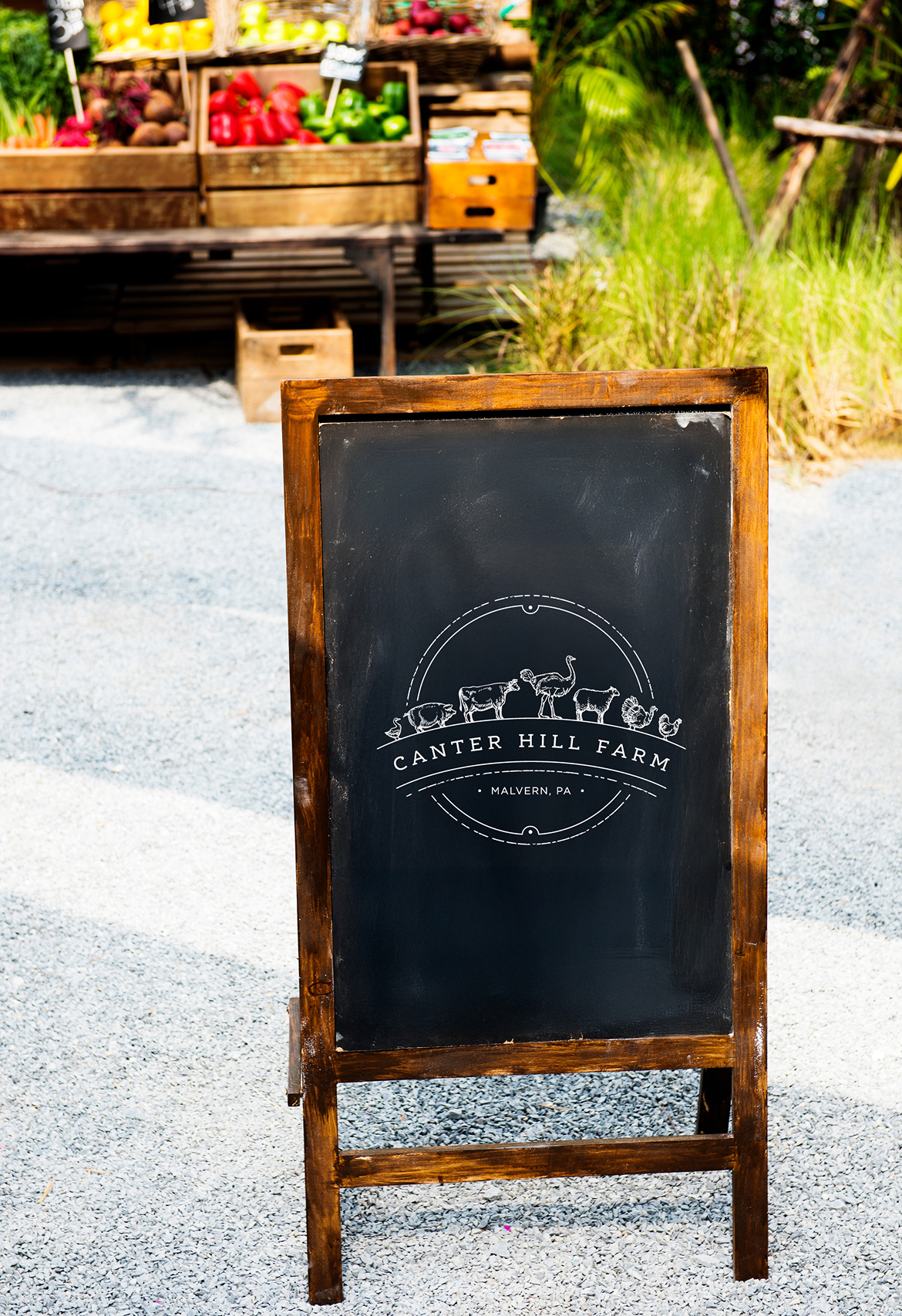
We designed a mark featuring the farm’s animals in profile along a gentle horizon. The fine-line style conveys craftsmanship and clarity, supported by classic typography and a circular frame that make it adaptable across applications.
Results
The visual identity captures the heart of Canter Hill Farm with a look that’s inviting, balanced, and enduring. It translates seamlessly across print and digital formats, reinforcing the farm’s reputation for quality and care.
The Objective
Design a flexible identity that reflected Canter Hill Farm’s abundance and its values of sustainability, care, and community.
The goal was to create a mark that honored the farm’s essence and conveyed its commitment to ethical, high-quality farming through an emblem that could adapt seamlessly across mediums while staying true to its character.
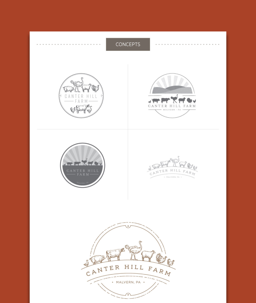
Crafted Composition
A handcrafted identity with heart and harmony
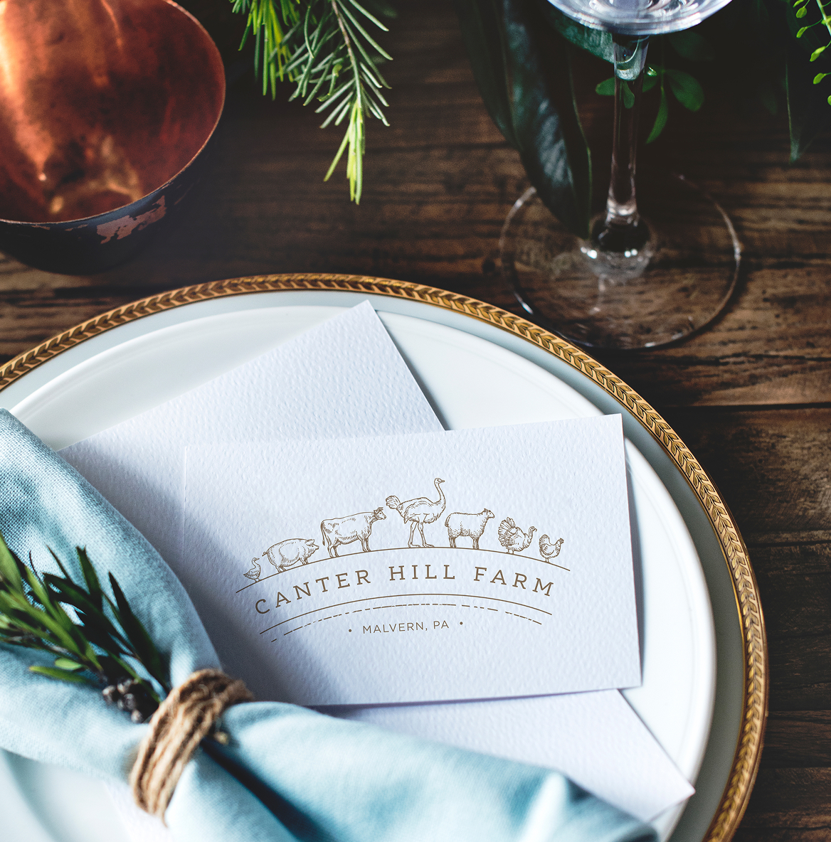
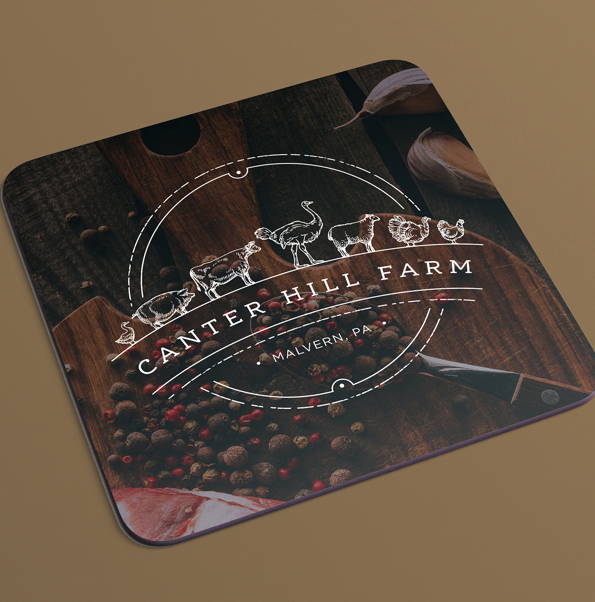
The logo unites each farm animal in a composition that feels grounded and genuine. Clean line work and fine detailing create a sense of rhythm, while the circular frame and serif typography bring refinement and balance. Though the engagement centered on a primary mark, we created several variations for flexible use across print and digital applications. The visual identity reflects the connection between people, animals, and land that defines Canter Hill Farm.
Color Palette
Brown
Red
Dark Green
Light Green
Cream
Challenges & Accommodations
Capturing warmth without excess detail.
We needed to represent multiple animals while maintaining balance and legibility. The final mark uses consistent line weight and thoughtful spacing to create a unified, distinctive identity that performs across all scales and reinforces the farm’s reputation for quality.

Outcomes
A cohesive visual identity rooted in craftsmanship and care.
The final mark gives Canter Hill Farm a distinctive look, combining warmth and simplicity with a refined, handcrafted feel. It endures across every touchpoint, adapting easily to signage, packaging, and digital use, and provides a lasting visual foundation for the farm’s continued growth.


