Background
Children’s Crisis Treatment Center (CCTC) is a nonprofit that serves children and families dealing with trauma, behavioral health challenges, and difficult life circumstances.
Their programming focuses on helping kids build stability and coping skills early in life. CCTC joins forces with community partners, board members, and local supporters to raise the funds needed to sustain and expand these programs.
Because the work is sensitive and deeply human, the way CCTC shows up matters. Their materials need to communicate impact, invite participation, and reflect care and optimism, without minimizing the seriousness of the mission.
Challenge
Communicate sensitive, emotionally complex work in a way that feels hopeful, inviting, and appropriate across fundraising and community settings.
Solution
A flexible design approach that balances warmth and restraint, allowing the mission to show up consistently across reports, events, and communications.
Results
A cohesive set of materials that strengthens engagement, supports fundraising, and evolves alongside the organization’s growing impact.
The Objective
Use design to support fundraising and engagement
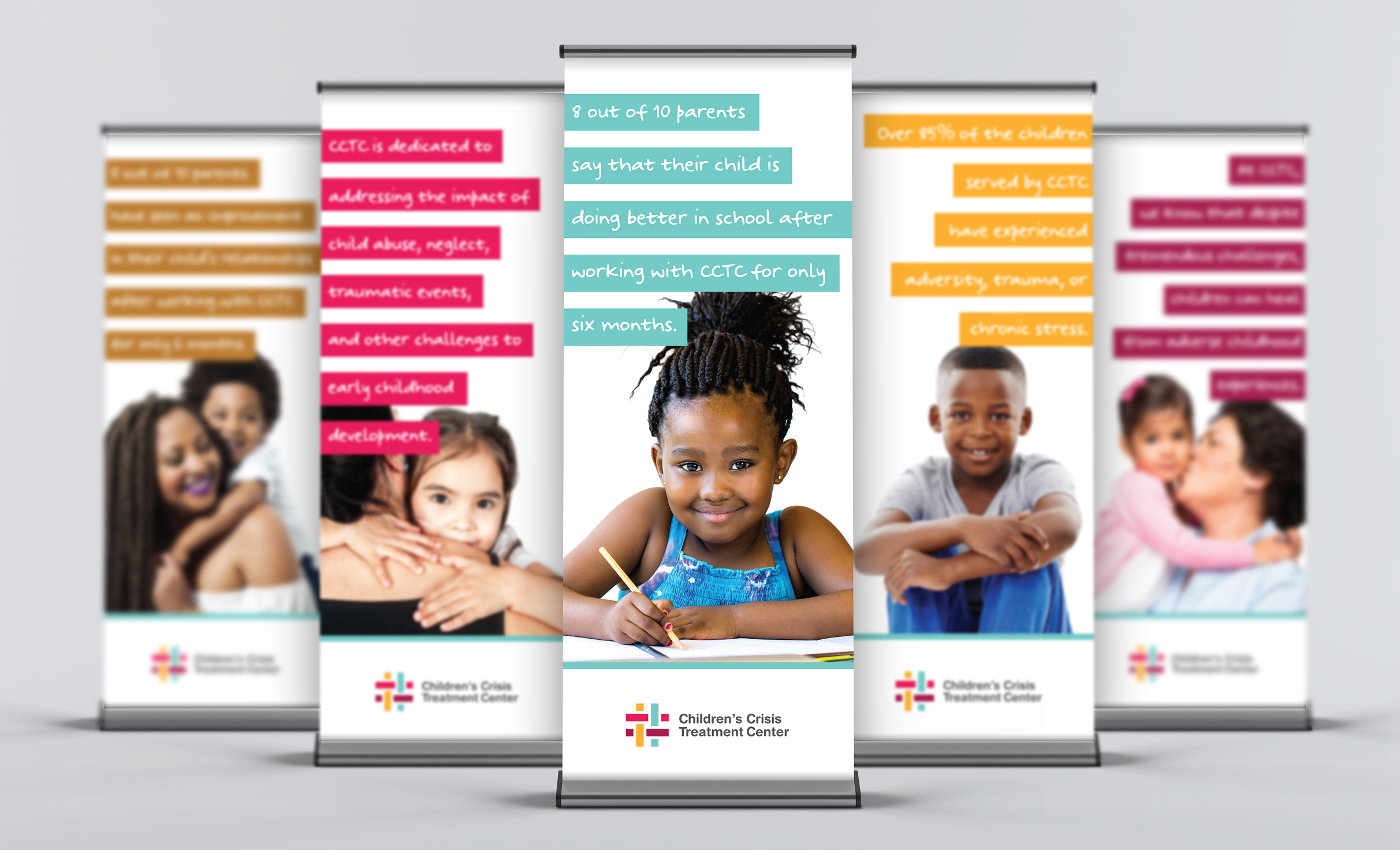
The goal was to create designs that could carry CCTC’s mission across reports, events, and communications. Each piece needed to feel intentional and connected, while still allowing flexibility to evolve year after year, season after season.
Design Solution
Purposeful design across programs and events
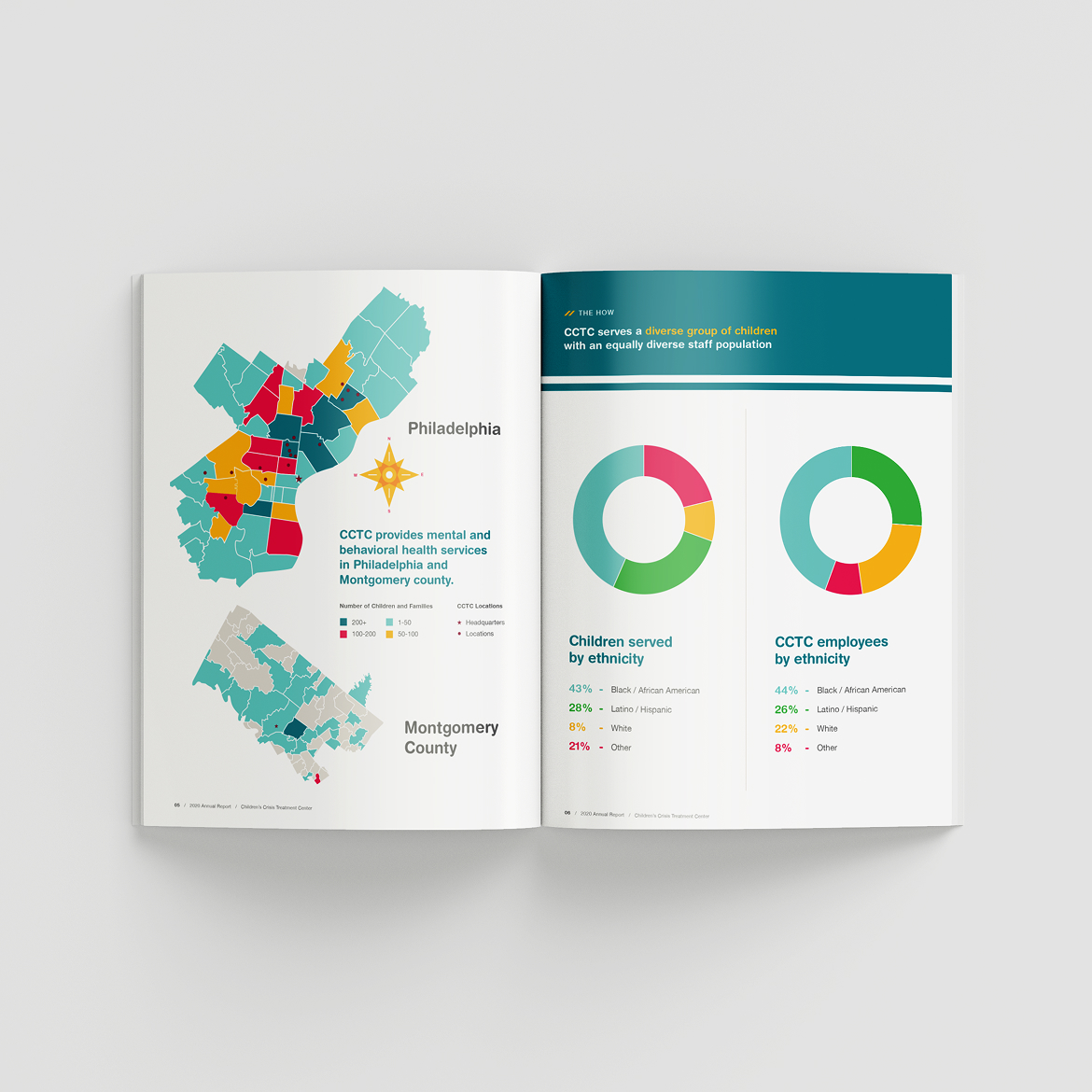
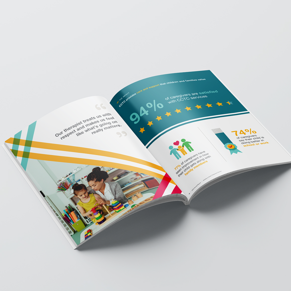
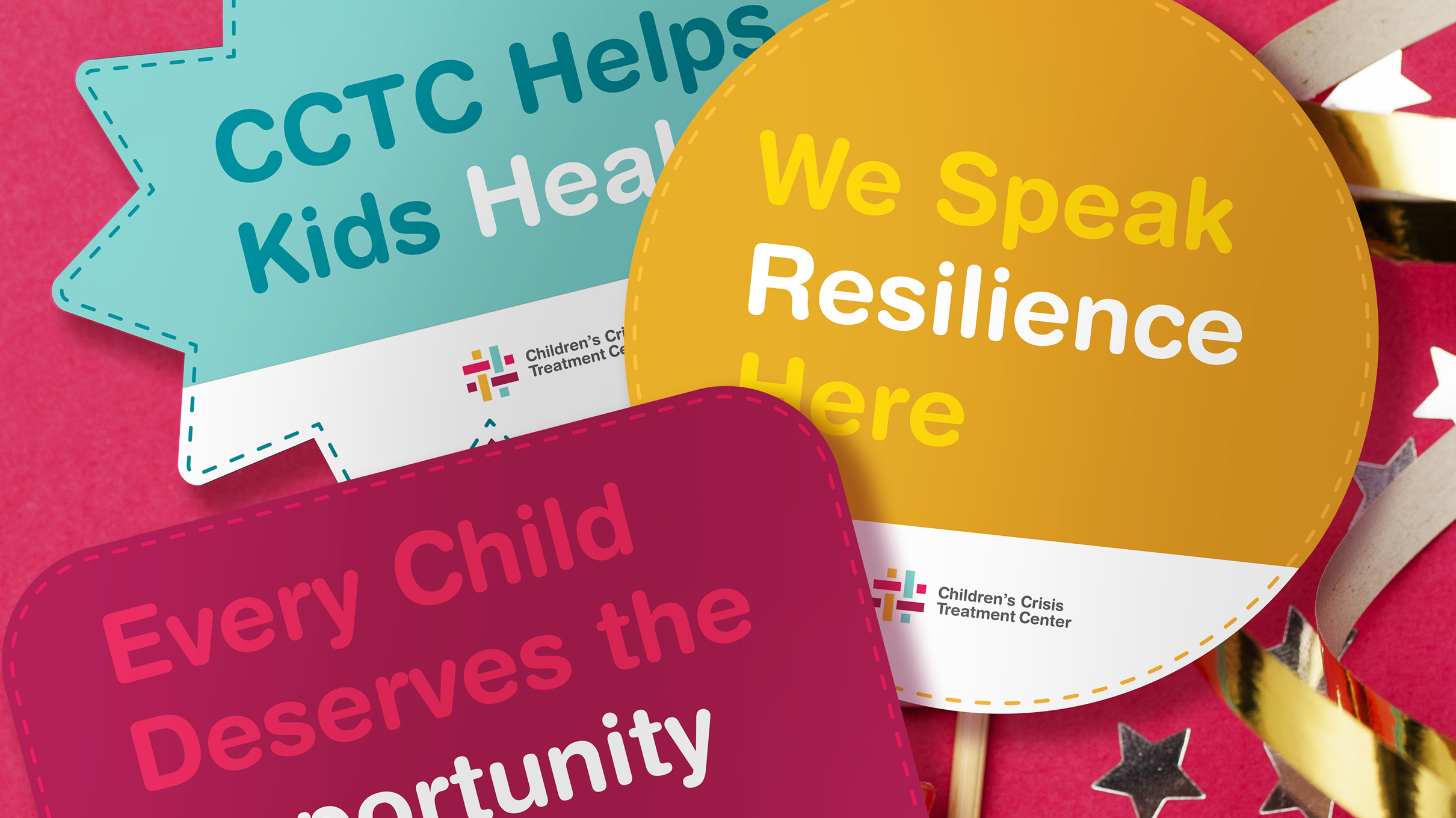
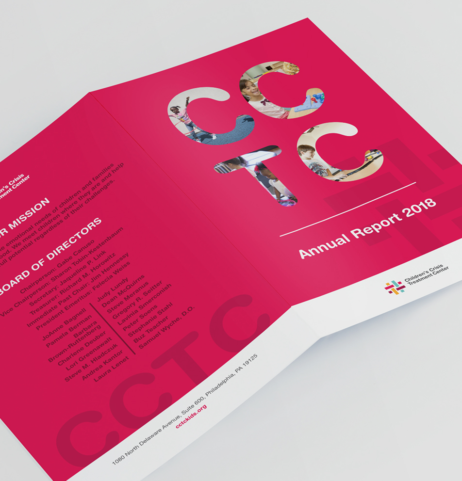
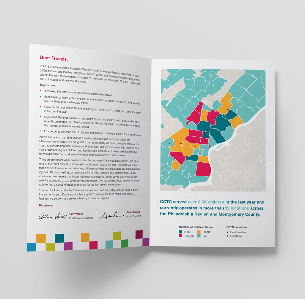
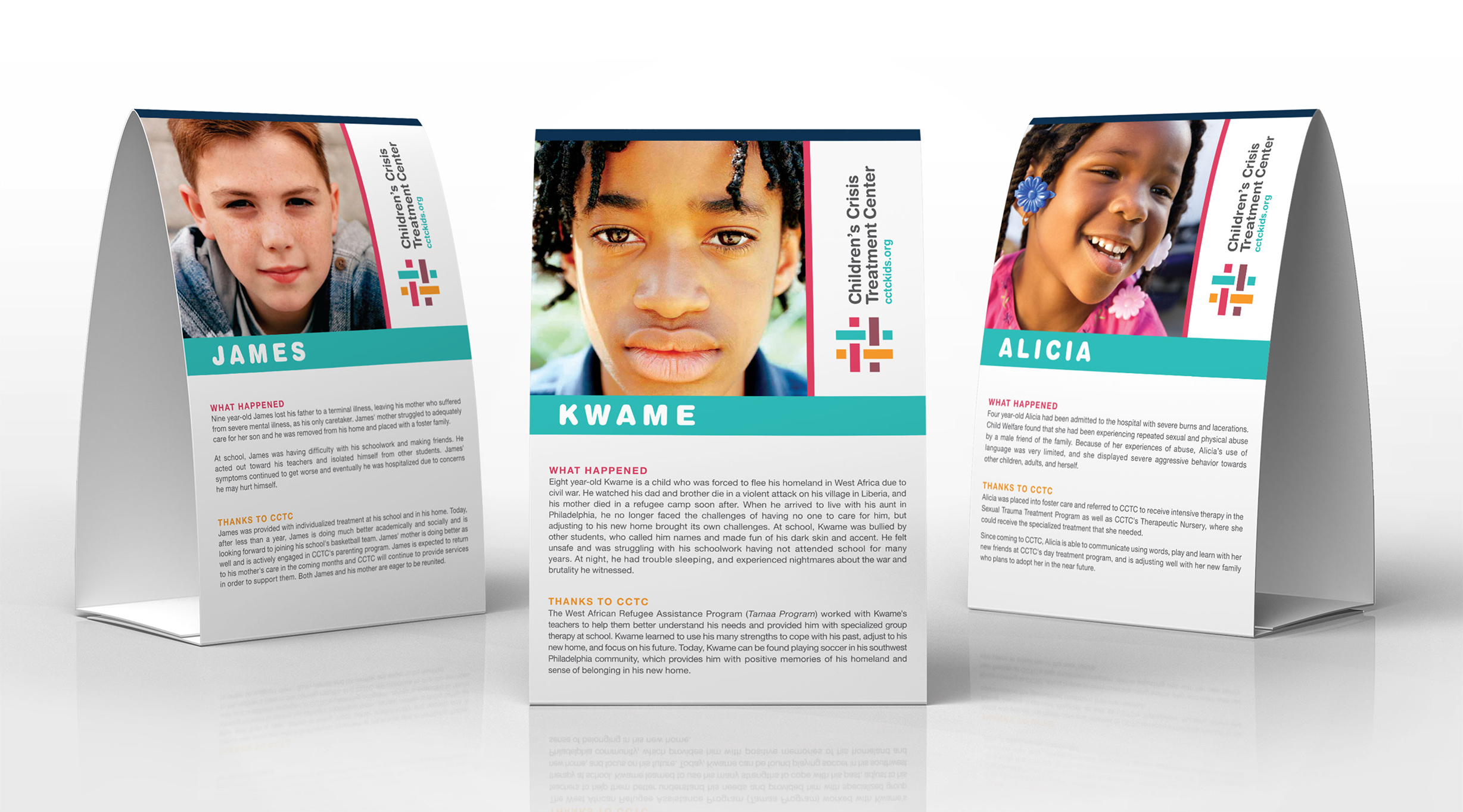
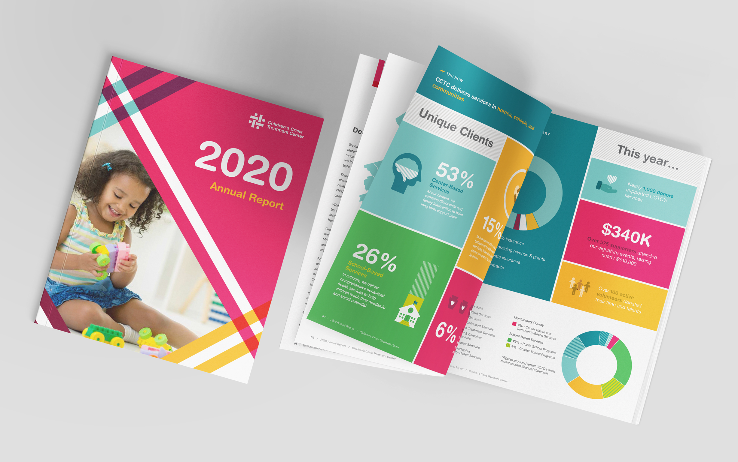
Our effort with CCTC spans a wide range of materials, all created as extensions of the same brand. Annual reports present outcomes and statistics in a way that feels readable and approachable. Event materials, including table tents, signage, traveling banners, and photobooth props, are designed to bring the mission into the physical space for experiential consistency with the brand. Color, typography, and layout choices support a modern, high-design aesthetic that still feels appropriate for the organization’s work.
Color palette & Typography
Blue
Teal
Maroon
Pink
Gold
Yellow
Gray
Cream
Challenges & Accommodations
Designing for sensitive topics while keeping energy and warmth
CCTC’s work involves complex and emotional subject matter. The challenge was to respect that reality while creating materials that felt welcoming and engaging, especially in fundraising and community settings.
Outcomes
A foundation that supports momentum over time
The resulting system gives CCTC a dependable design foundation that continues to grow with the organization. Materials feel fresh and engaging while remaining rooted in the mission, allowing for more ambitious fundraising goals as previous targets are achieved. New initiatives and ideas can build on what already exists, making it easier to evolve programming, communications, and events without losing cohesion.
