Background
The Health Federation of Philadelphia is a public health nonprofit focused on improving access, equity, and outcomes across Philadelphia and beyond.
Its work spans direct services, research, policy, and large-scale initiatives addressing complex health and social issues. These efforts often involve multiple partners, long time horizons, and audiences ranging from community members to clinicians, educators, and policymakers.
We began working with the Health Federation nearly two decades ago and have continued to support the organization as it has grown and evolved. Over time, our work has expanded to include both the Federation’s core identity and a wide range of initiatives operating under its umbrella.
Challenge
Communicating complex public health work that unfolds over time and does not fit into simple narratives.
Solution
Thoughtful design systems and standalone pieces tailored to audience, format, and purpose.
Results
Clear, credible materials that support understanding and long-term trust across initiatives.
The Objective
Support communication across initiatives without losing cohesion
The goal has been to help the Health Federation communicate serious, nuanced work in ways that feel approachable and credible. Each initiative needed the flexibility to speak to its own audience, while still benefiting from a shared level of design quality and intention across the organization.
Design Solution
System-based and standalone design support
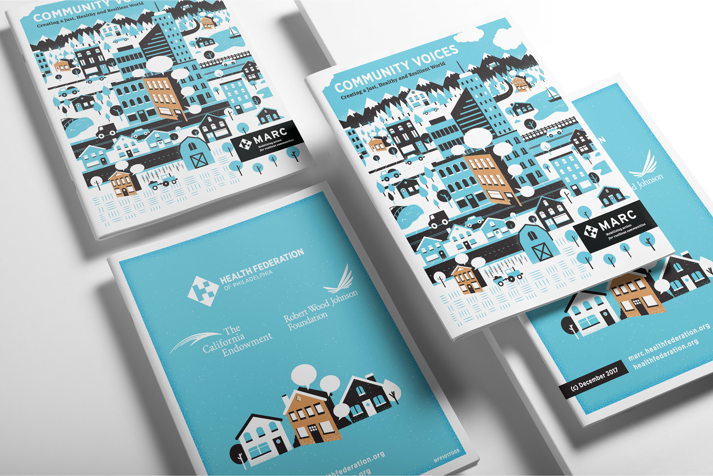
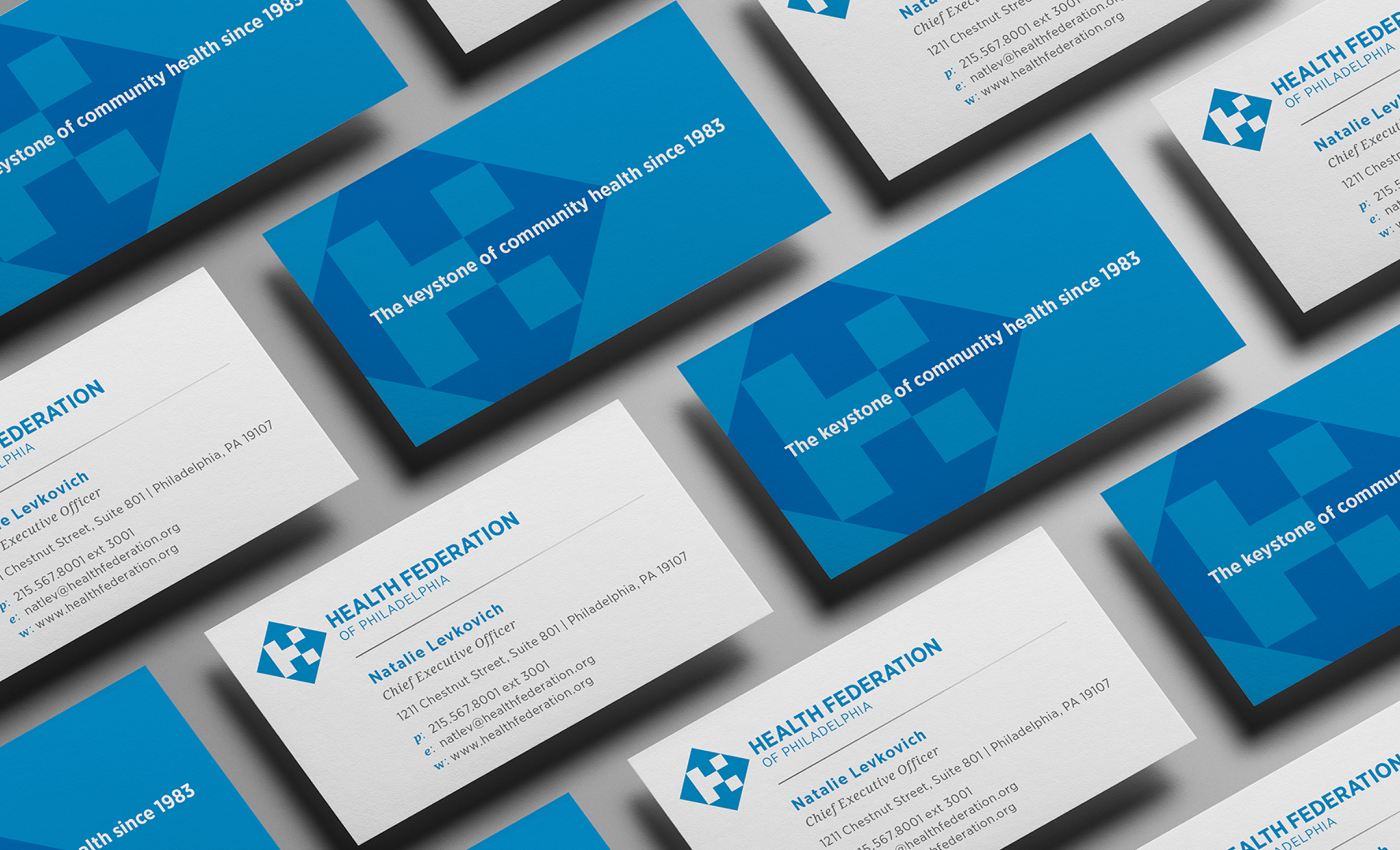
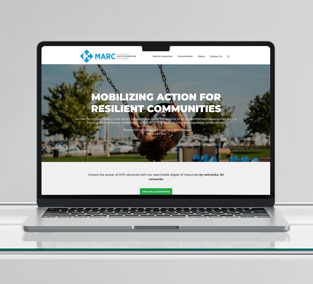
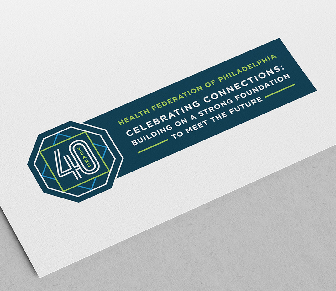
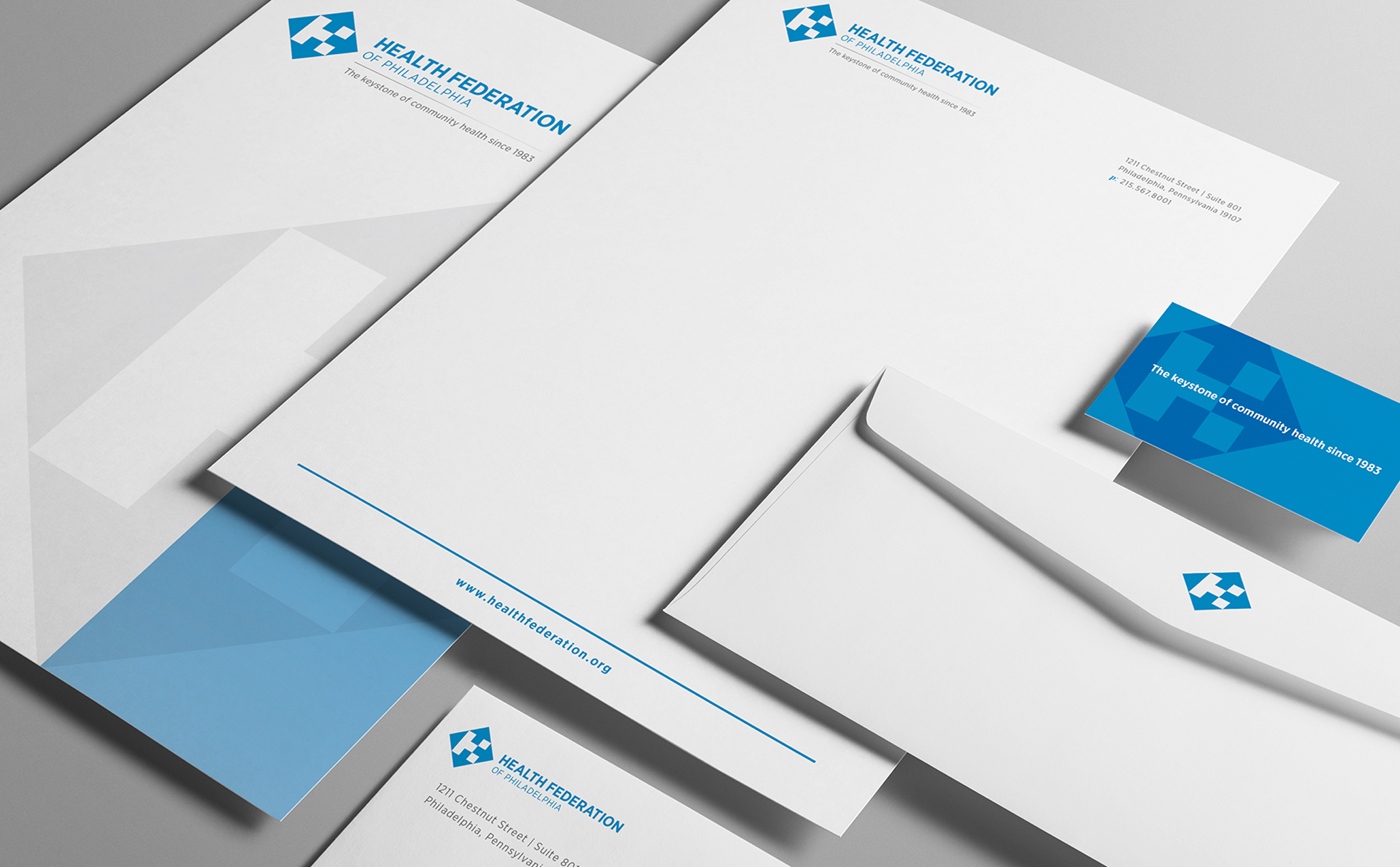
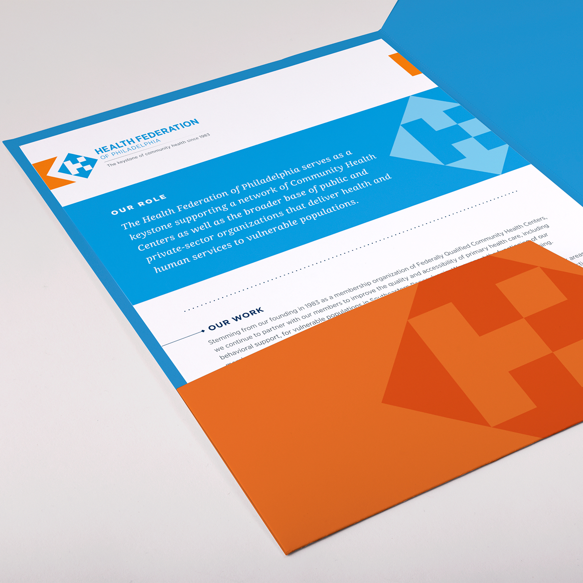
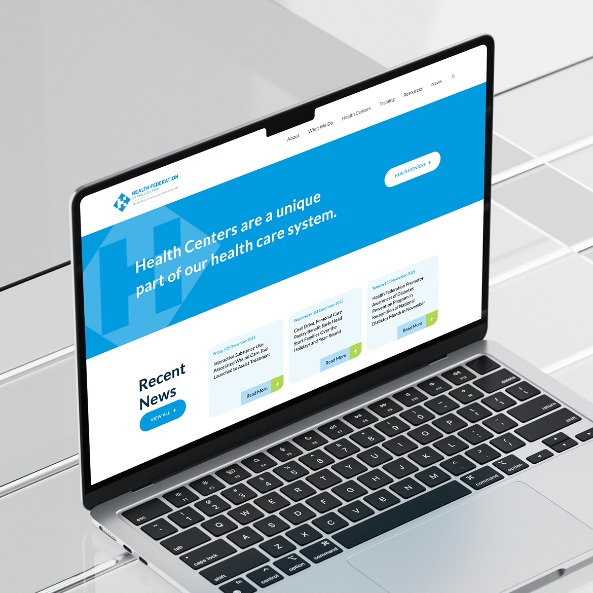
Our work with the Health Federation includes a complete organizational rebrand as well as design support for numerous initiatives, some closely connected to the parent brand and others designed to stand on their own. We have created logos and sub-logos, websites and microsites, pamphlets and booklets, illustrated covers, conference materials, and custom artwork. Each piece is designed to suit its specific context, while maintaining a consistent level of craft, clarity, and visual credibility across the broader body of work.
Color Palette
Navy
Blue
Orange
Green
Gray
Challenges & Accommodations
Designing for sensitivity, tone, and long-term relevance
The work often addresses sensitive public health topics that involve real people, real consequences, and long-term impact. The challenge was designing materials that could communicate seriousness and care while still engaging diverse audiences across different initiatives. Each piece had to strike the right emotional tone for its specific program and remain appropriate as the work continued to develop and reach new communities.
Outcomes
Materials designed to last and communicate with care
The work resulted in materials that remain relevant over time while allowing each program to express the appropriate tone and emotion. Across initiatives, the design helps communicate serious and sensitive topics with intention and respect. Each piece supports understanding and trust, ensuring that complex public health issues are presented thoughtfully to the community and to broader audiences, while maintaining the credibility expected of work with lasting impact.
