Background
A vision from a single food truck to a full-scale catering brand.
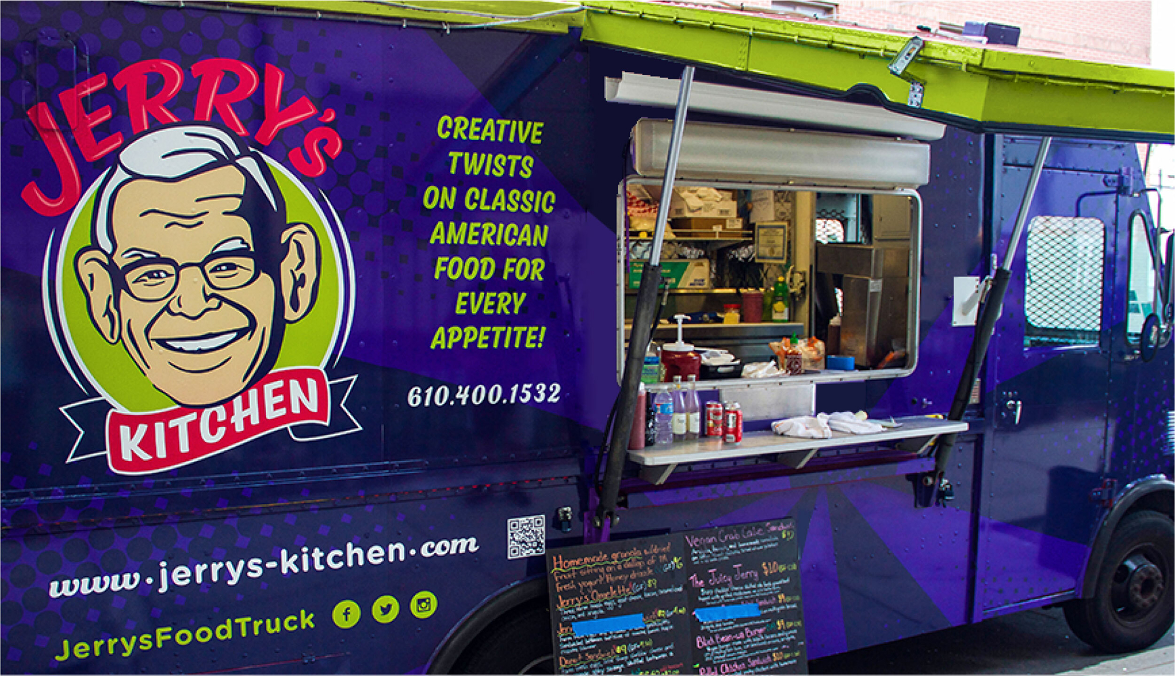
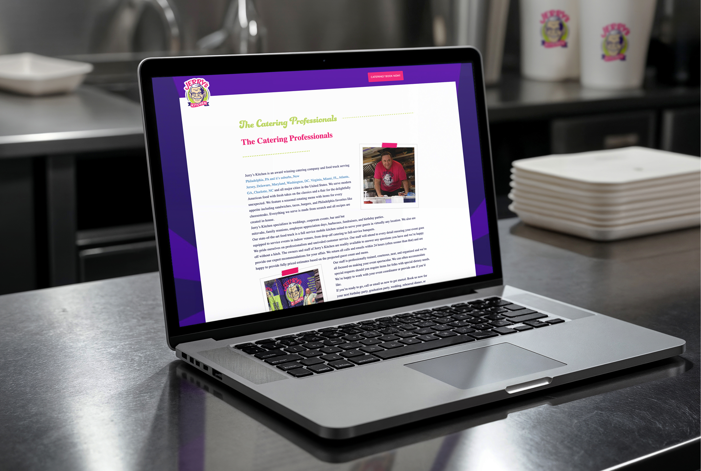
Named in tribute to the founder’s grandfather, Jerry’s Kitchen began as a neighborhood food truck serving creative spins on American comfort food. Although it was a new business at the time, the founder already had his eye on expansion into catering down the road, and wanted to set the wheels in motion for a flexible branding initiative that could serve as the foundation for his future vision. We helped shape the brand from its inception, creating the original identity and supporting its evolution as the company expanded.
Challenge
Design a brand that could stand out immediately while still having room to grow. The brand needed to convey personality, trust, and scale from day one.
Solution
We built a bold, scalable brand anchored by an illustrated logo inspired by the founder’s grandfather, with clean typography and a flexible design system that could perform consistently and confidently across every platform.
Results
The visual identity helped Jerry’s Kitchen build recognition quickly and establish credibility in competitive markets. The brand continues to serve as a flexible, lasting foundation as the company’s catering footprint expands.
The Objective
Create a standout identity for a new business built on family and flavor.
The goal was to design something bold, flavorful, and personal, reflecting both the food and the family story behind it. We also wanted to develop a system that could evolve with the company, maintaining its personal story while giving it a professional, cohesive presence across every touchpoint.
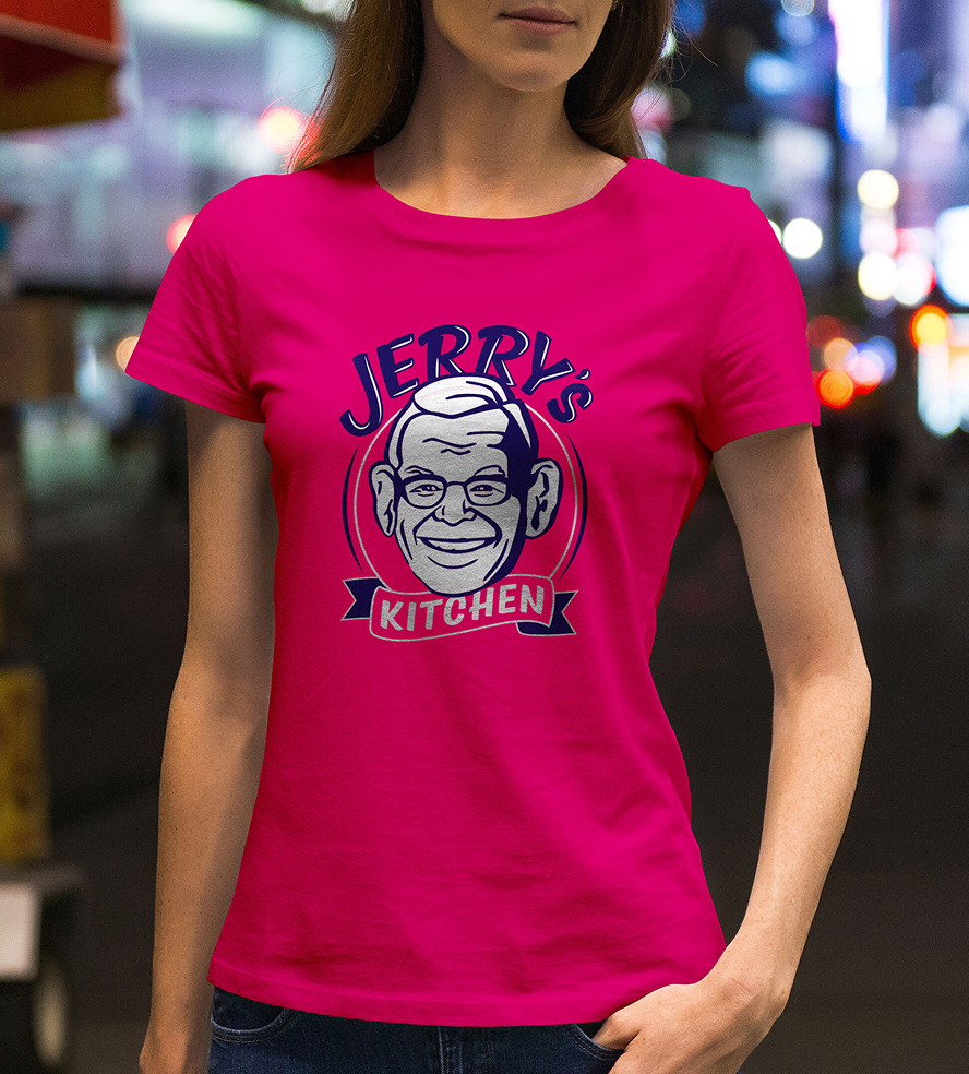

Iconic Character
A face that tells a story
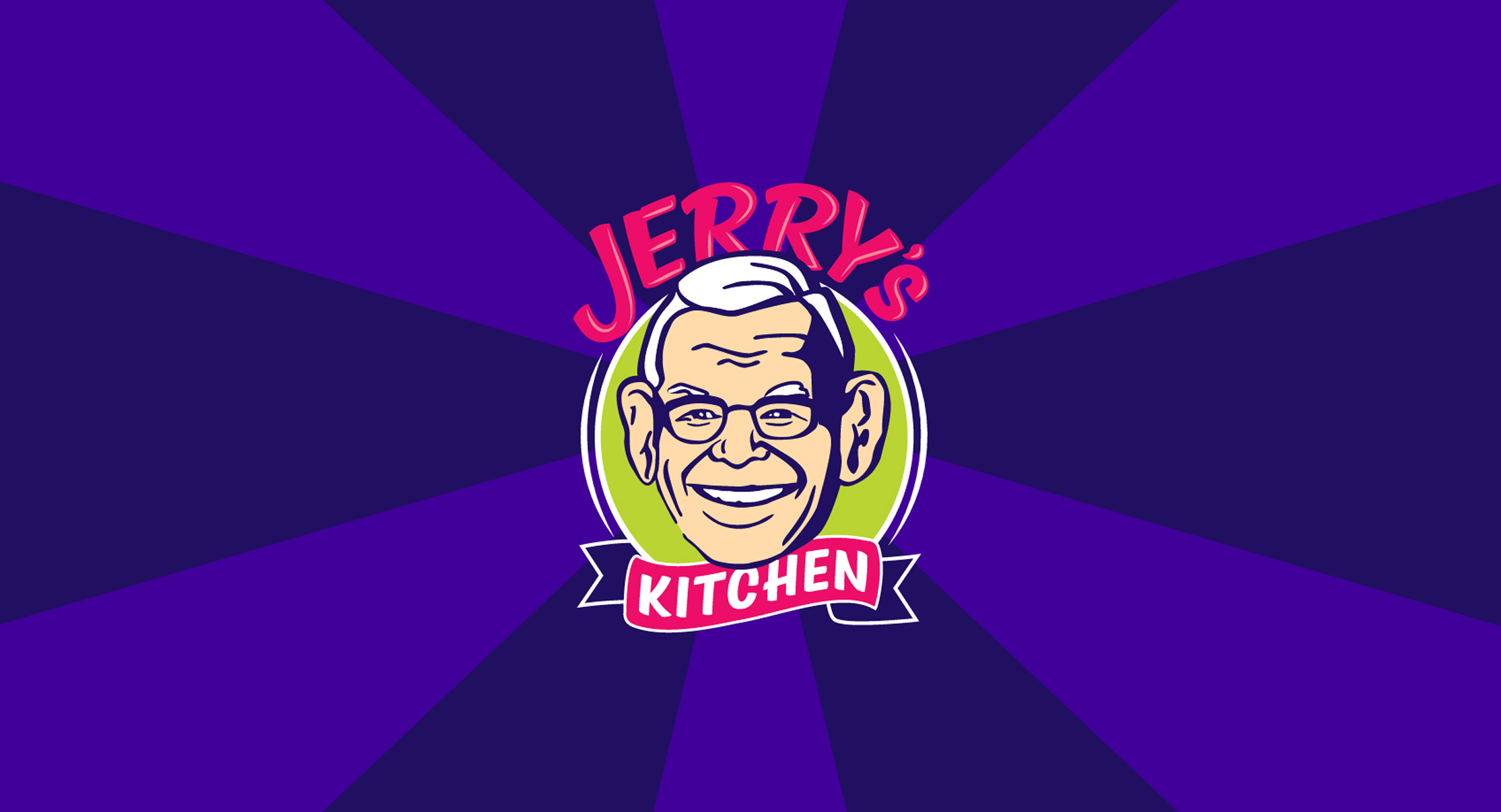
The illustrated logo, modeled after the founder’s grandfather, gives Jerry’s Kitchen an instantly recognizable character. Expressive line work and balanced detail bring warmth and approachability, while the bold color palette and clean typography add energy and confidence. The design embodies the company’s spirit—friendly, flavorful, and full of life.
Color palette
Dark Purple
Light Purple
Pink
Green
White
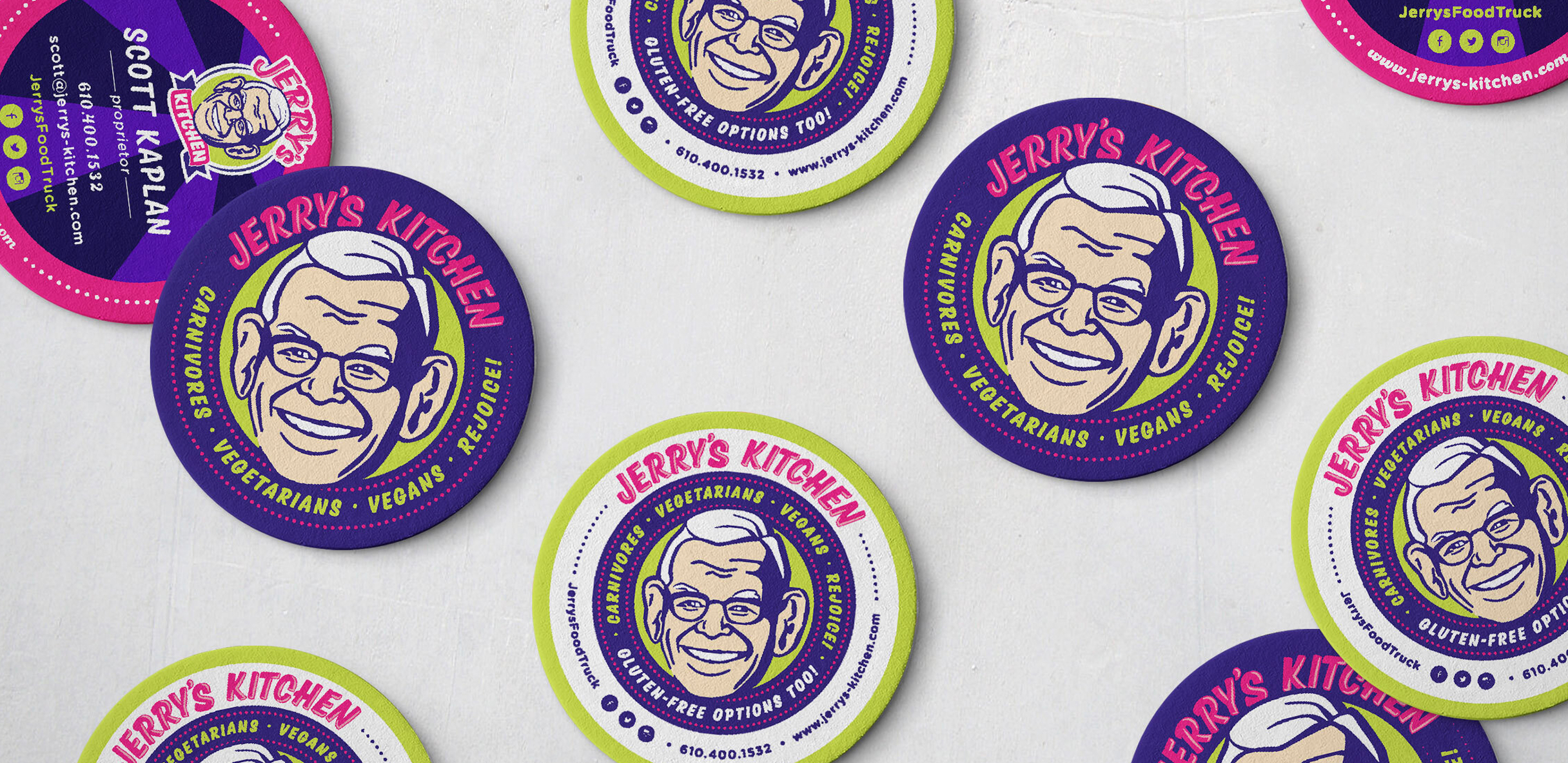
Challenges & Accommodations
Bringing a new culinary brand to life in short order.
The challenge was to introduce a new concept to the market with a visual identity that could build instant recognition, grow over time, and appeal to both individual and corporate audiences. It took thoughtful strategy to craft an homage to the founder’s grandfather that layered meaning, memory, and visual flavor into a brand that feels both personal and appetizing.
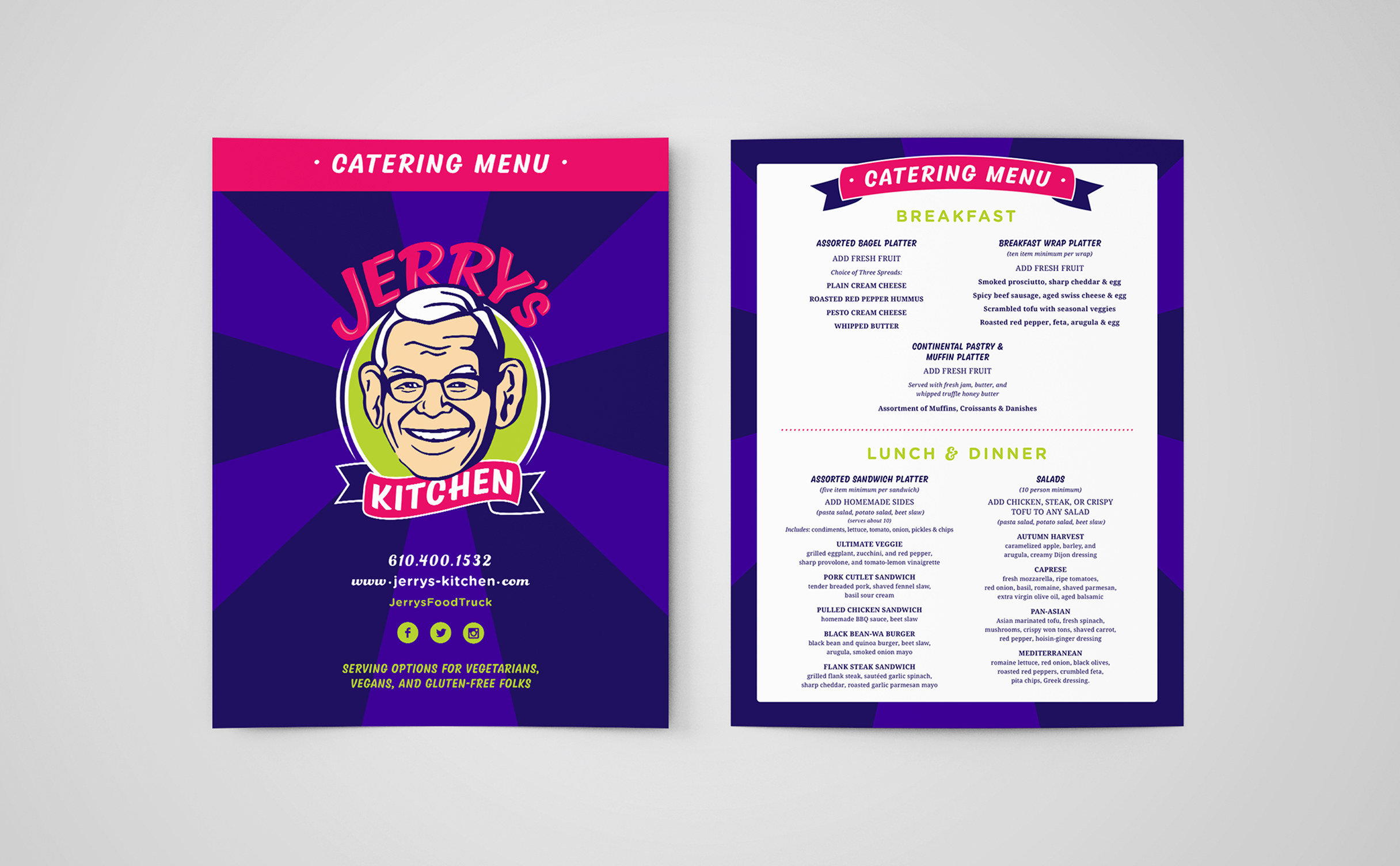
Outcomes
A thriving brand built on story, flavor, and growth.
Jerry’s Kitchen now has a cohesive visual system that tells its story with confidence. And as the brand gained recognition with stronger SEO, higher conversions, and a wider client base, the business was able to move into large-scale catering for film sets, concerts, corporate events, and construction projects. Through it all, the brand stays rooted in family heritage while powering the company’s rise as a sought-after name for catering at every scale.


