Background
Launching a modern eye care practice needs a brand and website rooted in clarity, compassion, and connection.
Lee Vision Associates approached us in 2020, following the onset of the Covid-19 pandemic. Dr. Lee chose to step away from the pace of large ophthalmology groups to deliver the kind of personalized, high-touch care he felt patients deserved. As a brand-new private practice, Lee Vision needed everything—from visual identity to website to in-office materials—to reflect a more human, attentive, technology-forward approach to eye care. The practice serves patients of all ages, so the brand needed to feel warm and approachable while communicating credibility, precision, and modern clinical expertise.
Challenge
Coordinate a full brand launch while adapting to shifting timelines and Covid-era constraints.
Solution
A calm, modern brand built around clarity, soothing color, and custom imagery.
Results
A welcoming, professional identity and digital presence that positioned Lee Vision for a successful opening.
The Objective
Establish a cohesive brand system that communicates expertise with warmth and clarity
The goal was to create an identity and website that immediately conveyed Lee Vision’s balance of compassion and advanced care. The visual expression needed to feel welcoming yet reassuring and professional for patients of all ages, and especially for those seeking specialized ophthalmic services. The mark also needed to visually indicate the focus of their business.
Design Solution
A soothing visual system anchored by custom photography and clean design
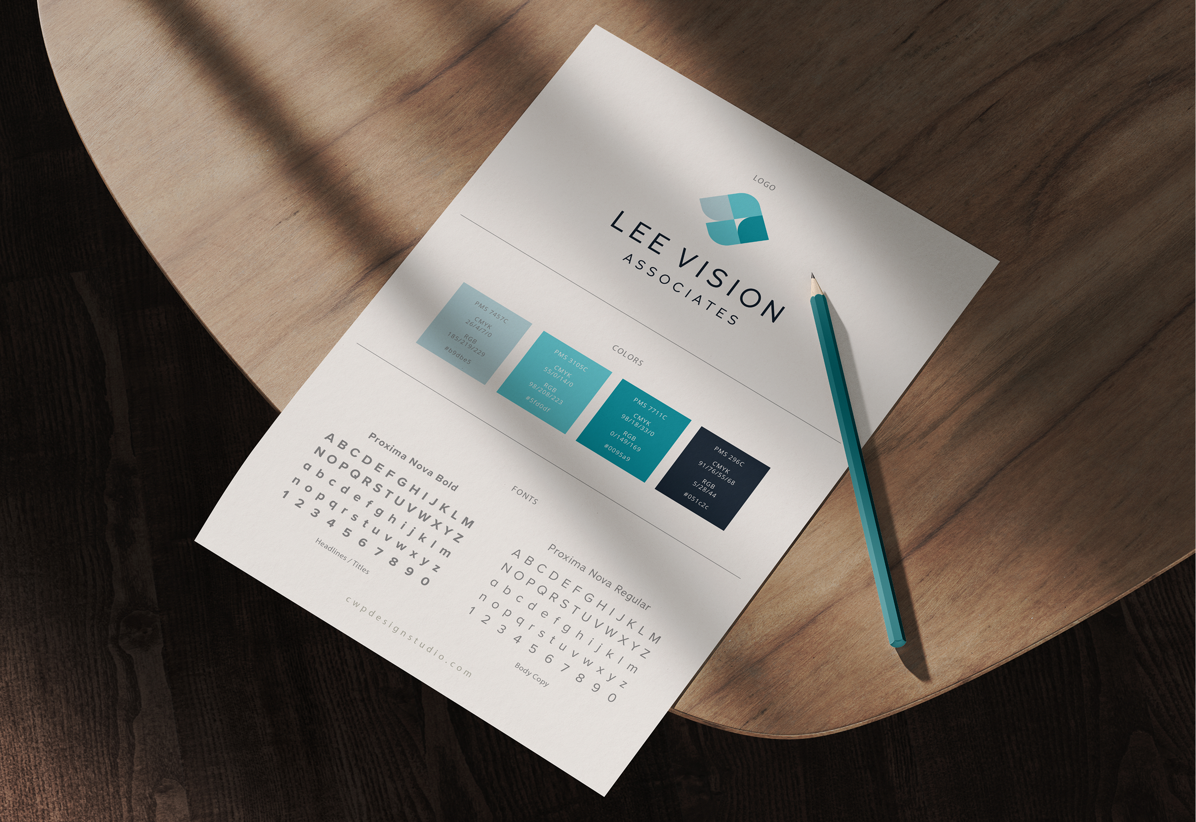
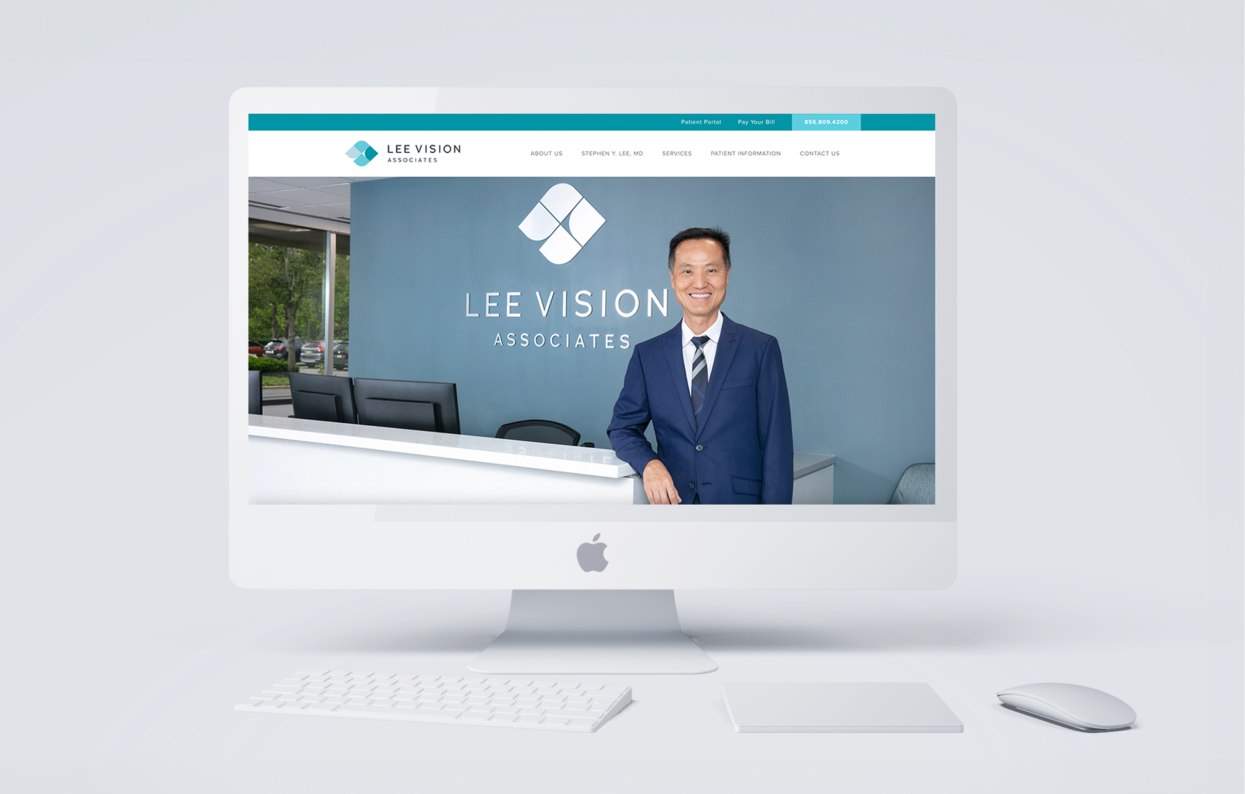
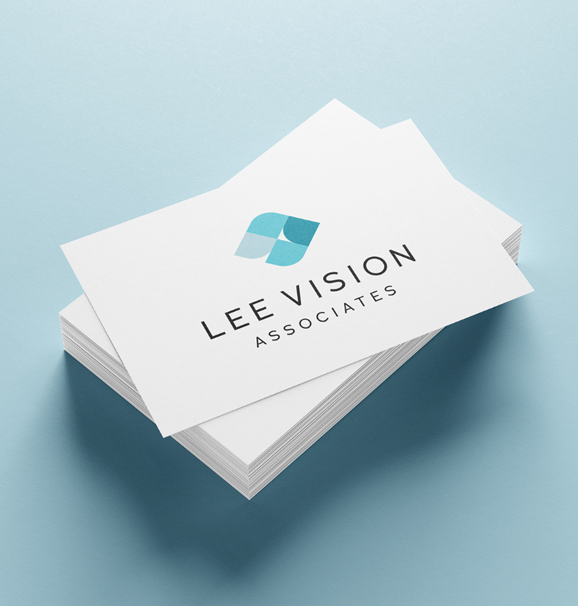
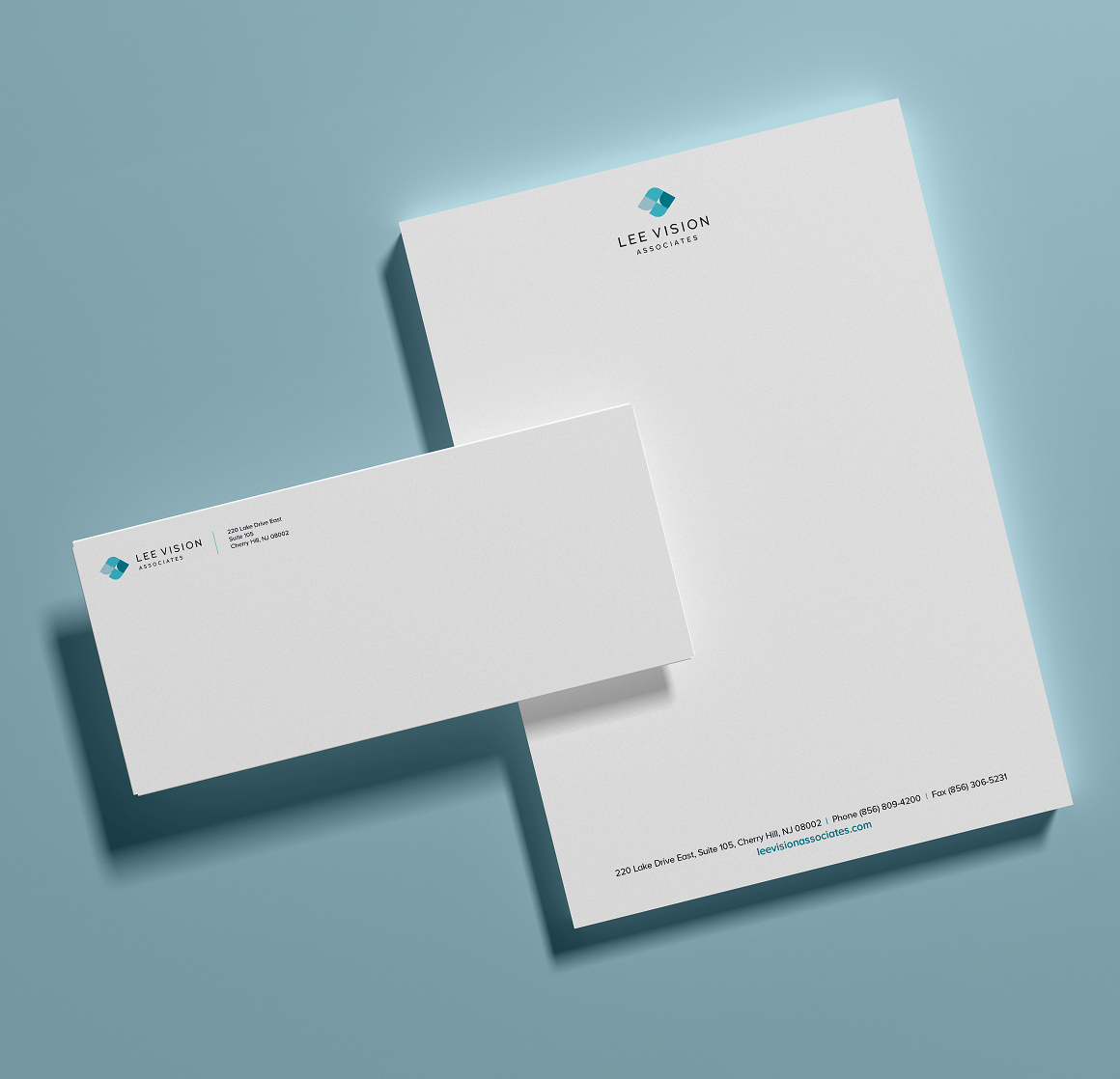
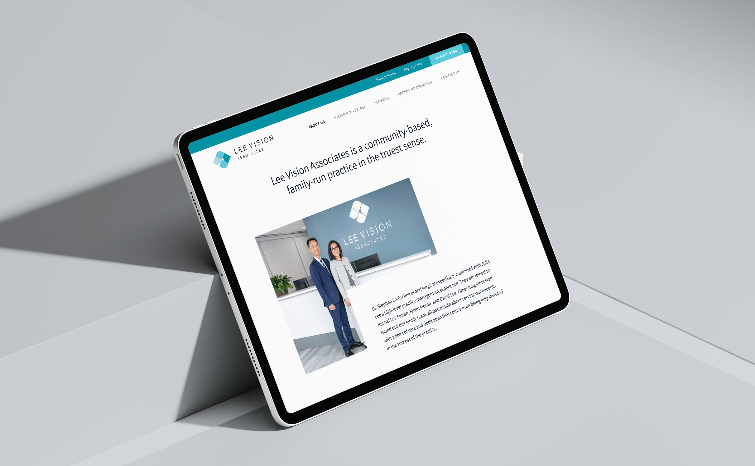
For this unique audience seeking vision care, we created a design system built on easy-to-read sans-serif fonts, ample white space, and a color palette of muted blueish teals to convey calming vibes. We crafted a sophisticated mark that symbolizes frames of vision that come together in the shape of an eye. The website balances depth of expertise and clinical information with the warmth of this family-run practice. Professional photography plays a key role, showing real interactions, the practice environment, and the advanced equipment that sets Lee Vision apart. The final website experience is bright, clean, and highly approachable.
Color palette & Typography
Navy
Blue
Bright Blue
Pale Blue
Assistant Extra Bold
Assistant Semi Bold
Assistant Regular
Challenges & Accommodations
Navigating timing and coordination during an unpredictable launch period.
As a new practice preparing to open its doors, Lee Vision was developing its brand and digital presence during a period of broader logistical uncertainty. External conditions introduced shifting timelines, with Covid-19 adding layers of complexity around scheduling and coordination, including delays in custom photography that was central to the website’s final look. The challenge was maintaining momentum and alignment across all deliverables so everything could come together seamlessly once conditions allowed.
Outcomes
A polished, credible identity that helped Lee Vision open with confidence and connection.
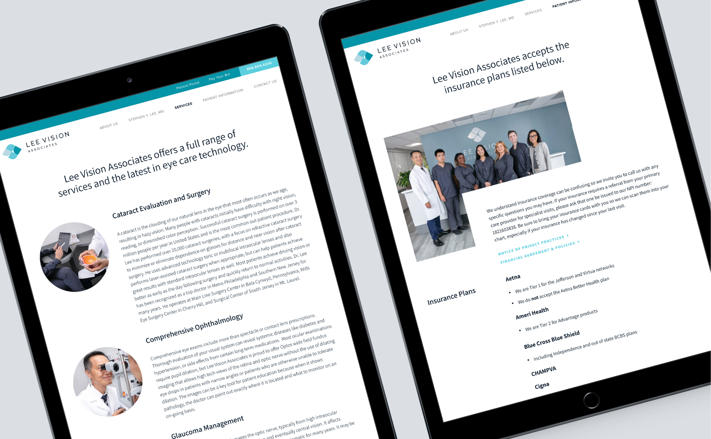
With a cohesive brand system in place, Lee Vision was able to launch with a professional presence that immediately conveyed trust and care. The website feels elevated yet warm, offering insight on expertise, services and technology, and the practice’s patient-focused philosophy without overwhelming visitors. The practice opened its doors with a full suite of brand assets and a clear digital identity designed to connect with its patient community.

