Background
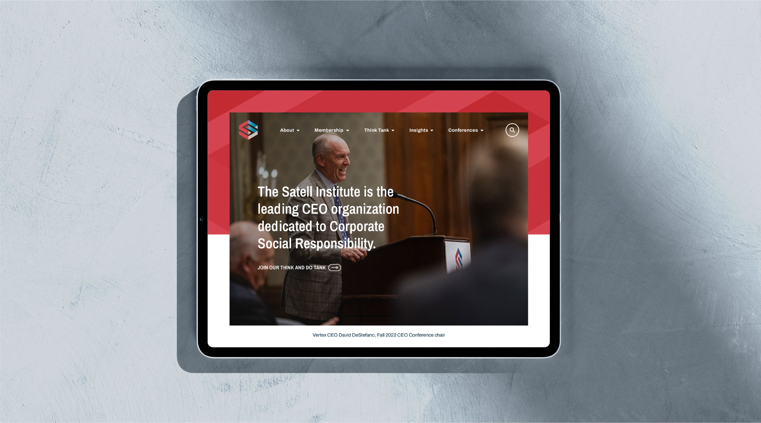
Piecemeal expansion of a website can backfire when the resulting site lacks cohesion. A strategic redesign means the difference between hodgepodge and hierarchy.
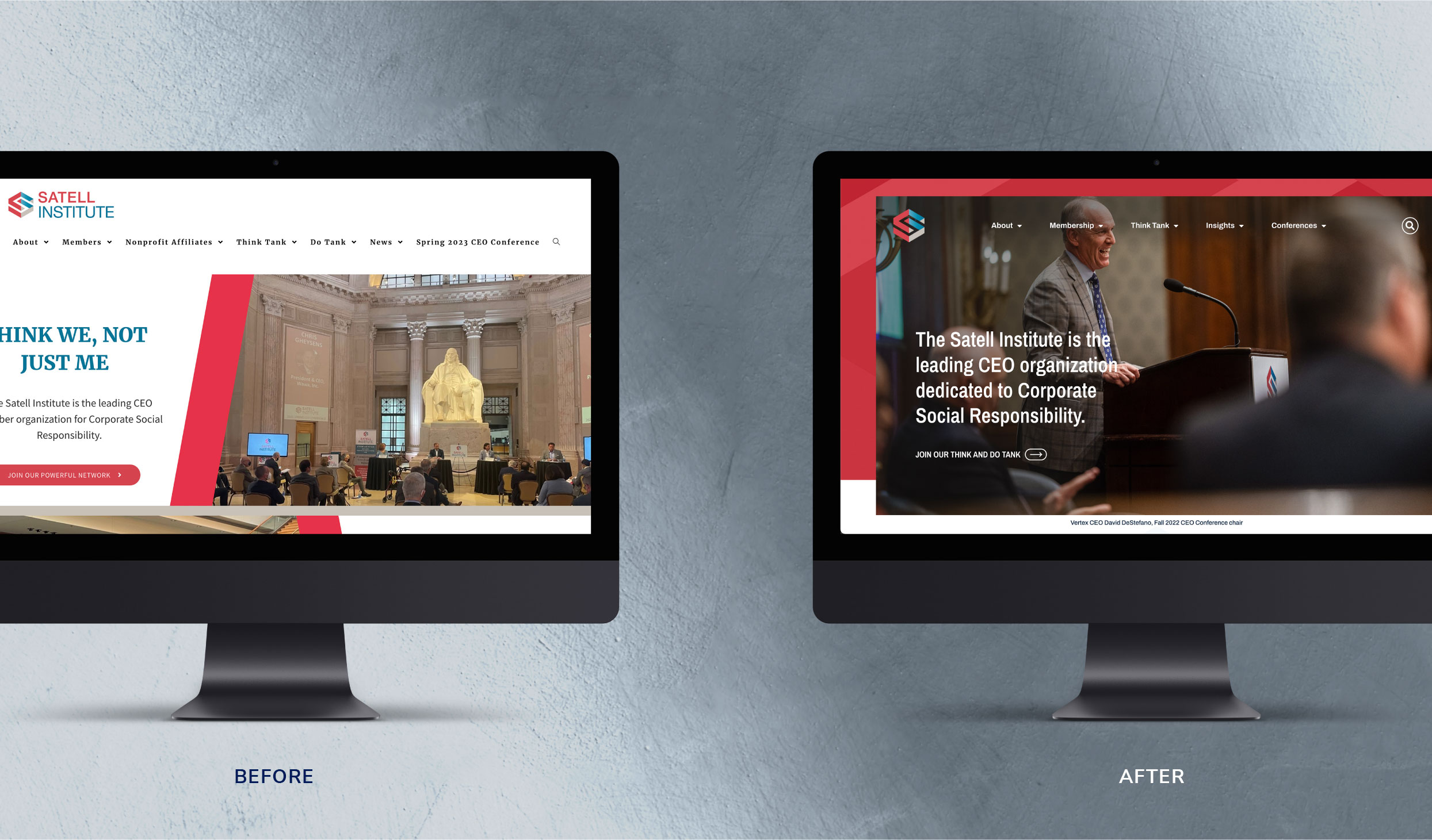
The Satell Institute is the leading CEO member organization dedicated to Corporate Social Responsibility (CSR). The website created during the organization’s infancy stage had become outdated, suffered from competing design elements, and the content lacked structure. As the Satell Institute grew, new content was added to the site without a thoughtful hierarchy or strategic game plan. A refresh was needed to better align with the organization’s current state and future vision, with a modern look and feel.
Challenge
Reimagine the website with clear structure and purposeful design elements in order to attract a multigenerational audience of leaders looking to build better communities.
Solution
A design based on strategy, with thoughtful organization, intuitive navigation, and inclusive color scheme, font choices, and imagery. Ensure responsive design and performance optimization.
Results
An easy-to-navigate interface with visually appealing and accessible styling for users of all ages. Enhanced user experience with improved speed and performance across a range of devices.
Through the Satell Institute, members have committed more than $50,000,000 to their chosen nonprofit partners.
The Objective
Overhaul the website to better align with organizational goals
The goals of the redesign were to: 1) reinforce the Satell Institute as a powerful Think and Do Tank and positively impact the national conversation on CSR, and 2) inspire membership growth and retention in order to foster stronger communities and healthier businesses.
Design solution
Focus on clarity, accessibility, and inclusion
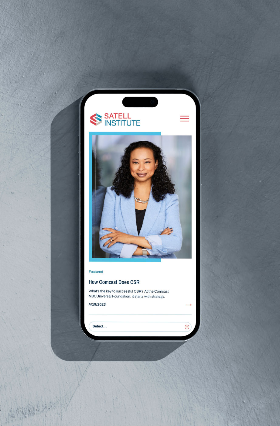
With intuitive navigation and structure, the menu bar clearly displays important sections, allowing users of all generations to quickly find the information they need. Content and imagery are purposefully placed within the site to appeal to any reader, whether they prefer bits of concise information or appreciate more details. The website’s color palette and typography have been carefully chosen to promote clear text and color contrast, enabling greater readability for people across the age spectrum and with potential visual challenges. Custom photography was incorporated with an eye toward diversity and inclusion so that imagery felt relatable across different age groups, genders, and backgrounds.
Blending modern and accessible design principles with revamped content creates a credible and inspiring digital platform for this Think and Do Tank to help change the world.
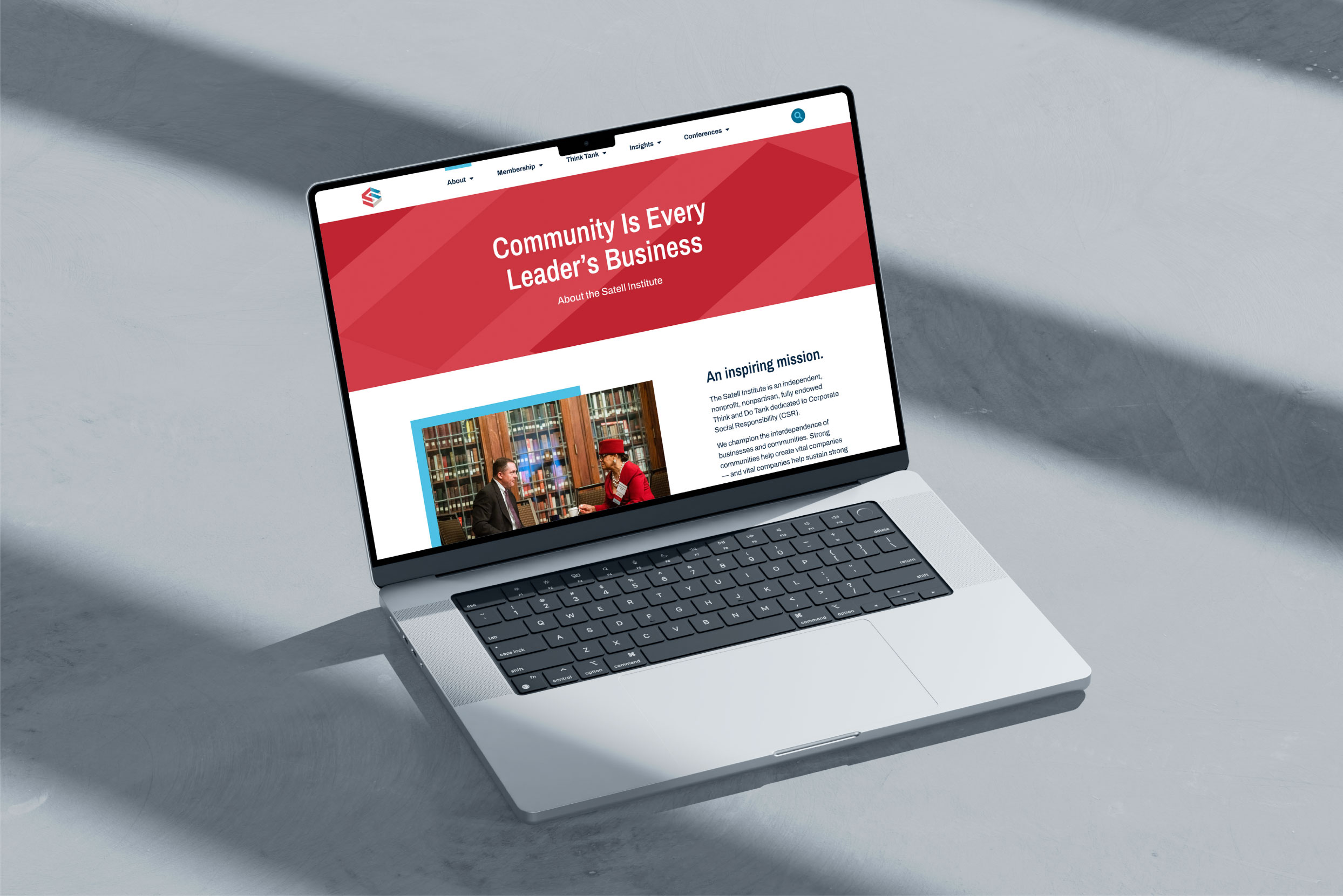
Color palette & Typography
Navy
Teal
Blue
Red
Light Gray
Archivo Narrow Bold
Archivo Narrow Semibold
Archivo Regular


challenges
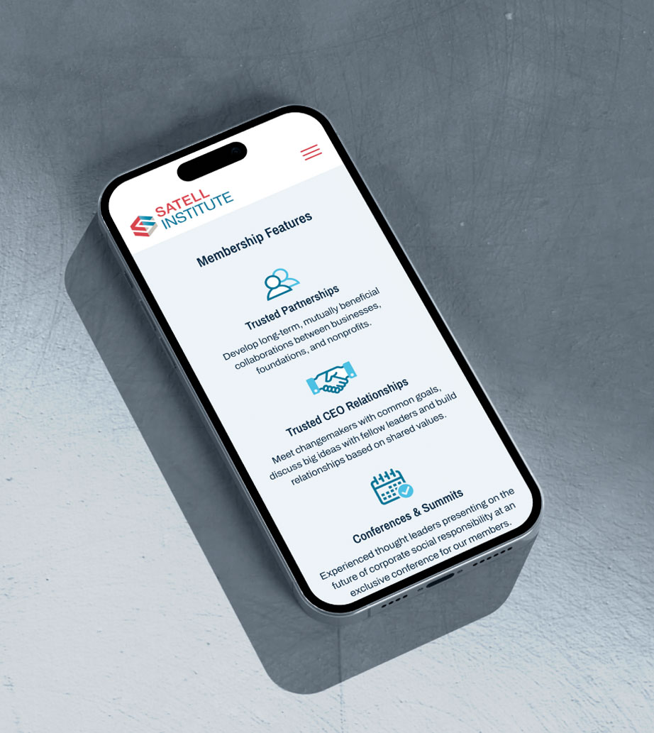
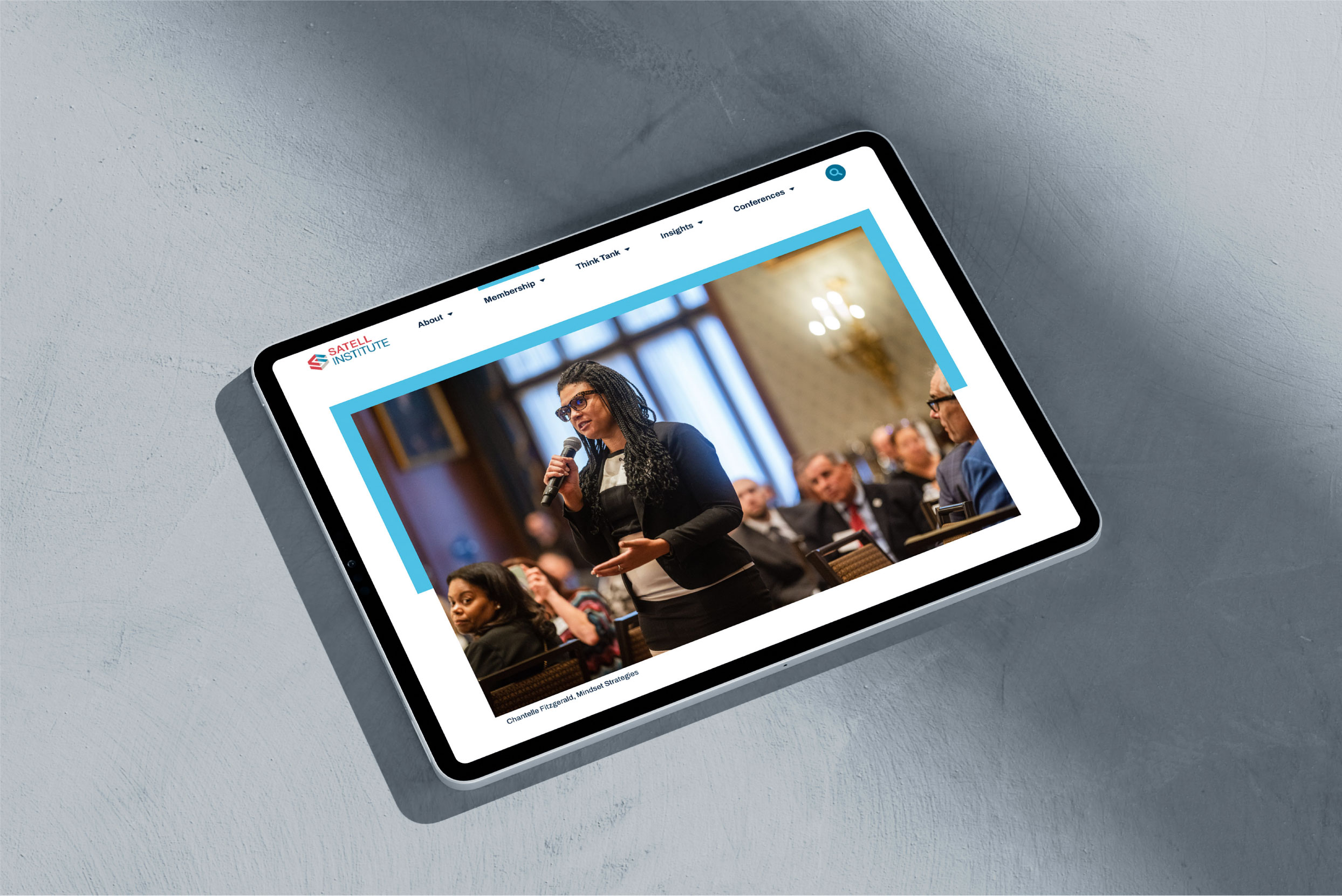
Optimization and responsive design matter, especially since user behavior differs from person to person and across generations.
While some people browse on desktops or laptops, others tend toward tablets or smartphones. The website is built to adapt seamlessly to different screen sizes and devices in order to make the site widely accessible. It’s also optimized for speed and performance, ensuring quick loading times and smooth browsing experiences for users of different generations with different browsing habits, variable internet connections, or varying degrees of device sophistication.
outcomes
With clear navigation and inclusive design elements, the new Satell Institute site couples accessibility with aesthetics, resulting in an informative and engaging user experience designed to boost membership and better society.


