Background
Entering the market with significant ambition calls for a brand identity that meets the moment.
Founded by serial entrepreneur Josh Devon, Sublime Strategy is a Philadelphia-based consulting firm that helps companies define strategy, strengthen leadership, and achieve operational excellence. Drawing on Josh’s experience scaling startups and enterprises, the new brand needed to convey confidence, focus, and forward momentum from the start.
Challenge
Create a brand that conveyed speed, precision, and credibility in a crowded category. It needed to capture Sublime’s energy while remaining grounded and professional for both startups and established organizations.
Solution
We developed a high-contrast identity with accessible colors, structured typography, and clean forms that balance momentum and control while performing seamlessly across every application.
Results
The new identity established Sublime Strategy as a firm with both confidence and agility. It communicates expertise, trust, and focus while remaining approachable and distinctive among consulting peers.
The Objective
Build a complete visual identity that reflected Sublime Strategy’s mission to help leaders grow their companies with velocity and intention.
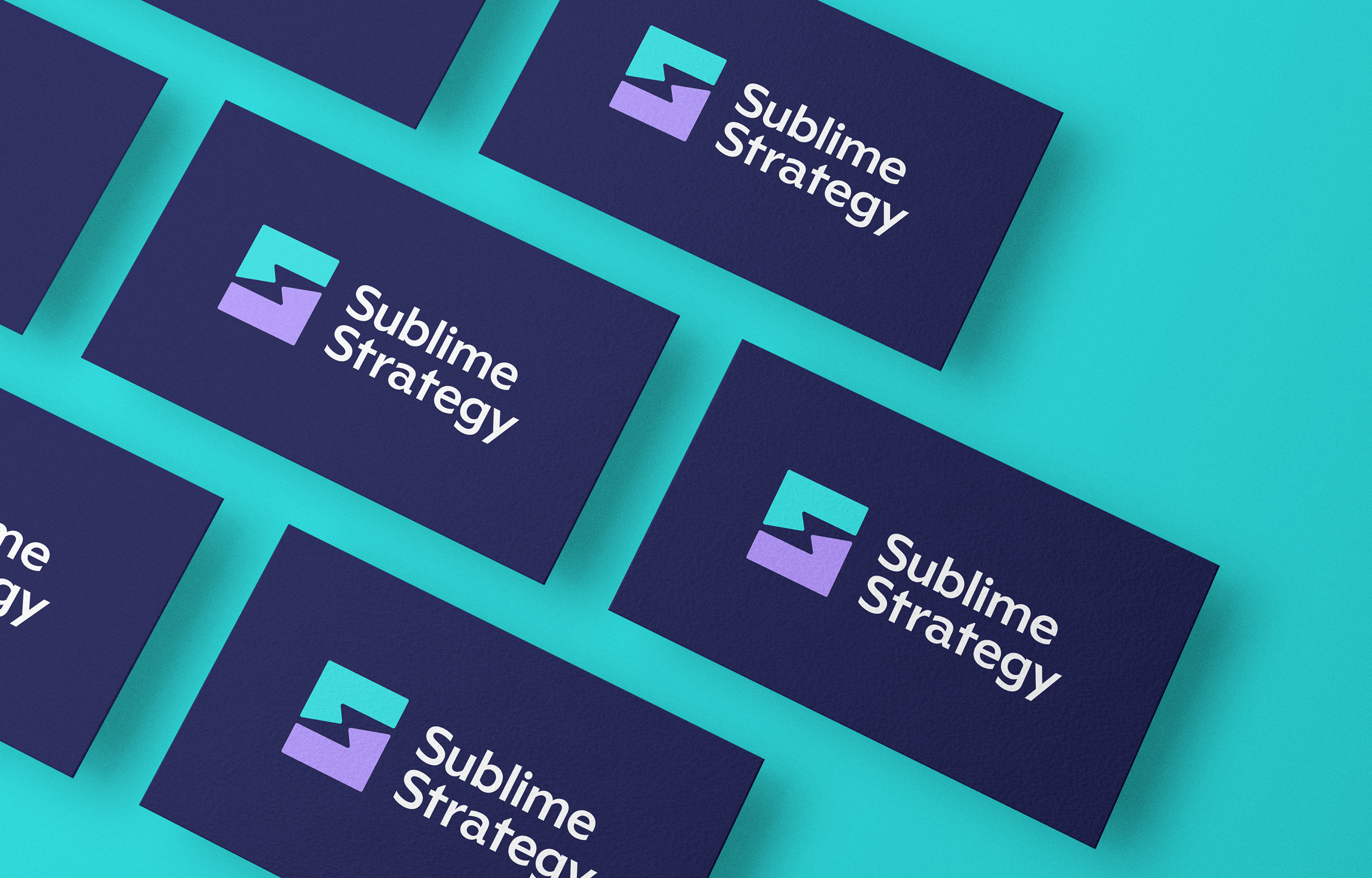
The goal was to create a strong, recognizable foundation that could scale alongside the business. The vision was a brand system that mirrored the firm’s own approach to advising clients, combining a balanced color palette, dual logo system for accessibility, and adaptable assets that perform across all mediums.

Measured Impact
Striking the right balance between energy and precision.
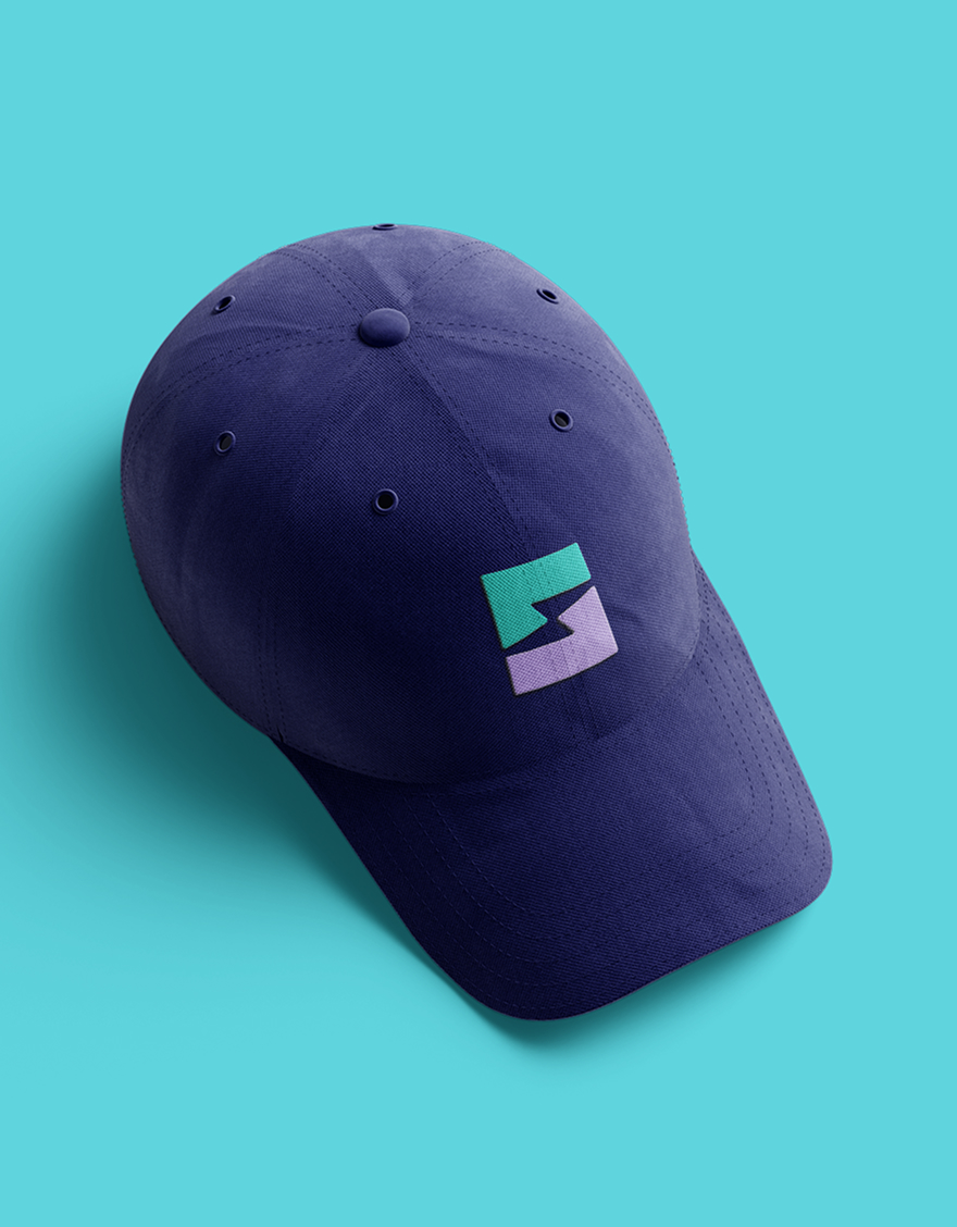
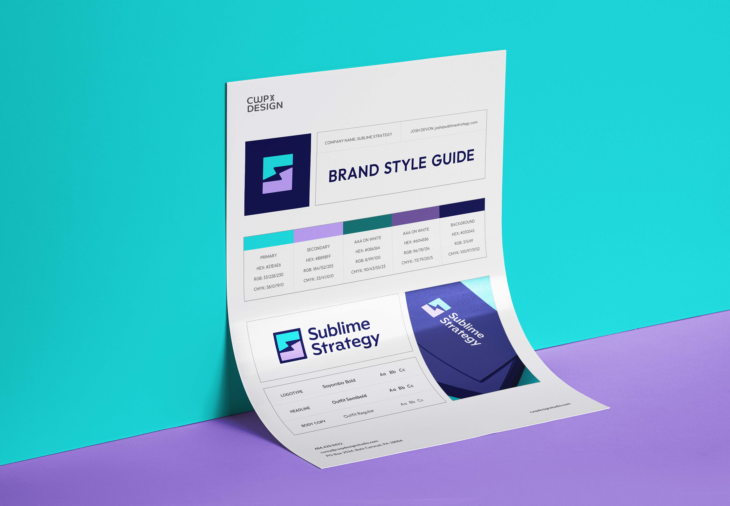
We developed a complete visual identity with clean typography, refined structure, and a high-contrast color palette designed for accessibility. The system includes two logo variations optimized for light and dark backgrounds, ensuring clarity and usability in any setting. The lightning-inspired “S” mark captures Sublime’s philosophy of sharp thinking and swift execution. Its angular form suggests forward motion, while its simplicity conveys structure and control. The design encapsulates the firm’s disciplined yet dynamic approach to strategy, and the result is a brand that feels powerful, professional, and adaptable to future growth.
Color palette & Typography
Teal
Purple
Green
Plum
Navy
Outfit Semibold
Outfit Regular
Challenges & Accommodations
Bringing personality into a professional consulting space.
The brand needed to project authority without feeling cold, and convey energy without sacrificing clarity. The challenge was finding a visual language that balanced speed, intellect, and warmth while remaining flexible for business advancement and expansion of client-facing materials.

Outcomes
A bold identity built for clarity, accessibility, and recognition.
The final brand system reflects Sublime’s disciplined approach to helping companies scale and evolve. It combines visual strength with thoughtful accessibility, creating a lasting impression that mirrors the firm’s confidence, precision, and sense of purpose.
