Background
The Sugary built its reputation as a made-to-order bakery known for clean, minimal designs and a highly personalized approach.
As the business grew, so did the vision. With a move to Philadelphia’s Rittenhouse Square—a neighborhood known for its elegant brownstones, boutique retail, and vibrant street life—the bakery was ready to expand into a full storefront: part specialty cake shop, part dessert café, with coffee service and a seating area.
Though compact in size, the shop was designed with care—from the window seat to the display cases—to create an experience that feels curated, warm, and worth seeking out.
CWP Design was brought in to reimagine the brand for this next chapter—one that would feel personal, premium, and rooted in both story and place.
Challenge
Design a brand that bridges The Sugary’s custom-cake past with its new role as a modern, welcoming dessert destination.
Solution
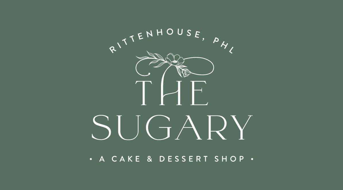
We created a new logo and visual system that blends warmth with simplicity. The brand references wedding culture without leaning into cliché, pairing soft, natural colors with graceful type to create a look that’s both elevated and inviting.
Results
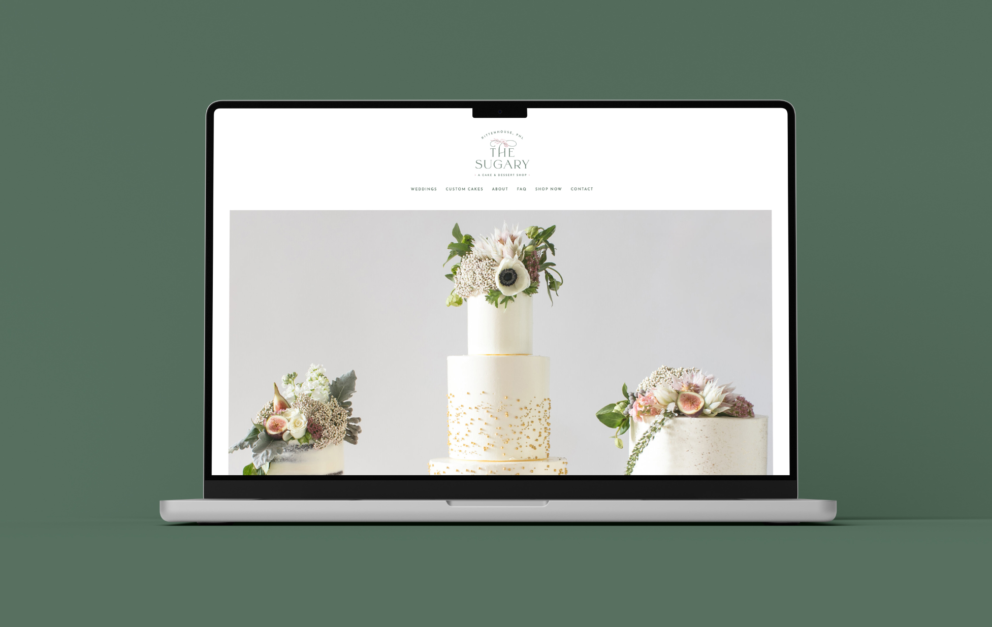
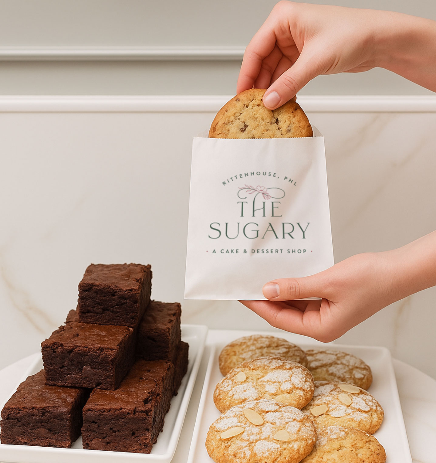
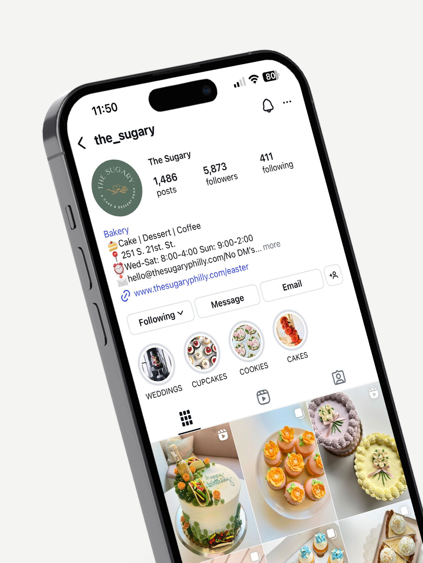
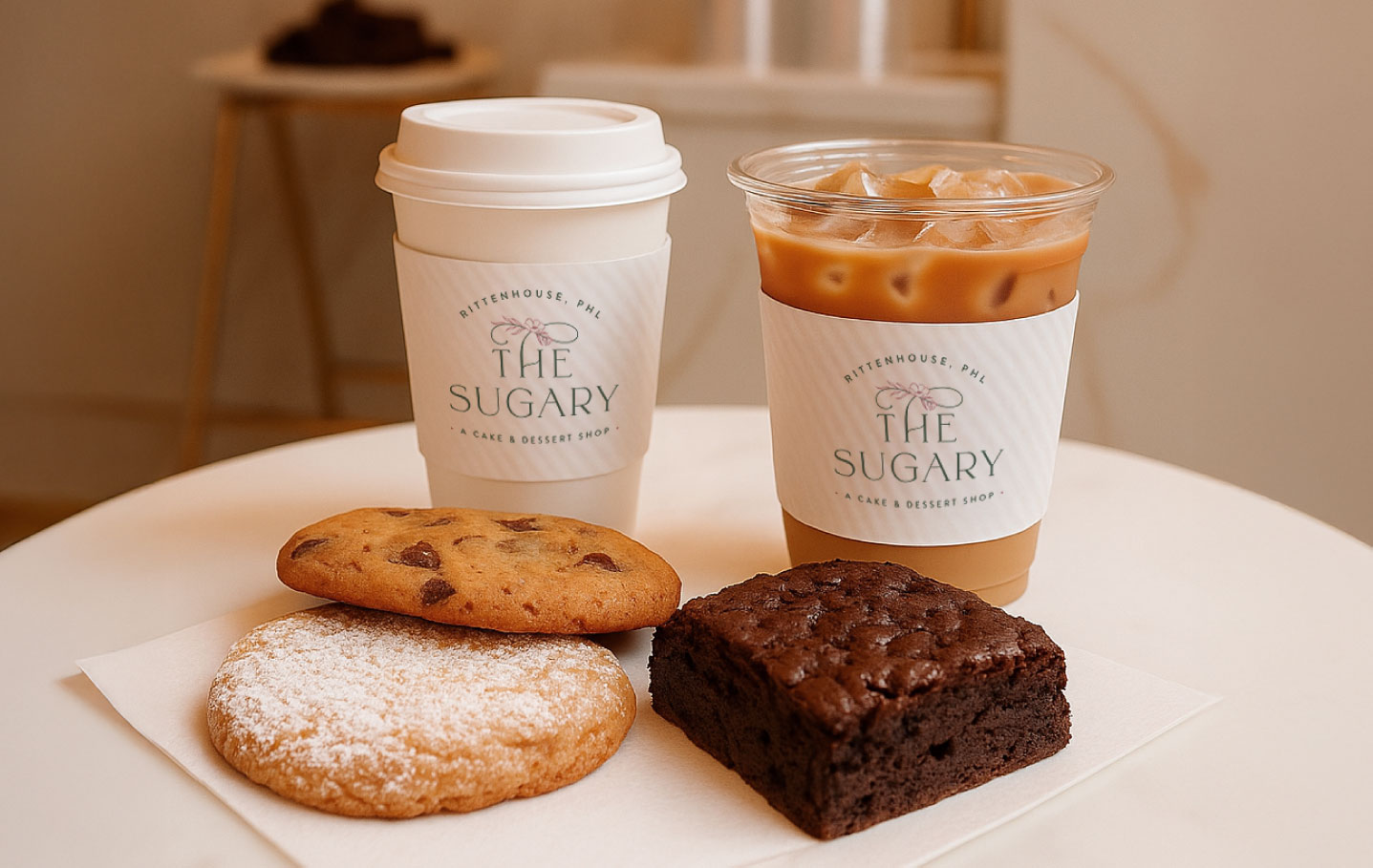
The new identity brings cohesion across signage, packaging, a refreshed website, and a gold foil logo that adds a hint of sophistication. The brand now supports both everyday visits and special occasions, capturing the sweetness that defines The Sugary.
The Objective
Elevate the brand to support a new physical space—while staying true to its origins
The goal was to build a brand identity that reflects The Sugary’s evolution: from a private bakery to a stylish neighborhood dessert shop. The visual system needed to hold both elegance and approachability—supporting the shift into a more public-facing business while preserving the personalized experience that set it apart.
Design solution
A modern romantic identity rooted in story and intention
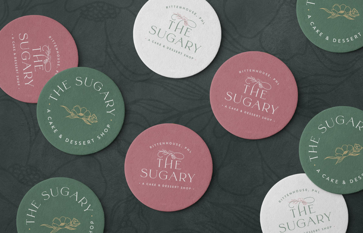
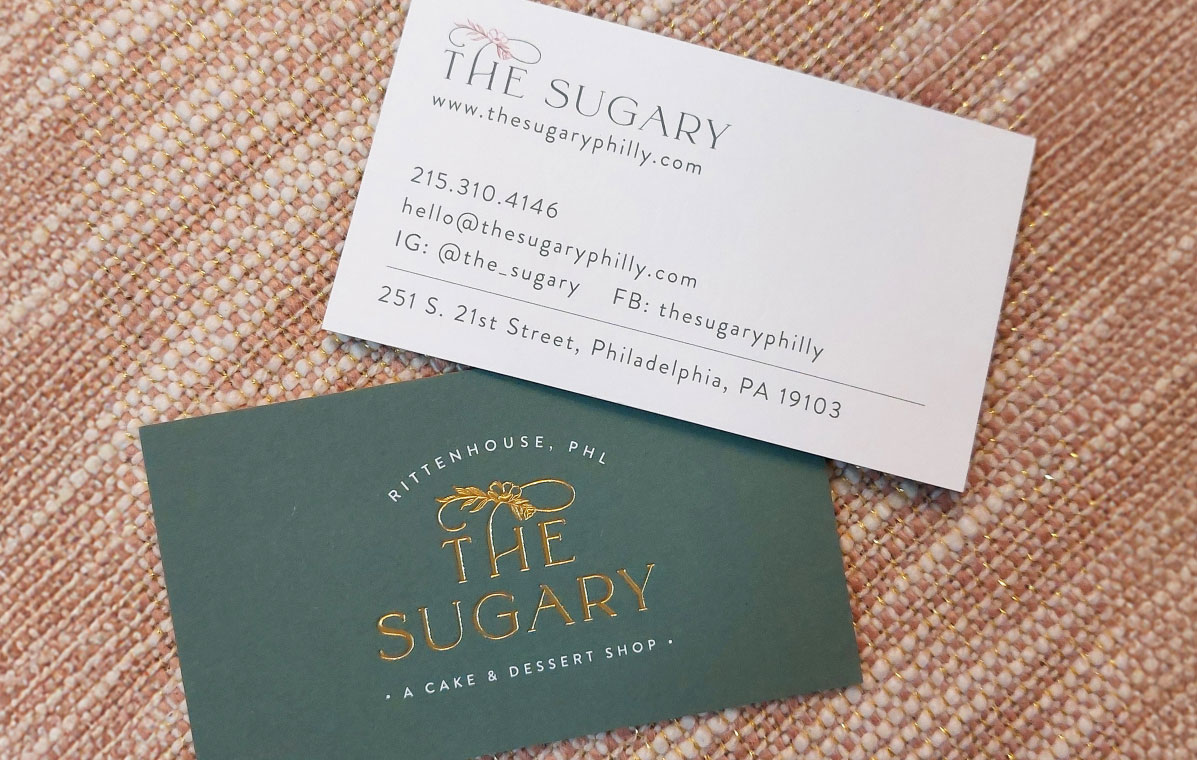
The new logo combines delicate script details with classic letterforms and a custom floral motif—a nod to the founder’s signature cake designs and love of peonies. The color palette—drawn from paint swatches and interior plans—includes warm whites, a soft cherry tone, greenish gray, and brushed gold. Supporting materials like signage and gold foil business cards bring a tactile richness to the brand experience. The tone is romantic but not fussy. Designed to make every customer feel like they’ve found something special.
A visual identity that reflects where The Sugary came from—and where it’s going.
Color palette & Typography
Cherry Malt
Greenish Grey
Soft Gold
Warm White
Smoke Grey
Antic Didone Regular
Josefin Sans Semibold
Josefin Sans Regular
Challenges & Accommodations
Creating a brand that speaks to both wedding clients and casual customers required a careful design balance.
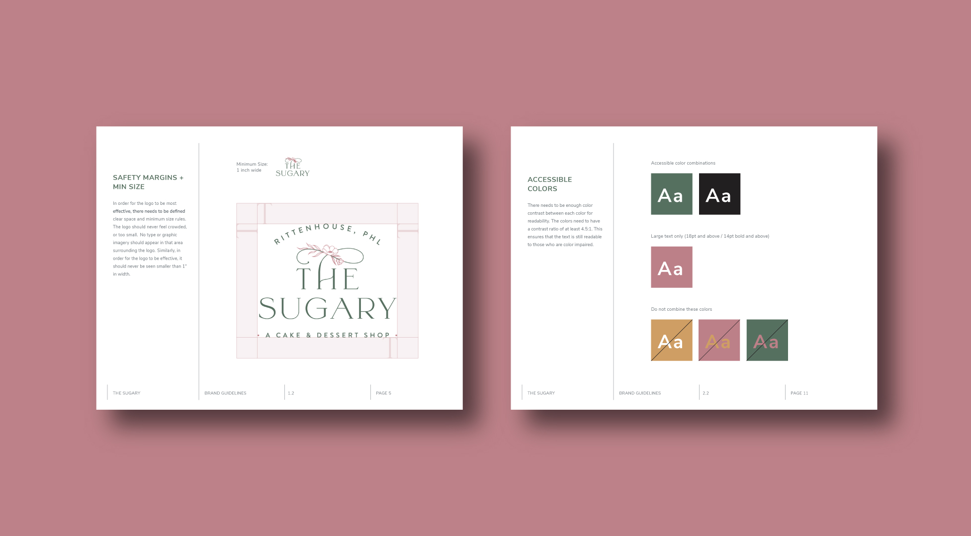
As The Sugary expanded from a private, made-to-order bakery into a public-facing dessert shop, the brand needed to retain its sense of elegance and personalization while becoming more accessible and storefront-friendly. The challenge was crafting an identity that felt elevated enough for wedding consultations, yet warm and welcoming for someone stopping in for coffee and a slice. Every visual choice—from typefaces to color pairings to the floral motif—had to support this dual purpose.
Outcomes
The Sugary’s new identity blends modern elegance with everyday warmth, offering flexibility across physical and digital touchpoints. The brand now reflects both the bakery’s roots and its expanded vision, with a consistent tone and visual style that work just as well on signage and menus as they do on packaging and web. As the business grows in its new Rittenhouse location, the refreshed identity gives The Sugary a polished foundation for reaching new customers and deepening loyalty with existing ones.
