Background
Uniting Wealth Partners (UWP) is reimagining the future of independent wealth management—combining the scale and resources of an RIA aggregator with a commitment to personalized, client-centric service.
Built to support advisor independence, long-term succession, and best-in-class service, UWP needed a brand and digital presence that conveyed clarity, credibility, and purpose from day one. We partnered with them to design a custom identity system, a stationery suite, and a flexible, growth-ready website that reflects their dual mission: empowering advisors and elevating client experience.
Challenge
Design a cohesive brand and website that speaks to two distinct audiences with different needs and expectations.
Solution
Create a responsive, scalable site with tailored content for each audience and an identity system that signals professionalism, structure, and clarity.
Results
A professional brand identity and refined website that clearly position UWP as a succession incubator and trusted fiduciary with a holistic approach.
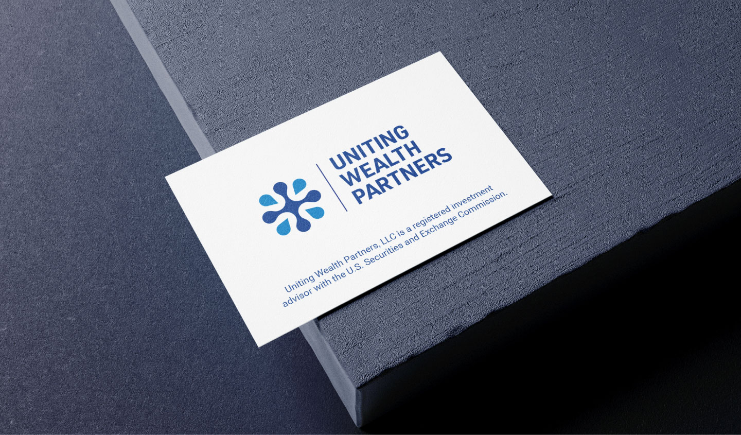
Uniting Wealth Partners’ platform supports advisors nationwide while delivering holistic financial care to clients.
The Objective
Establish a polished, professional brand identity and scalable web platform
The goal was twofold: 1) develop a strong visual identity that tells the story of UWP, and 2) build a sophisticated digital presence that performs across devices, is adaptive for growth, and connects with advisors and high-net-worth clients alike.

Design solution
Create cohesion between the brand’s conceptual foundation and its visual language
The logo draws inspiration from the Wealth Advisor Growth Network—the firm’s parent company—while introducing symbolism unique to UWP: a central infrastructure surrounded by a growing national network. The mark suggests connection, addition, and momentum.
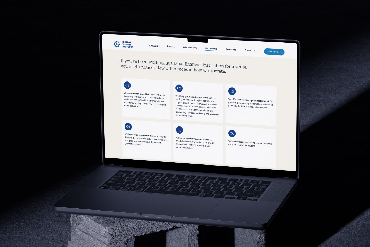
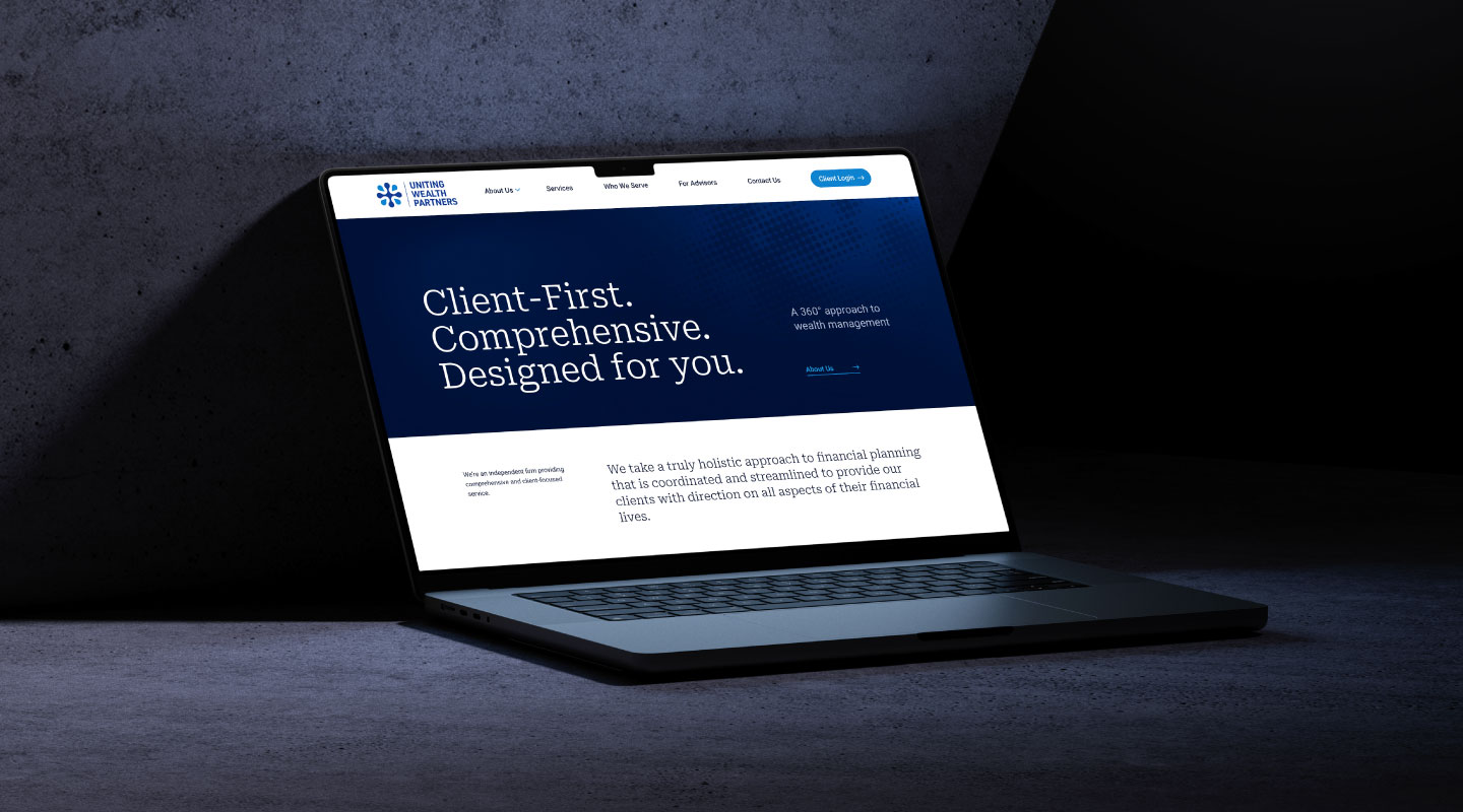
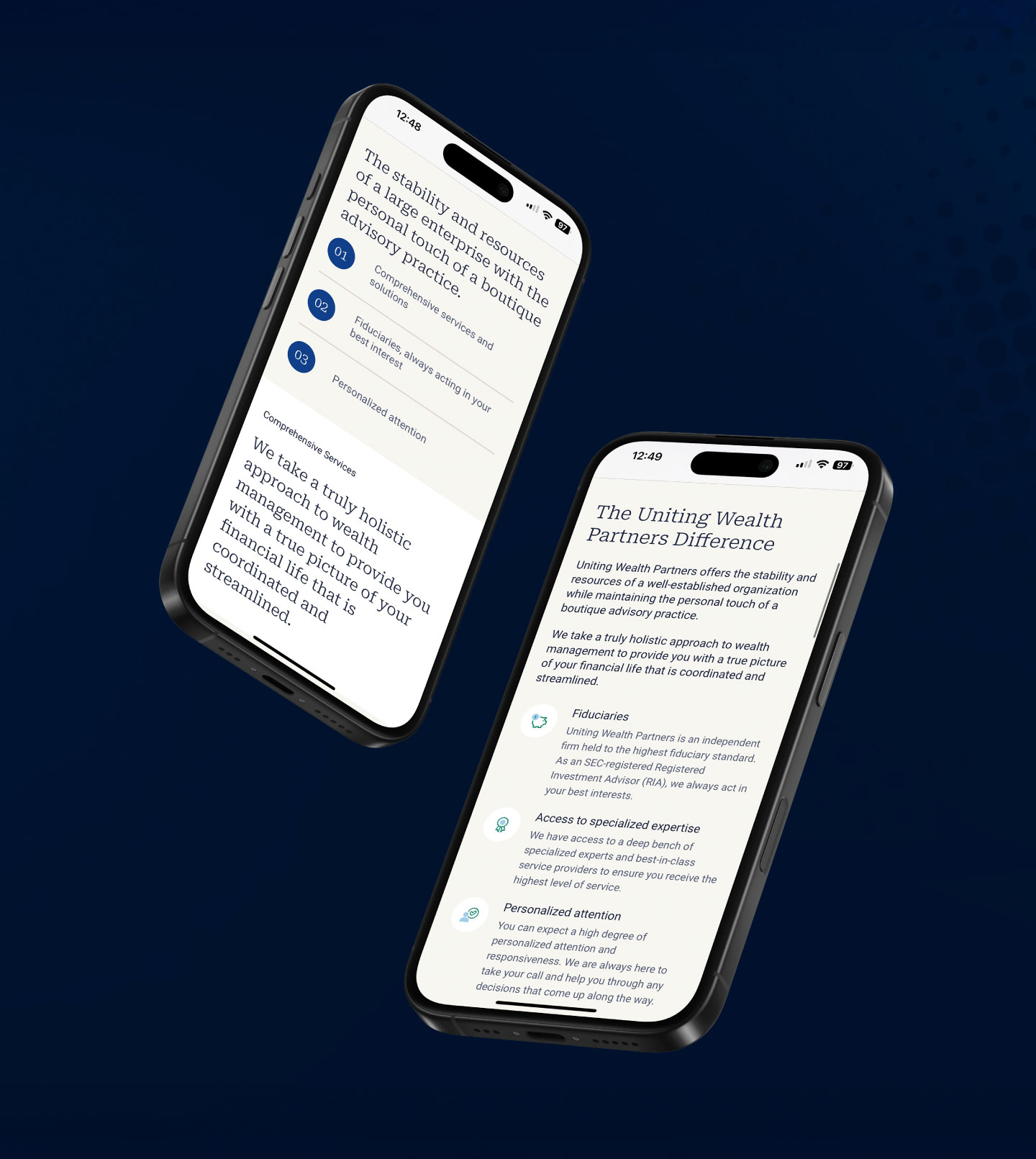
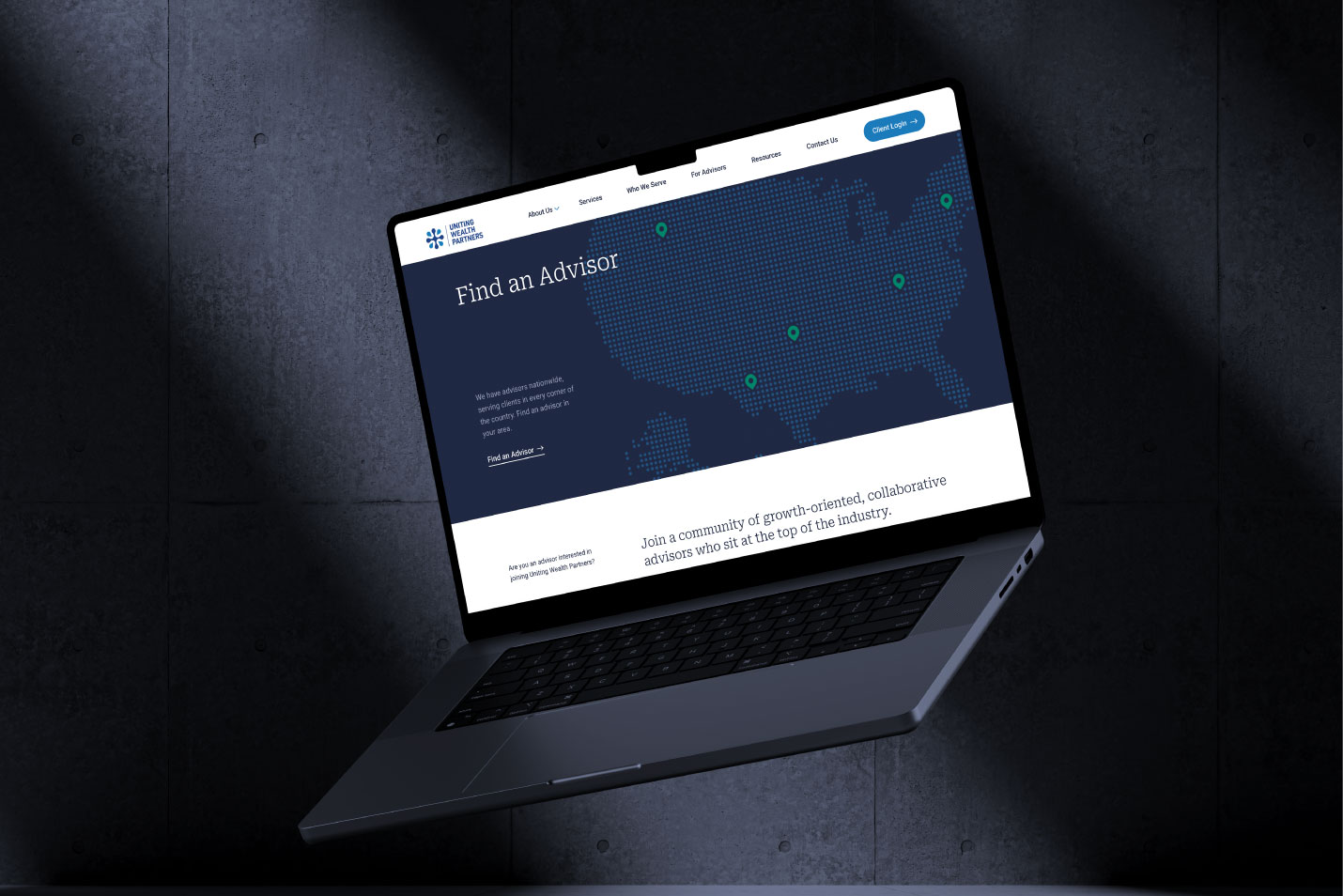
The website builds on this visual language with deep, rich tones and structured layouts. The homepage features clear entry points for clients and advisors, and modular internal pages support advisor profiles, location expansion, and future lead-gen functionality. Visual consistency is maintained across digital and printed materials through the stationery suite and extended brand elements.
A thoughtful blend of structure, accessibility, and messaging lays the foundation for a firm focused on empowering advisors and delivering lasting financial care.
Color palette & Typography
Navy
Slate Blue
Baby Blue
Warm Neutral
Emerald Green
Roboto Serif
Roboto Regular
challenges
Serving two distinct audiences—clients seeking trust and stability, and advisors looking for growth and independence—required a brand that could do both, without diluting either message.
The identity needed to convey professionalism and credibility to clients, while also appealing to entrepreneurial advisors evaluating the platform’s value. On the web side, the challenge was building a scalable structure with clear pathways for each audience—ensuring UWP could grow without overwhelming visitors or sacrificing clarity.
outcomes
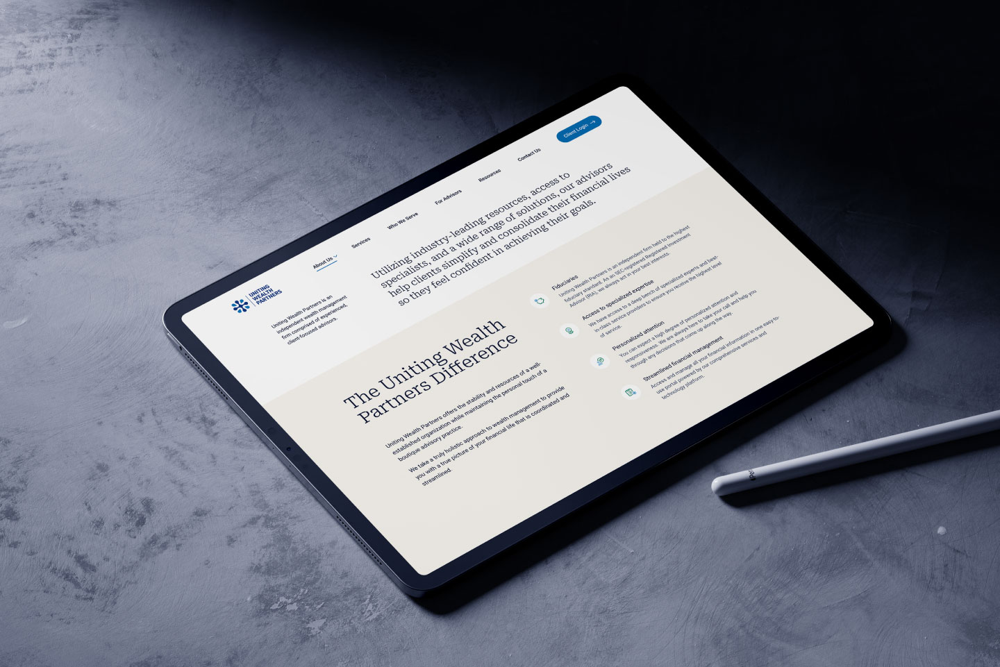
UWP’s new brand and website deliver confidence, clarity, and room to grow. A website that combines simplicity with subtle sophistication to create an intuitive and engaging user experience. The platform now communicates the firm’s value proposition with a visual system that feels structured yet flexible. The scalable design supports national advisor recruitment, strengthens credibility with prospective clients, and lays the groundwork for future tools and content—all while maintaining a polished, professional tone across every touchpoint.
