Background
NEPOOL is a long-standing group that brings together the people and organizations involved in shaping how electricity markets work across New England. Its role is to provide a structured place for discussion, feedback, and problem-solving around how power is produced, moved, and paid for in the region.
Over time, NEPOOL has evolved as New England’s energy system has changed. Today, it includes more than 500 members, from energy providers and utilities to consumer advocates and public representatives. The organization helps these groups understand one another’s perspectives and work through complex decisions together.
Challenge
Updating an outdated digital presence to better communicate complex information.
Solution
A refreshed logo and website focused on modern design, clarity, and usability.
Results
A more current, readable digital presence that supports understanding and participation across a wide range of audiences.
The Objective
Make complex information easier to take in
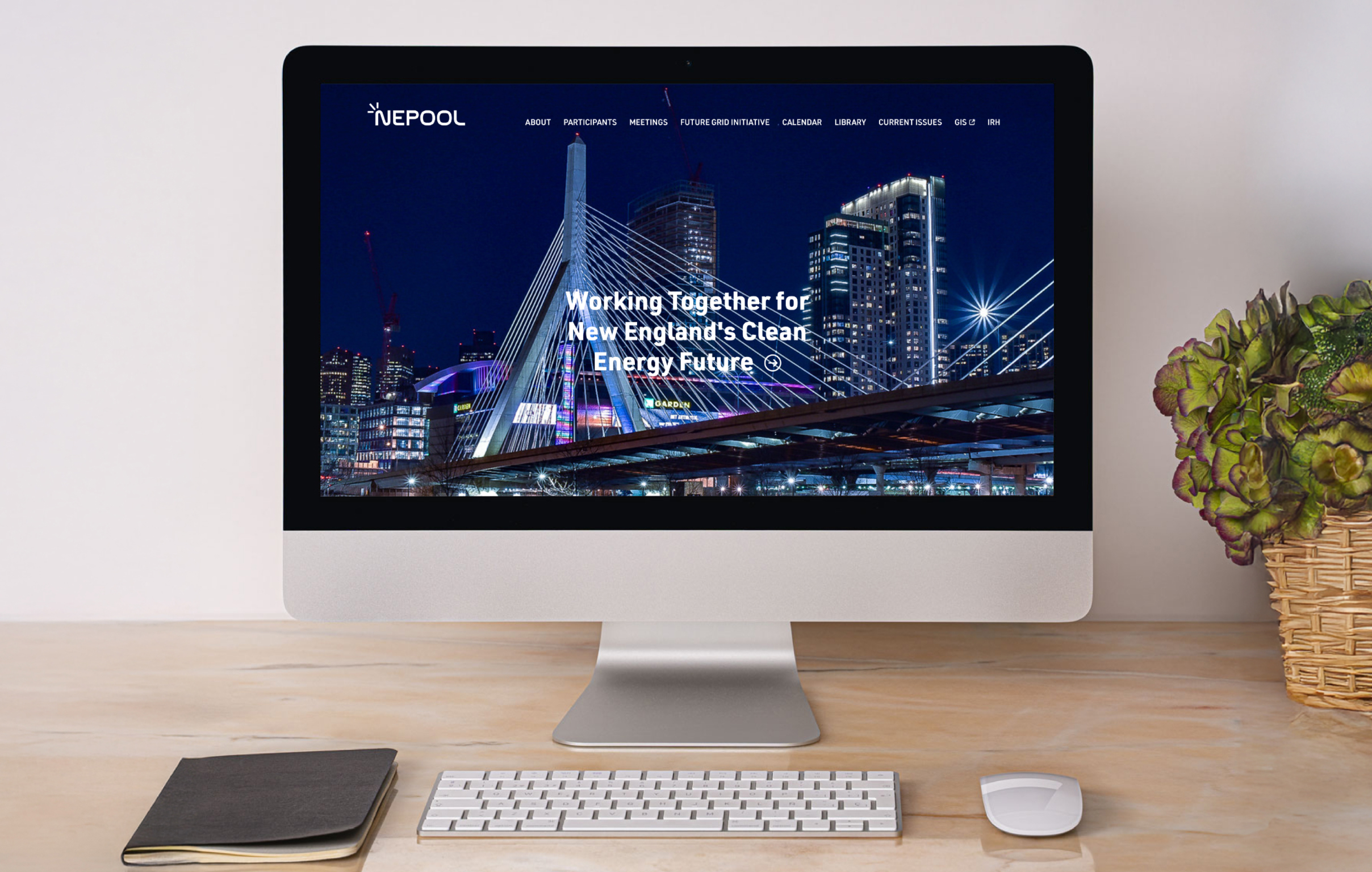
The goal was to help users quickly understand NEPOOL’s role and find relevant information quickly and easily. The content needed to feel established and trustworthy, while using simplified layouts and clear navigation to reduce friction and confusion.
Design Solution
Intentional design choices that support improved user experience
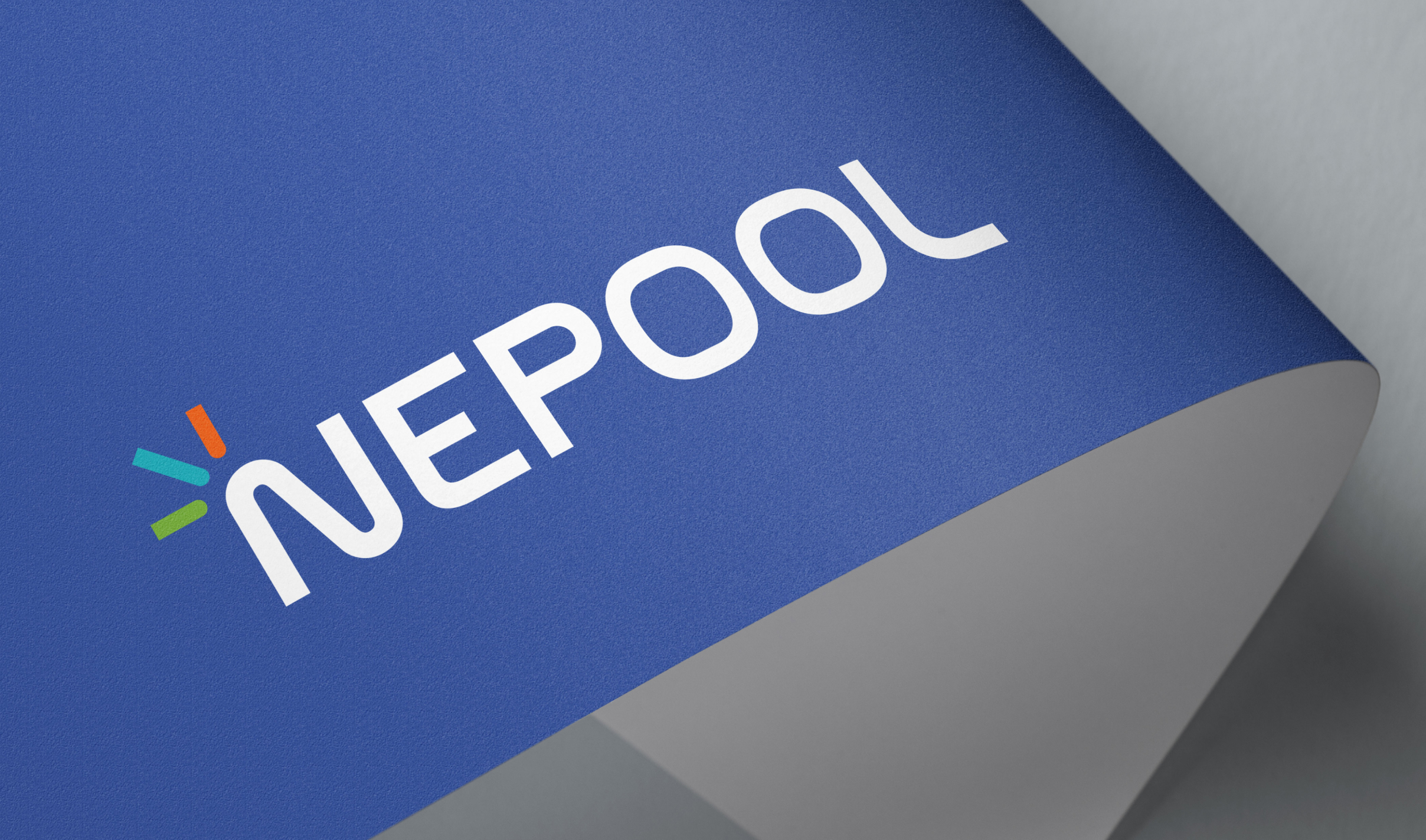
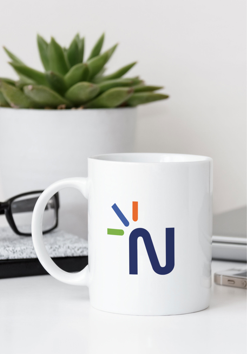
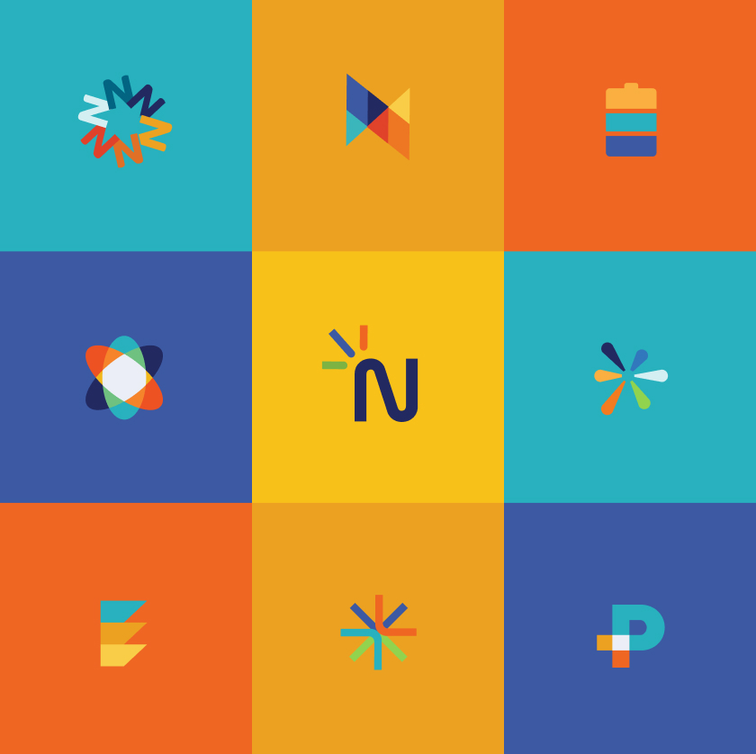
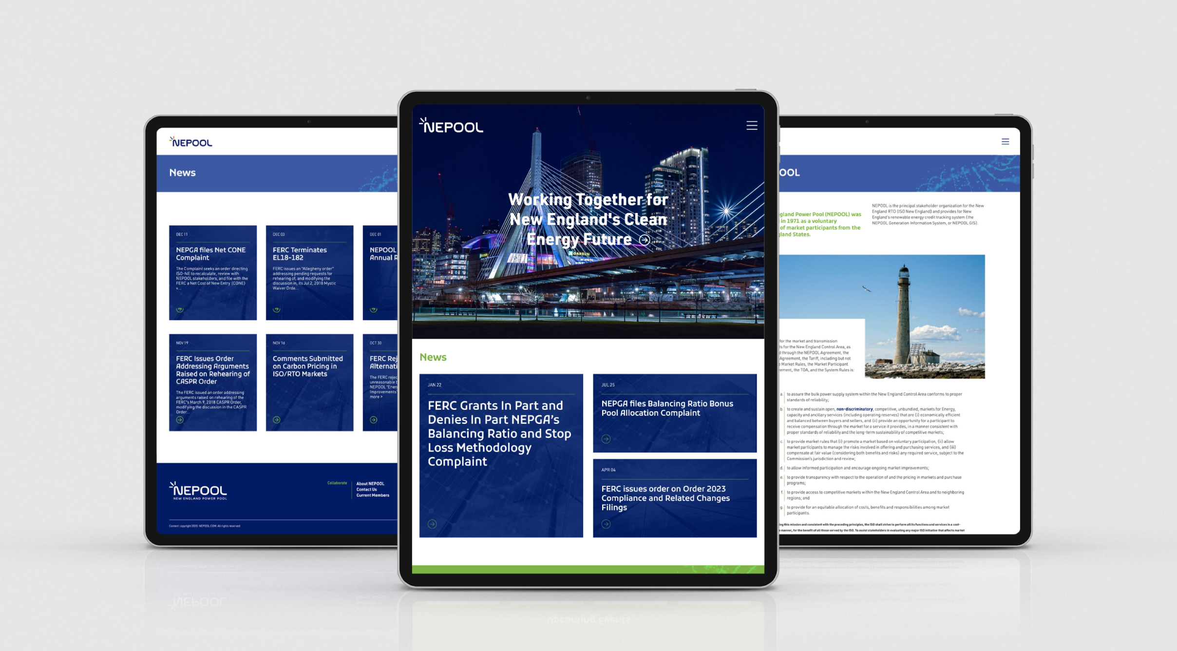
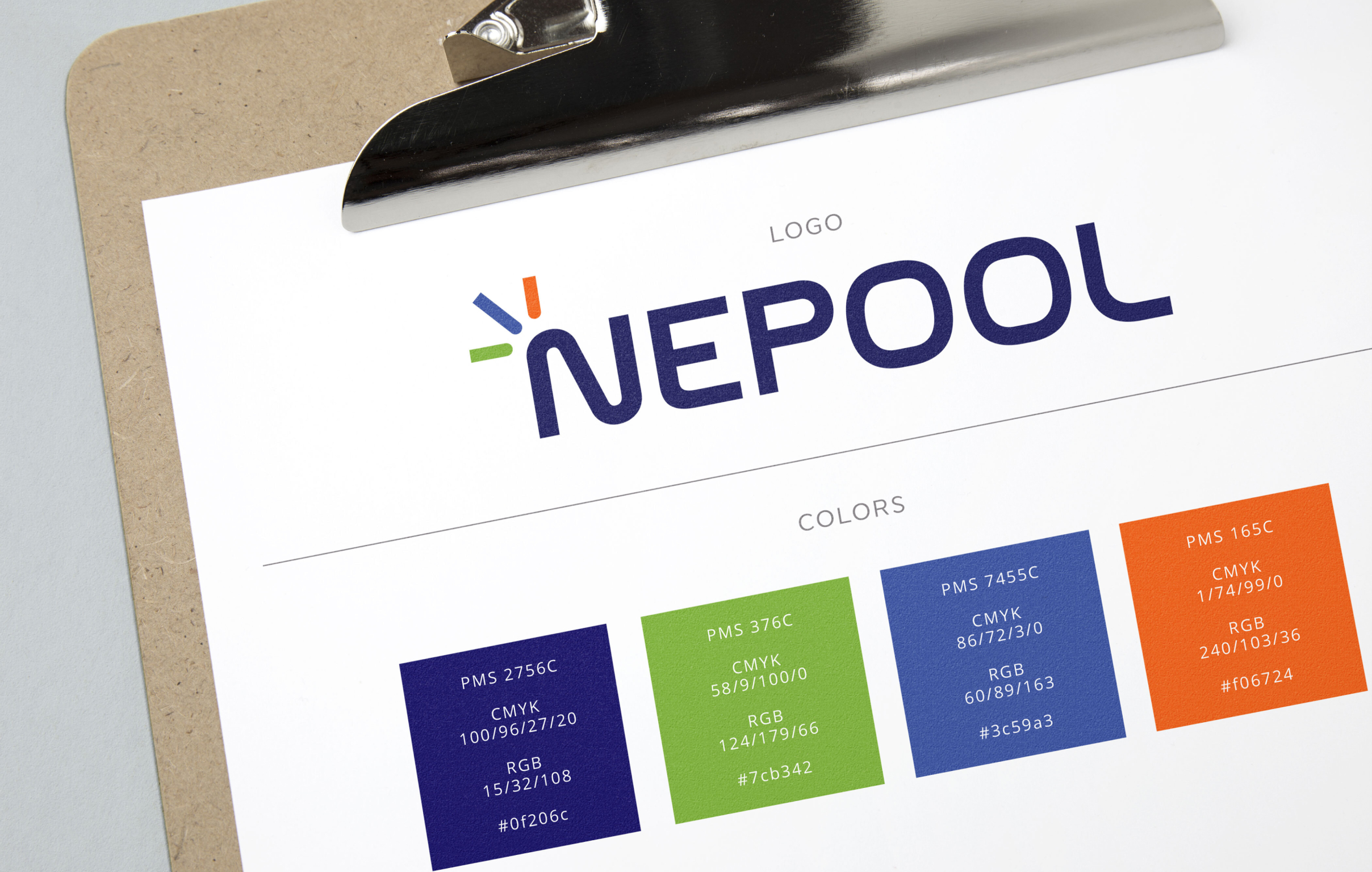
We redesigned NEPOOL’s logo to be cleaner and more legible, updating the brand while maintaining an official, credible tone. The mark uses a spark-like form to reference energy, with diversified color representing the range of stakeholders and perspectives NEPOOL brings together. The website was redesigned with clearer hierarchy, simplified layouts, and improved typography to help organize a large volume of information.
Color Palette
Navy
Green
Blue
Orange
Gray

Challenges & Accommodations
Presenting depth without overload
NEPOOL’s existing brand and website conveyed an old-school impression and made it hard to move through a large amount of information. The challenge was to update the identity and website while presenting complex material in a way that felt clear and approachable.
Outcomes
A clearer and more usable platform
The updated identity and website provide NEPOOL with a stronger foundation for sharing information. The work helps users better understand NEPOOL’s purpose, navigate its resources, and engage with content in a way that feels current, structured, and accessible.


