Background
When your business operates in complexity, your brand needs to lead with clarity.
Pathfinder is a consulting firm that supports complex capital projects across a wide range of industries, from traditional sectors to emerging markets. Leadership initially approached us with an outdated logo and a website that felt dense and no longer fully captured the breadth of its services, the nuance of its expertise, or the essence of its value proposition. With nearly a half-century of history and a pioneer in its field, Pathfinder was ready for a refresh with an eye on the future.
Challenge
Elevate the visual presence and communicate deep expertise without overwhelming users or overbuilding content.
Solution
A brand system based on the firm’s global presence and cross-industry expertise, paring back excess detail in favor of simplicity.
Results
An updated brand identity and digital experience that clarify Pathfinder’s scale, scope, and purpose.
The Objective
Modernize the brand to communicate Pathfinder’s value succinctly and confidently.
The goal was to evolve Pathfinder’s identity in a modern direction, and redesign Pathfinder’s website to improve clarity, usability, and narrative flow. Content needed to feel intentional and accessible, guiding users through Pathfinder’s services, approach, and experience without overwhelming them. The goal was to move away from overly dense or redundant content and toward a clearer, more strategic presentation that could scale as Pathfinder continues to grow.
Solution
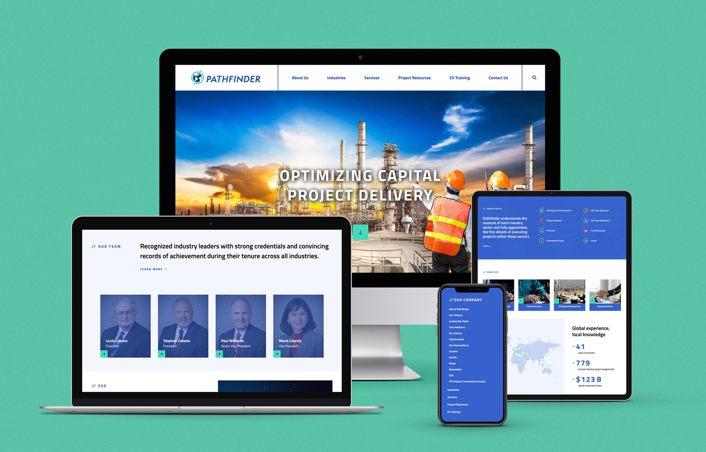
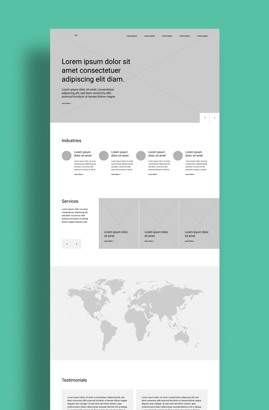
A streamlined, content-forward website designed for clarity and flexibility.
The final website embraces simplicity and structure, using clean layouts, clear hierarchy, and purposeful content to guide users intuitively through the site. Messaging was refined to communicate breadth of industry experience at a glance and emphasize Pathfinder’s approach and transferable expertise, rather than repeating similar information across multiple pages. Selective use of graphics and custom icons reinforces understanding of content without introducing visual clutter.
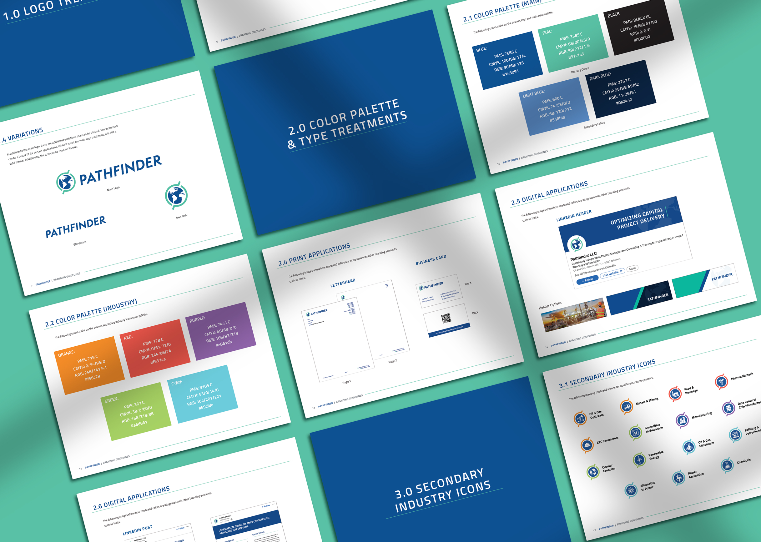
Color palette & Typography
Black
Dark Blue
Blue
Light Blue
Teal
Purple
Cyan
Green
Orange
Red
Titillium Web Bold
Titillium Web Semi Bold
Titillium Web Regular
Challenges & Accommodations
Balancing depth of expertise with simplicity and long-term sustainability.
One of the main challenges was determining how much detail was truly helpful to users. The website had to communicate Pathfinder’s versatility, strategic value, and ability to operate across industries (both established and emerging) without relying on excessive content, visual noise, or interaction-heavy design patterns. Early concepts that spotlighted deep industry expertise revealed that too much specificity risked confusion, repetition, and maintenance challenges. Designs were therefore refined to avoid redundancy and content structures that would be difficult to maintain over time.
Outcomes
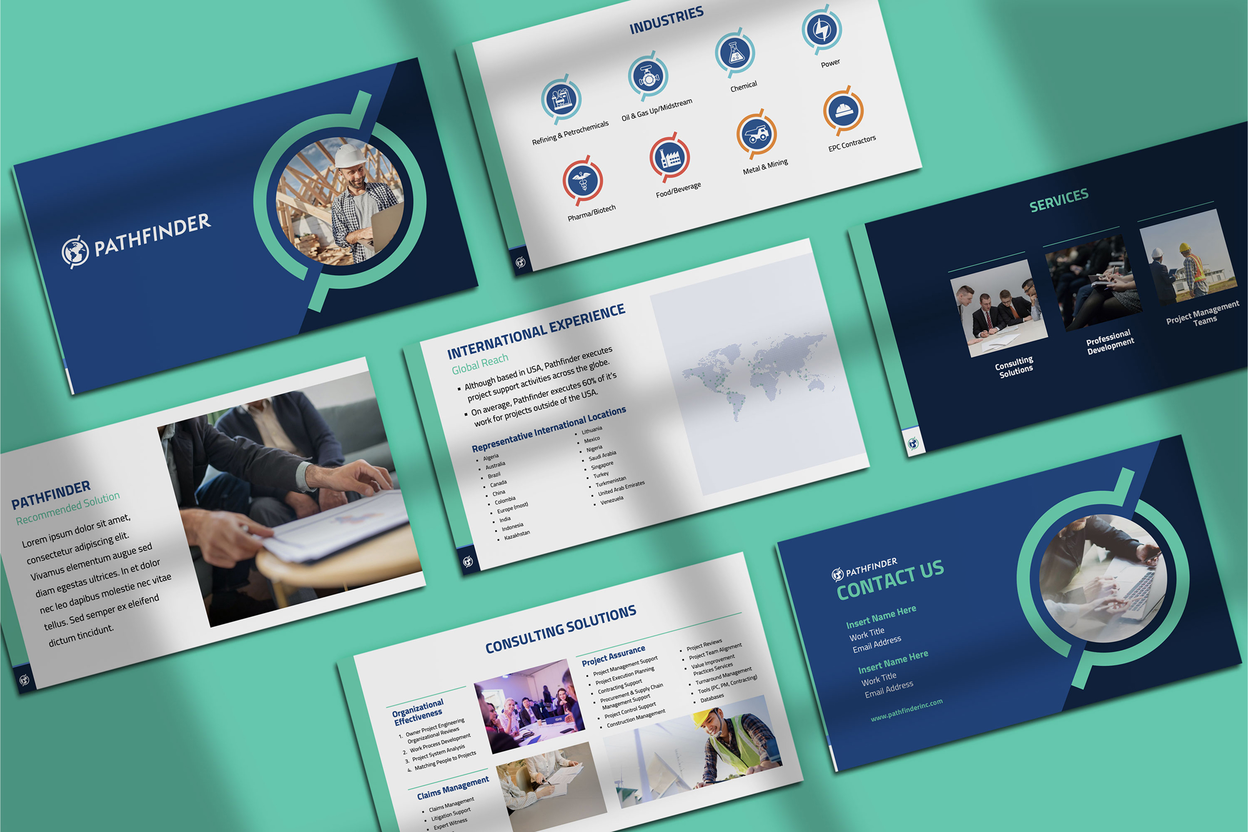
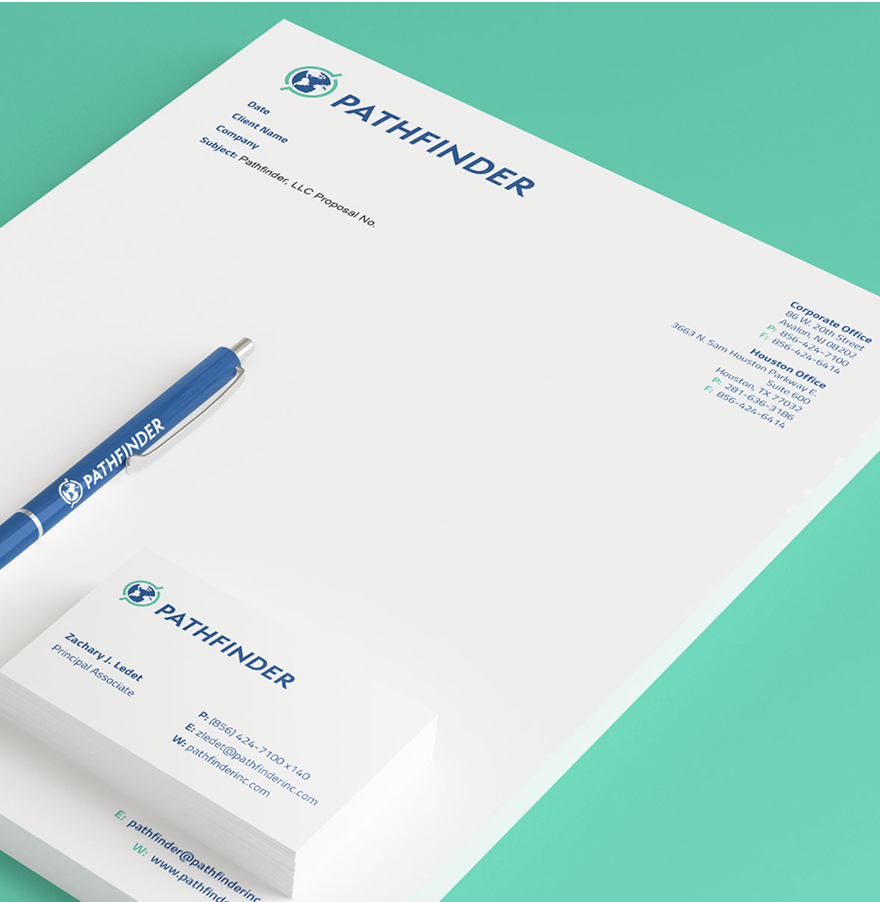
The redesigned visual presence strengthens Pathfinder’s positioning and supports future growth, presenting the company as a confident, strategic partner. Website users can quickly grasp what Pathfinder does, how it works, and the geographic and industry scope of its experience, without navigating unnecessary layers of content. The modernized visual identity was applied across their other marketing materials, from business cards to presentation templates, for a consistent and cohesive brand experience.
