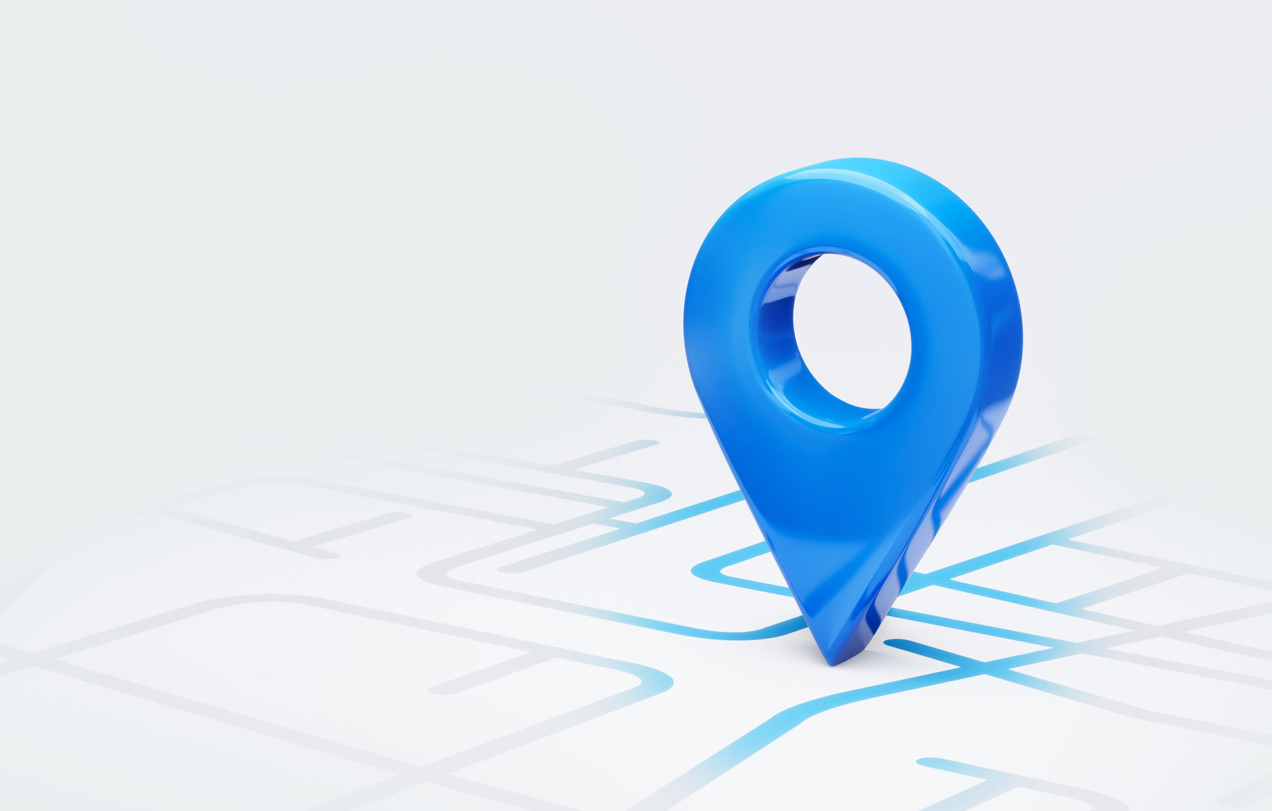
Have you ever tried to drive somewhere new without using Google Maps or Waze? Chances are at least one of two things happens: 1) you get lost, and/or 2) you get stuck in traffic. Both outcomes are frustrating. Gone are the days when we carry dog-eared maps in our glove compartment, or print out MapQuest directions before leaving the house. In this digital era, quality navigation is essential to get you where you want to go.
The beauty of modern technology is that when we plug our destination into our device, we don’t just get a single route– we’re offered multiple routes, and we can pick and choose what we’re comfortable with: quickest, most fuel-efficient, avoiding highways, etc. The point is that we can decide which navigation path works best for us depending on our individual goals.
It should come as no surprise then, that website navigation should be designed according to similar principles. It’s best to ensure that there are multiple ways to access content. Why? So you can steer clear of frustrated users and minimize website bounce.
Not everyone drives in the same way with the same directions, and not everyone navigates a website in the same way either– particularly as we think about user behavior across generations. Individual users are unique, and the navigation should respect that a single defined route through the site is restrictive and may not best serve everyone. Offering flexibility in how people approach and consume your content improves overall usability.
Because not all users think alike when it comes to information searches, it’s a good idea to keep inclusivity and accessibility in mind. Enable users to find content in a way that serves their needs. Some users are guided along the scenic route, perusing the teasers and callouts throughout the main page content, while others prefer to access links sequentially through the main navigation. People with vision deficiencies might head straight for the search bar rather than scrolling through a site with adaptive technology.
The bottom line is that your navigation should support your users, not compel them to follow a singular path that may not be intuitive to them. Alternative navigation elements should be clearly marked so users can easily figure out where to go next. However, don’t overcorrect– balance is key to providing strategic and logical redundancy without overwhelming the user.
If your website has you feeling a little lost, let’s talk! We can help you find your way.