A lot of people think that brand identity is really just a logo, but that’s a case of mistaken identity. The reality is that while a logo is part of a brand identity, they are not one and the same. Plain and simple, brand identity ≠ logo. Believing in this myth discounts the value of your brand identity as a whole.
So what’s the difference? A logo is part of the visual representation of a brand, along with color schemes, fonts, and other graphical elements. It’s a symbol associated with the brand, but it is not the brand itself– e.g., McDonald’s isn’t just arches, and Nike isn’t just a swoosh. When the logo and other visual elements are coupled with the brand’s values, voice, and messaging, altogether they make up the complete brand identity.
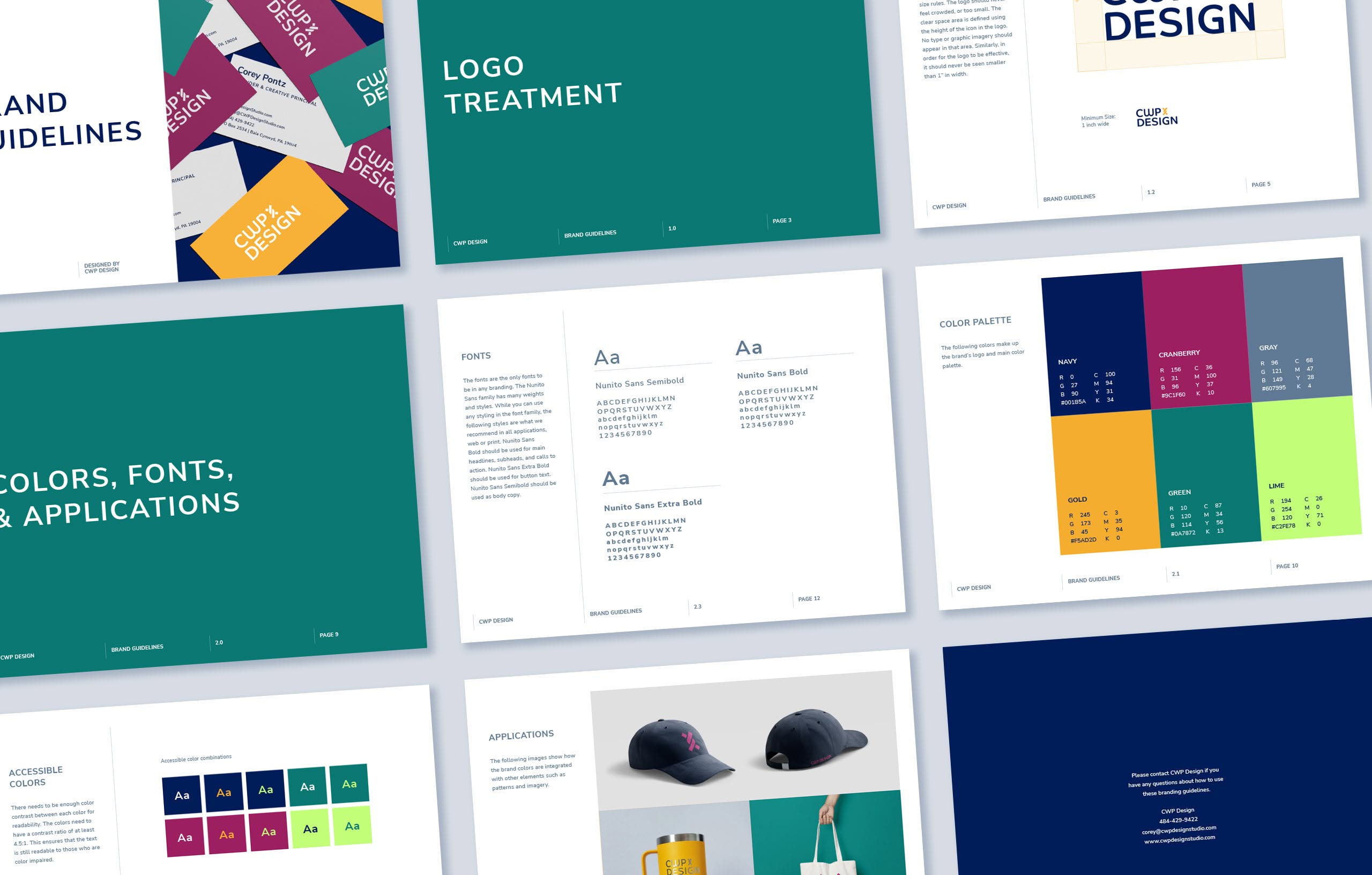
CWP recently unveiled a new brand identity, and it wasn’t just about coming up with a fun new logo. There’s so much more to a branding effort than meets the eye. While logo design was essential to our rebranding process, it was superficial– there was a lot that had to happen beneath the surface. Some of that work was foundational; much like you can’t frost a cake without baking the cake itself first, we had to strategically formulate our mission, vision, and values before we could come up with a beautiful new aesthetic that truly represented CWP.
But here’s the thing– brand identity is not just an external facade. It doesn’t stop with what you put forward to the outside world. It’s the connective tissue of your business, so everything internally can and should fall in line. While addressing what’s under the hood might seem less important at first, it’s incredibly necessary. This unsexy part of a rebranding helps ensure solid infrastructure is in place as you look toward new horizons.
Although we got to a point where we were ready to publicly reveal CWP’s new brand identity and website, we had more work to do behind the scenes. We started with creating our own style guide (yes, even a branding studio needs one!), and then used that to trickle down throughout our administrative systems, design and strategy tools, marketing collateral, and educational materials. We’ve renewed processes, adopted new software and practices, and completed new trainings. The goal of dotting i’s and crossing t’s internally was to feel aligned with our mission and values, and to feel cohesive in how we present ourselves– both internally and externally. Because if we aren’t clear about who we are and how we look, then no one else will be, either.
If your branding is starting to get under your skin, let’s chat about a facelift. We can help you improve the look and feel, inside and out.


