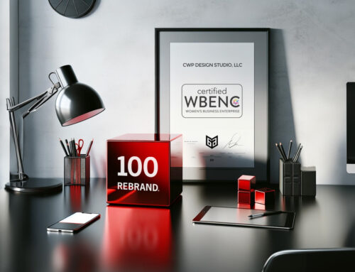
Pssst – we’ve rebranded! This has been a long time coming and we’re super excited to share our new look and feel with you, but we’re about to get vulnerable for a second.
For awhile now, we’ve felt a disconnect between what we do for our clients, and the fact that we haven’t done a good job implementing that for CWP itself. Admittedly, we talk the talk, but we just weren’t walking the walk when it came to our own branding. With a business that is so client-focused and deadline-driven, it was hard to find the time to prioritize our own branding (or so we thought).
As a branding agency, our purpose is to help organizations develop a unique look and feel that will help them stand out among the competition. That look and feel needs to tell a story and be consistent and cohesive– and that’s exactly where we were falling short when it came to CWP’s own branding.
The reality is, investing in your brand is an investment in your future. Yes, it was hard to find the time for ourselves– so we needed to make the time. Over the past year we’ve prioritized our own transformation, strategically assessing where we were and where we wanted to go as a business. We not only dug into what we were doing, but also why we were doing it. Our mission and our business model had evolved, and so our brand identity and website needed to be refined and refreshed as well. And just as we’d promote a cohesive and consistent experience for any of our clients, we needed to make sure we were updating our own brand presence across the board.
So what’s changed?
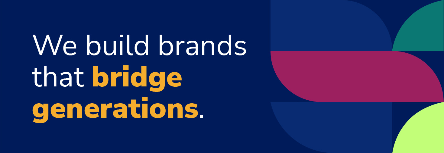
First off– our mission. Since CWP first launched back in 2008, we’ve gone from being a generalist studio to one with a focused point of view. We kept hearing from our clients about this need to bridge the gap between older and younger generations, and not really knowing how to do that. The same story was repeated over and over by different clients, and it sparked a lightbulb moment– that this was our purpose, helping brands by bridging generational divides!
In support of our cross-generational perspective, we pursued more training on accessibility and inclusion, and dove into research about generations– both similarities and differences– in order to understand how we could best serve businesses that were looking to be age-diverse. What we found was the surest way to future-proof a brand is to consider the next generation of consumers without alienating those lifelong brand users.
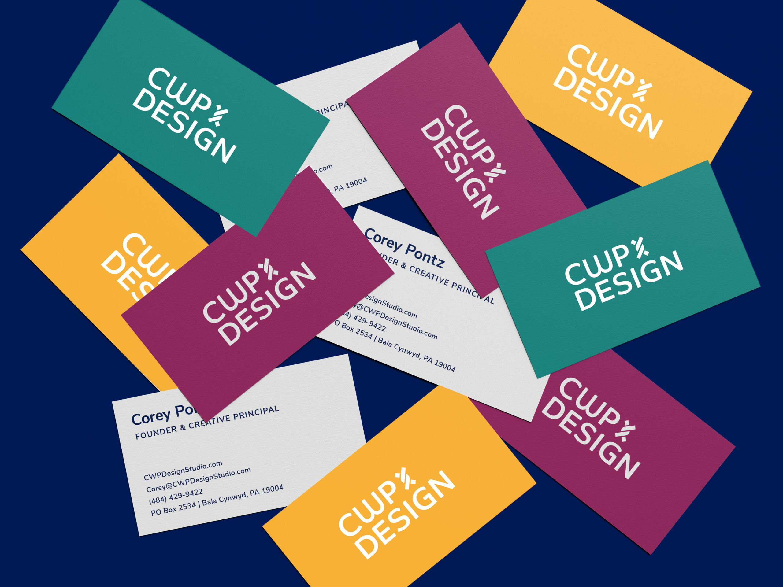
This new point of view has given us a different outlook on our brand identity as well. As a generalist studio we really embraced a minimalist vibe, but now we’re shedding the minimalist look for something bolder. Our vivid new logo was designed to be easier to see by all different kinds of eyes. While we’ve never had an icon in our logo before, we felt it was important in the rebrand to have an element that represented weaving together the generations, and so the thread icon was born.
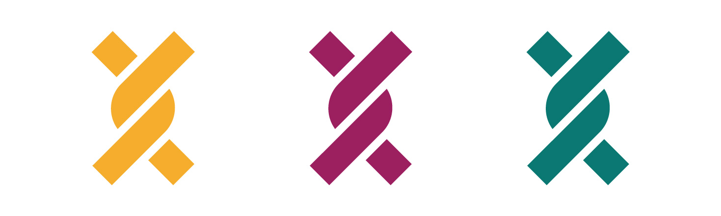
Beyond the logo, we worked on establishing a balanced color palette. We have pulled timeless hues and paired them with fresh pops of color so we could bridge the gap between traditional and modern. We also ensured the palette depicted suitable color combinations for accessibility purposes.
Speaking of accessibility, our website was designed with inclusivity in mind, reflecting appropriate color contrast and font sizes for legibility. We made sure to add an accessibility plugin on our site that would keep it up to standards. This means our content can be easily consumed by younger and older generations alike.
With the launch of our rebrand, we’re finally walking the walk and we’re excited to share it with you. Join us on our journey!