
When you want to create something beautiful that really stands out from the crowd, color is a solid approach, right? Not necessarily. Color has the potential to enrich communication, but for the many people with visual deficiencies, oftentimes the message is lost.
Considering that graphic design is a visual way to communicate messaging, it should be obvious that you want people to see the output. The problem is– not everybody can. Among the numerous visual impairments that exist, color blindness is more common than you might think. More than 350 million people worldwide have a visual color deficiency, affecting 1 in 8 males (8%) and 1 in 200 females (0.5%).
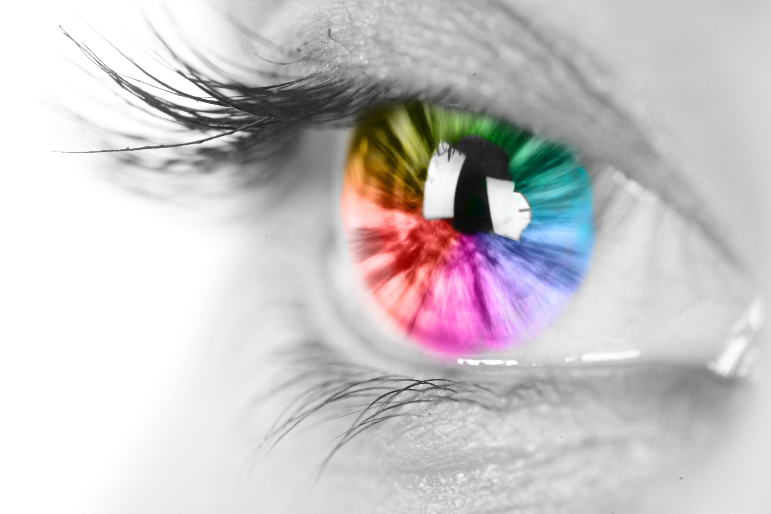
Having color blindness means that you don’t perceive colors in the same way that other people do, and there are actually several different types of the condition. With the most common type, people have trouble distinguishing between red and green (that’s why order of traffic lights is important!). Less commonly, people have difficulty distinguishing yellow from blue. And rarely, people have monochromatic vision and can’t see any color at all.
So what does this mean for visual messaging?
Because of these types of visual impairments, it’s important to think about color selection and contrast when designing– wether you’re creating something digitally or in print:
- Choose colors carefully. If possible, select a palette that is friendly to people with color blindness.
- Optimize contrast. Consider how colors are arranged in the design for readability. Try to avoid color combinations without high contrast.
- Differentiate with texture. Inaccessible designs often rely on color as the sole way to differentiate ideas. Incorporating patterns, shapes, or symbols can help provide contrast between color blocks in order to enhance the clarity of messaging.
- Choose accessible fonts. A font that has a simple typeface and distinct lettering is more legible. Improve readability further with spacing and size considerations.
- Check your work. It can be challenging to understand how someone with visual impairments will perceive your work. This accessibility tool has both color-blind safe palettes, and a contrast checker to help to ensure visibility for those with color blindness.
By designing with accessibility in mind, you’ll create more inclusive designs that enable your visual communications to reach a wider audience. If your vision is to expand your brand’s reach, let’s chat about making your designs more inclusive!