Background
When you’re building a niche real estate rental portfolio, a recognizable brand identity adds value to your investment.
Auberge is a real estate management company that offers flexible accommodations to the discerning purpose-driven traveler. Blending the essence of luxury travel with the comfort of home, Auberge’s sweet spot is the mid-term rental market. Poised to expand their rental portfolio beyond their flagship building in order to meet demand, Auberge needed a brand identity that was scalable and versatile to work across locations and platforms.
Challenge
Establish a distinctive brand identity in a competitive market, distinguishing Auberge from both upscale boutique hotels and typical mid-term rental options.
Solution
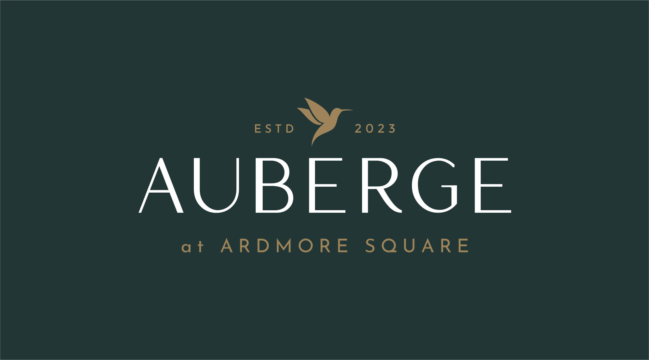
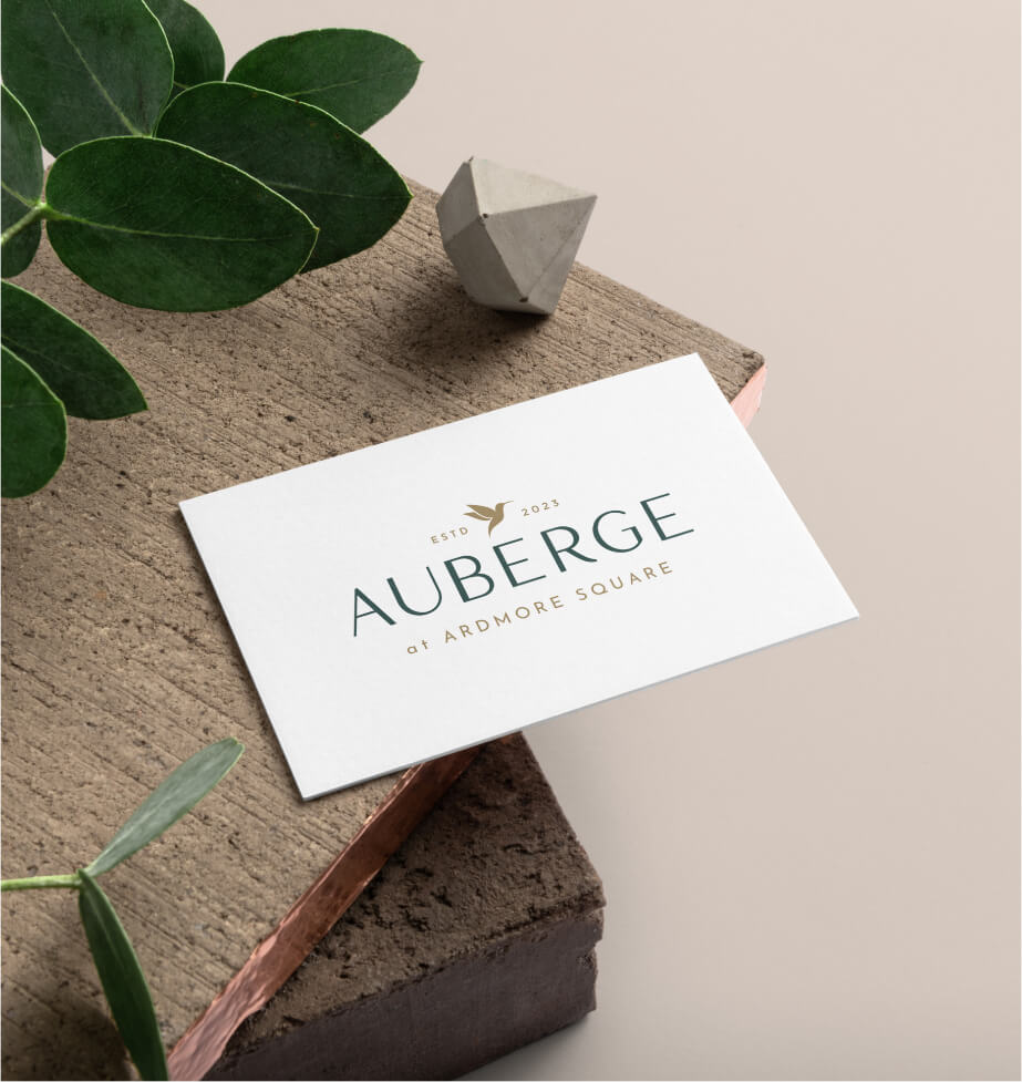
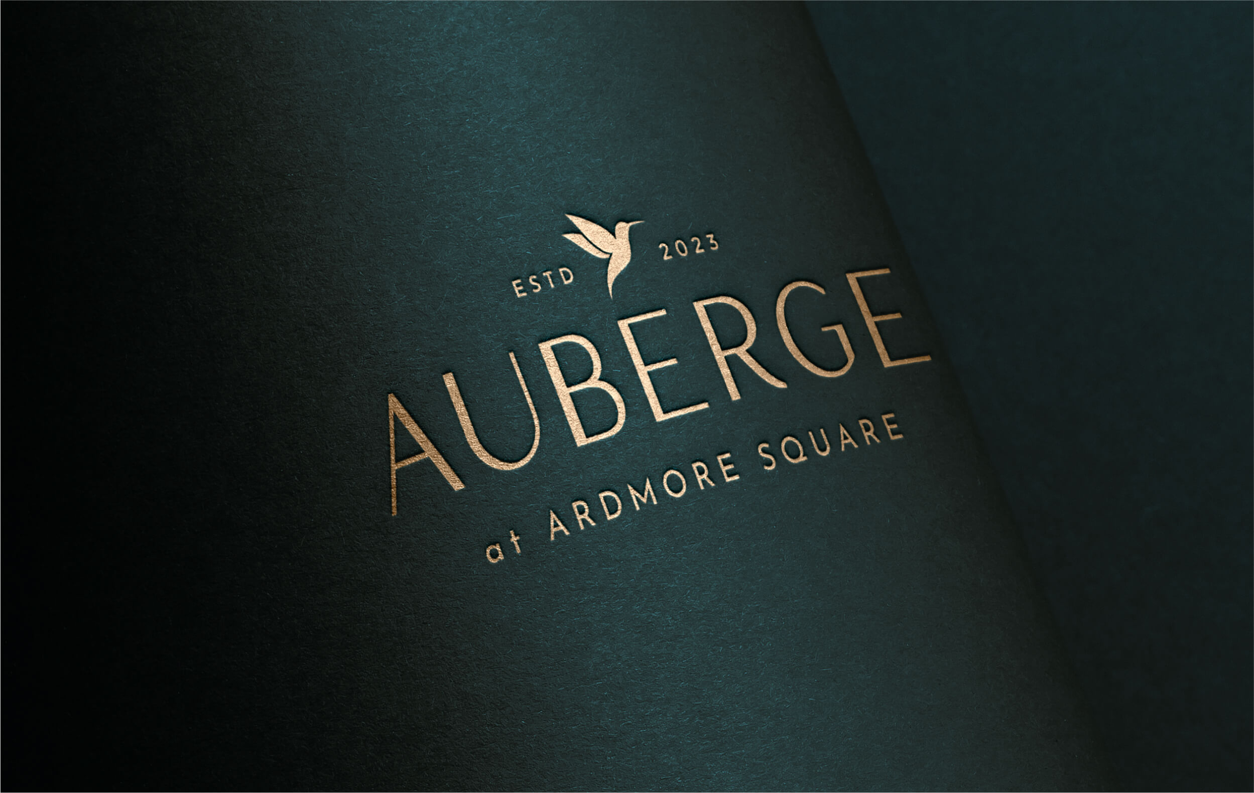
A modern, minimal, and timeless visual identity centered around a hummingbird logo, symbolizing joy, beauty, and peace, perfectly mirroring Auberge’s brand ethos.
Results
The new branding supported both flexibility and cohesion, effectively communicating Auberge’s core values to increase brand awareness and positioning.
The Objective
Differentiate the brand for the mid-term rental market
The aim was to elevate Auberge as a standout in the mid-term rental sector, offering the sophistication of upscale hotels with the comfort of home. The strategy focused on a brand identity that appeals widely, spotlighting Auberge’s prime locations and excellent service, while the design ensured scalability for future growth. This approach sought to attract a diverse clientele– from healthcare students to traveling professionals to empty nesters– securing Auberge’s place as a market leader.
Design solution
Focus on scalability, careful positioning, and core values
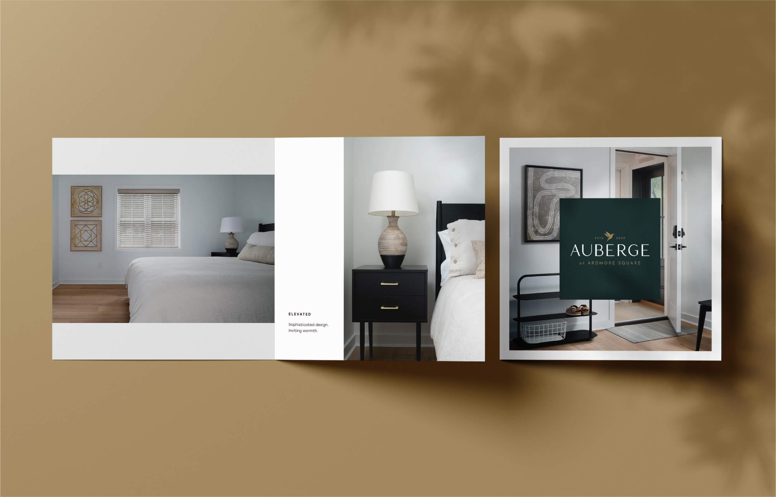
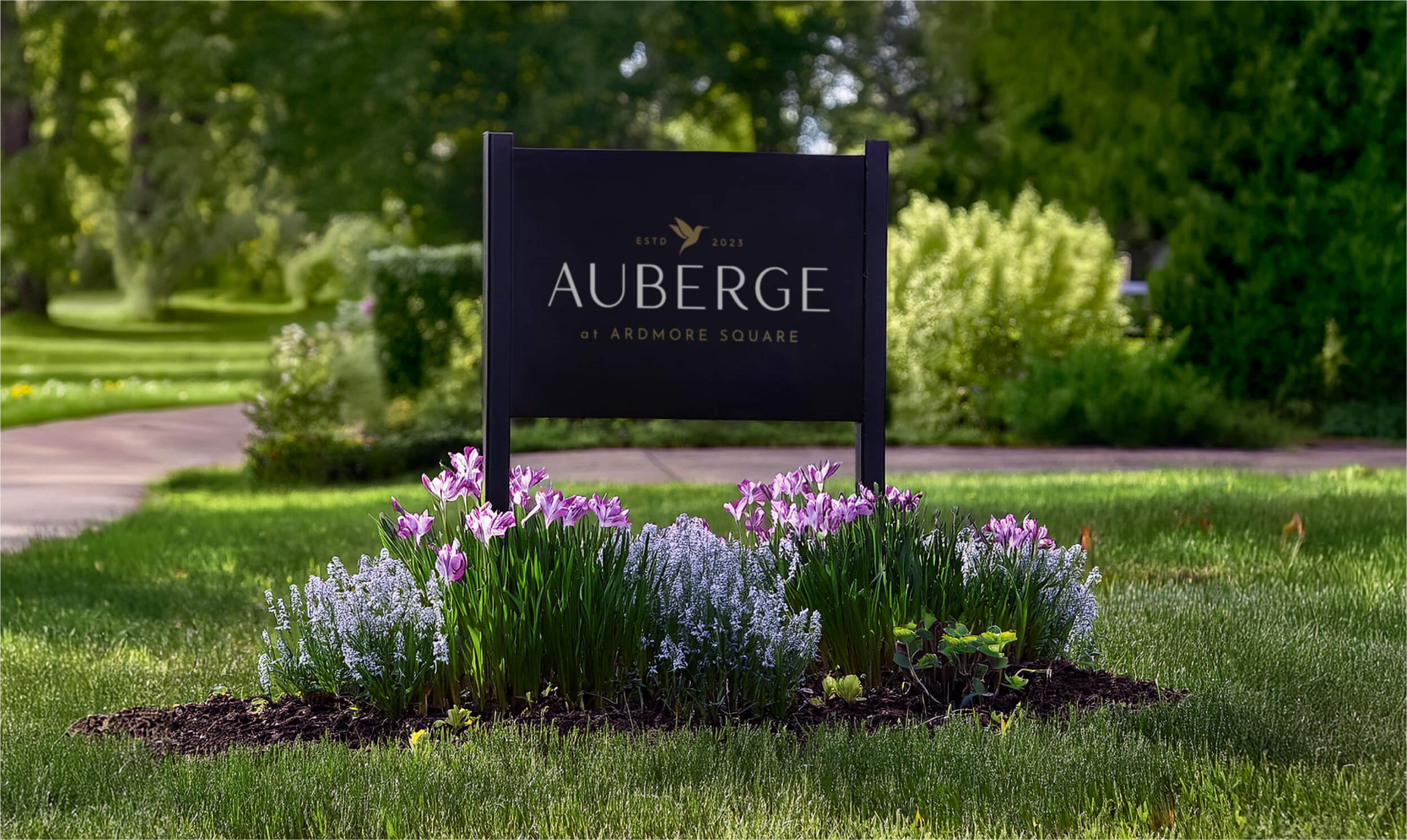
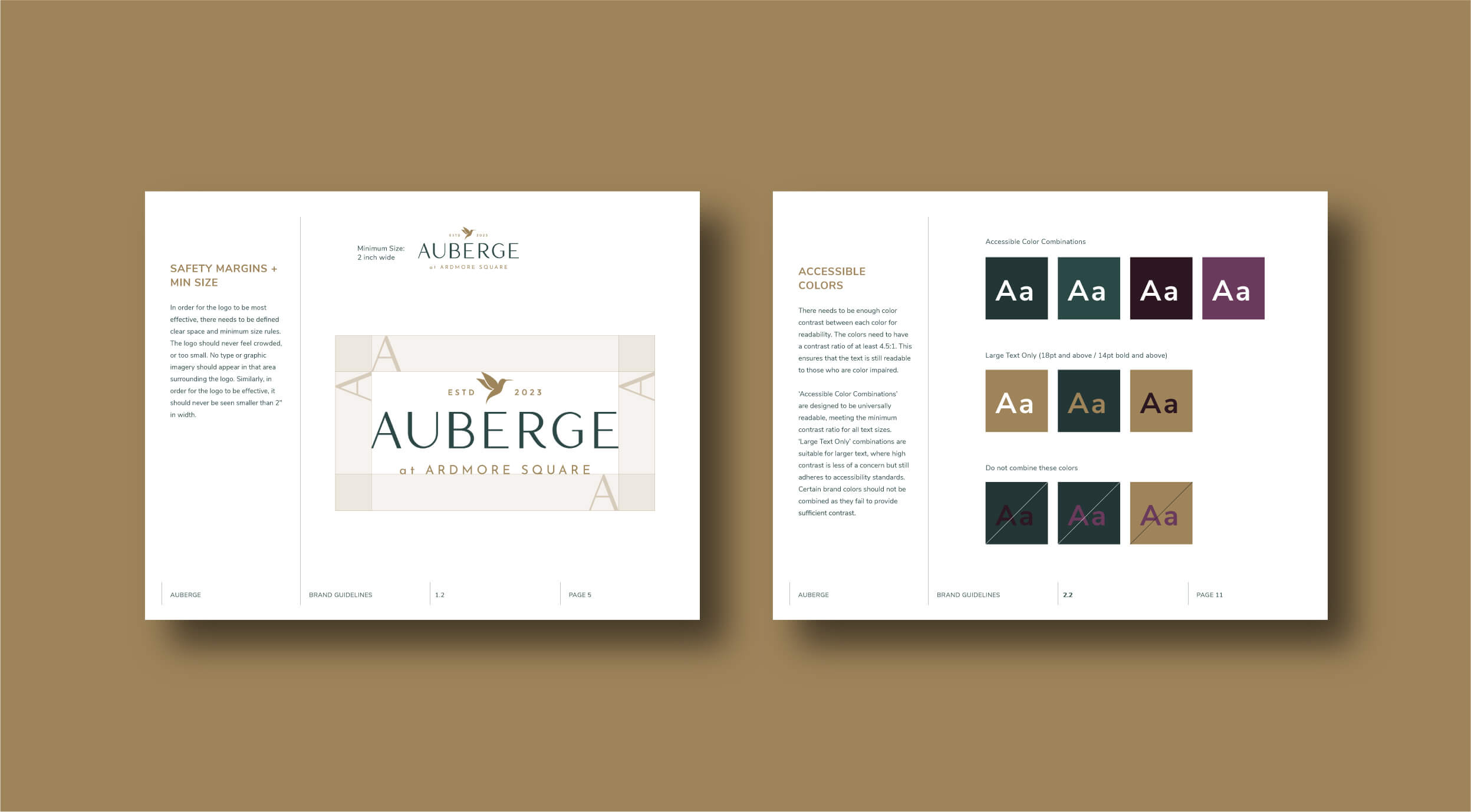
The design approach honed in on an intentional visual identity that was distinctive from luxury hotel brands, conveying a combination of understated elegance with comfort and warmth. The inclusion of a hummingbird icon embodied happiness, beauty, seamless agility, and peace and restoration, mirroring Auberge’s core values. A carefully selected color palette and elevated font enhanced the brand’s appeal, offering an upscale yet approachable image. This versatile design ensured seamless application across all platforms, supporting brand consistency and facilitating future expansion.
Auberge seamlessly blends style and comfort with a mom-and-pop mentality for a curated, memorable experience. This essence is visually captured in the brand identity.
Color palette & Typography
Forest
Pine
Gold
Burgundy
Plum
Antic Didone
Josefin Sans Semibold
Josefin Sans Regular
Challenges & Accommodations
Connecting across audiences means achieving a happy medium in design.
Aside from standing apart from the traditional hotel industry, the project’s challenges included finding a harmony between Auberge’s upscale image and its inviting atmosphere, while ensuring broad demographic appeal. Achieving this balance was crucial for the brand’s identity, requiring careful selection and integration of design elements to resonate with a diverse audience comprised of both purpose-driven travelers and potential referral sources.
Outcomes
Auberge’s new brand identity couples both sophistication and hospitality, and offers versatility for future expansion. The cohesive look and feel enables solid positioning and enhanced visibility among mid-term rentals, such that Auberge is able to attract a diverse clientele and establish a solid foundation for growth.


