Background
Indelible Coaching launched as a new leadership coaching practice focused on helping people make meaningful change that lasts.
With no existing brand in place, the business needed a visual identity that could feel established from the start while still reflecting a highly personal, one-on-one experience. The owner also wanted the brand to lean subtly feminine—expressive, intuitive, and human—without alienating male clients or losing a sense of strength and authority. The brand also needed to support presentations, worksheets, and the materials used every day in coaching engagements.
Challenge
Create a brand that feels strong and assured while balancing warmth, intuition, and inclusivity.
Solution
A distinctive identity supported by a comprehensive style guide, designed to project confidence without rigidity.
Results
A flexible visual system that feels powerful, personal, and welcoming across audiences.

The Objective
Create a brand ready for real-world application
The goal was to develop an identity that could move easily across workshops, presentations, and client resources while communicating clarity and trust. The brand needed to feel polished with enough nuance to reflect the relational nature of coaching, without skewing overly feminine or neutralizing its impact.

Design Solution
A wordmark that blends permanence and personality
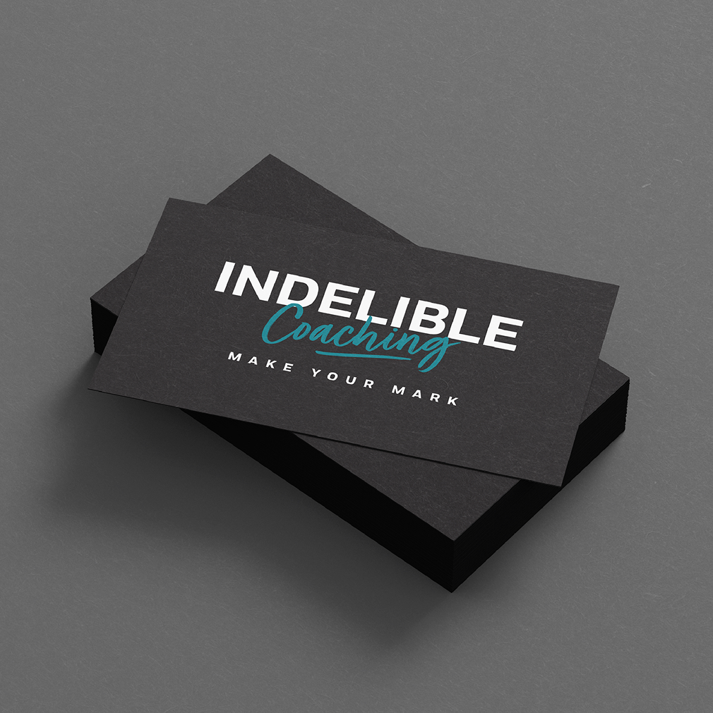
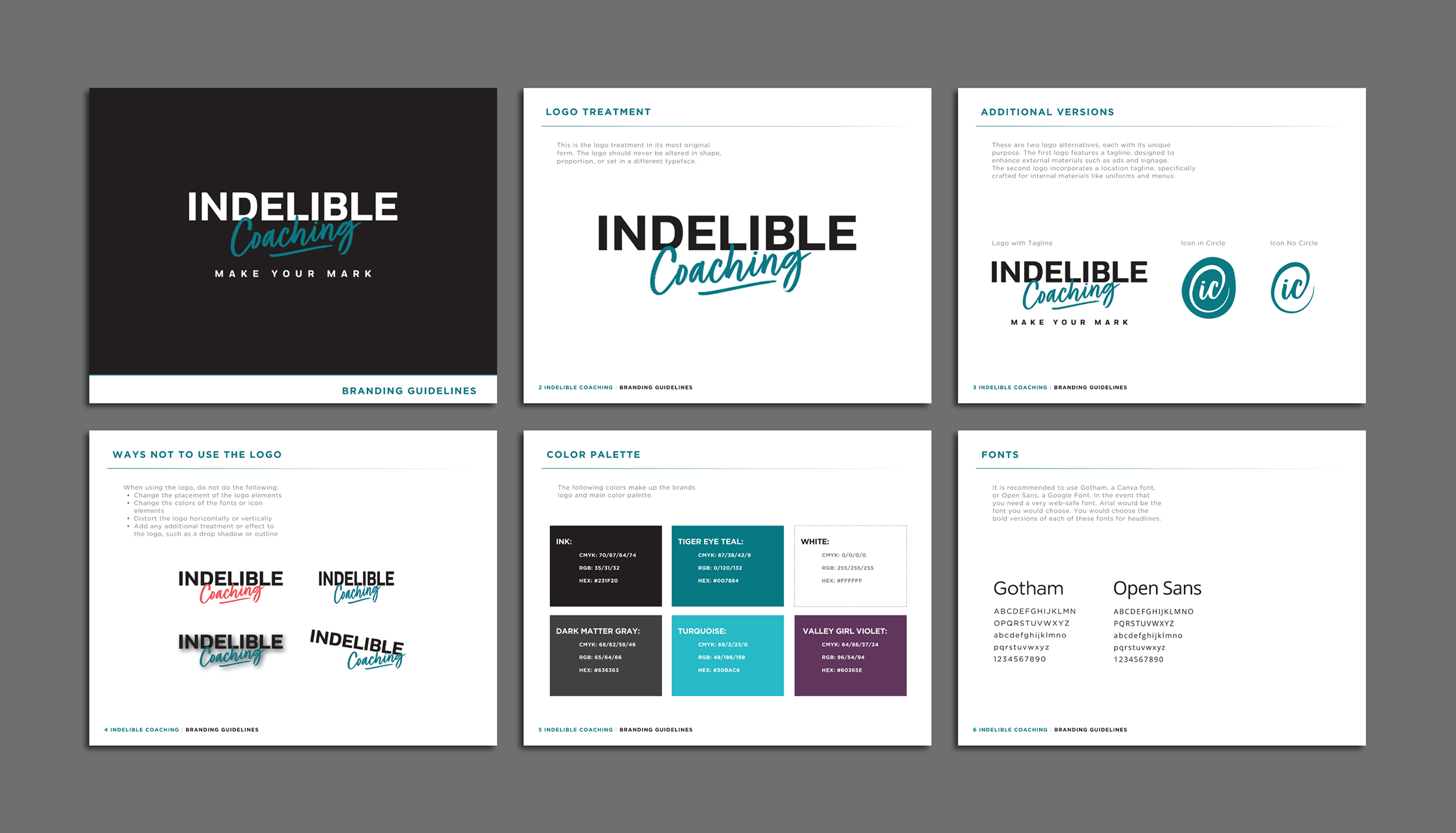
The logo pairs a bold uppercase treatment of “Indelible” with a handwritten script for “Coaching,” echoing the idea of a Sharpie signature that leaves a lasting mark. A palette of deep neutrals and vibrant teal tones adds energy while keeping the brand grounded. The comprehensive style guide gave the business a practical system for creating materials that feel cohesive and recognizable.

Color Palette
Ink
Dark Matter Gray
Tiger Eye Teal
Turquoise
Valley Girl Violet

Challenges & Accommodations
Balancing authority with approachability
The identity needed to resonate across genders and leadership styles while still reflecting the owner’s perspective and voice. It had to feel credible in executive and organizational settings, yet personal enough to support vulnerable, reflective coaching work.
Outcomes
A strong foundation for consistent materials
With a clear identity and guidelines in place, the business gained the tools to create polished, cohesive materials quickly and maintain a consistent presence as it grows.
