
Background
Radnor Memorial Library underwent a major renovation that transformed the building into a more open, modern, and community-oriented space.
The updated architecture introduced cleaner lines, larger windows, and a more welcoming presence that reflected how the library serves the community today. The identity needed to evolve alongside the space and support signage, social media, the website, and ongoing communications.

Challenge
Update the brand to reflect a more modern, community-driven library experience.

Solution
A bright, symbolic identity paired with a classic serif wordmark.

Results
A recognizable logo that aligns with the renovated space and its renewed role.
Challenge
Update the brand to reflect a more modern, community-driven library experience.
Solution
A bright, symbolic identity paired with a classic serif wordmark.
Results
A recognizable logo that aligns with the renovated space and its renewed role.

The Objective
Create an identity that reflects openness and community
The goal was to design a logo that captured the shift from a traditional library to a more active, welcoming environment. The identity needed to feel current and approachable while still grounded in the trust and familiarity associated with the institution.


Design Solution
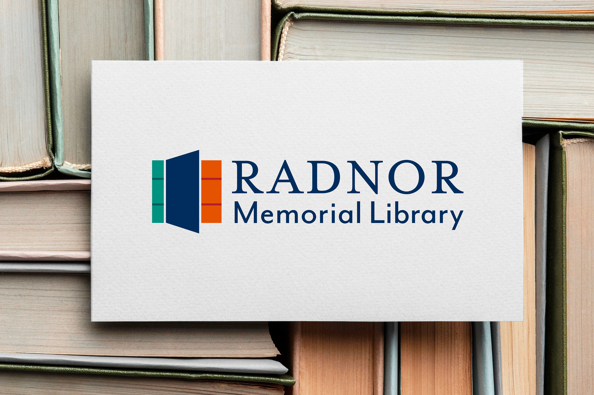
A mark inspired by books, architecture, and entry
The logo was designed to function on multiple levels, reading as both a stack of books and an open doorway. This dual meaning reflects the library as a place of knowledge and a point of entry into the community. The form draws from the updated architecture, referencing clean lines and structural elements seen throughout the renovated space. A bright color palette brings energy and visibility, while a traditional serif wordmark anchors the identity and maintains a sense of history and credibility.
Color palette & Typography
Navy
Green
Orange
Dark Green
Red
Libre Baskerville Regular
Raleway Bold

Challenges & Accommodations
Ensuring the brand’s visual identity reflected the physical transformation
The renovation introduced a more expansive, modern environment, but the identity needed to communicate that shift in a simple, immediate way. The challenge was creating a mark that felt fresh and community-driven while still appropriate for a long-standing civic institution.

Outcomes
An identity aligned with a renewed experience
The final logo gives the library a clear, updated presence across signage and communications, helping signal a more welcoming, modern space to the community.