Background
Ziksana is a leadership development and consulting firm built around the idea “Play to Learn. Learn to Lead.” The company supports organizations in developing stronger leaders through experiential learning, collaboration, and creativity. Their approach connects research, play, and practical application to support lasting leadership development.
Challenge
Develop a brand identity that is professional while clearly expressing Ziksana’s commitment to learning through play.
Solution
A playful, modular identity system and a family of subbrand marks.
Results
A cohesive visual language that supports five distinct offerings and continued growth.
Challenge
Develop a brand identity that is professional while clearly expressing Ziksana’s commitment to learning through play.
Solution
A playful, modular identity system and a family of subbrand marks.
Results
A cohesive visual language that supports five distinct offerings and continued growth.
The Objective
Build a brand that balances play and leadership
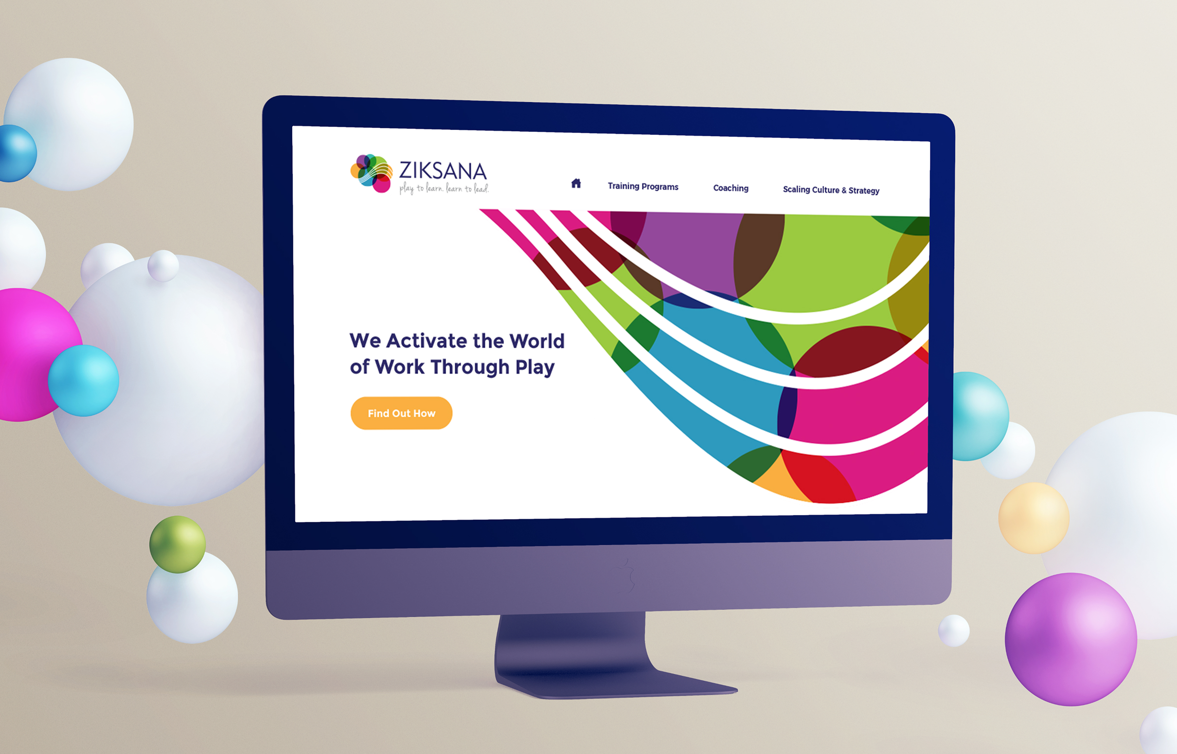
The goal was to create an identity that could feel playful and energetic while remaining systematic and credible. The brand needed to communicate Ziksana’s philosophy at a glance and clearly support multiple offerings as the business evolved. It also needed to stand apart within the leadership consulting space, where visual language often feels overly corporate.
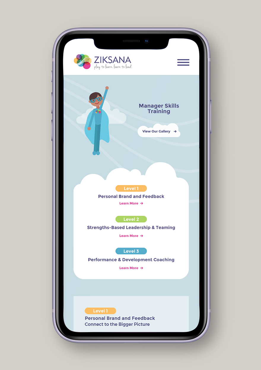
Design Solution
A modular identity inspired by playful thinking
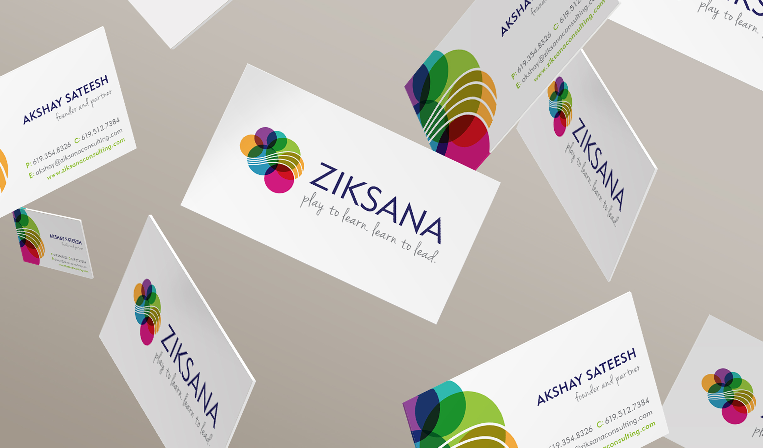
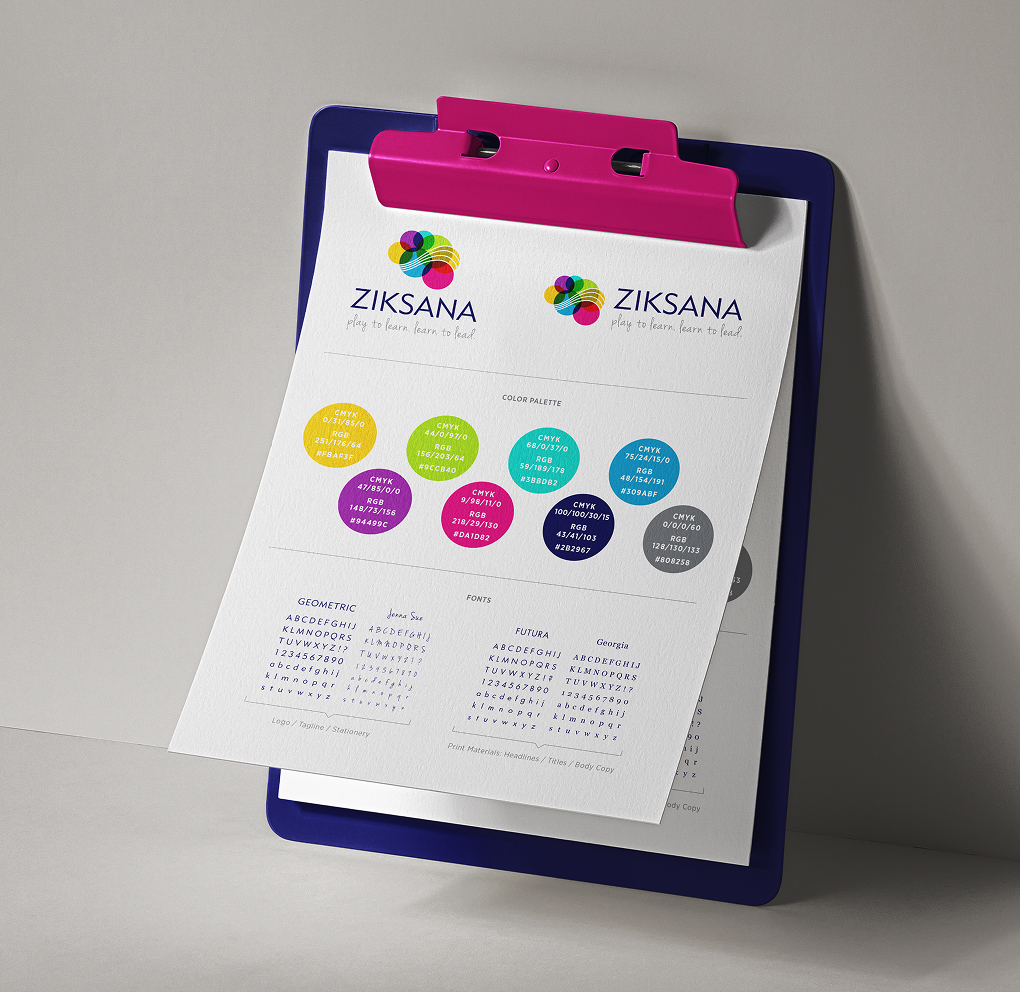
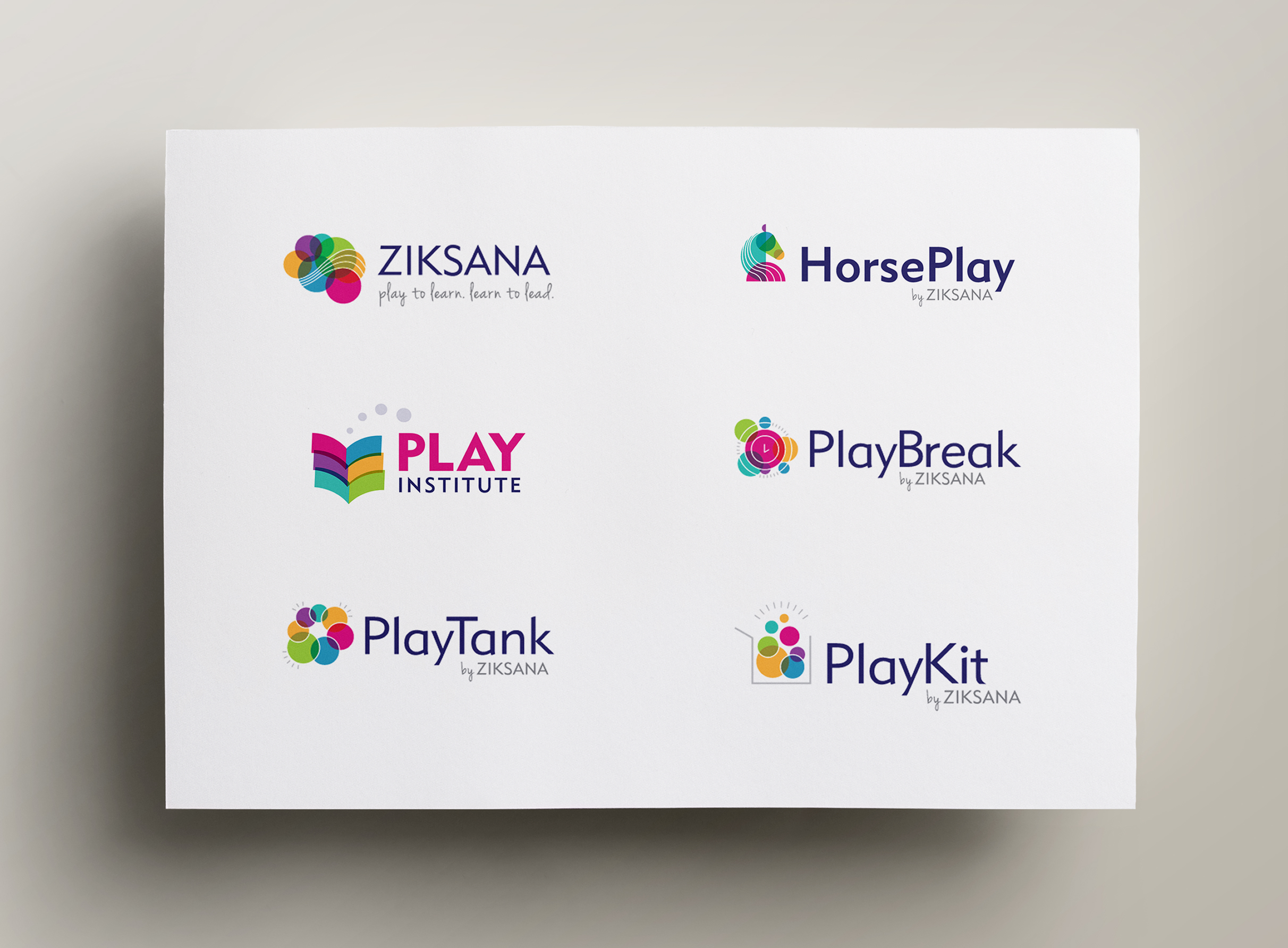
The logo concept is derived directly from the “Play to Learn. Learn to Lead.” philosophy, featuring a playful brain composed of translucent circles and a train of thought running through its shape. As Ziksana expanded, these core elements became building blocks for five subbrand marks. The circles and lines were rearranged into new pictorial forms that reflected each specific offering while staying connected to the parent brand. Bright color and modern typography helped establish a consistent system that balanced energy with structure.
A brand system built from playful building blocks.
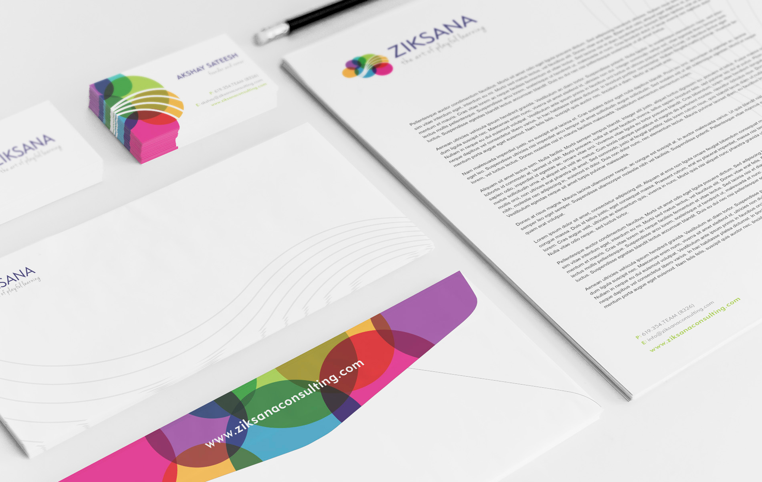
Color Palette
Yellow
Lime
Green
Teal
Blue
Red
Pink
Purple
Navy
Gray
Challenges & Accommodations
Designing for growth from the start
As Ziksana introduced additional subbrands, the identity needed to stretch without losing its personality. The challenge was to turn the core elements into a system that could be recombined into distinct symbols while remaining clearly connected to the parent brand. Each mark also needed to feel specific to its offering while remaining part of a cohesive family.

Outcomes
A scalable brand foundation
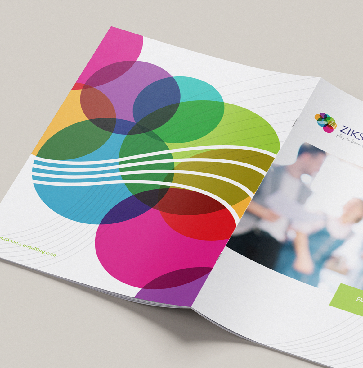
Our work encompassed brand identity, stationery, digital components, marketing materials, and a concise style guide—resulting in a flexible system that supports multiple offerings while maintaining consistency across communications. The brand can expand into new programs without needing to reinvent its visual language, giving the company a clear and recognizable presence as it grows.
