
There are very few times an organization gets to brag without sounding like it is bragging, and a major anniversary is one of them. Reaching 25, 40, or 50 years gives an organization something most brand messaging cannot: proof.
Clients kept coming back, staff stayed, funders renewed; the work continued to matter. An organization can call itself trusted, experienced, or committed, but an anniversary validates it.
A milestone deserves more than a mention in a newsletter or a graphic created for one event. An anniversary logo gives the organization a way to tell that story consistently across everything it shares.
Build on brand recognition
The strongest anniversary logos grow out of the existing identity. The point is not to create a decorative number and place it next to the logo. It should feel connected to the brand from the start.
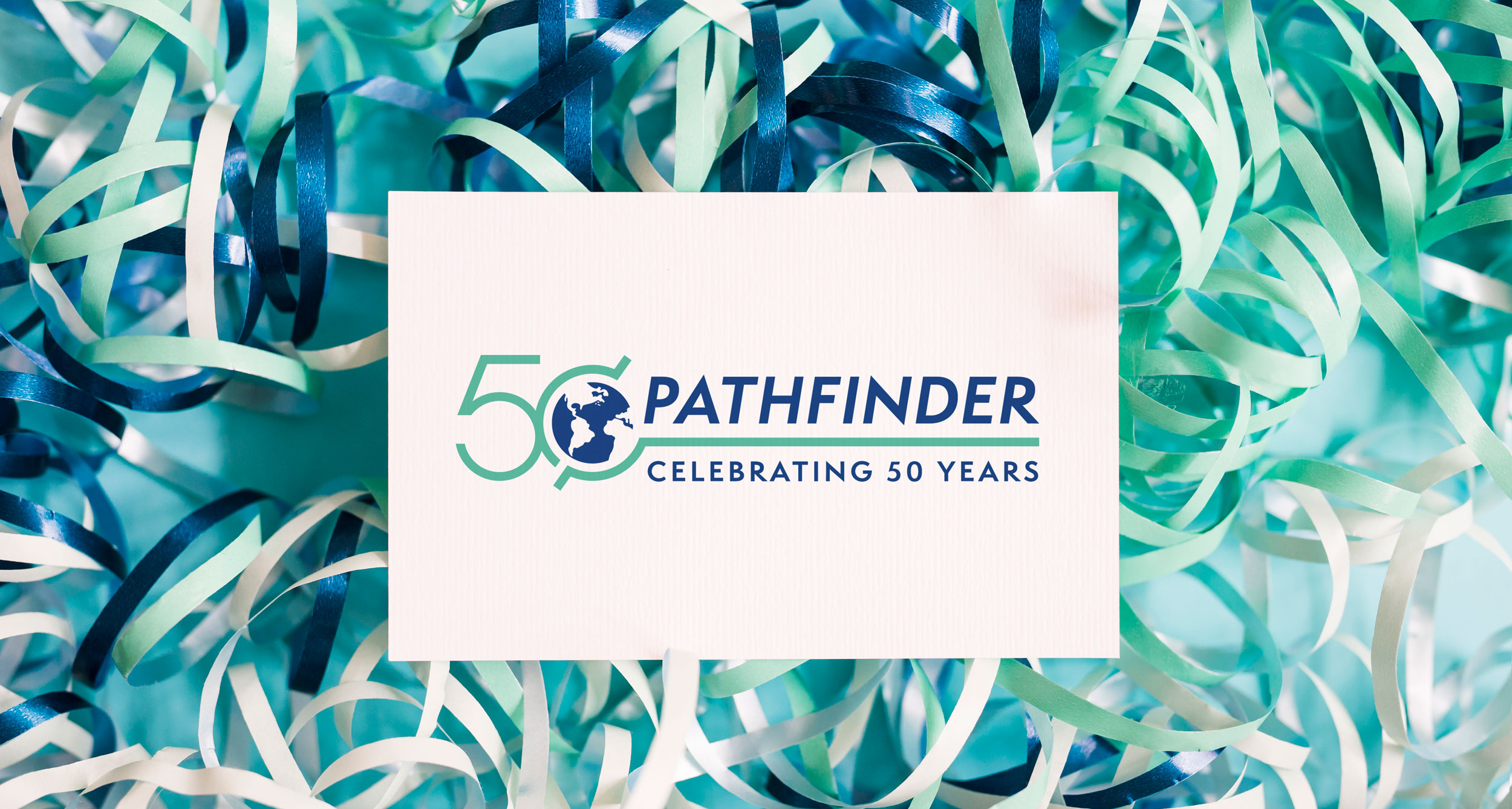
For Pathfinder’s 50th anniversary, the zero became the globe already used in its logo. It was a simple move, but it tied the anniversary directly to Pathfinder. The 50 could not be lifted off and handed to another organization because part of it was already theirs.
That creates a useful test for any anniversary concept. Could the mark belong to someone else? If the answer is yes, the work is not finished.
Give the number a meaning
An anniversary logo should do more than tell people how old an organization is. The number should connect those years to the work and communicate why the milestone matters.
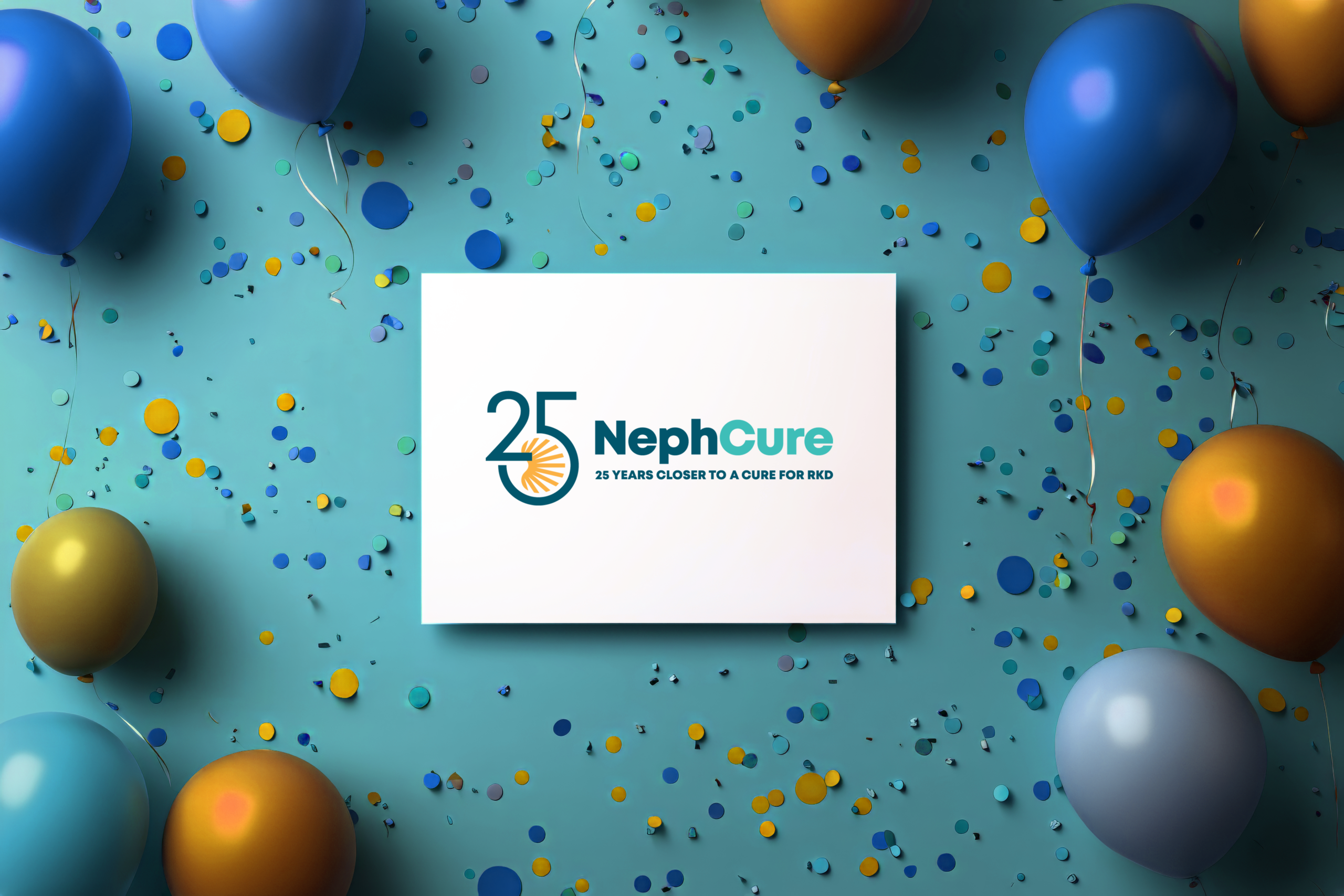
For NephCure’s anniversary, the line beneath the logo reads, “25 Years Closer to a Cure for RKD.” Rather than simply announcing that NephCure is 25 years old, the message connects those years directly to the organization’s reason for existence.
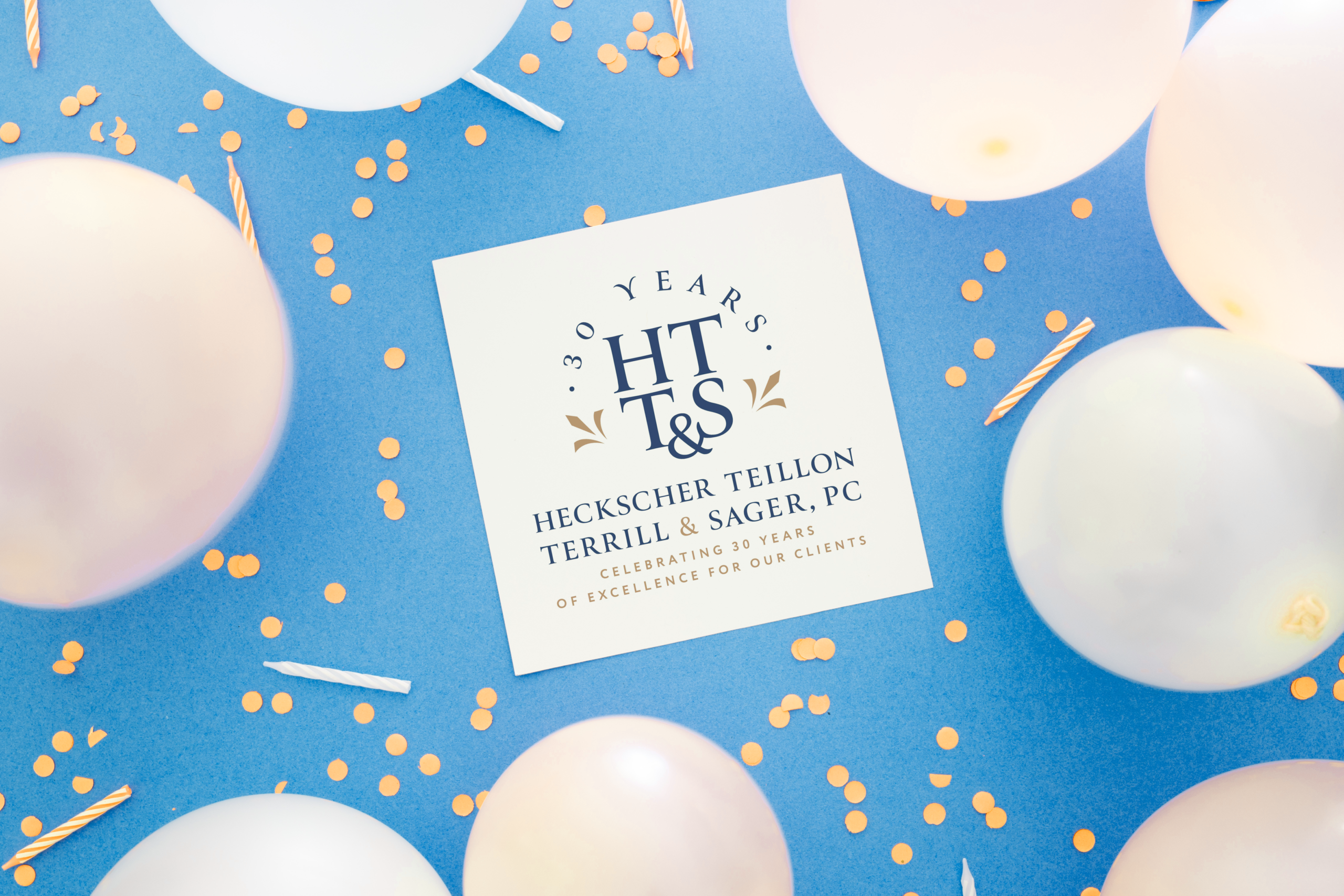
The meaning shifts for a professional firm, where credibility and experience are part of what clients are hiring. Heckscher, Teillon, Terrill & Sager marked 30 years of excellence for its clients, turning the anniversary into a credential and placing that experience directly in front of the people who value it.
The organizations are very different, but the strategy is the same. The number stops describing the organization’s age and starts communicating what those years have meant to the people it serves.
Let the logo do its job
A sentence in a newsletter says something once. An anniversary logo allows the same message to appear across the organization for months.
It belongs on invitations and event signage, but it should also appear in email signatures, proposals, presentation decks, social profiles, annual reports, sponsorship materials, apparel, and anything else the organization already typically sends out. Those repeated, everyday applications are where most people will actually encounter the milestone.
The logo also needs to work across all of those formats. A full version may include the organization’s name and anniversary message, while a simplified version should remain recognizable at the size of a social media thumbnail. The applications may change, but the identity should remain consistent.
Make the most of the milestone
An anniversary gives an organization a limited window to talk about something it has spent decades earning. A strong anniversary identity makes that accomplishment visible and gives clients, donors, employees, and prospects a reason to pay attention.
The campaign does not have to begin and end with the anniversary year. It can launch months ahead, carry through the celebration, and continue into the following annual report, fundraising cycle, or fiscal year. The anniversary may mark one year, but the story behind it took decades to build. A strong identity makes sure the milestone carries the full weight of what it represents.