
Background
Making the grade is easier when you start with expert insight
Early Bird Essay and Tutoring Services focuses on helping high school students, particularly rising seniors, develop strong college admissions essays. The business speaks to both students and their parents, emphasizing an engaging rather than stressful writing process. As a new offering, the company needed a visual identity that could stand apart from more traditional, advisor-driven competitors and reflect a more dynamic approach to writing.

Challenge
Build a novel brand that feels fresh and engaging while maintaining professionalism.

Solution
A colorful, approachable identity centered on a modern bird mark and supporting brand elements.

Results
A distinctive visual system that feels both vibrant and credible, appealing to a multigenerational audience.
Challenge
Build a novel brand that feels fresh and engaging while maintaining professionalism.
Solution
A colorful, approachable identity centered on a modern bird mark and supporting brand elements.
Results
A distinctive visual system that feels both vibrant and credible, appealing to a multigenerational audience.
The Objective
Create a brand that makes writing feel approachable
The goal was to develop an identity that could appeal to both students and parents while signaling a different kind of tutoring experience. The brand needed to feel vibrant and modern, while still conveying trust and expertise in a competitive space.


Design Solution
A playful system rooted in clarity and personality
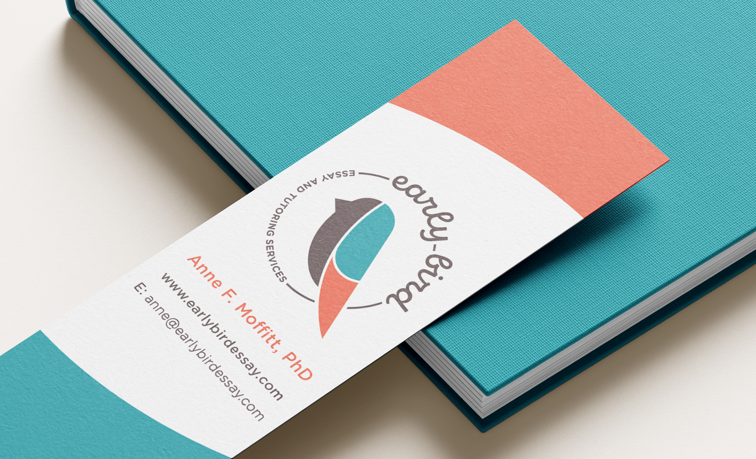
The logo combines a geometric bird mark with clean, rounded typography to create something that feels both structured and approachable. The color palette brings in bright, fresh tones that stand apart from more muted competitors, reinforcing a sense of energy and optimism. Supporting elements, including a custom “pencil worm” graphic, extend the brand’s personality into materials and create moments of visual interest that connect back to writing in unexpected ways. The overall system balances simplicity with character, making it easy to apply across business cards, worksheets, and marketing materials.

Color palette & Typography
Brown
Teal
Red
Gray
Montserrat Bold
Montserrat Light

Challenges & Accommodations
Standing out in a traditional category
Most competitors leaned toward corporate or overly academic visuals. The identity needed to break from that pattern while still feeling credible to parents making decisions.

Outcomes
A brand that feels distinct and usable
The final identity gives Early Bird a recognizable presence and a set of visual tools that carry across materials, helping the business present itself with clarity and personality from the start.